
Professional Fonts: 12 Best Fonts for Resumes, Business Documents and Presentations
Professional fonts are typefaces that let the content speak: clear, even letters that read well in a resume, report, pitch deck or brand guide, with enough weights to build headings without a second font. Most are neutral sans serifs or calm text serifs.
Our top three are Essential Sans, a 16-font sans spaced for body text; Arbeit, a neo-grotesque with a variable font; and Barnaby, a quiet serif drawn for small sizes. Every font on the main list is a commercial Creative Market font. Further down: the built-in fonts in Word and Google Docs, size and spacing rules from career and typography sources, and six free fonts with their licences.
Browse professional fonts on Creative Market Commercial fonts: regular one-seat Desktop prices, checked late October 2026
What is a professional font?
A professional font is a typeface that reads clearly at text sizes, looks neutral or authoritative rather than playful, and comes as a family with regular, italic and bold styles. Most are sans serifs such as Aptos, Helvetica or Frutiger, or text serifs such as Georgia, Garamond or Source Serif.
“Professional” isn’t a type classification. It describes fonts that don’t get in the way of the message.
What makes a font look professional
- Legibility at small sizes: a generous x-height, open counters and letters that can’t be confused. Wix’s guide suggests checking that capital I, lowercase l and the numeral 1 look different.
- A real family: regular, italic, bold and ideally a semibold, so headings and emphasis come from one design instead of faked styles.
- Restraint: no swashes, novelty shapes or texture.
- Even spacing: rhythm across a paragraph matters more in a 20-page report than in a logo.
The classic corporate sans serifs show the pattern: Frutiger began as airport signage, Univers was planned as a large family of weights and widths, and Proxima Nova and Gotham became brand defaults. Our guides explain the legal ways to get each.
Is there one “most professional font”?
No. The U.S. Supreme Court’s Rule 33 requires booklet briefs “in a Century family (e.g., Century Expanded, New Century Schoolbook, or Century Schoolbook) 12-point type.” The State Department moved from Times New Roman to Calibri in 2023 for accessibility, then went back to 14-point Times New Roman in December 2025. Matthew Butterick’s Practical Typography tells writers to avoid system fonts, “especially Times New Roman and Arial.” The takeaway: the professional choice is the one that suits the reader and setting, at the right size, used consistently.
The best professional fonts at a glance
| Font | Best for | Styles | Desktop price* |
|---|---|---|---|
| Essential Sans | Brand systems and body text | 16 (8 weights with italics) + variable | $149 |
| Arbeit | Corporate documents and interfaces | 6 weights with italics + variable | $100 |
| Oakes Grotesk | Reports and annual reviews | 5 weights with italics | $100 |
| Commuters Sans | Brochures and editorial-style decks | 8 weights with italics | $149 |
| Altone | Data-heavy documents and tables | 18 (9 weights with obliques) + variable | $89 |
| Volda Sans | Small businesses on a budget | 14 (7 weights with italics) | $19 |
| Gorga Sans | Large brands that need widths | 162 + 2 variable fonts | $42 |
| Pogonia | Friendly but tidy branding | 9 weights | $49 |
| Barnaby | Body text and letters | 2 (Regular, Semibold) | $39 |
| Hangoe | Reports with text and condensed cuts | 8 (incl. Text, Condensed, italics) | $24 |
| Hello Branch | Headings for proposals and decks | 8 weights | $39 |
| TBJ Malta | A budget serif with a full weight range | Thin to Black | $29 |
*One-seat desktop licence on Creative Market, checked October 2026.
How we chose these fonts
We started from tantype’s own reviews of Creative Market fonts and kept neutral sans serifs and readable serifs sold as families, with at least two weights and preferably italics. Each listing was checked live in late October 2026 for availability, the regular one-seat Desktop price, styles, language support and file formats, and we read any buyer reviews. We left out display-only and all-caps fonts and anything already in our logo and geometric sans roundups. Descriptions come from the listings and our reviews, not from printing every font.
Best professional fonts on Creative Market
Prices are regular one-seat Desktop licences, checked in late October 2026. See each listing for current pricing.
Professional sans serif fonts handle most business work: resumes, reports, slides, websites and brand guidelines.
1. Essential Sans
Jen Wagner Co describes Essential Sans as “an eight weight, 16-font typeface designed to be an easy go-to for branding” that “was intentionally spaced for clean reading if you wanted to use it for body type.” That second point is why it leads: many branding sans serifs look good in a logo and tiring in a paragraph. Weights run from Hairline to Black, each with an italic, and a variable font is included. Desktop licence: $149.
See Essential Sans on Creative Market · Read our Essential Sans review
2. Arbeit
Studio Few calls Arbeit “a functional Neo-Grotesque typeface,” exactly what a corporate document needs. It has six weights with italics, and “a variable version of the font is included with the complete family.” Language support covers Baltic, Central European, Dutch, Romanian, Turkish and Western European sets. Our review notes slightly more open counters than strict Helvetica-style grotesques, which helps at small sizes. One 2023 buyer review reports a stray pixel on the a in several styles. Arbeit also appears in Creative Market’s business letter fonts list. Desktop licence: $100.
See Arbeit on Creative Market · Read our Arbeit review
3. Oakes Grotesk
Also from Studio Few, Oakes Grotesk is “a more corporate take on the Oakes typeface,” with “brand new metrics that allow it to be more legible in body text as well as headings.” The g was redrawn as double-storey, giving a more traditional texture than most geometric sans serifs. There are five weights with italics and the same European language coverage as Arbeit; a buyer calls it a “great go to font.” Choose it over Arbeit for slightly softer, rounder shapes in an annual report or services brochure. Desktop licence: $100.
See Oakes Grotesk on Creative Market · Read our Oakes Grotesk review
4. Commuters Sans
Dharma Type’s Commuters Sans “is a daily type”: slightly wide proportions, plain terminals and “eight weights with matching italics,” and it “supports almost all Latin-based languages.” The wider letters give lines a relaxed rhythm that suits brochures, slides and magazine-style company reports, and eight weights cover captions, body, subheads and titles without a second family. Desktop licence: $149.
See Commuters Sans on Creative Market · Read our Commuters Sans review
5. Altone
Eko Bimantara’s Altone is sold as geometric, but its letterforms “are more likely associated with Grotesk rather than the original classical Bauhaus style.” Nine weights from Thin to Heavy each have a matching oblique, plus upright and oblique variable fonts. The useful extra for business documents is the figure set: fractions, numerators, denominators and tabular lining figures, so numbers line up in tables and financial statements. Desktop licence: $89.
See Altone on Creative Market · Read our Altone review
6. Volda Sans
Volda Sans from Yukita Creative is the budget pick: “7 weights from Light to Black, each equipped with matching Italic styles.” Our review describes a contemporary grotesque with “no ink traps, no quirky terminal flourishes,” which is what a resume or proposal needs, and true italics rather than slanted romans. The listing doesn’t state language support, so check the character set if you work beyond English. No buyer reviews yet. Desktop licence: $19.
See Volda Sans on Creative Market · Read our Volda Sans review
7. Gorga Sans
VP Fonts’ Gorga Sans is a full type system: 162 styles “from Thin to Black and Ultra Condensed to Ultra Expanded,” italics for every weight and width, and two variable fonts with weight and width axes. The listing claims 85 languages. One family covers condensed type for tables, wide type for headlines and regular widths for body copy. The catch is size: the download is close to 39 MB, and 162 entries clutter a Word font menu, so install only the styles you need. Desktop licence: $42.
See Gorga Sans on Creative Market · Read our Gorga Sans review
8. Pogonia
Asenbayu describes Pogonia as “a modern aesthetic sans serif” with “geometric and humanist structure.” Round bowls look clean, while softened terminals keep it from feeling cold, a good fit for consultancies, clinics and agencies that want to look friendly and organised. Nine weights run from Thin to Black, with stylistic alternates and ligatures, in OTF, TTF and WOFF. The listing mentions no italics, so use bold for emphasis or pair it with a serif. Desktop licence: $49.
See Pogonia on Creative Market · Read our Pogonia review
Professional serif fonts read as traditional and authoritative, which suits law, finance, publishing, academia and formal letters.
9. Barnaby
Barnaby, another Jen Wagner Co design, is “an upper and lowercase text serif that works beautifully for branding projects and especially body text,” “designed to be easily read at small scale.” Our review describes modest contrast, short bracketed serifs and a generous x-height, the traits that keep a paragraph comfortable at 10 or 11 points. There are two weights, Regular and Semibold, and no italics are mentioned, so it suits letters, reports and resumes more than complex layouts. Desktop licence: $39.
See Barnaby on Creative Market · Read our Barnaby review
10. Hangoe
Issam Type’s Hangoe is unusually practical for its price: Regular, Condensed, Text and Text Condensed, each with an italic. Use the Text styles for running copy, the others for headings, and the condensed cuts to fit long titles or table headers into narrow columns. The listing names kerning, ligatures, stylistic sets and multilingual support, with OTF, TTF, WOFF and WOFF2 files. No buyer reviews yet. Desktop licence: $24.
See Hangoe on Creative Market · Read our Hangoe review
11. Hello Branch
Sans & Sons’ Hello Branch is “designed with smooth contrast and graceful shapes,” in eight weights from Thin to Extra Bold. Our review calls it “quietly polished”: restrained terminals, and light weights that stay readable instead of breaking into hairlines. It suits proposal covers, slide titles and pull quotes, paired with a sans for body text. One April 2026 buyer review says it did not work in Canva, so test it there before building templates. Desktop licence: $39.
See Hello Branch on Creative Market · Read our Hello Branch review
12. TBJ Malta
Taboja Studio’s TBJ Malta is “a serif typeface designed with elegance and ease of use in mind.” The listing promises “9 variants from Light to Black,” though its own list names eight weights from Thin to Black, so check the count in the download. Language support is described as multilingual, with accented characters; no italics are mentioned. Desktop licence: $29.
See TBJ Malta on Creative Market · Read our TBJ Malta review
How to choose a professional font
Professional fonts for resumes
Career offices stress readability over style. MIT advises: “Use a conservative font no smaller than 10pt and leave at least half inch margins on all sides” (MIT CAPD). Harvard says to “ensure your resume and cover letter are prepared with the same font type and size” and to check the formatting survives conversion to PDF (Harvard Mignone Center). MIT also notes employers may use keyword scanning, so keep your resume as real text, not an image. In practice: one family with bold headings, body text at 10 to 12 points (small-looking fonts like Garamond need the upper end), and a PDF unless the employer asks for Word. Aptos, Calibri or Georgia are safe; a paid family like Barnaby or Volda Sans looks considered without looking unusual.
The most professional fonts in Word
Microsoft replaced Calibri with Aptos as the default in Word, Excel, PowerPoint and Outlook, announced in July 2023 (TechSpot). Microsoft’s typography page says Steve Matteson designed Aptos “as a new default Office font to replace Calibri,” in six weights from Light to Black with italics, plus Display and Narrow styles. These built-in fonts all look professional when set well:
| Font | Type | Where it comes from |
|---|---|---|
| Aptos | Sans serif | Microsoft 365 cloud font; free download from Microsoft |
| Calibri | Sans serif | Windows (since Vista) and Office |
| Arial, Verdana | Sans serif | Windows, macOS and Office |
| Georgia, Times New Roman | Serif | Windows, macOS and Office |
| Cambria | Serif | Windows and Office |
| Garamond, Book Antiqua | Serif | Office cloud fonts (on a Mac, Garamond is only a document-support font) |
Sources: Microsoft’s pages for Calibri, Georgia and Garamond, and Apple’s fonts included with macOS Tahoe, where document-support fonts are “available only to documents that already use the font.” To use a Creative Market font in Word, install the OTF or TTF file and restart Word. Office can embed fonts in a file, but Microsoft notes not all fonts can be embedded, and a commercial licence may not allow it.
Professional fonts in Google Docs
Google Docs uses its own web fonts, not the fonts on your computer: open the font menu, choose “More fonts” and add families from the Google Fonts library; you can’t upload font files (All Things How). Good choices are Inter, Source Serif 4, IBM Plex Sans, Merriweather and Lato. To make one the default, set the Normal text style, then choose Format, Paragraph styles, Options, “Save as my default styles” (Google Docs Help).
Fonts for presentations and corporate brands
Slides are read from a distance and documents up close, so one family with a wide weight range does both best: semibold or bold titles, regular text, no thin weights on projectors, one or two fonts per deck. For corporate fonts across a brand, check for italics, tabular figures and the languages you need; Altone, Gorga Sans and Essential Sans are strongest here. For logos, see our best logo fonts, and for circle-based sans serifs like Futura, our best geometric sans serif fonts.
Font size, spacing and accessibility
Butterick’s key rules are a good baseline for the best font for documents: “Point size should be 10–12 points in printed documents, 15–25 pixels on the web,” “Line spacing should be 120–145% of the point size,” and lines should average “45–90 characters.” Use bold or italic sparingly, “and not together.” Microsoft’s accessibility guidance says to “select familiar sans serif fonts such as Arial or Calibri” and avoid “all capital letters and excessive italics or underlines” (Microsoft Support). WCAG asks for contrast of at least 4.5:1 for normal text and 3:1 for large text, “at least 18 point or 14 point bold” (W3C).
Free professional fonts
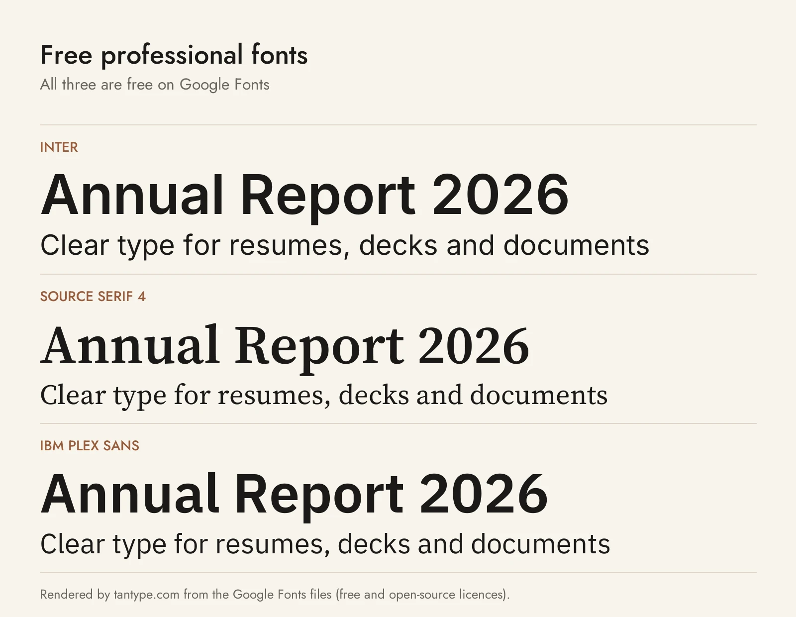
These six are free for commercial use, from official sources. None is one of the Creative Market fonts above.
- Inter (Google Fonts): Rasmus Andersson’s variable sans “designed for computer screens,” with “a tall x-height,” weights 100 to 900 and italics. The closest free match to Arbeit or Volda Sans.
- Source Serif 4 (Google Fonts): Frank Grießhammer’s transitional serif for Adobe, with optical sizes and weights 200 to 900 with italics. A free alternative to Barnaby or Hangoe.
- IBM Plex Sans (Google Fonts): IBM’s corporate typeface by Mike Abbink and Bold Monday, “a neutral, yet friendly Grotesque” with a width axis, italics and matching Serif and Mono families.
- Atkinson Hyperlegible Next (Google Fonts): from the Braille Institute, “developed specifically to increase legibility for readers with low vision.” The pick when accessibility comes first.
- Merriweather (Google Fonts): Sorkin Type’s serif, “designed to be a text face that is pleasant to read on screens,” with a matching Merriweather Sans.
- Switzer (Fontshare): Jérémie Hornus’s neo-grotesk for Indian Type Foundry, “18 styles; nine of those are italics.” A free stand-in for Oakes Grotesk.
| Font | Source | Licence | Commercial use |
|---|---|---|---|
| Inter | Google Fonts | SIL Open Font License | Yes |
| Source Serif 4 | Google Fonts | SIL Open Font License | Yes |
| IBM Plex Sans | Google Fonts | SIL Open Font License | Yes |
| Atkinson Hyperlegible Next | Google Fonts | SIL Open Font License | Yes |
| Merriweather | Google Fonts | SIL Open Font License | Yes |
| Switzer | Fontshare (ITF) | ITF Free Font License | Yes, including logos; no modifying or redistributing the files |
The Google Fonts licences are in each family’s google/fonts folder. Fontshare’s licence page says its fonts are “100% free for personal and commercial use.” Aptos is also a free download from Microsoft, under Microsoft’s own terms rather than an open licence.
Licensing: personal vs commercial use
Creative Market’s font licence page sets out four licences:
- Desktop: “unlimited commercial and personal projects,” including “physical end products, social media, packaging, and paid ads”; on websites and apps only as images. Buy “a number of seats that is consistent with the amount of users.”
- Webfont: websites you own or control.
- App: one application.
- E-pub: one e-book title.
You may hand finished work to a client, but not the font files. For logos, the font must be “(1) modified and (2) not the dominant element of the logo.” For company templates many people will edit, budget for seats or choose a free font such as Inter. None of the twelve listings offers a free personal-use version, and copies from download sites carry no licence. This is a summary, not legal advice.
Professional font FAQ
What is the most professional font?
There is no single winner; the most professional font is a clear, neutral family set at the right size. In Word that usually means Aptos, Calibri or Georgia; among paid fonts, a neo-grotesque like Arbeit or a text serif like Barnaby.
What is the best font for a resume?
A conservative, readable font at 10 to 12 points, used for the resume and the cover letter alike. MIT’s career office sets 10 pt as the minimum. Avoid scripts and display fonts.
What font size should a business document use?
10 to 12 points in print and 15 to 25 pixels on screen, with line spacing of 120 to 145% of the point size, according to Practical Typography.
What is the most professional font in Google Docs?
Pick a well-made family from “More fonts”: Inter or IBM Plex Sans for a modern look, Source Serif 4 or Merriweather for a traditional one. Save it as your default style so new documents start with it.
Is Times New Roman or Arial unprofessional?
No, but they can look like a default nobody chose, which is why Butterick advises against them. If a form, court or employer specifies a font, use it.
Serif or sans serif for business fonts?
Either works. Sans serifs read as modern and suit screens, slides and service brands; serifs read as traditional and suit law, finance and formal letters. Many corporate identities pair one of each.
Can I use Creative Market fonts in Word, PowerPoint and Canva?
Yes, with a Desktop licence. Install the font on your computer for Word and PowerPoint, or upload it to Canva on a paid plan. Colleagues who edit the file need the font installed and their own seat.
