
Commuters Sans: a wide, even-tempered grotesque for editorial and branding work
Design style
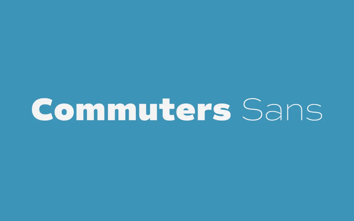
Commuters Sans sits in that familiar territory of contemporary grotesques built for utility rather than personality. The proportions run slightly wide, which gives the lowercase a settled, unhurried rhythm rather than the compressed tightness you get from more fashion-driven sans faces. Curves are simple, terminals are cut plainly, and there’s no attempt to smuggle in quirky details — no ink traps, no flared stems, no eccentric apertures. It reads as a working typeface first, a design statement second.
That restraint is the point, but it does mean Commuters Sans won’t stand out in a lineup of similar grotesques unless you lean on its weight range to do the differentiating. The warmth the foundry claims comes through mostly in the curves of the bowls and the slightly open counters, which soften what could otherwise be a very dry, mechanical structure. It’s not a cold typeface, but it’s not an expressive one either — it’s the sans equivalent of a well-cut shirt.
Character set and features
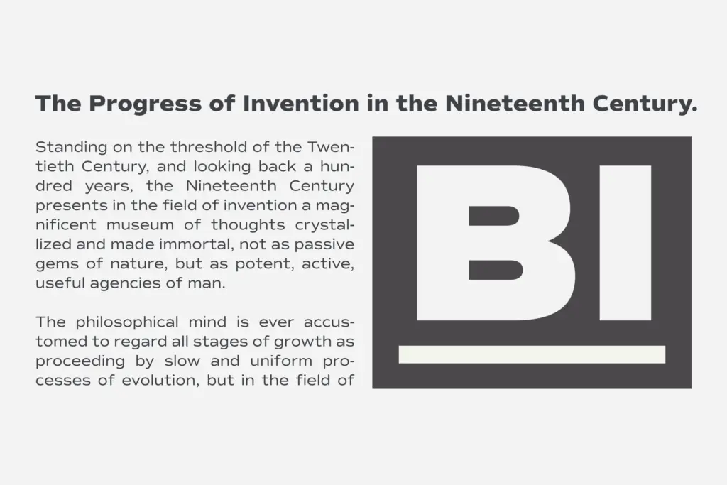
Eight weights with matching italics is a serious range, and it’s the strongest practical argument for the family. That span lets you build real typographic hierarchy — captions in a light weight, body copy in regular, callouts in a heavier cut — without introducing a second typeface. The italics aren’t just slanted romans; they carry enough of their own cursive structure to function as true companions rather than obligatory afterthoughts, though they stay closer to the sans-serif tradition of restrained obliques than to anything calligraphic.
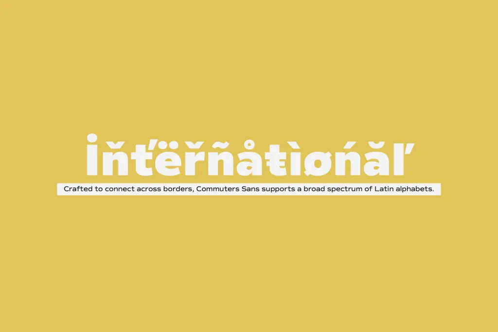
Language support across the Latin set is broad enough that multilingual editorial or branding projects shouldn’t run into gaps, which matters more than it sounds for anyone working across European markets. Numerals and punctuation are handled competently but without much flourish — this isn’t a typeface with a deep bag of ligatures or alternates to discover. What you see in the weight chart is largely what you get.
Use cases
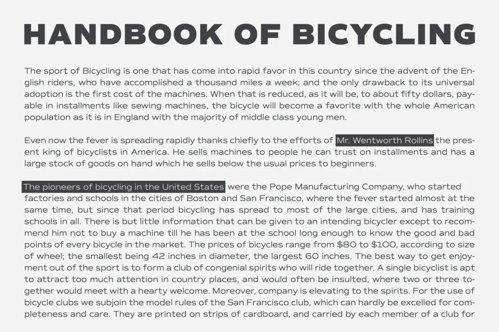
The wide proportions and even colour make Commuters Sans comfortable at both ends of the size spectrum. Set small, in a lighter weight, it holds together in long-form editorial text without the letterforms crowding each other. Set large, in a bolder cut, it has enough structural clarity to work as titling or wordmark type without redrawing. That range is genuinely useful for studios that want one family to cover a masthead, a body-copy stylesheet, and a set of pull quotes without switching typefaces mid-project.
Branding work benefits from the same versatility — the family can carry a logotype in a heavier weight and then step down to set the supporting collateral in a lighter one, keeping visual consistency across a system. Where it’s less convincing is in anything that needs a distinct voice: packaging that wants personality, or a brand mark that needs to be instantly recognisable on its own shape rather than its weight. For that, Commuters Sans is a dependable background player rather than the star.
What we liked, and what we didn’t
Strengths
- Eight weights with matching italics give real hierarchy options within one family
- Wide proportions and even colour keep it legible from caption size up to titling
- Broad Latin language support suits multilingual editorial and branding projects
Trade-offs
- The letterforms play it safe, with little to distinguish it from other contemporary grotesques
- Limited typographic extras like alternates or ligatures make it a workhorse, not a feature typeface
Commuters Sans is a competent, wide-set grotesque with a genuinely useful eight-weight range and solid italics. It won't turn heads on its own, but it will do editorial and branding work reliably across sizes and languages.
Verdict

Tantype reviews typefaces in depth — every font is tested in real branding, editorial and screen layouts before a word gets written. 555+ fonts reviewed and counting.