
Oakes Grotesk: a corporate grotesk with quietly rounded manners
Design style
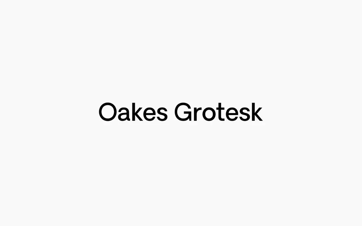
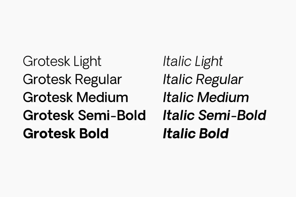
Oakes Grotesk sits in the crowded field of corporate grotesques but doesn’t try to win on neutrality alone. It’s built from five weights plus italics, and the family carries over the rounded undercurrent of the original Oakes while reworking the metrics for a more businesslike register. The curves are subtle rather than decorative — you notice them in the shoulders of the n and m, and in the way terminals ease off rather than cut square. It reads as a grotesk that’s been softened just enough to avoid feeling cold, without tipping into anything that could be called friendly or humanist in an obvious way.
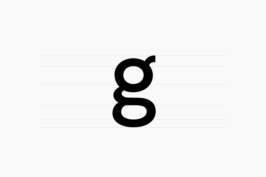
The double-story g is the most deliberate departure from the parent typeface, and it changes the character of the face more than its size on the page suggests. A single-story g tends to read as more geometric or vernacular; the double-story version here pulls Oakes Grotesk toward a more traditional, editorial register, closer to what you’d expect from a text-oriented grotesk than a display one. Other characters have been refined alongside it — nothing flashy, just the kind of quiet correction that comes from testing a typeface at body sizes rather than only at headline scale.
Character set and features
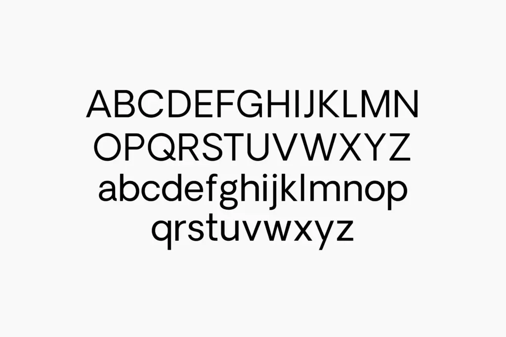
Language coverage spans Baltic, Central European, Western European, Dutch, Romanian and Turkish alongside Basic Latin, so it’s built with genuine multilingual work in mind rather than as an afterthought. Five weights give a reasonable range for building hierarchy — enough to separate a headline from a caption without resorting to a completely different typeface for emphasis — and the italics are a proper cut rather than a mechanical slant, which matters if you’re using this for anything with sustained running text.
The family’s stated aim is legibility at both heading and body sizes, and the metrics do the work you’d expect: even spacing, moderate x-height, apertures open enough to keep letters distinct without looking loose. It doesn’t have unusual features like ligatures or alternates to speak of — this is a workhorse grotesk, not a display face with tricks up its sleeve. That restraint is the point. It’s designed to disappear into the content rather than announce itself.
Use cases
This is a font for corporate identity work, editorial layouts, and any project where a brand needs a grotesk that can carry both a wordmark and several paragraphs of body copy without swapping typefaces. The double-story g and refined metrics make it more comfortable in dense text than a lot of headline-first groteskss, so it suits annual reports, packaging copy, UI text, and long-form web content as readily as headlines.
It’s less suited to work that wants personality up front — there’s nothing here that will make a poster jump out on its own, and designers looking for a distinctive display character should look elsewhere. But for studios that need one reliable grotesk to hold a brand system together across sizes and media, Oakes Grotesk does that job without fuss.
What we liked, and what we didn’t
Strengths
- Double-story g and reworked metrics genuinely improve body-text legibility over the parent typeface
- Five weights and true italics give enough range for full editorial or brand systems
- Solid multilingual character coverage for European-market work
Trade-offs
- The restrained, neutral design means little visual personality for standalone branding or posters
- No alternates or ligatures for designers wanting expressive flexibility
Oakes Grotesk is a competent, well-mannered corporate sans that trades personality for range. It won't be the font that defines a brand on sight, but it will carry that brand reliably from headline to footnote.
Verdict

Tantype reviews typefaces in depth — every font is tested in real branding, editorial and screen layouts before a word gets written. 555+ fonts reviewed and counting.