
Arbeit: a no-nonsense Neo-Grotesque for corporate and editorial work
Design style
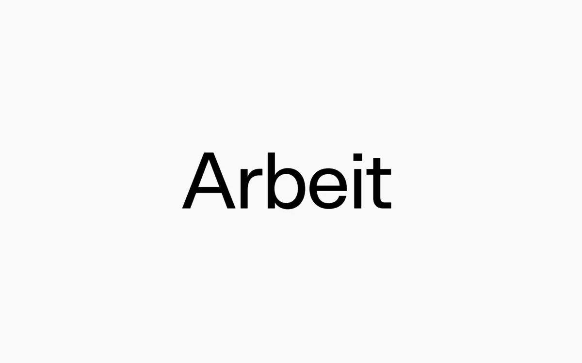
Arbeit sits squarely in the Neo-Grotesque tradition, the family of sans serifs built on even stroke weight, closed apertures and a general refusal to draw attention to itself. There’s no flourish here, no single letter designed to make a case study slide look clever. The skeleton is upright, the proportions are fairly even across the alphabet, and the overall impression is of a typeface built for use rather than for admiration in isolation.
That said, it’s not anonymous. The counters are a touch more open than the strict Helvetica-adjacent grotesques, which helps it breathe at smaller sizes, and the terminals are cut cleanly rather than rounded off. It reads as considered rather than default — a font that’s clearly been drawn with care even though its job is to disappear into the message.
Character set and features
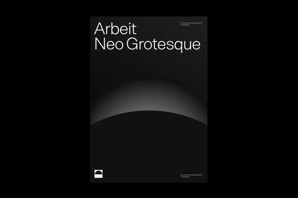
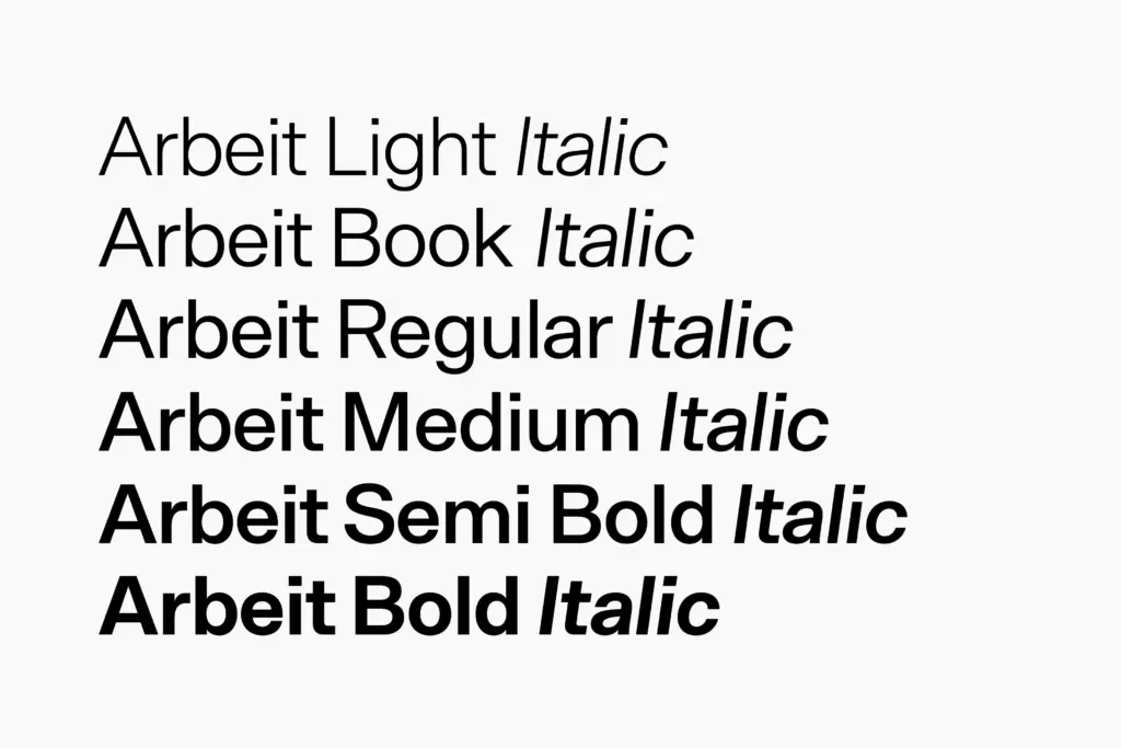
The family spans six weights plus italics, with a variable font included, which is the more interesting part of the package for anyone doing digital work. Being able to dial weight along a single axis rather than swapping static files is useful for responsive interfaces and for animation work where weight needs to shift smoothly rather than jump between fixed steps.
Language coverage runs across Baltic, Basic Latin, Central European, Dutch, Euro, Romanian, Turkish and Western European character sets, so it’s built for real multilingual corporate use rather than just English-language mockups. That’s a meaningful point in its favour if your work touches European markets — a lot of grotesques marketed for branding quietly drop support the moment you need a Turkish dotless i or Romanian comma-below characters.
The weight range itself gives you genuine range: the lighter cuts are fine and a little austere, useful for large-scale display or minimal editorial headers, while the heavier weights hold their own as standalone display faces without turning to sludge. The italics are true cuts rather than mechanically sloped romans, though they don’t diverge much in character from the uprights — which is consistent with the typeface’s overall restraint, even if it means they won’t do much heavy lifting stylistically.
Use cases
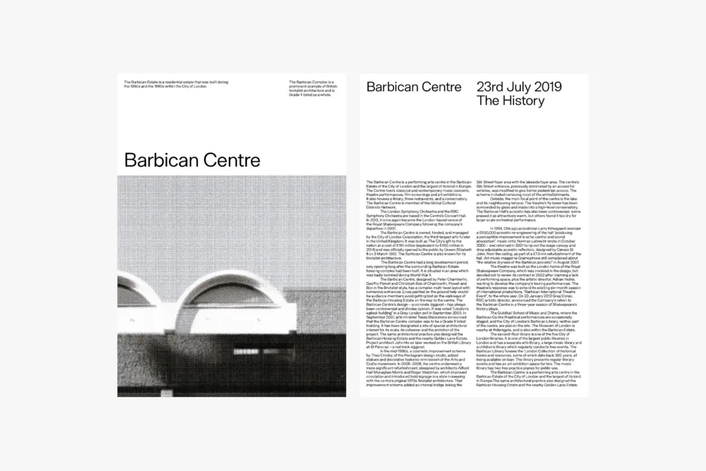
Arbeit is built for corporate identity work, annual reports, interface design and editorial systems where a typeface needs to carry a lot of text without becoming a character in its own right. The variable font makes it a solid pick for product UI and web typography where weight needs to respond to context — dark mode, small screens, dense tables.
It’s less suited to anything that wants personality up front. If you’re building a brand around warmth, quirk or handmade texture, this isn’t the vehicle. It’s also not a typeface that will do much to differentiate a logotype on its own — the neutrality that makes it useful in a system is the same neutrality that makes it forgettable as a standalone mark. Where it earns its keep is in the unglamorous middle of a design system: body copy, labels, dense data, the parts of a project nobody screenshots but everyone reads.
What we liked, and what we didn’t
Strengths
- Six weights plus a variable font give real flexibility for interface and editorial work
- Broad European language support beyond basic Latin
- Open counters keep it legible at smaller text sizes
Trade-offs
- Italics are true cuts but stylistically understated, offering little contrast from the roman
- Too neutral to carry a brand identity on its own without additional design support
Arbeit is a competent, well-built grotesque that does exactly what it says: functional, clean, corporate. It won't surprise you, but the variable font and language coverage make it a practical workhorse for system-heavy projects rather than standalone branding statements.
Verdict

Tantype reviews typefaces in depth — every font is tested in real branding, editorial and screen layouts before a word gets written. 555+ fonts reviewed and counting.