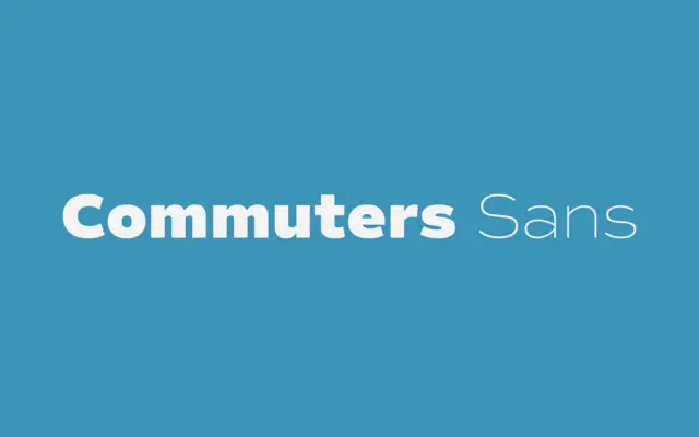
Commuters Sans: a wide, even-tempered grotesque for editorial and branding work
Design style Commuters Sans sits in that familiar territory of contemporary grotesques built for utility rather than personality. The proportions…
Sans serif fonts do the modern heavy lifting: clean lines, screen-friendly clarity and versatility from interfaces to signage. Browse our sans serif reviews — geometric, grotesque and humanist faces — each with a verdict, use cases and a download link.
Design style Commuters Sans sits in that familiar territory of contemporary grotesques built for utility rather than personality. The proportions…
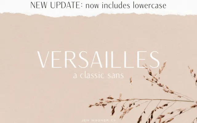
Design style Versailles sits in a small but useful corner of the sans serif world: letterforms with a visible stroke…
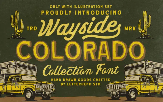
Design style Wayside Colorado is built around a distressed, hand-drawn sans that leans hard into the worn-signage look — the…
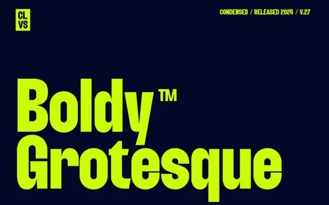
Design style Boldy Grotesque is a condensed display sans that leans hard on the grotesque tradition without pretending to be…
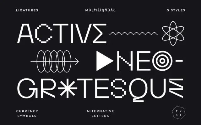
Design style Activica presents itself as a neo-grotesque, and at its core that’s accurate: even stroke weight, restrained curves, a…
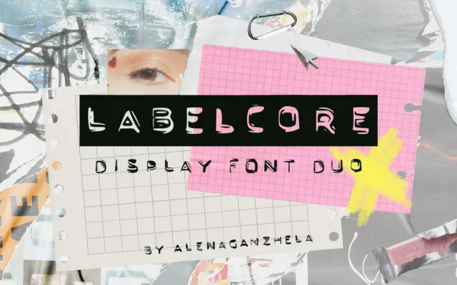
Design style LABELCORE takes its cue from the plastic embossed label makers that lived in every junk drawer in the…
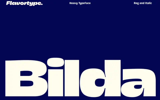
Design style Bilda sits squarely in the current run of heavy geometric sans faces built for headlines rather than paragraphs.…
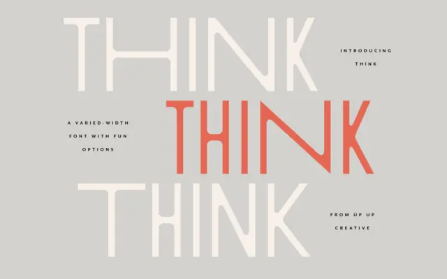
Design style Think Sans starts from a simple premise: a monoweight, all-caps sans serif, then breaks its own rules by…
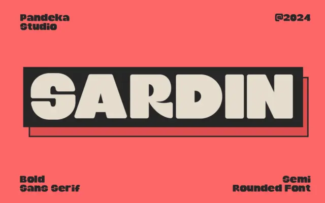
Design style Sardin is a heavyweight rounded sans that leans hard on its 90s cartoon reference. The strokes are thick…