
Volda Sans: a 14-style workhorse sans for branding and editorial systems
Design style
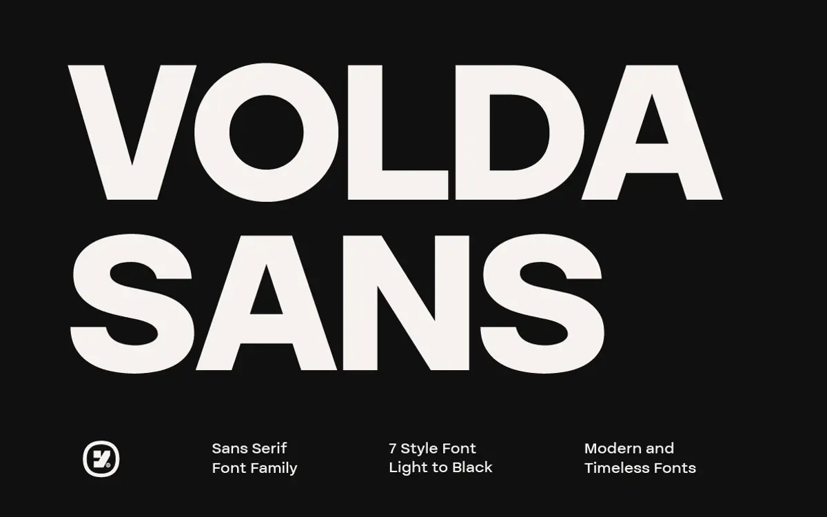
Volda Sans sits in the well-populated middle ground of contemporary grotesques: even stroke modulation, a slightly tightened x-height, and apertures that stay open enough to read clearly at small sizes without looking cut-and-pasted from a template. There’s nothing eccentric here — no ink traps, no quirky terminal flourishes, no single letter that announces the typeface at a glance. That’s a deliberate choice rather than a failure of imagination, and it’s worth being upfront about it: this is a font built to disappear into a layout, not to be the layout.
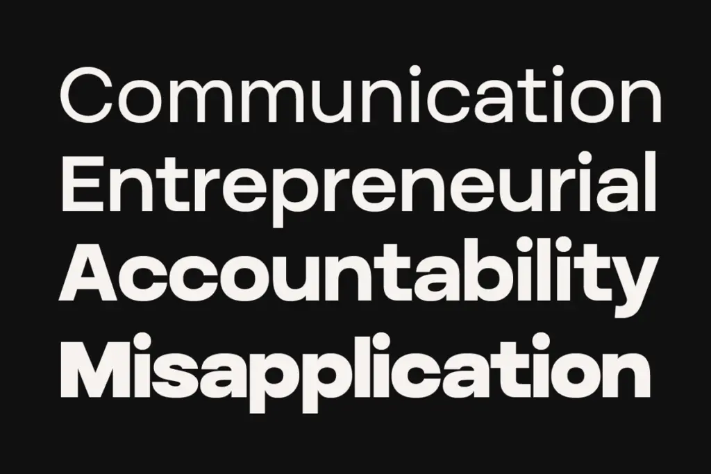
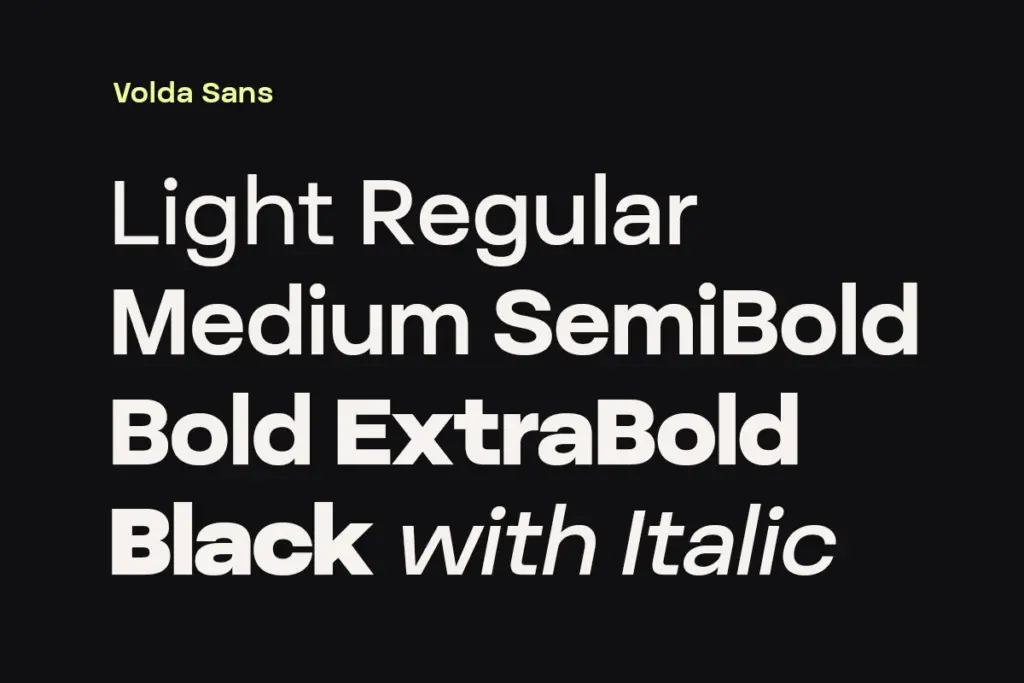
The seven weights move in sensible increments, and the jump from Light to Black is wide enough to give real contrast between a body-copy setting and a headline without the two feeling like different families. The Black weight in particular holds its counters reasonably well rather than collapsing into ink blots, which is where a lot of heavy grotesques fall apart. The italics are a genuine cut rather than a slant — worth checking if that matters to your workflow, since sloped-only italics are common in this category and Volda Sans doesn’t take that shortcut.
Character set and features
With fourteen styles on offer, the practical question is how much daylight there is between adjacent weights. Here it’s handled well: Regular to Medium is a subtle step, useful for the kind of hierarchy you build inside a paragraph rather than between headline and body. The middle weights — Regular, Medium, SemiBold — are where the font earns its keep, since they’re legible enough for long-form text and neutral enough not to fight with a logotype or a photograph sitting next to them.
The lighter weights are less forgiving. Light and Thin need generous point sizes and clean backgrounds; set small or reversed out of a dark colour, the thinner strokes start to break up. That’s a common trade-off with the light-to-black spectrum approach and not specific to Volda Sans, but it means the promise of “maximum flexibility” comes with a caveat — not every weight is suited to every job at every size.
Use cases
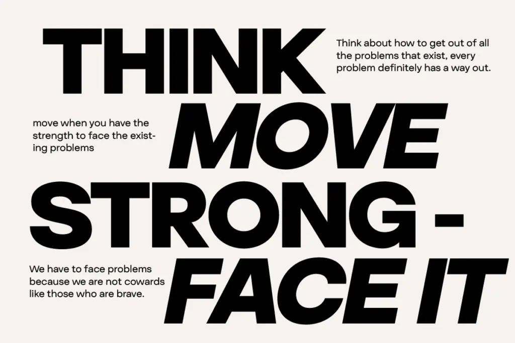
This is a system font more than a personality font, and it’s best used that way. Branding work that needs a dependable sans for a style guide — wordmark set in Black or SemiBold, supporting copy in Regular — is a natural fit. Editorial layouts benefit from having seven weights to build a masthead-to-caption hierarchy without reaching for a second family. Packaging copy, web UI, and presentation decks all sit comfortably within its range, since the letterforms are plain enough not to clash with whatever imagery or colour surrounds them.
Where it won’t help you is anywhere you need a typeface to carry the concept on its own — a boutique identity that needs one distinctive mark, or a headline that has to stop someone scrolling through sheer character. For that, look elsewhere. For the unglamorous, load-bearing work of a design system, Volda Sans does the job without drawing attention to itself, which is exactly the point.
What we liked, and what we didn’t
Strengths
- Seven weights with true italics give real range for building hierarchy without a second typeface
- Middle weights (Regular through SemiBold) hold up well for long-form and small-size text
- Black weight stays legible without ink-blotting, useful for headline impact
Trade-offs
- Light and Thin weights struggle at small sizes or reversed out of dark backgrounds
- Letterforms are neutral enough that it won't carry a brand identity on its own
Volda Sans is a competent, neutral grotesque that earns its keep in branding systems, editorial hierarchies and packaging rather than as a standalone star. The middle weights are the strongest part of the family; the lightest weights need careful handling. It's a dependable workhorse, not a showpiece.
Verdict

Tantype reviews typefaces in depth — every font is tested in real branding, editorial and screen layouts before a word gets written. 555+ fonts reviewed and counting.