
Pogonia: a geometric-humanist sans built for branding and editorial work
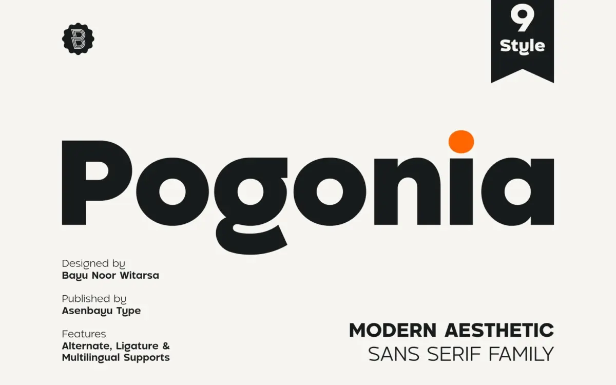
Design style
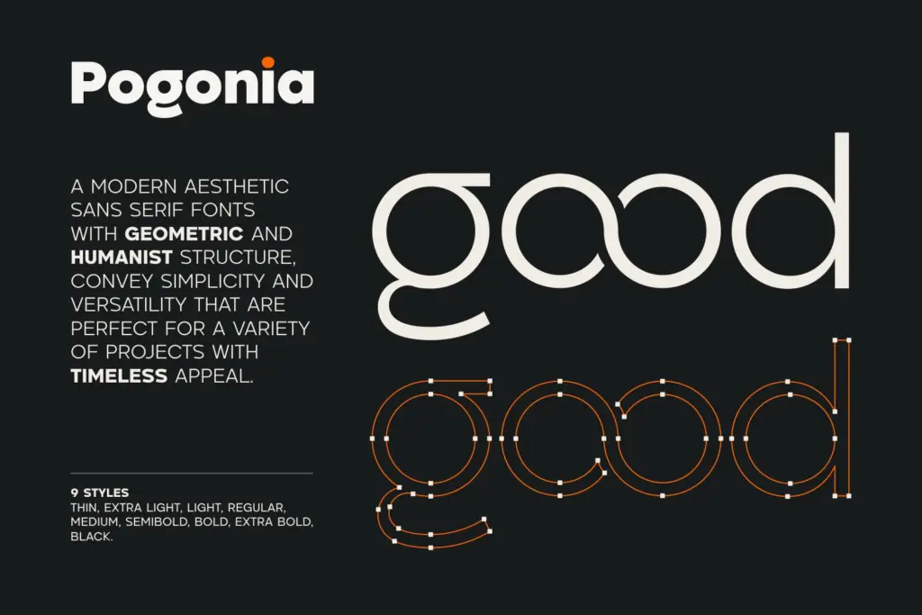
Pogonia sits in the well-populated territory between geometric construction and humanist warmth, a combination that has become the default recipe for contemporary branding sans faces. The circular bowls and near-uniform stroke widths give it a clean, engineered look, while slightly softened terminals and a touch of stroke modulation keep it from reading as cold or mechanical. It doesn’t push hard in either direction, which is both its appeal and its limitation: nothing here surprises you, but nothing fights you either.
The nine-weight range, from Thin through Black, is the real design statement. Rather than relying on a single well-drawn regular, Pogonia asks to be judged as a system. The extremes are where it gets interesting: the Thin weight thins out the geometric bowls to something almost architectural, while the Black weight compresses counters just enough to stay open at small sizes without turning into a slab. The middle weights are competent but unremarkable, doing the quiet job of holding paragraphs together.
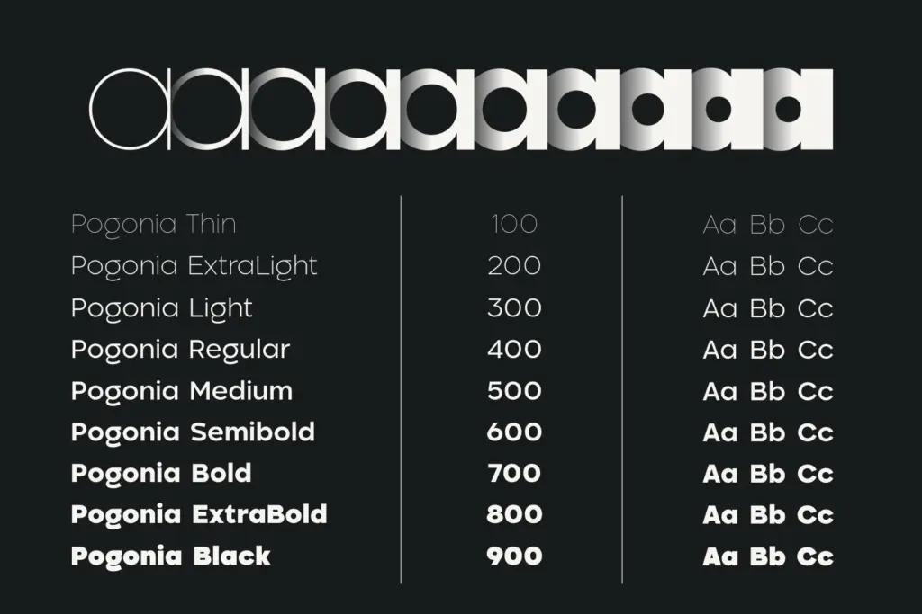
Character set and features
Beyond the standard glyph set, Pogonia includes stylistic alternates and ligatures, which is where a family like this earns its keep. The alternates give designers a way to dial in personality on a lockup or headline without switching to a different face altogether — useful for wordmarks that need one distinctive letter rather than a wholesale style change. The ligatures are subtle rather than decorative, more about fixing awkward junctions than adding flourish.
Symbol and punctuation coverage rounds out the set adequately, and multiple language support is included, though the brief doesn’t specify which scripts or diacritics are covered, so anyone working in a specific non-Latin market should check the character map before committing. There’s no mention of italics, which is worth noting if your project needs that contrast for emphasis or captions — you’ll be relying on weight changes alone.
Use cases
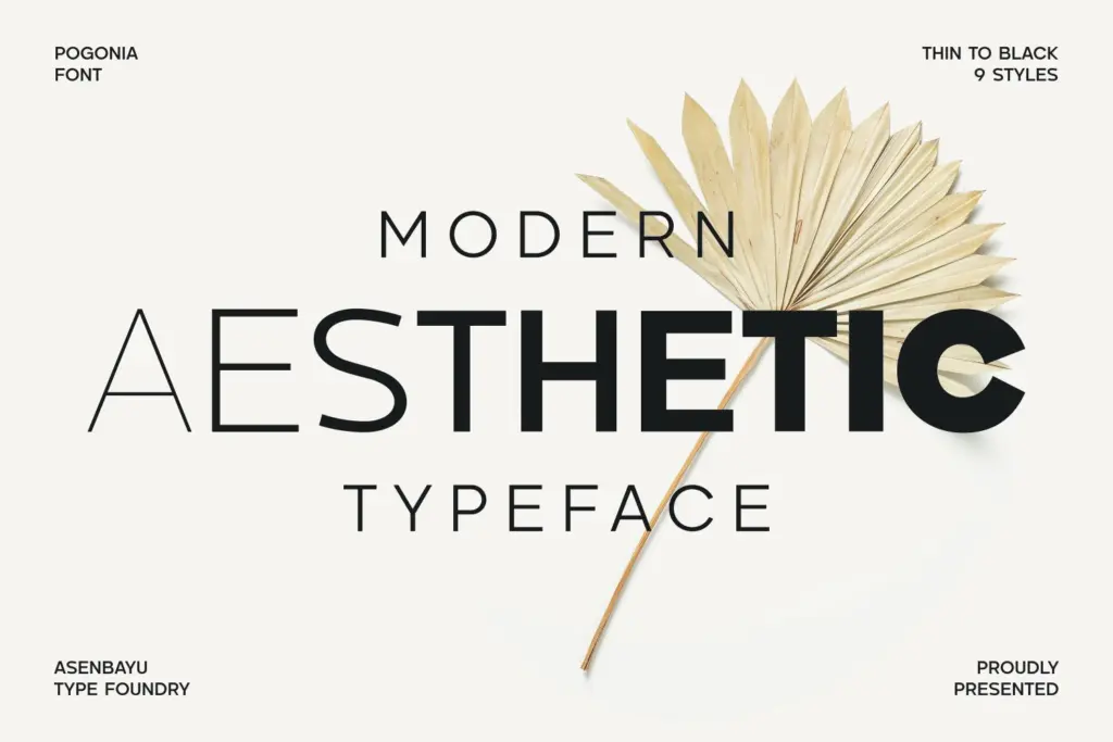
This is a working family for identity and editorial projects that need a broad tonal range without introducing a second typeface. A brand that wants Thin for a masthead, Regular for body copy, and Black for a punchy call-to-action can do all three from one family and keep the geometry consistent throughout — genuinely useful for consistency-conscious style guides.
It reads well on websites and social templates at the lighter-to-medium weights, and the Black end holds up on posters and packaging where you need presence at a glance. It’s less suited to long-form print reading, where a more considered text face would serve better, and the absence of italics limits its use in more literary or editorial contexts that lean on that contrast. Treat it as a solid, flexible utility face for branding work rather than a display font with a strong signature — which, for a lot of commercial jobs, is exactly what’s needed.
What we liked, and what we didn’t
Strengths
- Nine weights from Thin to Black give real tonal range from one family
- Stylistic alternates offer a way to customise wordmarks without switching typefaces
- Extreme weights (Thin and Black) are the most distinctive and useful part of the set
Trade-offs
- Middle weights are serviceable but forgettable, without a distinct personality
- No italic is included, limiting contrast options for editorial or caption use
Pogonia is a competent, flexible geometric-humanist sans that does its job well across a nine-weight range but doesn't offer a strong point of view. It suits branding and editorial work that needs consistency over character, and the alternates give just enough room for personality on a logo lockup.
Verdict

Tantype reviews typefaces in depth — every font is tested in real branding, editorial and screen layouts before a word gets written. 555+ fonts reviewed and counting.