
Barnaby: a quiet text serif built for reading, not shouting
Design style
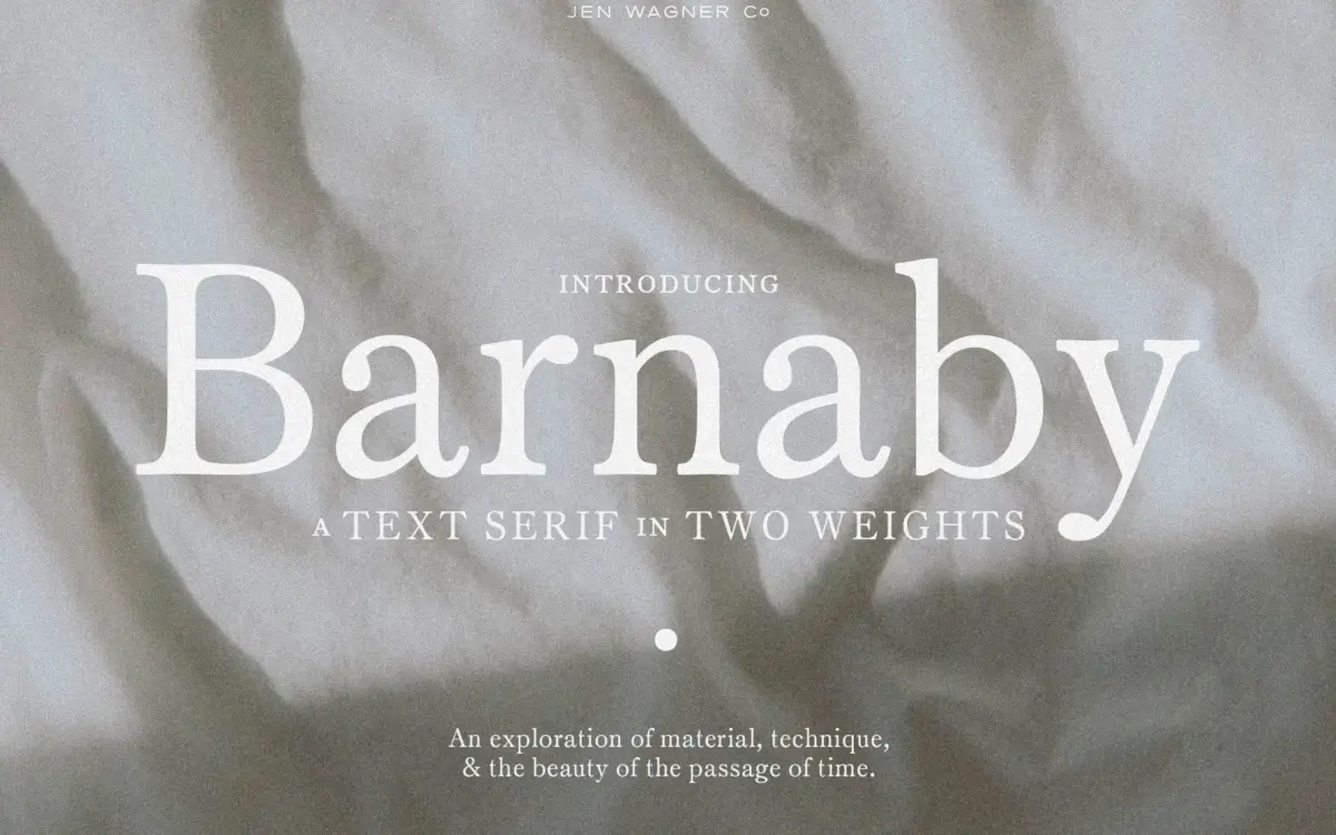
Barnaby sits firmly in the restrained camp of contemporary text serifs. The contrast between thick and thin strokes is present but modest, the serifs are short and bracketed, and there’s no calligraphic flourish anywhere in the design. This is a serif that has been drawn to disappear into a paragraph rather than announce itself. The x-height is generous and the counters stay open, which is exactly what you’d want from something pitched at small-scale reading.
What gives it a bit of character despite the restraint is a slight warmth in the curves — the bowls of the lowercase b, d, p and q aren’t perfectly symmetrical, and there’s a touch of humanist looseness in how the strokes terminate. It reads as classic rather than austere. It won’t be mistaken for a high-contrast display serif, and it isn’t trying to be one.
Character set and features
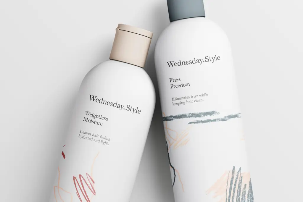
Barnaby ships in two weights, Regular and Semibold, which is the whole toolkit for building hierarchy — body copy in one, emphasis or subheads in the other. That’s a fairly narrow range if you’re used to working with a full family of weights, but it’s enough for the jobs this typeface is aimed at: a paragraph of text, a pull quote, a line of caption copy. The two weights are drawn to sit together comfortably, which matters more than it sounds; a lot of two-weight pairings look like they were interpolated without much care, and this one doesn’t have that problem.
Set in all caps, Barnaby takes on a different personality — tighter, more formal, closer to something you’d put on a plaque than a page. That’s a genuinely useful side effect for a text face, since it means the same family can carry a wordmark or a heading without switching typefaces entirely. Standard punctuation and figures are present and behave as expected; there’s nothing exotic in the set, no swashes or alternates, which is consistent with the minimalist brief but worth knowing going in if you were hoping for extras.
Use cases
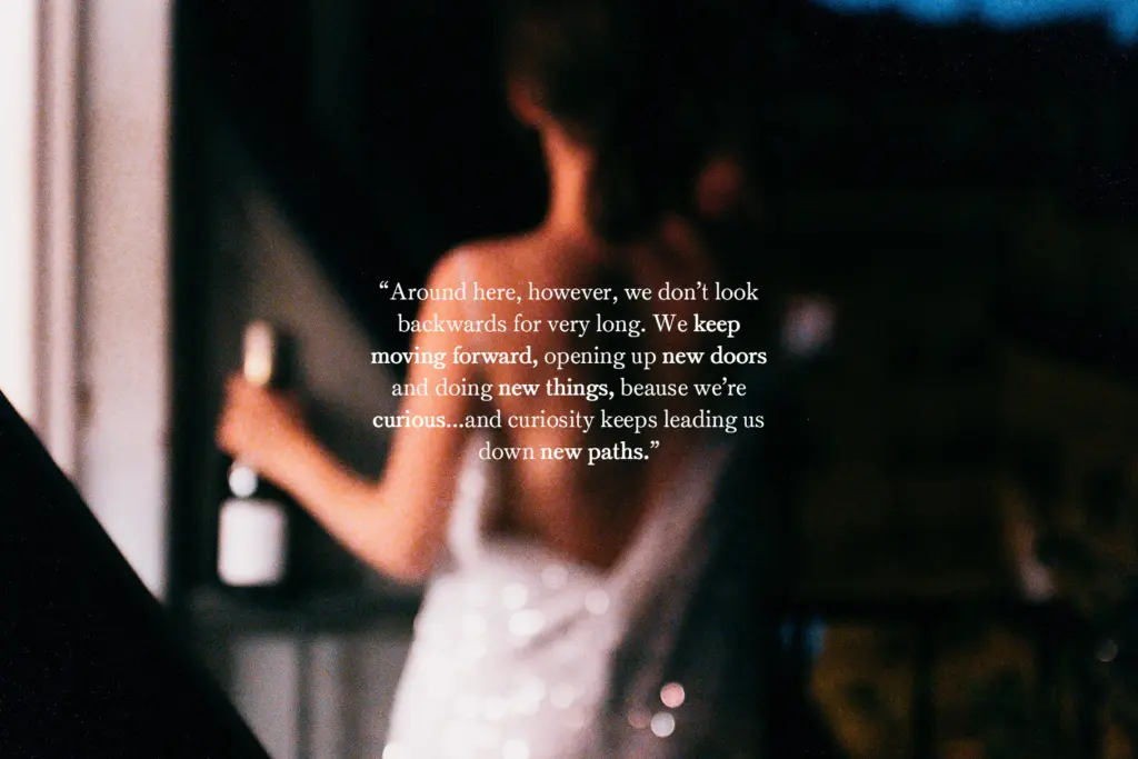
Body text is where Barnaby is built to work, and it holds up there — the open counters and even rhythm keep it legible at small sizes in both print and on screen. Editorial layouts, books, longer web copy: this is the natural territory. The Semibold weight gives just enough lift for subheads and pull quotes without needing to bring in a second family.
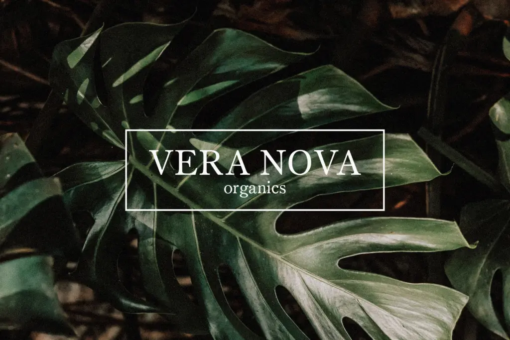
It also does a reasonable job outside that lane. Set large and in caps, it reads as a plain, confident logotype or heading treatment, and the seller’s own comparison — mixing Regular and Semibold within a single lockup — is a sensible way to get some visual interest out of a fairly quiet design. It’s not a typeface built for expressive branding or anything that needs personality up front; if that’s the brief, look elsewhere. But for projects where the type needs to carry information cleanly and stay out of the way, Barnaby does the job without fuss.
What we liked, and what we didn’t
Strengths
- Open counters and generous x-height keep it legible at small sizes
- Regular and Semibold are drawn to sit together without looking mismatched
- Reads convincingly as a simple logotype or heading when set in caps
Trade-offs
- Only two weights limits how much hierarchy you can build within the family alone
- No alternates or swashes, so there's little room to add personality beyond the base design
Barnaby is a competent, quietly warm text serif that does exactly what it sets out to do: read well at small sizes. It won't carry an expressive branding project on its own, and the two-weight range limits how far you can push hierarchy, but as a workhorse for editorial and body copy it holds up.
Verdict

Tantype reviews typefaces in depth — every font is tested in real branding, editorial and screen layouts before a word gets written. 555+ fonts reviewed and counting.