
Gorga Sans: a 162-style variable system for brand and interface work
Design style
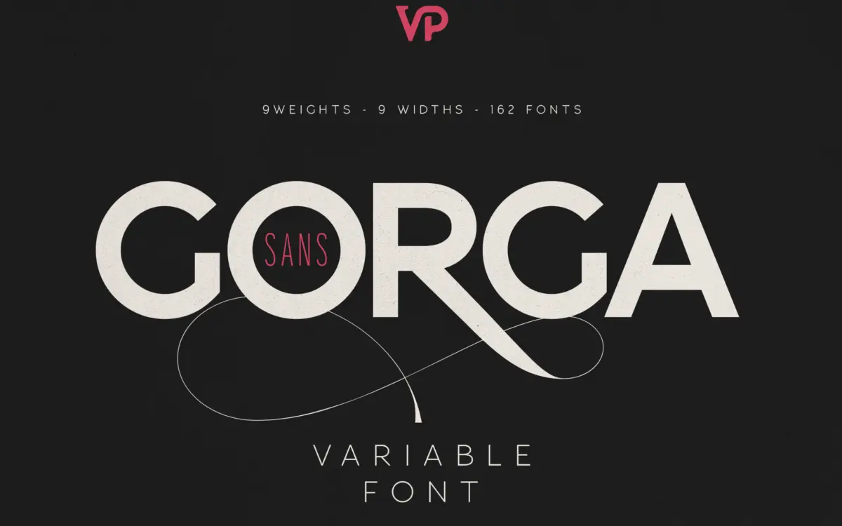
Gorga Sans sits in familiar territory for a large-scale grotesque system: even stroke contrast, closed apertures, a fairly neutral skeleton that doesn’t try to editorialise. What sets it apart is the sheer width the family covers, from Thin Ultra Condensed through Black Ultra Expanded, with matching italics at every stop. Nothing about the individual letterforms is radical — no eccentric terminals, no signature quirks — and that’s the point. This is a workhorse drawn to stay consistent across an enormous range of weight and width combinations, which is a much harder design problem than inventing a single distinctive voice.
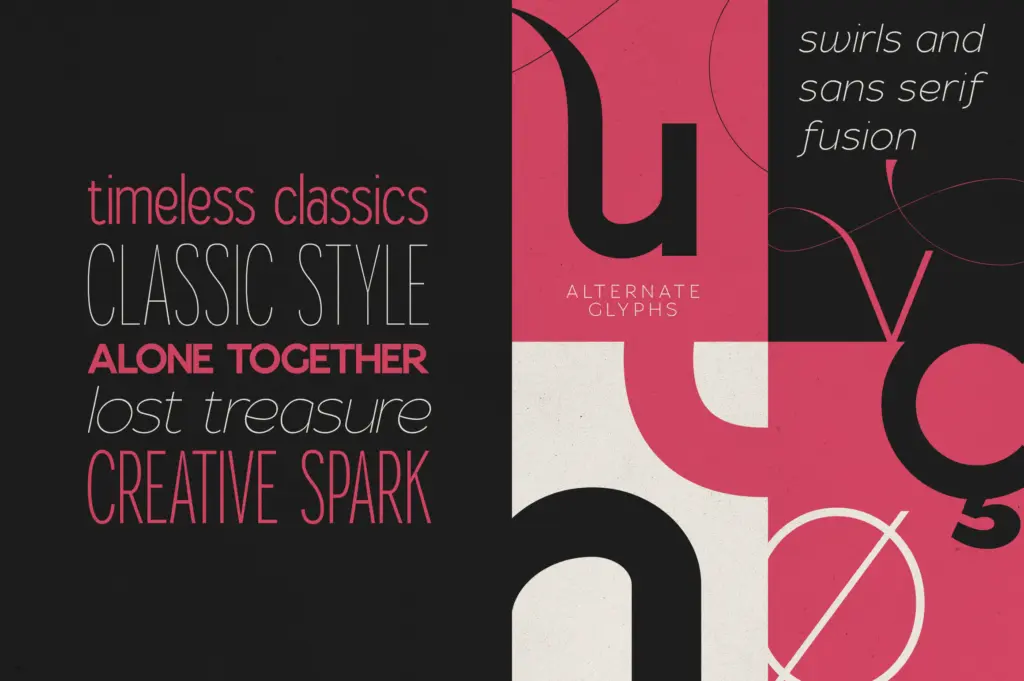
The italics are true companions rather than obliques, which shows discipline given how many instances had to be drawn or interpolated. Where the family shows its character, modestly, is in the swash alternates offered as extras — a bit of flourish bolted onto an otherwise buttoned-down structure, there for headline moments rather than body text.
Character set and features
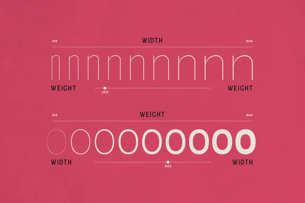
The headline spec is the two variable fonts, Regular and Italic, each running on Weight and Width axes so you can dial in any point on the grid rather than picking from the 162 static instances. That’s genuinely useful in a production environment — one file replacing dozens, with type tightening or loosening to fit a column or a button without redrawing anything. The static cut of 162 fonts is there for workflows that don’t yet trust variable fonts in production, or for print work where a fixed instance is safer.
Language support spans a long list of Latin-based languages, which matters more than it sounds for any brand system meant to travel. Kerning is even across the weights I’d expect to be tested hardest — the condensed extremes and the black expanded — though at the very heaviest, widest settings some counters start to close up, which is normal for a grotesque pushed that far and worth checking at your actual point size before committing. The swash alternates are a nice extra but limited in scope; don’t expect a script-level flourish set, it’s a handful of tasteful extensions on the sans skeleton.
Use cases
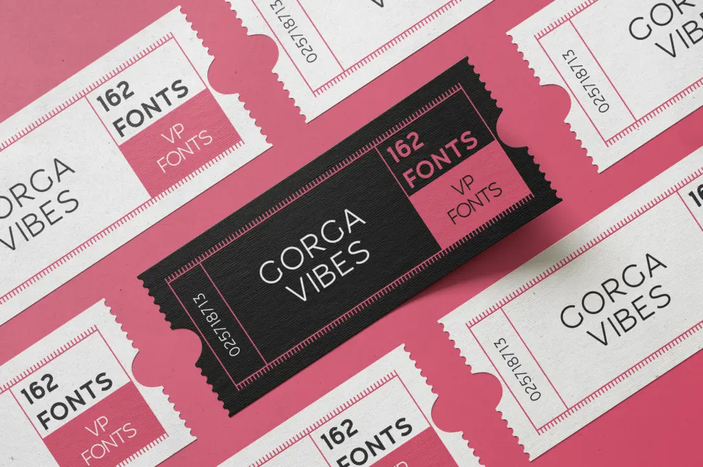
This is a system font more than a personality font, and it earns its keep in situations where consistency across contexts matters more than a single memorable shape. Brand identity work benefits most: a wordmark set in the Black Expanded instance, body copy and UI text pulled from the Regular variable axis, captions in a condensed cut — all visibly related without extra type decisions. Editorial layouts get a similar payoff, with headline, deck, and caption hierarchy handled inside one family rather than pairing multiple typefaces.
For interface design, the variable font is the real draw: responsive type that can shift weight or width by breakpoint without swapping files. Packaging and signage can lean on the extended widths for tight or generous spaces. What it won’t do is give a brand a strong, quotable voice on its own — for that, you’re relying on the swashes or on how you apply the width axis, not on the base letterforms themselves.
What we liked, and what we didn’t
Strengths
- Two variable fonts cover the full weight and width range without needing 162 separate files loaded
- Matching italics across the whole system rather than mechanical slants
- Broad language support makes it usable across most Latin-script brand rollouts
Trade-offs
- The base letterforms are neutral to the point of being forgettable next to more characterful grotesques
- Extreme black-expanded instances show tightening counters that need checking at your working size
Gorga Sans is less a typeface with a voice than a type system built to solve production problems — matching weights and widths across branding, editorial, and UI work through two variable fonts. It won't give a brand a distinctive personality on its own, but as infrastructure it's thorough and well engineered.
Verdict

Tantype reviews typefaces in depth — every font is tested in real branding, editorial and screen layouts before a word gets written. 555+ fonts reviewed and counting.