
Proxima Nova Font Free Download
There is no official Proxima Nova font free download. Proxima Nova is a commercial typeface by Mark Simonson, sold by Mark Simonson Studio (now owned by The Type Founders) and through resellers such as MyFonts, and there is no free, demo or personal-use version to download. As of October 2026 a single style costs $39.99 on Simonson’s own site, or $29 for a three-font pack on MyFonts. If you already pay for Creative Cloud, all 80 fonts are included in Adobe Fonts at no extra cost. Sites offering free Proxima Nova files are sharing unlicensed copies.
Proxima Nova font free download: is there a legal free version?
No. The Proxima Nova page on Mark Simonson Studio’s site sells licences and offers PDF specimens and a browser “Mini-Site” where you can type with the font. It doesn’t offer a free download. The studio’s licensing FAQ says you can “contact us to arrange a trial license” if you need to test fonts “for internal mockups or client pitches”. That is a request to the foundry, not a public download.
The one legal way to use Proxima Nova without buying a licence is Adobe Fonts. Every style is marked as part of the full library rather than the free tier, so you need a paid plan such as Creative Cloud. Simonson’s FAQ confirms that “all fonts on Adobe Fonts are licensed for personal and commercial use with a Creative Cloud account”.
Get Proxima Nova (MyFonts) Commercial font, packs from $29 as of October 2026
Proxima Nova at a glance
- Designer: Mark Simonson
- Foundry: Mark Simonson Studio, owned and operated by The Type Founders
- History: released as Proxima Sans in 1994 (six fonts), relaunched as Proxima Nova in 2005 (42 fonts)
- Style: sans serif that mixes geometric shapes with grotesque proportions
- Family today: 80 fonts in five widths, plus Proxima Soft, Proxima Vara (variable) and Proxima Sera (serif)
- Price: $39.99 per style, $359.99 per 16-style width, $975.99 for all 80 at Mark Simonson Studio (October 2026)
- Free alternatives: Montserrat, Figtree, Nunito Sans
Design and character: Futura meets Akzidenz-Grotesk
Simonson’s own one-line summary is that Proxima Nova “blends the geometric style of Futura with the versatility of Akzidenz Grotesk”. The 12-page overview PDF on his site tells the longer story. He sketched the idea in 1981 under the name Zanzibar, and in 1991, while art director of Business Ethics magazine, he wanted something “a bit plainer and more modern” than Gill Sans “that still had a geometric feel”.
The working name was Visigothic. He took “the general proportions and stroke contrast of Helvetica or Akzidenz Grotesk”, borrowed construction from Futura, Kabel, the American gothics and US highway signs, and ended up with “a hybrid; a face combining modern, even-width proportions with a somewhat geometric appearance”. FontHaus released it as Proxima Sans in 1994. After Rolling Stone picked it for a 2003 redesign, Simonson rebuilt it as Proxima Nova, which he announced on June 30, 2005.
In Simonson’s specimen, the O and C are round and full, and the lowercase a has two storeys while the g has one. The italics are drawn as true italics rather than slanted uprights.
What’s in the Proxima Nova family
Mark Simonson Studio sells 80 fonts: eight weights (Thin, Light, Regular, Medium, Semibold, Bold, Extrabold and Black), each with an italic, in five widths. Condensed and Extra Condensed have been there since 2005. Medium arrived with version 2.008 in 2015, and Wide and Extra Wide came with Proxima Nova 4.0 in 2023.
Proxima Nova Bold and the other weights
Regular is the text weight, and Proxima Nova Bold is the usual pick for headings and buttons. Extrabold and Black go heavier for posters and logos, and Thin and Light suit large, airy display lines.
Proxima Soft, Proxima Vara and Proxima Sera
- Proxima Soft (2017): a rounded version with 48 styles (eight weights, three widths, italics).
- Proxima Vara (2021): the variable version, with weight, width and slant in one file, $199.99.
- Proxima Sera (2022): a serif built to pair with Proxima Nova, 18 styles.
Language support and OpenType features
The main family covers Latin-based languages including Vietnamese, plus Greek and Cyrillic. Separate families add Arabic, Thai, Devanagari, Hangeul, Hebrew and Tamil. Adobe Fonts says the character set has grown from about 700 characters in 2005 to 1,453.
The foundry lists these OpenType features:
- Small caps: true capital-shaped letters at lowercase height, for acronyms and labels.
- Figures: lining and old-style numbers, each in proportional and tabular (equal-width, so columns line up) versions.
- Alternates: a single-storey a, a tailed l, a different y and G, a slashed zero and a seriffed 1.
- Extras: case-sensitive punctuation for all-caps text, a full set of f-ligatures, automatic fractions and ordinals (1st, 2nd).
InDesign, Illustrator, Affinity and Figma reach these through their OpenType menus. Canva, Cricut Design Space and most video editors can’t. The older “Std” packs on MyFonts include two supplemental fonts per style, labelled A (Alt) and S (ScOsf), which put the alternates or small caps on normal keys for apps like these.
Where Proxima Nova has been used
Simonson says that since 2010 Proxima Nova has been the most widely used commercial font family on the web. Fonts In Use has more than 120 examples, including:
- TVGuide.com: the logo and the whole website have used Proxima Nova since 2019.
- Tinder: in Wieden+Kennedy’s 2018 “Single, Not Sorry” campaign, the Tinder logo and hashtag use Proxima Nova.
- We Love NYC (2023): the campaign’s website and text are set in Proxima Nova.
- Dimension 20: the Dropout show’s logo uses Proxima Nova.
Proxima Nova font pairings and best uses
Proxima Nova suits websites, apps, brand identities, packaging and signage. Condensed and Extra Condensed fit long headlines into narrow spaces, and Wide gives logos and short titles more presence.
- Foundry pairing: Simonson designed Proxima Sera as its serif partner, with matching proportions and weights.
- Free serif partners: Merriweather for long reading, or Lora for a softer editorial feel.
- Weights: Regular with Semibold or Bold covers most layouts; save Black for short display lines.
Proxima Nova font download prices and licences
Prices in US dollars, checked October 2026:
- Mark Simonson Studio: $39.99 per style, $359.99 for a 16-style width family, $975.99 for the 80-style superfamily. The final price depends on the licence and number of users you select. Desktop licences are priced by users, web licences by monthly page views (yearly), app licences by app titles (yearly).
- MyFonts: “Licenses from $29.00”. It sells the older 48-style edition (three widths) one weight at a time, each $29 pack holding the standard font plus its A and S supplements. Wide and Extra Wide aren’t listed, and there is no family bundle.
Simonson’s FAQ says all its licences allow commercial use; there is no personal-only tier. A desktop licence covers logos, images, print and packaging made on your licensed computers. It doesn’t cover uploading the font files to Canva, Figma, a shared drive or a brand portal. Through Adobe Fonts, you can use Proxima Nova on your own website, but not on clients’ websites. Students and non-profits can ask the studio for a discount. This is general information, not legal advice.
Buy Proxima Nova from Mark Simonson Studio From $39.99 per style as of October 2026
How to download Proxima Nova legally and install it
- Adobe Fonts: with a paid Creative Cloud plan, open the Proxima Nova page and activate the styles you need. The Creative Cloud desktop app makes them available in your design apps.
- Buying: choose styles and a licence on Mark Simonson Studio or MyFonts, and download the files after checkout. Simonson supplies desktop fonts as OpenType (.otf) and TrueType (.ttf).
- Windows: unzip, select the files, right-click and choose Install.
- Mac: double-click each file and click Install Font in Font Book.
- Restart any open apps.
To try it first, use the Mini-Site on Simonson’s Proxima Nova page or ask the studio for a trial licence.
Free fonts similar to Proxima Nova
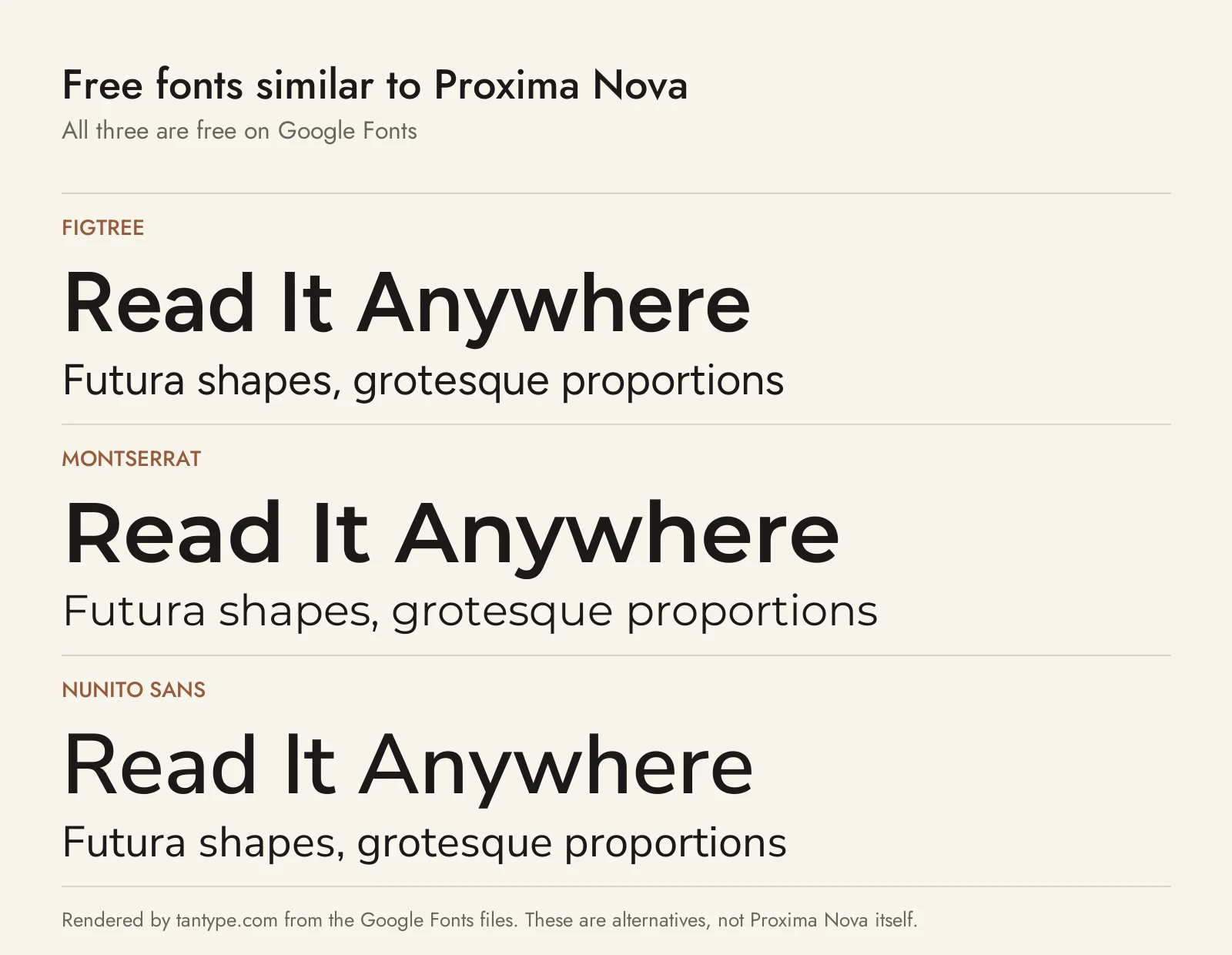
Proxima Nova isn’t on Google Fonts, but these three come close, and all are free for commercial use under the SIL Open Font License.
- Figtree: Erik Kennedy’s geometric sans for web and apps, the closest match in proportions and spacing. It has the same two-storey a and single-storey g. It runs from Light to Black with italics but covers Latin only.
- Montserrat: the most common free substitute, by Julieta Ulanovsky and team, with Thin to Black, italics, Cyrillic and Vietnamese. It is noticeably wider and rounder than Proxima Nova, so it looks bigger at the same size.
- Nunito Sans: the square-ended sister of Nunito. It is a little softer and more humanist, but its variable width axis lets you narrow it toward Proxima Nova Condensed. It covers Cyrillic and Vietnamese.
Among paid fonts we cover, Futura is one of the two models Simonson blended, Gotham is the Hoefler&Co. geometric sans it is often compared with, and Gilroy is a geometric sans with two officially free weights.
Proxima Nova font FAQ
Is Proxima Nova free?
No. It’s a commercial font with no free or personal-use version. It’s included with paid Creative Cloud plans through Adobe Fonts; otherwise single styles start at $29 to $39.99.
Is Proxima Nova a Google Font?
No. Google Fonts doesn’t have it. Figtree is the closest free match, and Montserrat is the most popular substitute.
Who designed Proxima Nova?
Mark Simonson. He released it as Proxima Sans in 1994 and as Proxima Nova in 2005.
Can I use Proxima Nova in Canva?
We couldn’t confirm it in Canva’s built-in library. Simonson’s standard desktop licence doesn’t cover uploading the font files to Canva, so export your text as images or outlined vectors instead, or ask the studio for a licence that covers it.
Is Proxima Nova on Adobe Fonts?
Yes. All five widths (80 fonts) and Proxima Soft are there, in the full library that comes with paid plans. Proxima Vara isn’t.
What’s the difference between Proxima Nova and Proxima Soft?
Proxima Soft is the rounded version, with softened ends and 48 styles in three widths, and is sold separately.
