
Frutiger Font Free Download
There is no official Frutiger font free download. Frutiger is a commercial typeface by Adrian Frutiger, published by Linotype (now part of Monotype), and neither MyFonts nor Linotype offers a free, demo or personal-use version. As of October 2026 single styles start at $42.99 on MyFonts and the 19-style family costs $429.90. Sites handing out free Frutiger files are sharing unlicensed copies.
Frutiger font free download: is there a legal free version?
No. The legal source is MyFonts’ Frutiger page, where Linotype sells the original family as Frutiger Pro. Its two updates are sold the same way: Frutiger Next starts at $53.99 per style and Neue Frutiger at $71.99. None of the three pages offers a trial, and prices rise with the licence type and number of users.
The one route at no extra cost is Adobe Fonts, which has Neue Frutiger World, a 20-font, multi-script relative of Neue Frutiger. It is listed in the full library, not the free tier, so it needs a paid Creative Cloud plan. We found no Adobe Fonts listing for the classic Frutiger family.
Get Frutiger (MyFonts) Commercial font, from $42.99 per style as of October 2026
Frutiger font at a glance
- Designer: Adrian Frutiger (1928–2015), per Swissinfo
- Foundry: D. Stempel AG with Linotype; Linotype is now owned by Monotype
- Retail release: 1976 or 1977, depending on the source
- Style: humanist sans serif
- Versions: Frutiger (19 styles), Frutiger Next (21), Neue Frutiger (40), plus Frutiger Serif and Frutiger Arabic
- Price: from $42.99 per style, $429.90 for the family (MyFonts, October 2026)
- Free alternatives: Hind, Mukta, Open Sans
The Frutiger typeface: from airport signs to print
According to MyFonts, Adrian Frutiger was commissioned in 1968 to design the sign system for the new Charles de Gaulle Airport. Instead of reusing his Univers, he drew a new sans that people could read quickly from the distances and angles of driving and walking. The Wikipedia article on Frutiger, citing Frutiger’s book Typefaces: The Complete Works, calls the airport version Roissy, completed in 1972.
Sources disagree on the print release. MyFonts’ Frutiger page and Wikipedia say he completed the family for D. Stempel AG with Linotype in 1976. MyFonts’ Neue Frutiger page says it “came out as part of the Linotype library in 1977”.
MyFonts calls the design “neither strictly geometric nor humanistic”, drawn so each character is “quickly and easily recognized”. Wikipedia classes it as a humanist sans with wide apertures, a high x-height, a two-storey a and a single-storey g. On MyFonts’ airport-sign specimen you can see that open g and the slanted cut at the top of the t.
The NHS digital service manual calls Frutiger “the brand font for the NHS”, with Arial as the fallback. Swiss road signs use ASTRA-Frutiger, which Swissinfo says replaced the old SNV lettering in 2003 and is based on Frutiger 57 Condensed.
Which Frutiger to buy: Frutiger, Frutiger Next or Neue Frutiger
- Frutiger (Frutiger Pro): the original drawings. 19 styles from 45 Light to 95 Ultra Black, with condensed widths and obliques. From $42.99 per style, $429.90 for all 19.
- Frutiger Next: a redesign with Linotype Design Studio that adds true italics; MyFonts says the old italics “were based very closely on the roman forms”. 21 styles, from $53.99 per style, $548.99 for the family. Wikipedia dates it to 2000; MyFonts’ Neue Frutiger page says 1999.
- Neue Frutiger: the 2009 revision by Akira Kobayashi “in close collaboration with Adrian Frutiger”, which “returns to the original 1977 design”. Ten weights from Ultra Light to Extra Black, each with an italic, in normal and condensed widths. From $71.99 per style; the 20-font Basic and Condensed packs cost $344.99 each, and all 40 cost $548.99.
For most new projects, Neue Frutiger is the best buy: the widest weight range, the classic shapes, and a variable version on MyFonts with weight and width axes. Buy the original only to match older artwork set in, say, Frutiger 55 Roman. If you mainly need narrow text for tables, timetables or signs, see our guide to Neue Frutiger Condensed, which covers the condensed pack in detail.
The numbers in the original family’s names are a code. The first digit is the weight (4 Light, 5 Roman, 6 Bold, 7 Black, 8 Extra Black, 9 Ultra Black). The second is width and slant: 5 normal, 6 italic, 7 condensed, 8 condensed italic. So 57 is Condensed and 66 is Bold Italic.
Is there a Frutiger Aero font?
No. Frutiger Aero is a design style, not a typeface, and no foundry sells a font by that name. Wikipedia says Sofi Xian (formerly Sofi Lee) of the Consumer Aesthetics Research Institute named it in 2018 for the glossy, nature-themed tech look of roughly 2004 to 2013: blue skies, aurora wallpapers and glassy buttons. Dazed explains the name joins the Frutiger typeface and Windows Aero, the design language of Windows Vista.
The type on those screens was mostly not Frutiger. Windows Vista introduced Segoe UI as its interface font, and the Consumer Aesthetics Research Institute says Frutiger “originally inspired Vista’s default font (Segoe UI)”. Microsoft says Segoe “was not derived from Frutiger”, though Linotype got its EU design registration revoked over the resemblance, according to Wikipedia’s Segoe article. Emirhan Avcı, a researcher quoted on Wikipedia, notes that the Frutiger family “was never used in a major user interface associated with the style”.
Segoe UI is already installed on Windows PCs under Microsoft’s licence. For a free font you can use anywhere, Open Sans is a good stand-in: its designer, Steve Matteson, also drew Segoe.
Language support and OpenType features
MyFonts’ tech specs for Frutiger Pro 55 Roman list 394 glyphs and 121 languages, all in Latin script: Western, Central and Eastern European, Baltic and Turkish. There is no Greek or Cyrillic. Neue Frutiger is sold in separate Cyrillic and Paneuropean versions, and Neue Frutiger World covers more than 150 languages and scripts, Arabic, Hebrew and Thai among them.
The features listed for Frutiger Pro 55 Roman, in plain words:
- Kerning and ligatures: spacing fixes and joined letter pairs, applied automatically in most apps
- Case-sensitive forms: brackets and dashes move up to sit better with capitals
- Fractions, superscripts and ordinals: proper ½, footnote numbers and 1st, 2nd
- Ornaments: a few decorative symbols, reached through a glyphs panel
The original has no small caps or oldstyle figures. Frutiger Next adds both, and Neue Frutiger adds a stylistic set and alternate letters. These need an OpenType-aware app such as InDesign, Illustrator or Affinity; Canva and Cricut Design Space can’t reach the alternates.
Frutiger font pairings and best uses
Frutiger was built for wayfinding and still does that job best: signs, maps, timetables, forms, labels, medicine packaging and reports.
- With a serif: Frutiger Serif, a 2008 family by Frutiger and Kobayashi, is the natural partner. Free options include Source Serif 4 and Merriweather.
- Within the family: 65 Bold for headings, 55 Roman for text and the condensed styles for tables.
Frutiger licensing: personal and commercial use
There is no free personal-use licence, so any use needs a paid one. On MyFonts the Desktop licence “enables personal and commercial traditional graphic designer work” and is priced by number of users. It covers logos, brand identity, signage, packaging, posters, social posts and video titles. It excludes websites, emails, apps, eBooks, digital ads, sharing the files and AI training, which need Webfont, App, Electronic Doc or Digital Ad licences. Frutiger, Frutiger Next and Neue Frutiger are separate purchases.
The NHS licence doesn’t extend to anyone else: the service manual says NHS England licenses three weights for NHS organisations in England. This is general information, not legal advice; read the EULA before you buy.
How to download and install Frutiger legally
- On MyFonts, pick the family, then single styles or a pack, the licence type and the number of users.
- After checkout, download the ZIP from your MyFonts account and unzip it.
- Windows: select the .otf files, right-click and choose Install.
- Mac: double-click each file and click Install Font in Font Book.
Free fonts similar to Frutiger
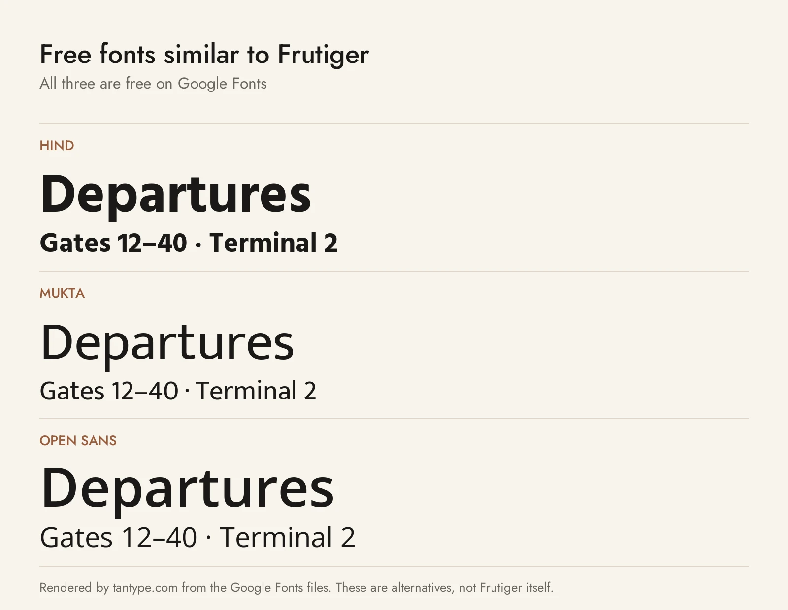
These Google Fonts share Frutiger’s humanist skeleton, open shapes and single-storey g. All three use the SIL Open Font License, which allows commercial use.
- Hind: the closest match. A humanist sans by Indian Type Foundry, made for interfaces, with open apertures and near-monolinear strokes. Its stroke endings are flat horizontal or vertical cuts, and it has five weights but no italics.
- Mukta: a humanist, monolinear family from Ek Type with seven weights. Next to Hind it has a smaller x-height and a lighter feel, and it has no italics.
- Open Sans: by Steve Matteson, wider and rounder than Hind or Mukta, with italics, a width axis and Greek, Cyrillic and Hebrew. It is the best free pick for a Frutiger Aero look.
Among paid humanist faces we cover, Whitney is a compact sans often placed between News Gothic and Frutiger, and Optima is Hermann Zapf’s flared, more elegant take on the humanist sans.
Signage fonts don’t have to be neutral: compare Frutiger with Gravesend Sans, which revives the hand-made lettering on Southern Railway station signs.
For the 19th-century grotesque behind Helvetica, Univers and the Swiss Style, see our guide to Akzidenz-Grotesk.
Frutiger font FAQ
Is Frutiger font free?
No. It is a commercial Linotype font with no free or trial version, from $42.99 per style on MyFonts as of October 2026.
Is Frutiger Aero a font?
No. It is a 2000s design style named after the Frutiger typeface and Windows Aero. Vista’s interface used Segoe UI, a Frutiger-inspired font.
What font does the NHS use?
Frutiger, with Arial as the fallback, according to the NHS digital service manual.
What is the difference between Frutiger and Neue Frutiger?
Neue Frutiger is the 2009 revision by Akira Kobayashi with Adrian Frutiger. It keeps the original shapes but offers 40 fonts against the original’s 19.
Is Frutiger on Adobe Fonts?
Not the original. Adobe Fonts has Neue Frutiger World, included with paid Creative Cloud plans.
What is the closest free font to Frutiger?
Hind, on Google Fonts. Mukta is a close second, and Open Sans suits jobs that need italics, Greek or Cyrillic.
