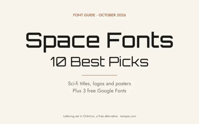
Space Fonts: 10 Best Space, Sci-Fi and Futuristic Fonts for Titles and Logos
Space fonts are display typefaces that make a design look like it belongs on a spaceship, a mission patch or…
 Varun
Varun

Space fonts are display typefaces that make a design look like it belongs on a spaceship, a mission patch or…
Varun
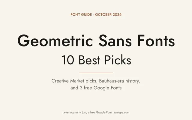
Geometric sans serif fonts build their letters from circles, straight lines and triangles. The o is close to a true…
Varun
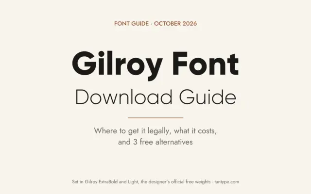
Yes, there is an official Gilroy font free download, but it covers only two of the family’s 20 styles. The…
Varun
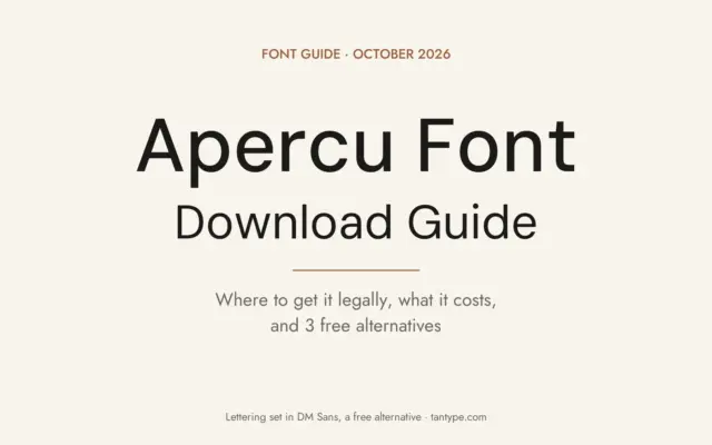
There is no official Apercu font free download. Apercu is a commercial typeface from Colophon Foundry, the London studio of…
Varun
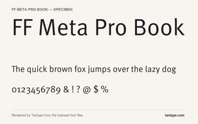
An FF Meta Pro Book free download does not exist officially: FF Meta is a commercial typeface by Erik Spiekermann,…
Tantype
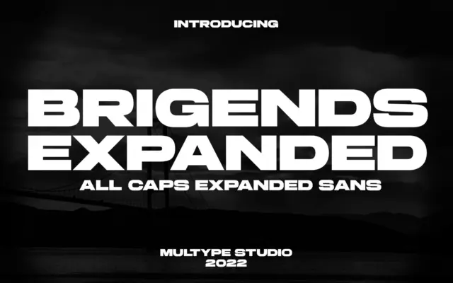
Is Brigends Expanded free to download? Brigends Expanded is a commercial font sold on Creative Market, so the full version…
Tantype
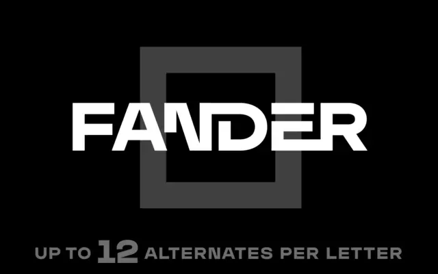
Is Fander Font free to download? Fander Font is a commercial font sold on Creative Market, so the full version…
Tantype
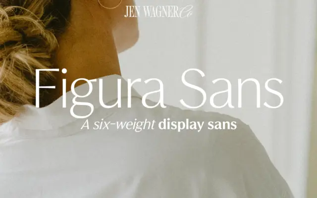
Is Figura Sans free to download? Figura Sans is a commercial font sold on Creative Market, so the full version…
Tantype
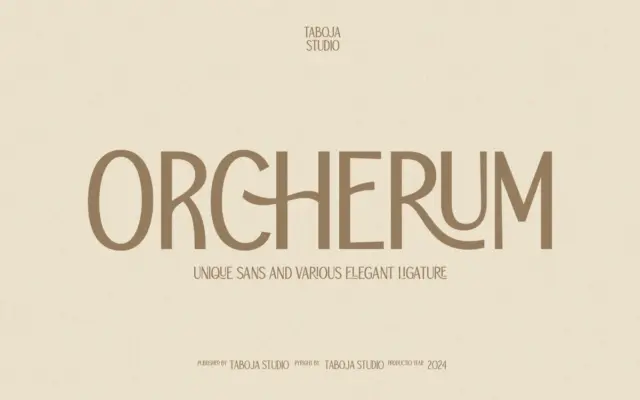
Is TBJ Orcherum free to download? TBJ Orcherum is a commercial font sold on Creative Market, so the full version…
Tantype