
Hello Branch: an 8-weight serif family for editorial and branding work
Design style
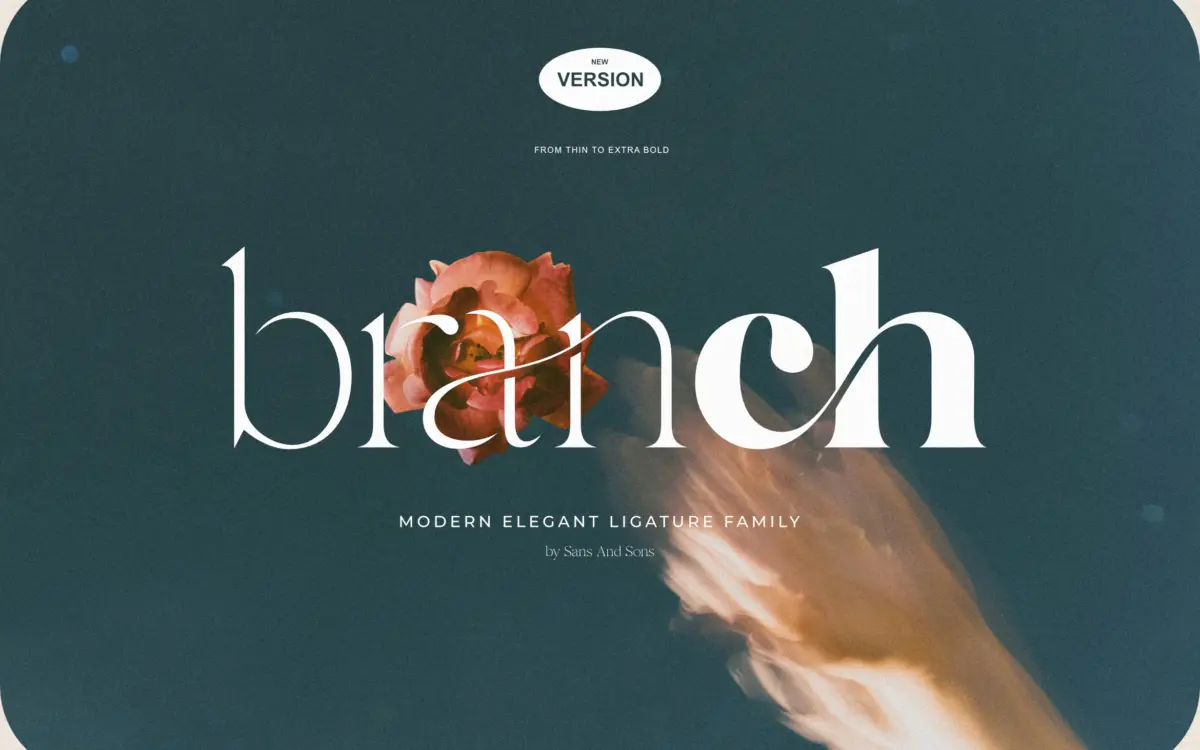
Hello Branch is a serif built on smooth, moderate contrast rather than the high-contrast snap you’d get from a display didone. The shapes are graceful without tipping into fragility, which is what lets the family run all the way from Thin to Extra Bold without any weight looking like an afterthought. At the lighter end, strokes thin out gently rather than vanishing to hairlines, so Thin and Extra Light stay readable instead of becoming decorative gestures. At the heavy end, Bold and Extra Bold thicken evenly without ballooning the counters shut.
The overall temperament sits closer to “quietly polished” than “statement serif.” Terminals are rounded but restrained, curves are unhurried, and there’s none of the wonky, hand-cut quirk that some vintage-leaning serifs lean on for personality. That’s a deliberate trade: Hello Branch reads as tasteful and safe rather than distinctive. If you’re after a serif with an obvious signature detail — a flared serif, an odd bowl, an eccentric italic — this isn’t it. If you want something that behaves itself across eight weights, it delivers.
Character set and features
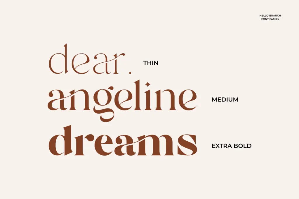
The eight weights are the headline feature, and they’re genuinely useful rather than padding: Thin, Extra Light, Light, Regular, Medium, Semi Bold, Bold, and Extra Bold give you enough steps to build a real type hierarchy within one family, which is handy for editorial layouts or brand systems that need a masthead, subheads, and body copy to feel related but distinct.
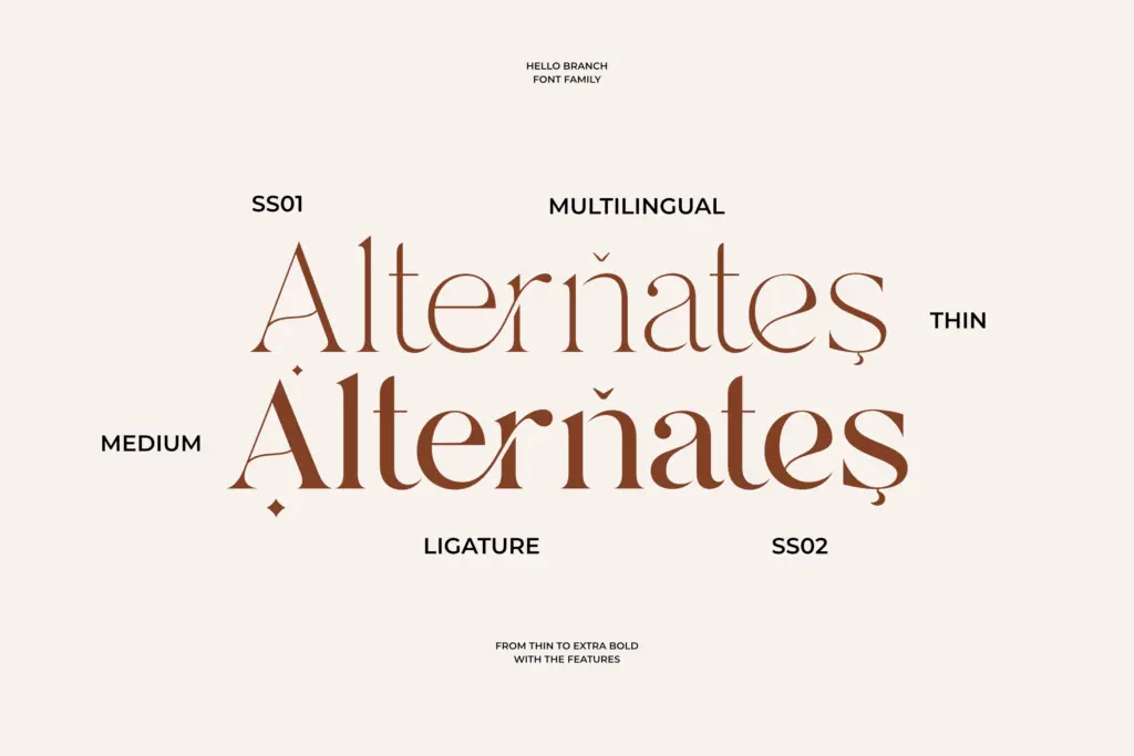
Alternates and ligatures are included for more natural letter connections, and PUA encoding means those extra glyphs are reachable without a glyphs panel, which matters if you’re working in Canva or Cricut Design Space rather than Illustrator. Multilingual support is mentioned, though the brief doesn’t specify which scripts or diacritics are covered, so European-language buyers should check character coverage before committing to a project that needs accented characters. Format coverage is straightforward: OTF and TTF for desktop use, WOFF for web.
Use cases
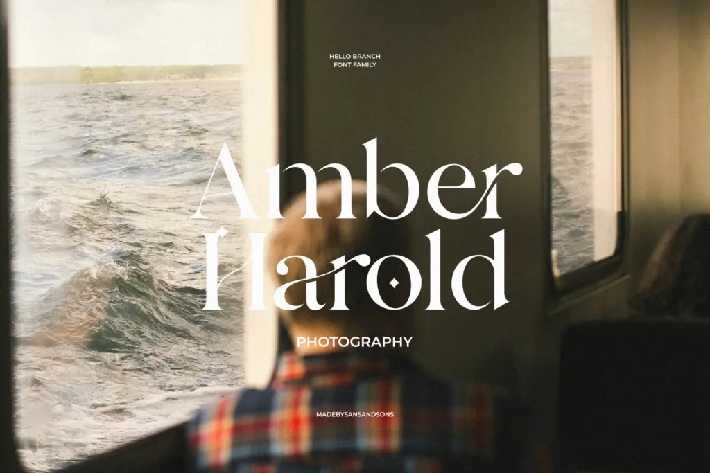
This is a family built for consistency across touchpoints rather than for one loud application. Branding and logo work benefit from having a genuine weight range to pull from — a wordmark in Semi Bold, supporting text in Regular, fine print in Light, all clearly related. Editorial layouts, packaging copy, and invitation suites are the other obvious homes, especially where a project needs body text and display headlines to share DNA without switching typefaces.
It’s less suited to jobs that need a serif with real character at large display sizes — a poster or a logotype that has to carry a brand on its own with no supporting text. For that, the restraint that makes Hello Branch versatile also makes it forgettable. Where it earns its keep is in systems: brand guidelines, style guides, and templates where predictability across eight weights is worth more than a single striking headline face.
What we liked, and what we didn’t
Strengths
- Eight consistent weights make it easy to build a full type hierarchy from one family.
- Alternates, ligatures, and PUA encoding keep the extra glyphs practical to access.
- Smooth contrast holds up reasonably well from Thin through Extra Bold without breaking.
Trade-offs
- The letterforms are tasteful but lack a distinctive detail that would make it memorable at large display sizes.
- Multilingual and diacritic coverage isn't specified, so international projects need checking first.
Hello Branch is a competent, well-behaved serif family whose real value is the eight-weight range rather than any single distinctive letterform. It suits brand systems and editorial hierarchies better than standalone display use.
Verdict

Tantype reviews typefaces in depth — every font is tested in real branding, editorial and screen layouts before a word gets written. 555+ fonts reviewed and counting.