
Geometric Sans Serif Fonts: 10 Best Geometric Fonts for Logos, Branding and Web
Geometric sans serif fonts build their letters from circles, straight lines and triangles. The o is close to a true circle, the lowercase a often has a single storey, and strokes keep nearly the same thickness throughout. The style began in 1920s Germany and still dominates logos, apps and packaging.
Our top three picks are Nexa, a 36-font Fontfabric family built on the circle; Mont, a ten-weight family with pointed apexes on its M and t; and Gilmer, a six-weight family inspired by Futura and Avant Garde. Every font on the main list is a commercial font sold on Creative Market. Three free Google Fonts options are further down.
See Creative Market’s geometric sans guide Commercial fonts: prices below were checked on October 16, 2026
What is a geometric sans serif font?
A geometric sans serif is a typeface without serifs whose letters are drawn from simple shapes. Wikipedia’s sans-serif article says these typefaces “are based on geometric shapes, like near-perfect circles and squares,” and lists a single-storey lowercase a and a nearly circular capital O as common features.
Bauhaus designers (1919–1933) drew geometric alphabets by hand, but, as Wikipedia notes, these were not cut into metal type at the time. German foundries turned the idea into fonts:
- Erbar: Jakob Erbar wanted a type “free of all individual characteristics,” with the circle as its basic element. He sketched it in 1914, the war delayed it, and Ludwig & Mayer of Frankfurt released it in 1926 (Wikipedia).
- Futura: Paul Renner began sketching in 1924, and the Bauer foundry released it in 1927. Wikipedia says Renner was not part of the Bauhaus but shared its ideas, and was disappointed that Erbar reached the market first. Futura became the most successful; our Futura guide covers today’s versions and prices.
- Kabel: Rudolf Koch’s design for the Klingspor foundry, also 1927. Wikipedia notes its tilted e, angled terminals and “more animated, less static feeling” than Futura.
Monotype’s Century Gothic (1990) descends from Sol Hess’s Twentieth Century and ITC Avant Garde, as our Century Gothic guide explains. Some popular modern faces are hybrids: Gotham is a geometric-leaning sans based on New York building lettering, and Mark Simonson describes Proxima Nova as blending Futura’s geometry with the versatility of Akzidenz-Grotesk. Gilroy (2016) is a recent favourite.
The traits to look for:
- Circle-based rounds: o, c, e and the bowls of b, d, p and q follow a circle, not an oval.
- Single-storey a: a round bowl with a stem, often paired with a single-storey g.
- Uniform stroke: little or no difference between thick and thin parts of a letter.
- Contrasting widths: round capitals such as O, C and G are wide, while E, F and S are narrow.
Geometric vs grotesque, neo-grotesque and humanist
Wikipedia splits sans serifs into four groups. Grotesques are the 19th-century originals, such as Akzidenz-Grotesk, with some stroke variation and usually a two-storey a and g. Neo-grotesques such as Helvetica and Univers are smoother and more uniform, with tight, closed openings on c and e. Humanist sans serifs such as Gill Sans and Frutiger take their shapes from calligraphy and Roman capitals, with open forms and slight stroke contrast. Geometric designs start from the compass and ruler instead. The groups overlap, hence the many “geometric grotesk” fonts.
The best geometric sans serif fonts at a glance
- Nexa — 36 fonts built on the circle, with a Text subfamily for long copy.
- Mont — ten weights with italics, sharp apexes, Latin, Cyrillic and Greek.
- Gilmer — six weights inspired by Futura and Avant Garde.
- Causten — nine weights with matching obliques, alternates and ligatures.
- Codec Pro — eleven weights, “cold” and “warm” stylistic sets, Arabic script support.
- Rockford Geometric — subtly rounded edges, eight weights and small caps.
- Without Sans — 1950s geometric meets grotesque, ten weights with italics.
- Cocogoose Classic — low-contrast, slightly rounded headline family.
- Ratio — Futura-influenced lowercase with inktraps cut into the joins.
- Benzin — five weights with Cyrillic, at a low price.
Best geometric sans serif fonts on Creative Market
Prices are for a one-seat Desktop licence as listed on Creative Market on October 16, 2026. Sales and price changes are common, so check the listing.
1. Nexa
Fontfabric released Nexa in 2012 and describes it as “fundamentally based on a circle.” The 2020 version on Creative Market has nine weights and 36 fonts. Part of the family is Nexa Text, with looser spacing and larger openings, which Fontfabric says is “optimized for longer pieces of writing.” The main styles are for headlines and logos, and Stylistic Set 02 swaps in squared-off alternates for a more futuristic look. It covers extended Latin and Cyrillic, with tabular figures and fractions. It is the most complete system here for logo, website and documents in one family. Desktop licence: $249.
2. Mont
Mont, Fontfabric’s 2018 family, was built from the circle, square and triangle, according to the foundry. The triangle shows in the pointed apex of the M and the triangular bracket on the t, while o, a and e stay soft and circular. The listing gives ten weights from Hairline to Black with italics, 744 glyphs, and Latin, Cyrillic and Greek coverage for more than 130 languages, plus ligatures, fractions and tabular figures. Choose it for multilingual brands and digital products. Desktop licence: $279, the most expensive font on this list.
3. Gilmer
Piotr Łapa’s Gilmer is the most direct nod to the classics here: the listing calls it “inspired by the iconic typefaces like Futura and Avant Garde.” Its large x-height and minimal stroke contrast give it more of the Avant Garde feel than Futura’s, which has a much smaller x-height. There are six weights from Thin to Heavy, extended Latin, more than 500 glyphs according to the current listing, and OTF and webfont files. Use it for magazine headlines, posters, websites and branding when you want classic geometric shapes without a historic Futura licence. Desktop licence: $150.
See Gilmer on Creative Market · Read our Gilmer review
4. Causten
Causten, from Bagas Ardiatma’s trustha shop, is a plain, well-behaved geometric family: nine weights, each with a matching oblique, for 18 styles. You also get a stylistic set, ligatures, alternate glyphs and multilingual accents (the listing doesn’t name the languages). Creative Market features it in its own Futura alternatives guide. The obliques make it practical for corporate identities, reports and websites that need emphasis without a second family. Desktop licence: $129.
See Causten on Creative Market
5. Codec Pro
Codec Pro from Zetafonts grew out of a 2017 research project by Francesco Canovaro, Cosimo Lorenzo Pancini and Andrea Tartarelli on variations of the geometric sans. It is really two typefaces in one. The default “Codec Cold” set cuts terminals parallel or perpendicular to the baseline, while “Codec Warm” switches to open diagonal cuts and more humanist shapes. Eleven weights run from hairline to “bulky fat,” and the character set covers Latin, Cyrillic and Greek plus Arabic, Farsi and Urdu, rare in this style. The package has 22 fonts plus a variable font. Desktop licence: $180.
See Codec Pro on Creative Market
6. Rockford Geometric
Fenotype’s Rockford Geometric softens the style with “subtly rounded edges,” a large x-height and round features the listing calls “both legible and friendly.” It has eight weights with matching italics and unusually complete OpenType features for a geometric face: small caps, oldstyle figures, superior and inferior figures, and fractions. That makes it workable in editorial layouts. The rounded edges suit food brands, children’s products and apps that want a gentler tone than Futura. Desktop licence: $99.
See Rockford Geometric on Creative Market
7. Without Sans
Without Sans was designed in 2014–15 by Felipe Sanzana and Diego Aravena of Without Foundry. The listing describes “a new geometric sans serif of 10 weights plus matching italics and alt family,” drawing on 1950s geometric sans serifs blended with grotesques. That mix puts it in the same hybrid territory as Proxima Nova: geometric rounds with a calmer rhythm in text. It covers Western, Central and Eastern European languages, and suits magazines, web and logotypes. It was on sale when we checked (October 2026), so see the listing for the current price.
See Without Sans on Creative Market
8. Cocogoose Classic
Cocogoose began in 2012 as a heavy display face by Cosimo Lorenzo Pancini at Zetafonts. The 2019 Classic version keeps the original capitals but adds a new lowercase with a smaller x-height and round dots, with “very low contrast and slightly rounded corners.” You get 16 fonts, eight weights each with an italic, and more than 1,000 characters, including positional numerals, alternates and extended ligatures. The rounded corners give the heavy weights a friendly, chunky look on packaging, posters and logotypes. Our review found it repetitive in long text, so keep it for display. Desktop licence: $149.
See Cocogoose Classic on Creative Market · Read our Cocogoose Classic review
9. Ratio
TOMO Fonts names its influences openly: mid-century modernism, the Bauhaus and the lowercase of Futura. Ratio’s twist is inktraps, small notches cut where strokes meet, combined with spurless letters. Inktraps were originally a fix for ink filling joins in small print; here they are a visual signature that grows stronger in the heavier weights. There are seven weights, and OpenType stylistic sets offer alternates if you want to tone the effect down. Use it for tech, architecture and music branding where a plain geometric sans feels too safe, not for long body text. Desktop licence: $120.
See Ratio on Creative Market · Read our Ratio review
10. Benzin
Benzin, by Roman Postovoy of the Supremat shop, is the budget pick: a geometric sans in five weights. The designer adjusted spacing per weight, looser in the thin styles for small text and tighter in the bold for headlines, so you need less manual kerning. Language support covers Western, Central and Eastern European, Baltic, Turkish, Romanian and Cyrillic. There are no italics. It suits small brands, social graphics and multilingual packaging on a tight budget. Desktop licence: $17.
See Benzin on Creative Market · Read our Benzin review
How to choose a geometric sans serif font
- Start from the classic you have in mind. For “something like Futura,” look for a single-storey a and a circular o; Gilmer and Ratio name Futura as an influence. For the large x-height of Century Gothic, try Gilmer or Rockford Geometric. For the hybrid feel of Proxima Nova or Gotham, Without Sans, Mont and Nexa are closer than a strict Bauhaus design. Our Futura and Gilroy guides cover what the originals cost.
- Check the x-height for body text. Futura’s low x-height looks elegant but reads small. On screens and in small print, a larger x-height (Mont, Gilmer, Rockford) is easier to read.
- Watch for confusable letters. In strict geometric designs, l, I and 1 can look alike; test codes and product numbers.
- Count the styles you need. A logo needs one weight. A brand system needs italics, tabular figures and a range of weights; Nexa, Mont, Causten and Codec Pro cover that.
- Check languages. Mont, Nexa, Codec Pro and Benzin include Cyrillic; Codec Pro adds Arabic script.
- Logos, signage and Cricut. Even strokes cut cleanly in vinyl and stay legible on signs. Avoid hairline weights for cutting.
Free geometric sans serif fonts
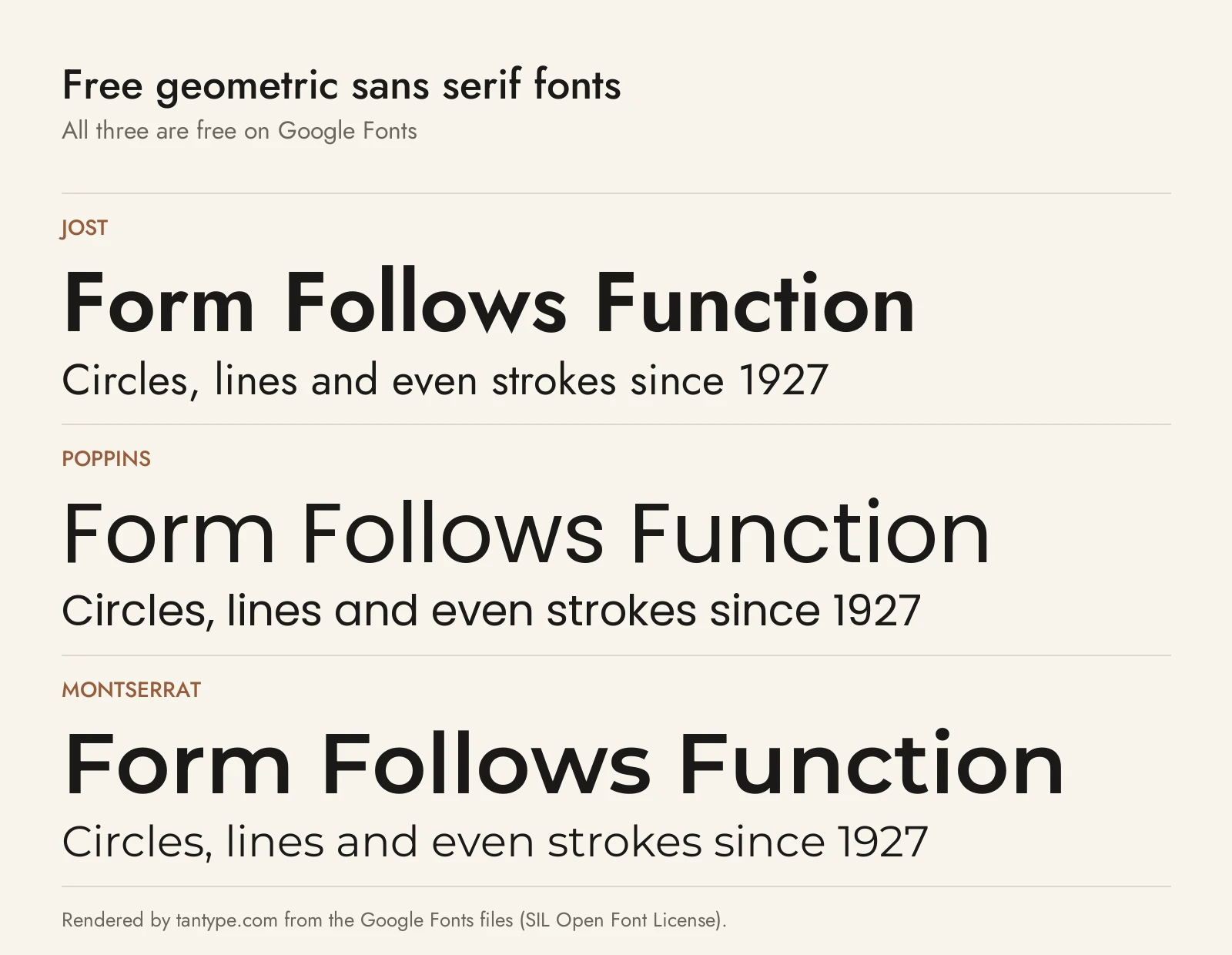
These three are on Google Fonts under the SIL Open Font License, free for personal and commercial use, including on websites.
- Jost by Owen Earl of indestructible type is “inspired by 1920s German sans-serifs,” which makes it the closest free match to Futura. It is a variable font from Thin to Black with italics, covering Latin and Cyrillic, but with fewer OpenType extras than the paid picks.
- Poppins from Indian Type Foundry covers Latin and Devanagari; Google Fonts says its Devanagari is “based on pure geometry, particularly circles.” The letters are nearly monolinear with a high x-height, in nine weights with italics. It looks more constructed than Gilmer or Causten.
- Montserrat by Julieta Ulanovsky was inspired by old posters and signs in Buenos Aires’s Montserrat neighbourhood. It is wider and less strictly geometric than Jost or Poppins, closer to Gotham’s urban feel, and variable from Thin to Black with italics and Cyrillic.
Licensing: personal vs commercial use
Creative Market sells fonts under four licences, explained on its font licence page:
- Desktop: unlimited personal and commercial projects, including products, packaging, social media and paid ads. On websites, apps and games the font may appear only as images, not embedded. One seat per user.
- Webfont: embedding with @font-face on websites you own or control, within a pageview limit set at checkout. It doesn’t cover desktop use.
- App: embedding in one app or game, as long as the font can’t be extracted.
- E-pub: embedding in one e-book.
Print-on-demand tools are not allowed unless you make the finished product yourself. For a logo you plan to register as a trademark, the licence says the font must be modified and not the dominant element, and you must disclaim it. You can’t share the files. This is a summary, not legal advice; check the terms on each listing.
Geometric sans serif font FAQ
What is a geometric font?
A sans serif built from basic shapes: circles for round letters, straight lines for stems and triangles for letters like A, M, V and W. Strokes are nearly even, and many have a single-storey a. Erbar, Futura and Kabel from the 1920s are the classic examples.
What are geometric fonts used for?
Logos, branding, packaging, posters, apps and websites. Their regular shapes stay recognisable from icon to billboard size. For body text, pick a larger x-height or a text cut such as Nexa Text.
Are there free geometric sans serif fonts for commercial use?
Yes. Jost, Poppins and Montserrat are free on Google Fonts under the Open Font License, which allows commercial use. Gilroy’s designer also gives away two weights, Light and ExtraBold, under a free licence. Fonts labelled “free for personal use” elsewhere need a paid licence for business work.
Is Montserrat a geometric font?
Mostly. It has round, wide letters and even strokes, but it comes from 20th-century Buenos Aires signage rather than pure circles, so it sits between geometric and grotesque, much like Gotham. Jost and Poppins are stricter geometric designs.
