
Altone: A 9-Weight Geometric Grotesk for Corporate and Brand Work
Design style
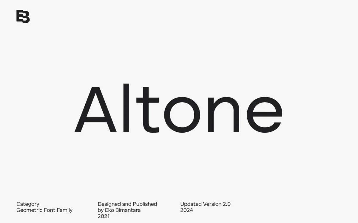
Altone sits closer to grotesque territory than to the geometric-purist camp its category label suggests. The seller draws a distinction from classical Bauhaus-style geometrics, and it holds up: apertures are closed rather than flared, stroke ends are cut straight rather than angled, and the apex on capitals like A is flattened instead of pointed. The result reads as disciplined rather than eccentric. Proportions are moderate and fairly even across the width of the alphabet, so there’s none of the exaggerated circle-and-square construction that makes some geometric sans families feel like a design exercise rather than a working typeface.
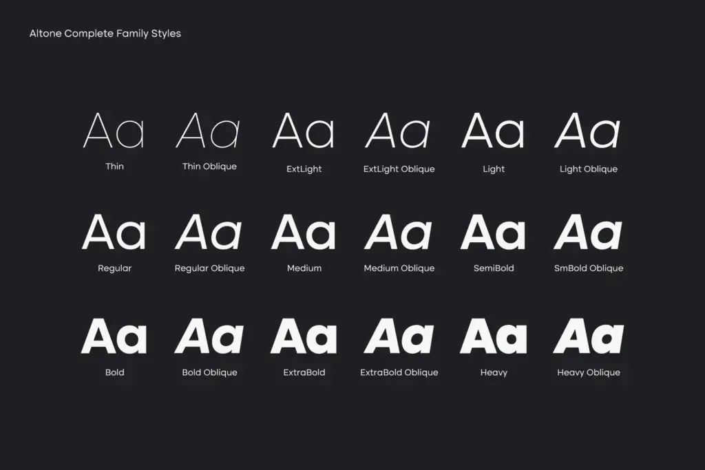
Nine weights running Thin to Heavy is a proper range, and each has a matching oblique rather than a mechanically slanted stand-in. That’s worth noting because a true oblique, drawn rather than skewed, keeps stroke weight and joins consistent at speed — something that matters once you’re setting italics-adjacent copy in a heavier weight. The overall personality is straightforward: bold when pushed, quiet in the lighter weights, without much stylistic flourish in between. This is a family built to disappear into the job rather than announce itself.
Character set and features
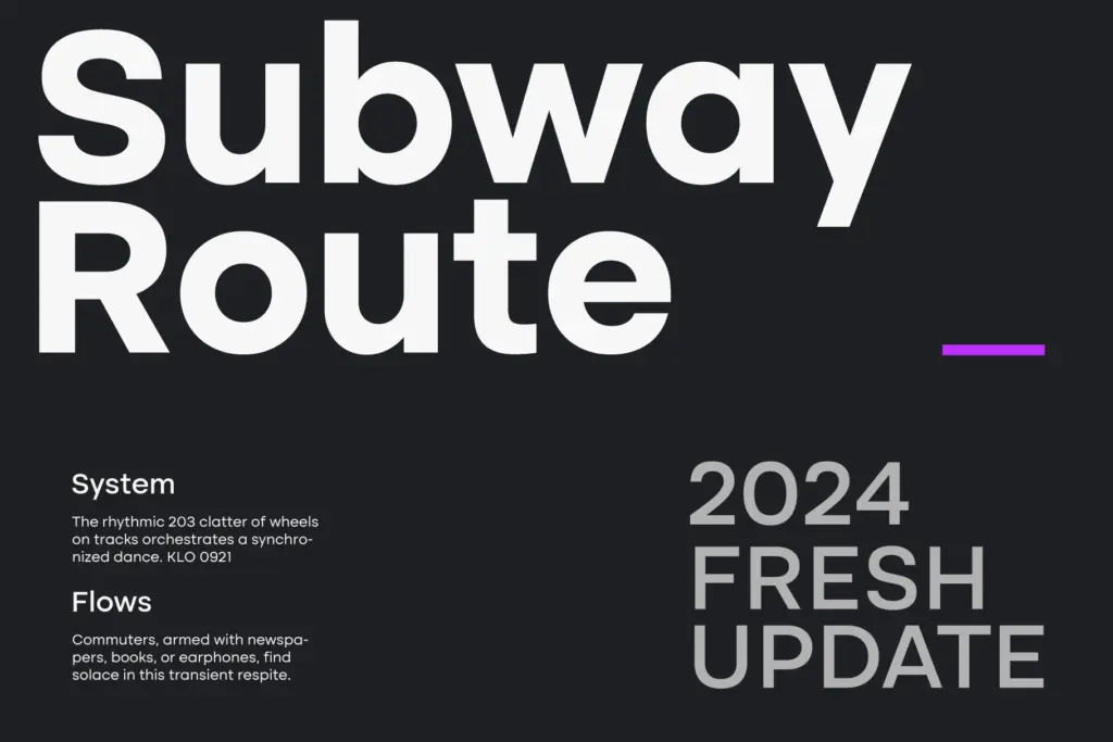
The OpenType feature set is reasonably deep for a sans marketed on cleanliness. Stylistic alternates give you room to adjust a handful of letters without switching styles, and the figure set covers tabular lining, fractions, numerator and denominator — genuinely useful in financial or data-heavy layouts where numbers need to line up in columns or sit correctly in a fraction without manual kerning. Latin language coverage is described as broad, which suggests the family was built with multilingual body text in mind rather than just a display alphabet with a few accented characters bolted on.
The variable font versions, split into Upright and Oblique axes, are the more practical addition for anyone working in a browser-based or app environment where loading eighteen static files is wasteful. Being able to interpolate weight on the fly is more useful in UI and web contexts than as a novelty — it means one file can cover a full weight range for responsive type scales.
Use cases
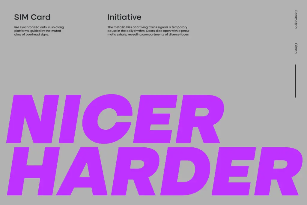
Altone’s flat apexes and closed apertures make it well suited to corporate identity work, annual reports, and branding systems that need a full weight range without switching families. The Thin and Light weights are legible enough for body copy in editorial or documentation contexts, though nothing here suggests the extreme legibility optimisation you’d want for long-form text at small sizes in print — it’s a sans built for signage, headlines, UI, and brand collateral before it’s built for a novel. The Heavy weight and its oblique companion do the loud work: wordmarks, packaging headlines, poster type. Because the design deliberately avoids strong personality quirks, it will sit comfortably in system-heavy brand guidelines where consistency across touchpoints matters more than a distinctive voice. Designers looking for a sans with more character or historical reference elsewhere should look past this one; Altone’s job is to be reliable, not memorable.
What we liked, and what we didn’t
Strengths
- True drawn obliques for all nine weights rather than mechanically slanted versions
- Tabular, fraction and numerator/denominator figures make it practical for data-heavy layouts
- Variable font axes in Upright and Oblique suit responsive web and UI work
Trade-offs
- The closed-aperture, flat-apex construction plays it safe and lacks a distinct point of view
- Better suited to headlines, UI and branding than to long-form print body text
Altone is a competent, well-built geometric grotesk with a genuinely useful weight range and feature set, but it doesn't distinguish itself stylistically. It will do reliable work in corporate and brand systems without ever becoming the reason someone remembers the design.
Verdict

Tantype reviews typefaces in depth — every font is tested in real branding, editorial and screen layouts before a word gets written. 555+ fonts reviewed and counting.