
Univers Font Free Download
There is no official Univers font free download. Univers is a commercial typeface by Adrian Frutiger, released by Deberny & Peignot in 1957 and now sold by Linotype, a Monotype company. On MyFonts the original family starts at $42.99 per style and the redrawn Univers Next at $53.99 (as of October 2026). Two subscriptions include it: Adobe Fonts carries Univers Next, and Microsoft 365 offers six Univers styles inside Office.
Univers font free download: is there a legal free version?
No. Linotype and Monotype don’t publish a free, demo or personal-use version, and the Univers family page on MyFonts lists only paid licences. If you already pay for one of these services, you can use it at no extra cost:
- Adobe Fonts: the Univers Next page on Adobe Fonts lists 59 fonts, and Adobe says its full library is “cleared for both personal and commercial use”. You need a Creative Cloud plan with the full library. The original Univers is not on Adobe Fonts.
- Microsoft 365: Microsoft’s cloud fonts list includes Univers, Univers Bold, Univers Light, Univers Condensed, Univers Condensed Light and Univers Condensed Bold for subscribers. They work inside Word, PowerPoint and other Office apps, not in design software or on websites.
License Univers on MyFonts Commercial font; from $42.99 per style
Sites offering a “Univers free download” share unlicensed copies. They can’t give you a licence, and the files are often old or renamed.
Univers typeface at a glance
- Designer: Adrian Frutiger
- Released: 1957 for the Lumitype-Photon phototypesetter, then as metal type in 1958 (Fonts In Use)
- Style: neo-grotesque sans serif
- Univers: 27 styles, from $42.99 per style, $429.90 for the Complete Family Pack
- Univers Next: 63 styles, from $53.99 per style, $539.90 for the complete family
- Free alternatives: Hanken Grotesk, Inter, Work Sans
Design and character
MyFonts’ family notes say Deberny & Peignot wanted a sans serif in several weights in 1954, and Frutiger, the foundry’s art director, proposed a new design based on sketches from his student days in Zurich. He wanted a sans serif good enough for long texts, an unusual goal at the time.
Univers sits in the neo-grotesque group with Helvetica and Folio. Wikipedia’s comparison lists what sets it apart: a G with no spur, K arms that meet at the stem, a Q tail along the baseline, an angled top on t, a rectangular i dot and a straight-tailed y. It also has a lower x-height and looser spacing than Helvetica. Frutiger put it this way: “Helvetica is the jeans, and Univers the dinner jacket.”
The slanted styles are obliques, sloped uprights rather than cursive italics. Frutiger drew them at 16 degrees. Some later versions used 12, and Linotype’s 1997 redraw returned to 16.
The Univers numbering system explained
Frutiger named the styles with numbers instead of words like “Demi” or “Heavy”. Fonts In Use explains it: the first digit is the weight, light to bold (3 to 8), the second is the width, wide to narrow (3 to 9), and even numbers mark obliques.
- First digit: 4 Light, 5 Roman, 6 Bold, 7 Black, 8 Extra Black (plus 3 Thin and 9 for Extra Black Extended)
- Second digit: 3 Extended, 5 normal, 7 Condensed, 9 Ultra Condensed
- Examples: 55 is regular at normal width, 65 Bold, 57 Condensed, 67 Bold Condensed, 53 Extended
Obliques are where it gets messy. In the original scheme the oblique of 55 was 56, but today’s digital fonts usually keep the odd number: MyFonts sells “Univers Pro 55 Oblique”. Wikipedia notes manufacturers applied the system inconsistently, so search for both forms.
Univers Next uses three digits. Per Wikipedia, the first is weight (1 Ultra Light to 9 Extra Black), the second is width (1 Compressed, 2 Condensed, 3 Basic, 4 Extended) and the third is 0 for roman or 1 for italic. So 430 is Basic Regular, 431 its italic and 620 Bold Condensed.
What’s in the Univers family
The MyFonts listing has 27 Univers Pro fonts:
- Normal width: 45, 55, 65, 75 and 85, each with an oblique
- Condensed: 47, 57 and 67, each with an oblique
- Ultra Condensed: 39, 49 and 59, no obliques
- Extended: 53, 63, 73 and 93, each with an oblique
Univers condensed styles
Univers Condensed isn’t a separate font. It is the 7 and 9 width columns of the family, mostly 57 Condensed and 67 Bold Condensed, used for headings, tables, labels and signs. Univers Next has Condensed in every weight plus a narrower Compressed width. Microsoft 365’s Univers Condensed comes in Light, Regular and Bold only.
Univers vs Univers Next: which version to buy
In 1997 Frutiger and Linotype’s design staff redrew the family as Linotype Univers. The Univers Next page on MyFonts says proportions and curves were refined and the family grew from 27 to 63 styles, including four monospaced Typewriter fonts. In 2010 Linotype added true small caps and renamed it Univers Next.
- Buy Univers to match artwork or a brand guide that names styles like “Univers 55”. It is cheaper per style.
- Buy Univers Next for new work: more weights and widths, small caps and italics in most widths. The 12-font Basic Pack costs $344.99, and it is the version on Adobe Fonts.
Style counts differ: MyFonts sells 63 Univers Next fonts, Adobe Fonts lists 59 (no Typewriter styles), and MyFonts’ Univers Next field guide says 76 versions. Check the store listing before you buy.
Language support and OpenType features
Adobe Fonts lists Univers Next for Western and Central European Latin languages, including French, German, Polish, Czech and Turkish. Univers Cyrillic on MyFonts is separate: 19 fonts at $55.00 each or $399.99 for the pack. Wikipedia also records Greek, Cyrillic and Arabic versions of Univers Next.
The main OpenType extra in Univers Next is small caps, shorter capitals for acronyms that sit evenly in lowercase text. InDesign, Illustrator, Affinity and Figma can switch them on. Canva and Cricut Design Space can’t reach OpenType features, so there you only get the default letters.
Univers font pairings and best uses
Univers suits systems where many weights and widths must look like one voice: annual reports, signs, timetables, packaging ranges and corporate identities. MyFonts suggests pairing it with serifs such as Sabon, Janson Text or Frutiger’s slab serif Serifa. Free options:
- With a serif: Source Serif 4 or EB Garamond for body text under Univers headings.
- With itself: 67 Bold Condensed for headings, 55 for text and 45 for captions.
Wikipedia notes Univers on the keycaps of many older Apple keyboards and Audi Sans, a Univers variant that became Audi’s corporate typeface in the 1990s. Fonts In Use records 659 uses, including the track listing on They Might Be Giants’ Flood and Univers 57 Condensed in the HUD of Resident Evil Requiem.
Univers licensing: personal and commercial use
Every Univers licence is paid, and the same licence covers personal and commercial work. MyFonts offers Desktop (priced by number of users), Company Desktop (annual, up to 250 employees), Webfonts (one domain), App, Electronic Doc and Digital Ad/Email licences. MyFonts asks you to read the Linotype Desktop EULA, which may restrict logos, locations and products for sale.
Adobe Fonts covers use while your subscription is active, but self-hosting web fonts or embedding in apps needs a licence from Monotype. Microsoft doesn’t present its cloud fonts as a licence for other software, so don’t rely on them for a logo or website. This is general information, not legal advice.
How to download and install Univers legally
- Adobe Fonts: sign in, open Univers Next and click Add family. The fonts appear in your design apps through Creative Cloud.
- Microsoft 365: choose Univers in the Word or PowerPoint font menu while online, and Office downloads it.
- MyFonts: buy the styles or pack with the licence you need, then download the ZIP from your account.
- Install: on Windows, right-click the .otf files and choose Install. On a Mac, double-click each file and click Install Font.
Free fonts similar to Univers
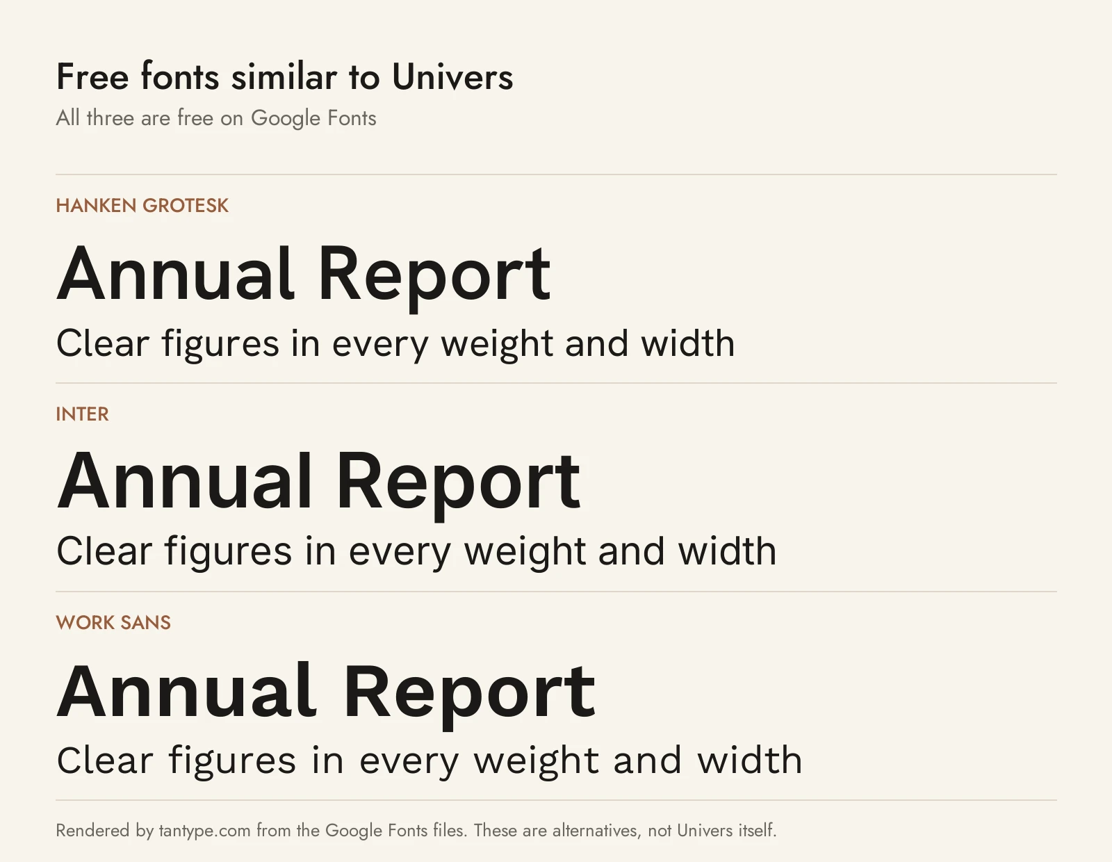
No free font matches Univers’ coordinated widths, but these Google Fonts have a similar neutral grotesque look. All use the SIL Open Font License, which allows commercial use.
- Hanken Grotesk: “inspired by the classic grotesques”. In its Google Fonts files the y has a straight tail, the t an angled top and the K arms meet at the stem, as in Univers. Thin to Black, but no condensed or extended widths.
- Inter: a neo-grotesque for screens. Its taller x-height, spurred G and curved y make it look more modern, but it has true italics plus Greek and Cyrillic.
- Work Sans: loosely based on early British and German grotesques, a little wider and rounder than Univers, Thin to Black.
For narrow and wide styles, Archivo has a width axis from ExtraCondensed to Expanded. Among commercial fonts we cover, Neue Frutiger Condensed is Frutiger’s later humanist sans in narrow widths, Trade Gothic Next is a grotesque with condensed and compressed styles, and Avenir Next is Frutiger’s geometric sans.
Univers font FAQ
Is Univers font free?
No. It is a commercial Linotype typeface. Adobe Fonts subscribers get Univers Next, and Microsoft 365 subscribers get six styles in Office, but there is no free download.
What does Univers 55 mean?
The first digit is weight, the second width. 55 is regular at normal width; 65 is Bold and 57 Condensed.
What is the difference between Univers and Univers Next?
Univers Next is the 1997 redraw by Frutiger and Linotype, renamed in 2010. It has 63 styles instead of 27, small caps and three-digit style numbers.
Who designed Univers?
Adrian Frutiger, who later drew Frutiger and Avenir. Deberny & Peignot released it in 1957.
Is Univers on Mac or Windows?
It isn’t in Apple’s list of macOS fonts or Microsoft’s Windows 11 font list. Microsoft 365 subscribers can use it inside Office.
What is the closest free font to Univers?
Hanken Grotesk is closest in feel. Inter is better for screen interfaces, and Archivo covers condensed widths.
