
Vintage Fonts: 12 Best Vintage Fonts for Labels, Logos and Posters
Vintage fonts borrow the look of older printing and lettering: nineteenth-century wood type posters, Victorian serifs, mid-century sign scripts and the worn strike of a typewriter. “Vintage” covers all of these, so the right choice depends on the era and the job.
Our top three picks are PressBox Font Combo for woodtype posters, Lovelace for a Victorian-style serif that can also set text, and Amaretti for a mid-century advertising script. Below are 12 picks grouped by look, with notes on which suit labels, logos and posters.
Every font in the main list is a commercial font sold on Creative Market. If you need something free, three genuinely free Google Fonts are further down.
Browse vintage fonts on Creative Market Commercial fonts: prices are set per licence on each listing
What is a vintage font?
A vintage font imitates type or lettering from an earlier period, usually between the early 1800s and the 1970s. Most of what people call “old timey” or “old fashioned” type comes from a few traditions:
- Fat faces and slab serifs. Fat faces, Didone serifs with very thick stems and hairline serifs, appeared in London around 1805–1810 and spread through posters and lottery adverts. Slab serifs, once called “Egyptians”, followed: Vincent Figgins showed one he named “Antique” in a specimen dated 1815 but probably issued in 1817. The later French Clarendon style is the one most people link with Western films.
- Wood type. Big poster letters were cut from wood because it was lighter and cheaper than large metal type. Darius Wells published his first known wood type catalogue in New York in 1828, and William Leavenworth added the pantograph in 1834 so one pattern could be copied many times, according to Wikipedia’s history of wood type.
- Mid-century scripts. Brush Script, drawn by Robert E. Smith for American Type Founders in 1942, “saw near immediate success with advertisers, retailers, and in posters”.
- Typewriter type. Typewriter faces were monospaced slab serifs; Courier was designed by Howard “Bud” Kettler for IBM in the mid-1950s.
What makes type read as vintage is mostly blunt or high contrast, condensed or very wide proportions, shading and outlines, swashes, and texture from ink, wood or paper.
The best vintage fonts at a glance
- PressBox Font Combo: woodtype poster sans with a spurred serif and ornaments.
- Songster: Victorian song-sheet capitals with a layering Line Shade style.
- Vienna Woodtype: ultra-condensed letters from hand-pulled linocut prints.
- Marlin: Western saloon-sign display with shadow layers.
- Milkstore Font Collection: hand-painted Americana fonts plus a badge kit.
- Lovelace: a 30-font Victorian-style serif family with a script.
- Tomato Ketchup: a bold mid-century serif for food labels and logos.
- Apothecary Serif: antique print serif with caps and spaced versions.
- Amaretti: vintage advertising script in three weights.
- Hello Radio: monoline diner-sign script.
- Nightingale Script: quill-pen hand based on old manuscripts.
- Olivetti Lettera: textured typewriter face.
Best vintage fonts on Creative Market
Picks 1–5 are Victorian, woodtype and sign display faces, 6–8 are vintage serifs, 9–11 are retro and antique scripts, and 12 is typewriter type.
1. PressBox Font Combo: woodtype poster type
PressBox, from Sean Coady’s Vintage Type Company, is a complete letterpress poster kit. PressBox Display is a heavy wood-type-style sans whose capitals and lowercase are drawn at different widths, so changing case gives you a condensed or a wide line in one font. Virgo Display is a condensed serif with spurs, in capitals with small-cap lowercase, and Virgo Ornaments adds catchwords and border pieces. Each font has an inked alternate style. Use it for event posters, menus and shop signs.
See PressBox Font Combo on Creative Market · Read our PressBox Font Combo review
2. Songster: Victorian song-sheet capitals
Ilham Herry based Songster on 19th-century song sheet covers: strong contrast, blunt serifs, theatrical capitals. It is all caps in two styles. Regular is solid; Line Shade carries an inner line, and stacking the two in different colours gives a two-colour printed effect. A Pair font for supporting lines, an Extras font of ornaments and OpenType stylistic alternates are included. It suits labels, book and album covers, and logotypes of a few words.
See Songster on Creative Market · Read our Songster review
3. Vienna Woodtype: real print texture
Despite the name, Vienna Woodtype comes from linocut: XTOPH says the letters were printed by hand, scanned and rebuilt as a font. The result is an ultra-condensed sans whose edges and ink coverage vary like a real hand-pulled print. It comes in Clean, Rough and SVG versions, so you can choose how much grain a job gets; the SVG version needs an app that supports colour fonts. The narrow width fits tall bottle labels, gig posters and vertical signage.
See Vienna Woodtype on Creative Market · Read our Vienna Woodtype review
4. Marlin: Western saloon display
Marlin, by David Phillips of Komet & Flicker, is a condensed, Western-inspired display face. It has five styles: Regular, Ornate, Rough, and a Shadow Outline plus Shadow Base + Fill pair that layer into a shaded letter. The lowercase holds 22 alternate letter designs to mix with the capitals, plus 23 pre-made connector words such as AND, OF and THE. Use it for bar signs, rodeo and barbershop branding, and spirits labels.
See Marlin on Creative Market · Read our Marlin review
5. Milkstore Font Collection: hand-painted Americana
Milkstore, by Julius Behr of Heritage Type Co., looks like old grocery and soda lettering painted on brick. There are five fonts: Milkstore 01, with alternates and swashes, and four uppercase companions for badge lines and stamps, in textured, rough and clean versions with Western European accents. The extras make it a badge kit: 18 editable Illustrator logo templates, over 30 vector icons and 12 textured backgrounds. Use it for crate labels, packaging and badge logos.
See Milkstore on Creative Market · Read our Milkstore review
6. Lovelace: Victorian serif family
Lovelace is Zetafonts’ homage to nineteenth-century “Old Style” typography, and unlike most vintage fonts it is a full family: 30 fonts in text and display optical sizes, each from Extralight to Extrabold, with calligraphic italics and a display script with swashes and connected lowercase. OpenType features include stylistic alternates and ligatures, and Zetafonts says it covers over 200 languages in Latin, Cyrillic and Greek. Use the display cut for book covers, wine labels and invitations, and the text cut for body copy beside them.
See Lovelace on Creative Market · Read our Lovelace review
7. Tomato Ketchup: mid-century bold serif
Emil Bertell of Fenotype calls Tomato Ketchup “a bold vintage style serif font with a nonchalant charm”. The heavy, slightly loose letters recall diner signs. This listing is the single bold weight; a lighter Regular is sold separately. It has contextual, swash, stylistic and titling alternates plus discretionary ligatures. The extras are PUA-encoded, so apps without OpenType controls can reach them through a glyph or character map. Best for food and drink labels, café logos and packaging.
See Tomato Ketchup on Creative Market · Read our Tomato Ketchup review
8. Apothecary Serif: antique print serif
Apothecary Serif, from the pixelcolours shop, is a serif with an antique print texture. The collection has four fonts: the regular, a Spaced version with wider tracking for short paragraphs, a Caps font of tall bold textured capitals (its lowercase keys give a second, smaller set of capitals), and Caps Spaced. It was drawn to match the designer’s Apothecary Script, sold separately. Use it for apothecary-style labels, candle and soap packaging, and recipe cards.
See Apothecary Serif on Creative Market · Read our Apothecary Serif review
9. Amaretti: vintage advertising script
Nicky Laatz designed Amaretti as “a smooth calligraphic script that was designed to be reminiscent of vintage hand-lettered advertising”. It has three weights, each with an oblique, plus many OpenType alternates, ligatures and swashes. Language support is English with some common accents. The font is PUA-encoded for Canva, so the alternates work there too. Use it for bakery and café logos, product names and greeting cards, with extra line spacing for the swashes.
See Amaretti on Creative Market · Read our Amaretti review
10. Hello Radio: monoline retro script
Hello Radio, from Invasi Studio, is a monoline script: one even stroke width and no thick-thin contrast. That gives it the casual look of a diner menu or an old radio dial rather than formal calligraphy. It includes ligatures, ships as OTF, TTF and WOFF, and the listing says it supports 60+ Latin-based languages. The even stroke makes it one of the easier scripts here for embroidery and vinyl cutting, as well as retro logos and stickers.
See Hello Radio on Creative Market · Read our Hello Radio review
11. Nightingale Script: antique quill hand
Nightingale Script is Nicky Laatz’s “intentionally imperfect, antique script based on old manuscripts”. Strokes carry the pressure of a dip pen, joins are loose and some strokes overshoot the baseline, so it reads like an old ledger or letter rather than a wedding script. OpenType features hold an alternate t and y and bonus ligatures; a Photoshop style for the watercolour look in the previews is included. The listing says it was made to pair with Apothecary Serif. Use it for period labels, stationery and book covers.
See Nightingale Script on Creative Market · Read our Nightingale Script review
12. Olivetti Lettera: typewriter type
Komet & Flicker based Olivetti Lettera on the Olivetti Lettera 35 portable typewriter, aiming for “rough tactile imperfection”: blunt serifs, uneven ink and a struck texture. It covers upper and lowercase Latin with Western and Central European characters, two styles of pre-made fractions for recipes and measurements, and 20 connecting word glyphs reached through the Glyphs panel in Illustrator or Photoshop. Use it for recipe cards, prop letters for film or games, zines, record sleeves and short labels that should look typed.
See Olivetti Lettera on Creative Market · Read our Olivetti Lettera review
How to choose a vintage font
- Pick an era first. 1880s wood type, 1950s diner script and 1970s soft serifs all count as vintage but say different things.
- Match the font to the job. For posters, condensed woodtype and display caps (PressBox, Vienna Woodtype, Marlin, Songster) fit a lot of large text on a sheet. For labels and packaging, look for caps, spaced and textured versions (Apothecary Serif, Milkstore, Tomato Ketchup). For logos, choose alternates and swashes so the wordmark looks drawn (Amaretti, Tomato Ketchup, Marlin).
- Check texture at the final size. Rough styles look good large but turn muddy in small print. Fonts with a clean version beside the rough one (Vienna Woodtype, Milkstore) cover both.
- Check your software. Canva and Cricut Design Space generally can’t switch on OpenType alternates. PUA-encoded fonts such as Amaretti and Tomato Ketchup let you paste extra glyphs from a character map instead. For cutting machines, monoline scripts like Hello Radio weed more cleanly than textured fonts.
- Pair one vintage font with something quieter. Set ingredients, dates and prices in a plain serif or sans.
Free vintage fonts
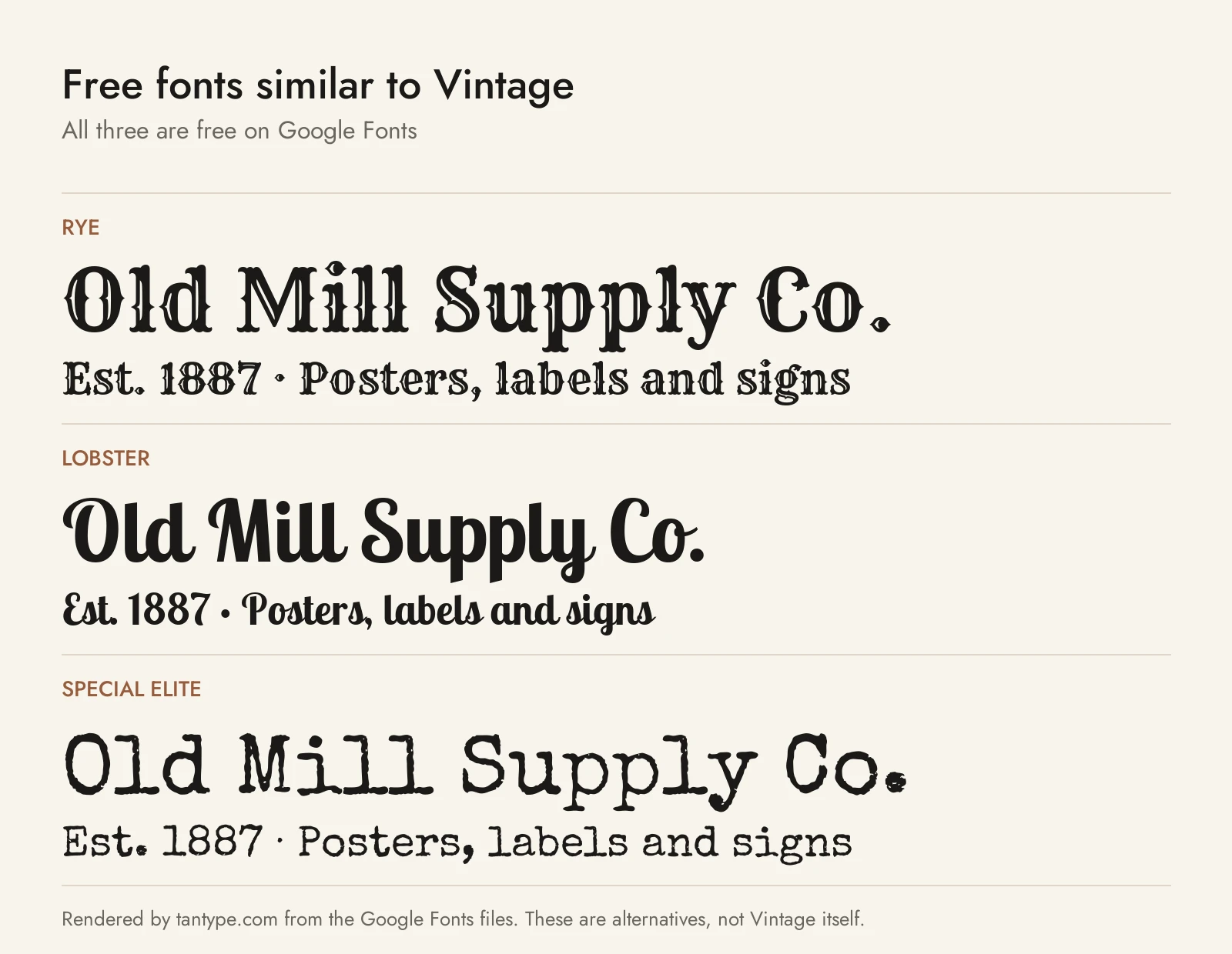
These three are free for personal and commercial use under open licences, and each covers a different vintage look.
- Rye (SIL Open Font License): Nicole Fally’s display face for Sorkin Type, which Google Fonts describes as “inspired by posters using wood type” with “a feeling of the American West”. It is the closest free match to Marlin and PressBox, but it is one style with no shadow layers, ornaments or inked version.
- Lobster (SIL Open Font License): Impallari Type’s bold connected script, which swaps in letter variations and ligatures to keep joins smooth. It is heavier and far more common than Amaretti or Hello Radio, so keep it for headlines where a free retro script is enough.
- Special Elite (Apache License 2.0): Astigmatic’s typewriter face, which mimics the Smith Corona Special Elite Type Number NR6 and Remington Noiseless models. It is a solid free stand-in for Olivetti Lettera, without the fractions or word glyphs.
Licensing: personal vs commercial use
Creative Market sells four standard font licences, per its font licensing page:
- Desktop: use the font in “unlimited commercial and personal projects”, including physical products, packaging, social media and paid ads. On websites and in games the type must be rasterised, such as in an image. Buy one seat per user.
- Webfont: embed the font on your own websites, up to the pageview limit chosen at checkout.
- E-pub: embed the font in one ebook or ecard title.
- App: embed the font, non-extractable, in one app or game.
A Desktop licence covers using the font in a logo. To register that logo as a trademark, Creative Market’s FAQ says the font must be modified and not the dominant element, you must disclaim it in the application, and you can’t enforce rights over the font itself. This is a summary, not legal advice.
Vintage font FAQ
What are old timey fonts called?
It depends on the period. Nineteenth-century poster type includes fat faces, slab serifs (once called Egyptians), Clarendons and Tuscans, many cut as wood type. Later styles go by source or decade: sign-painter scripts, Art Deco, typewriter fonts. Font shops file most of them under “vintage”, “retro” or “Western”.
What is the difference between vintage and retro fonts?
The words overlap. “Vintage” usually means older looks such as Victorian, woodtype and early twentieth century; “retro” usually means the 1950s to 1980s. Tomato Ketchup and Hello Radio sit on the retro side, Songster and Lovelace on the vintage side.
What is a good old fashioned font for labels?
Apothecary Serif and Milkstore, which both have caps-only versions for stacking lines in a small area. Pair Apothecary Serif with Nightingale Script for an antique pharmacy look, or use Vienna Woodtype on tall bottle labels.
Which vintage font is best for a logo?
One with alternates, so the wordmark looks drawn: Amaretti for a script, Tomato Ketchup for a bold serif, Marlin for Western or barbershop marks. Read the trademark note above before registering a logo.
Is there a free vintage font for commercial use?
Yes. Rye, Lobster and Special Elite are on Google Fonts under the SIL Open Font License or Apache License, which allow commercial use. “Free” copies of paid fonts on other sites come with no valid licence.
