
Songster: a vintage song-sheet display serif with a line-shade twist
Design style
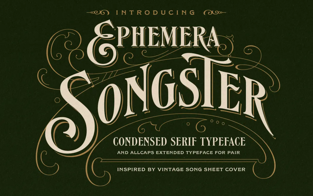
Songster pulls from the lettering found on 19th-century song sheet covers, and it shows in the details rather than the overall shape. The thick-thin contrast is pronounced, the serifs are blunt and confident, and the caps carry the slightly theatrical weight you’d expect from something meant to sit above a title on a broadsheet. It reads as vintage without leaning on distress textures or fake wear to get there. The drawing does the work.
It’s an all-caps face, which is worth noting up front — there’s no lowercase to fall back on. That’s consistent with its source material, but it means you’re working within a narrower register than a full text family would give you. The regular style is solid and grounded; the companion Line Shade style hollows out the letterforms with an internal line, giving you a layered, embossed-print effect when you stack the two on top of each other.
Character set and features
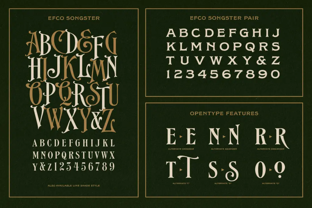
The package is built around that pairing idea. Regular and Line Shade are meant to be overlaid, and when they are, you get a two-colour, two-layer letter that mimics the look of old letterpress registration — slightly off, slightly worn, without any of it being an accident. It’s a smart bit of construction and the kind of thing that photographs well in a mockup.
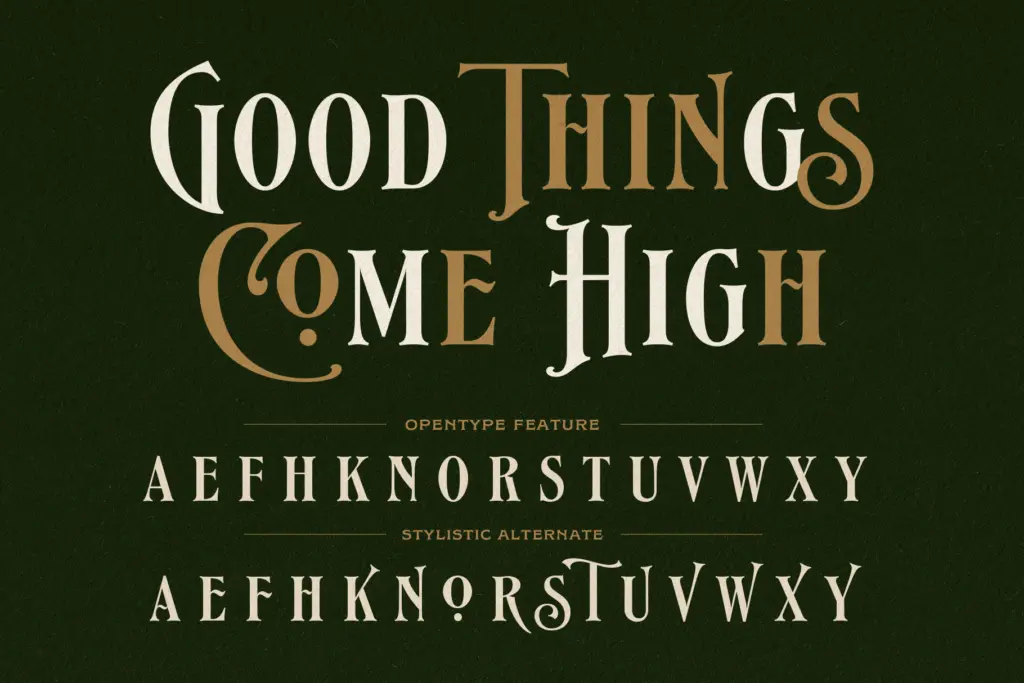
Beyond the two main styles, there’s a Pair font and an Extras font. The Pair file reads like a secondary or supporting style, useful for subheads or secondary lines of copy that need to sit near the display caps without competing with them. The Extras file is where the ornamental material lives — flourishes, dividers, the kind of decorative marks that 19th-century printers used to fill out a cover or frame a headline. Stylistic alternate support through OpenType features adds some variation to individual letters, which helps break up repetition when a word uses the same character twice in short order.
What you don’t get is a lowercase, a numeral set built for body text, or the kind of extensive multilingual coverage that a contemporary text serif would offer. This is a display kit, not a workhorse family, and it’s honest about that scope.
Use cases
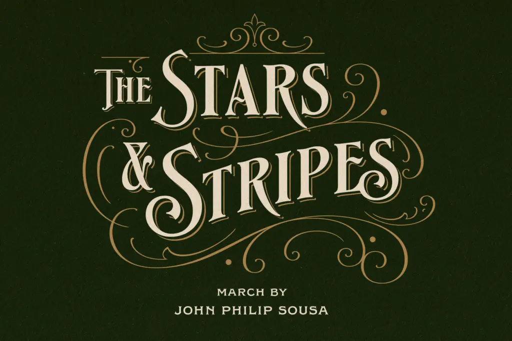
Songster is built for the jobs its description names: signage, posters, logos, labels, headlines, cover designs. It’s well suited to any project that wants to evoke old print culture — music packaging, craft beverage labels, barbershop or tailor branding, event posters for anything with a retro or Americana bent. The line-shade overlay technique is particularly good for logo lockups where you want a bit of dimensional interest without adding actual texture effects in post.
It won’t do the job of setting paragraphs or even short blocks of running text — there’s no lowercase, so anything requiring sentence-case copy needs a different typeface entirely. Treat Songster as a title-and-mark tool: get the headline or the logotype right, then hand the rest of the page to something built for reading. Used that way, with the ornaments from the Extras file for framing rather than filler, it does a specific vintage-display job cleanly and without fuss.
What we liked, and what we didn’t
Strengths
- The Regular and Line Shade overlay trick gives a convincing letterpress-layer effect without extra texture work
- Blunt serifs and strong thick-thin contrast give the caps real presence at large sizes
- Extras file includes period-appropriate ornaments that suit label and cover layouts
Trade-offs
- All-caps only, so it can't handle sentence-case copy or body text on its own
- Limited versatility outside vintage-leaning display and branding work
Songster is a well-drawn, single-purpose display serif that does a convincing 19th-century print impression, especially when the Line Shade style is layered over the Regular. It's not trying to be a text family, and buyers should know that going in. For logos, labels, and headline work with a vintage bent, it earns its keep.
Verdict

Tantype reviews typefaces in depth — every font is tested in real branding, editorial and screen layouts before a word gets written. 555+ fonts reviewed and counting.