
Apothecary Serif: a textured vintage-print serif for labels and headings
Design style
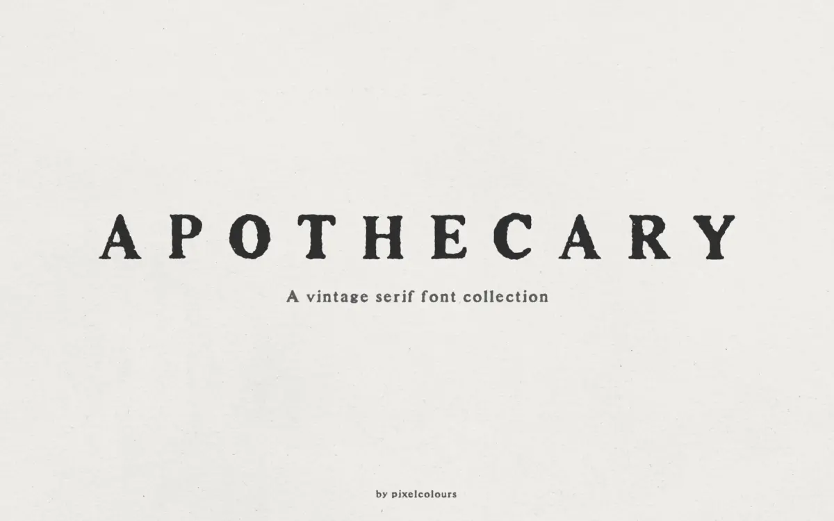
Apothecary Serif takes its cues from old letterpress and antique print work, the kind of serif you’d find on a 19th-century apothecary label or a weathered grocery tin. The letterforms carry a rough, inked texture rather than clean vector edges — strokes look slightly worn, as if the type had picked up ink unevenly on a old press. It’s a deliberate effect, and it reads as intentional rather than accidental, but it means the font announces its era immediately. This isn’t a serif you reach for when you want neutrality; it’s a serif you reach for when you want the reader to feel a specific decade.
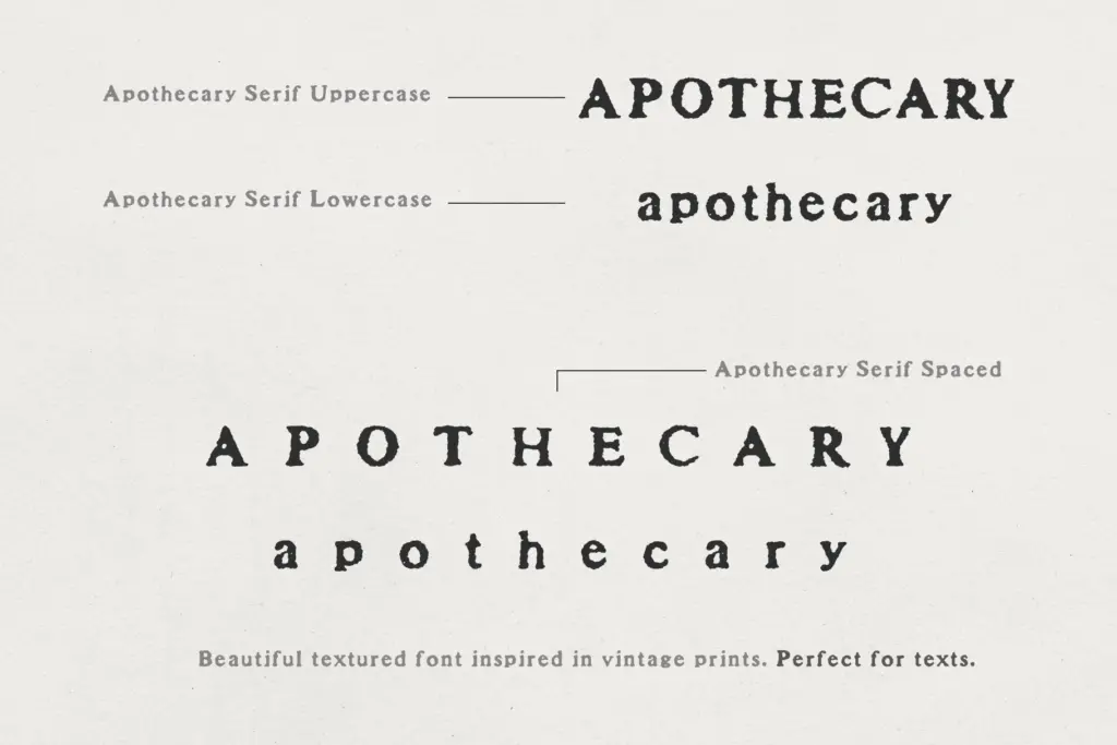
The collection isn’t a single font but a small family of related cuts: a standard serif, a spaced version, a caps-only version, and a spaced caps version. That structure tells you the designer built this for layout flexibility rather than as one static display piece — you’re meant to combine weights and spacing within a single design, which is a sensible way to build texture and hierarchy without introducing a second typeface.
Character set and features
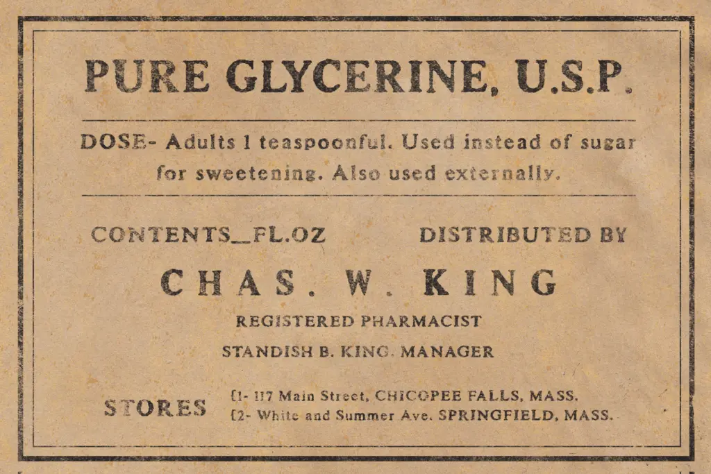
The core serif carries the antique-print texture throughout, with letterforms that stay legible despite the roughness — the texture sits on the surface of the strokes rather than distorting their structure. The Spaced version opens up the tracking, which softens the texture’s density and makes it more comfortable to read in short blocks of text, whether as body copy or as a companion to a script headline.
The Caps version is the more distinctive of the four. It’s tall, bold, and heavily textured, with lowercase letters repurposed as a secondary, slightly smaller uppercase set — a useful trick for varying letter height within a single word or line, which is common in the vintage-label genre this font is imitating. It works well for drop caps or short headings where you want visual weight without switching typefaces. Language support is included, which extends its usability beyond English-only projects, though exact character coverage isn’t detailed enough to specify here.
What’s missing, predictably, is a lightweight or clean option within the family — everything here carries some degree of texture, so there’s no neutral fallback if a project calls for a plainer serif moment.
Use cases
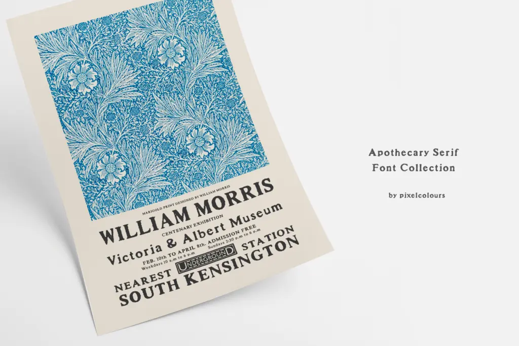
This is a font for projects that want to feel handmade and historic: packaging for small-batch goods, apothecary and wellness branding (the name isn’t accidental), wedding stationery with a rustic or antique theme, quote graphics, and product labels. The Caps version suits short headlines and logotypes where a few characters of bold, textured type can carry a lot of visual weight. The Spaced versions are better suited to short paragraphs — ingredient lists, taglines, or supporting copy beneath a script headline.
It’s not a font for interface work, long-form reading, or anything that needs to feel current or minimal. The texture that makes it charming at label size becomes noise at small body-text sizes or in dense paragraphs. Used within its lane — vintage branding, print-based packaging, decorative headings — it does its job without needing much dressing up around it.
What we liked, and what we didn’t
Strengths
- Four coordinated styles give real flexibility for mixing headings, caps, and body text
- The antique print texture feels considered rather than a generic distressed filter
- Caps version's dual-height lowercase-as-secondary-uppercase trick is a genuinely useful detail
Trade-offs
- Heavy texture limits legibility at small sizes or in long text blocks
- No plain or lightweight option within the family for moments that need a neutral serif
Apothecary Serif is a solid vintage-label serif with a well-considered four-style structure that gives it more layout flexibility than most decorative fonts in this niche. The texture is charming at display sizes but works against readability the smaller or denser the text gets. Best suited to designers already committed to a rustic, antique aesthetic rather than those needing a general-purpose serif.
Verdict

Tantype reviews typefaces in depth — every font is tested in real branding, editorial and screen layouts before a word gets written. 555+ fonts reviewed and counting.