
Pirate Fonts: 12 Best Pirate Fonts for Treasure Maps, Labels and Parties
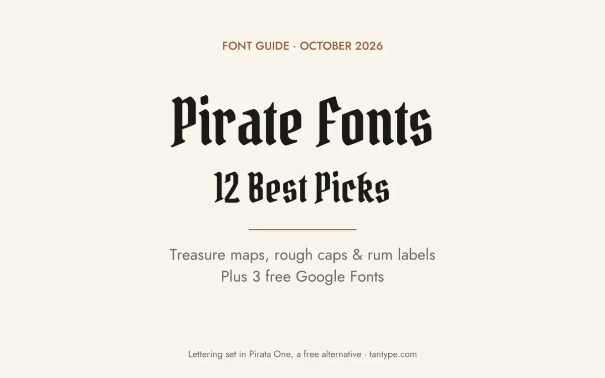
A pirate font is display lettering that makes a design look like it came from the age of sailing ships: pen-drawn treasure-map hands, rough old roman capitals, blackletter headings and weathered label type. None of it is a historical “pirate typeface”; it borrows from 17th- and 18th-century printing, old maps and the pirate stories written later.
Our top three picks are Treasure Trove for hand-lettered treasure maps, Captain Saltbeard for weathered caps with clean and rough styles, and Black Crest Pirates for a dark blackletter title. Every font in the main list is a commercial font sold on Creative Market and needs a licence. Three free Google Fonts are further down.
Browse pirate fonts on Creative Market Commercial fonts: see each listing for current pricing
What is a pirate font?
There was never a typeface that pirates used. “Pirate font” is a modern label for lettering that suggests the Golden Age of Piracy, usually dated from the 1650s to the 1730s, the period that shaped the popular idea of pirates. Most pirate fonts draw on four sources.
Maps and handwriting. According to Wikipedia’s treasure map article, there is no documented historical pirate treasure map. The image comes largely from Robert Louis Stevenson’s Treasure Island (1883), set in the 18th century, which popularised maps marked with an “X”. Fonts in this group copy quill handwriting or the lettering of real 17th-century maps.
Period printing. By about 1590 most European presses had moved from blackletter to roman type, but blackletter stayed in use into the 18th century for documents meant for a wide public, such as proclamations and Acts of Parliament. That was the world of George I’s 1717 Proclamation for Suppressing of Pirates, which offered pardons to pirates who surrendered and bounties for those who did not. For roman type, William Caslon’s types, first used in the mid-1720s, soon meant English printers no longer bought type from Holland. Worn type, uneven ink and rough paper give the weathered caps modern fonts imitate. For pure gothic lettering, see our guide to the best blackletter fonts.
Posters and signs. The slab-lettered wanted poster most people picture is a later American form built on 19th-century wood type, covered in our guide to western fonts. Old tavern signs were mostly pictures; Wikipedia’s pub sign article notes that most people in the Middle Ages could not read. Lettered “tavern” type is a modern sign-painter idea.
Sailor tattoos. Sailors tattooed anchors, ships, names and initials for centuries, and the bold black-outline “American traditional” style grew out of tattoo flash of the 1920s and 1930s, later popularised by Sailor Jerry, according to Wikipedia on sailor tattoos. Its banner lettering now turns up in nautical branding. Traits to look for:
- Rough, inky or worn edges
- Pen-drawn italics and handwriting for maps and logs
- Old roman capitals with oldstyle figures
- Blackletter titles for a darker mood
- Bundled skulls, anchors and badges for labels
The best pirate fonts at a glance
- Treasure Trove — crowquill treasure-map calligraphy
- Terra Ignota — italic map lettering based on a 1650 map
- Saltpetre — hand-inked 18th-century caps with borders
- 1822 GLC Caslon Pro — Caslon-style roman and italic with small caps
- Captain Saltbeard — six styles from clean to weathered
- Pirate Bay — label font with skull and sword illustrations
- Black Crest Pirates — condensed blackletter for titles
- Captain Shipwreck — distressed beer-label caps plus a clean version
- Galley — hand-drawn nautical serif with logo badges
- The Tattooist — traditional tattoo-style lettering in nine styles
- Oldforge — chipped medieval-style type for game titles
- Nightingale Script — antique quill hand for logs and letters
Best pirate fonts on Creative Market
1. Treasure Trove
Treasure Trove comes from Comicraft, the comic-lettering foundry, and is the most direct treasure-map font here. The listing calls it “cartographic calligraphy”: lettering artist JG Roshell drew it with a crowquill pen around a pirate and treasure-map theme. A crowquill nib makes fine, springy lines, so it reads like notes written on a chart rather than a printed title. The listing doesn’t detail alternates or language support, so check the character preview. Use it for map labels, invitations and game props.
See Treasure Trove on Creative Market
2. Terra Ignota
Three Islands Press based Terra Ignota on a reproduction of a 1650 map by the French cartographer Nicolas Sanson, right in the Golden Age of Piracy. It is a steady, deliberate italic, closer to the printed labels on a real map than to a scrawled clue. It is also the most complete font here: more than 800 glyphs, true small caps, ligatures, lining and oldstyle figures, a few cartographic ornaments and Central and Eastern European alphabets. Use it for maps, book covers and game worlds.
See Terra Ignota on Creative Market
3. Saltpetre
Magpie Paper Works drew Saltpetre from late 18th-century type specimens, inking the letters with antique dip pens and spacing them unevenly on purpose. It is uppercase only, with numerals, punctuation and currency figures (handy for a mock reward notice), plus period graphics and interlocking borders. The listing suggests cartography and historical reproduction. The same shop’s Jacob Riley, also based on 18th-century printers’ specimens, is suggested for letters and children’s books.
See Saltpetre on Creative Market
4. 1822 GLC Caslon Pro
For a pirate-era design that stays readable in longer text, use the type printers actually had. GLC Foundry modelled this family on William Caslon’s 18th-century type, working mainly from a Caslon-style set used by a printer in Bruges in the early 1800s. It has Regular and Italic styles, each with complete small caps, and covers Western, Central and Eastern European languages, including Celtic diacritics and Turkish. Use it for ship’s articles, mock proclamations, menus and book interiors.
See 1822 GLC Caslon Pro on Creative Market
5. Captain Saltbeard
Harris Thornton of The Bird Life Design Co. made Captain Saltbeard as a pirate-themed serif for logos and branding. Its six styles run from crisp to battered: Clean Press, Bold Press, Black Press, Rugged, Weathered and Overboard. A free set of 12 vector pirate icons is included. One quirk: the default numerals are Roman numerals, and you hold Option (Alt) to type 0–9. It is supplied as OTF. Good for kids’ party invitations, rum labels and pub branding.
See Captain Saltbeard on Creative Market
6. Pirate Bay
VozzyStock’s Pirate Bay is a vintage label font with five styles plus an aged version, aimed at posters, labels, logos and shirts. The package suits merch work: besides OTF, TTF, WOFF and WOFF2 files, it includes four t-shirt designs and illustrations of skulls, bones, swords, a ribbon and an anchor in EPS, JPG and PNG. Use it for rum and beer labels, party kits and apparel. The same shop’s Seaman Label Font offers clean and grunge sets for a plainer nautical look.
See Pirate Bay on Creative Market
7. Black Crest Pirates
PutraCetol Studio’s Black Crest Pirates is a bold blackletter display face. Its letters are tall and slightly condensed, with pointed serifs and strong thick-thin contrast, so a single word reads as dark and official. It is a single font, released in late 2025, and the listing doesn’t mention alternates. Keep it to short titles: game logos, event posters, book covers and band merch, with a plain roman such as Caslon for any text underneath.
See Black Crest Pirates on Creative Market
8. Captain Shipwreck
Jon Swinn designed Captain Shipwreck for Alphabet Agency with beer labels, biker jackets and pirate and outlaw themes in mind. It is heavy and distressed, with a worn-paint texture, and the designer suggests bars, navy graphics, tattoos and emblems. A clean companion, Captain Regular, is included for small sizes and embroidery where texture would fill in. It has upper and lowercase, numbers and extra glyphs. Use it for craft beer, barbershops and nautical apparel.
See Captain Shipwreck on Creative Market
9. Galley
Kait Kenobi of Midnight Grim drew Galley as a hand-drawn serif inspired by the waves of a dark ocean. It is quieter than most pirate fonts, so it suits nautical branding that wants a seafaring mood without skulls, and the listing says it works for paragraphs as well as display. The package adds 9 hand-drawn illustrations and 5 logo badges as AI, PSD and PNG files. A reviewer notes it lacks accented letters. The same shop sells a five-style Dark Seas family.
10. The Tattooist
Nicky Laatz’s The Tattooist is a hand-drawn typeface for traditional, quirky tattoo-style artwork, the kind of lettering used in old-school tattoo banners; Creative Market files it under blackletter. It has nine styles: Regular, Medium and Heavier, each with an oblique and a “max oblique”. Swoopy alternate capitals, extra swoops for H and K and a set of dingbats come through OpenType or the glyphs panel, and it is PUA encoded. Use it for nautical tattoo flash, rum and barbershop branding and shirts.
See The Tattooist on Creative Market
11. Oldforge
Iuliia Mazur (softulka) designed Oldforge to echo worn manuscripts, old carvings and hand-forged objects. The strokes are thick and uneven, with chipped edges built into the letters rather than laid on as a texture. It leans fantasy rather than seafaring, which suits pirate video games, tabletop adventures and tavern signs in game worlds. It is one style in OTF, TTF and WOFF, with a PDF preview sheet. Keep it to titles and short labels.
See Oldforge on Creative Market · Read our Oldforge review
12. Nightingale Script
Nicky Laatz based Nightingale Script on old manuscripts and left the wobble in: pressure changes, loose joins and strokes that overshoot like real ink. Use it when a design needs a captain’s log, a ransom note or a letter from a sea chest. Alternate “t” and “y” forms and bonus ligatures come through OpenType, and a Photoshop style adds the watercolour look in the previews. The designer suggests pairing it with Apothecary Serif, a rough 18th-century-style serif.
See Nightingale Script on Creative Market · Read our Nightingale Script review
How to choose a pirate font
Pick the prop first. A treasure map or log calls for handwriting (Treasure Trove, Terra Ignota, Nightingale Script). A notice or reward bill calls for old printing (Caslon, Saltpetre, Black Crest Pirates). A bottle, badge or shirt calls for a label font with extras (Pirate Bay, Captain Saltbeard, Captain Shipwreck).
Kids’ pirate parties. Guests need to read the time and address. Set the details in a bold, open style such as Captain Saltbeard’s Bold Press and save rough or script styles for the headline.
Rum and beer labels. Fonts with clean and distressed versions keep small text sharp while the name looks aged. Check texture at final print size; worn effects can fill in.
Game design. A Desktop licence covers fonts only as images in games. If the font is built into the game for menus or dialogue, you need an App licence.
Nautical branding. For a seafood restaurant or coastal shop, pick the quieter fonts (Galley, Caslon) and let illustrations carry the theme.
Free pirate fonts
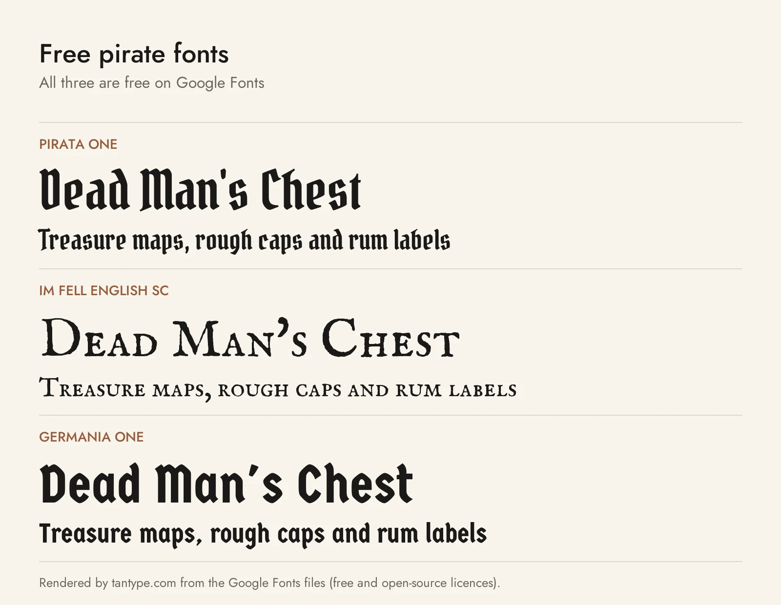
These three Google Fonts are free for personal and commercial use under the SIL Open Font License. None copies the paid fonts above or has their extra styles and illustrations.
- Pirata One — a condensed gothic textura by Rodrigo Fuenzalida and Nicolas Massi, simplified for screens. Despite the name it is a plain blackletter, cleaner and lighter than Black Crest Pirates.
- IM Fell English SC — Igino Marini’s digitisation of the Fell types, collected by Bishop John Fell for the Oxford press from 1668. It is the free option closest to real 17th-century printing: rough, inky small caps with oldstyle figures, suited to mock proclamations. Small caps replace the lowercase.
- Germania One — John Vargas Beltrán’s mix of old fraktur and simple geometric shapes. Heavy and easy to read, it suits party invitations and labels, though it has none of the worn texture of Captain Saltbeard or Pirate Bay.
Licensing: personal vs commercial use
Creative Market’s font licences come in four types:
- Desktop: unlimited personal and commercial projects, including physical products, packaging and ads. On websites and in games the font may only appear as an image. One seat per user.
- Webfont: embedding on websites you own, up to the pageview limit chosen at checkout.
- App: embedding in one app or game, as long as the font can’t be extracted.
- E-pub: embedding in one ebook.
Only the licensee may use the font to make a finished product, so print-on-demand tools where customers type their own text aren’t covered. In a trademarked logo the font must be modified, not the dominant element, and disclaimed. The licence page doesn’t mention tattoos, so ask the designer before using a font for tattoo flash. Designers can add terms, so read each listing. This is a summary, not legal advice.
Pirate font FAQ
What is the pirate font called?
There is no single pirate font. People usually mean treasure-map handwriting or old printed caps and blackletter. Treasure Trove and Terra Ignota cover the map look; Captain Saltbeard and Black Crest Pirates cover the printed look.
Did real pirates use a special typeface?
No. Printing of the pirate era used the ordinary types of the day: roman types such as Caslon’s, blackletter for some official notices, and handwriting. The skull-and-map style came later, shaped by Treasure Island.
Are there free pirate fonts?
Yes: Pirata One, IM Fell English SC and Germania One on Google Fonts. Avoid sites offering “free” copies of paid pirate fonts; they can’t give you a licence.
What font looks like a treasure map?
A pen-drawn hand or map-style italic. Treasure Trove was lettered with a crowquill pen for that purpose, and Terra Ignota is based on a 1650 map.
Can I sell rum labels or party invitations made with pirate fonts?
A Creative Market Desktop licence covers products you make and sell yourself, but not templates where customers edit the text. Check each listing for extra terms.
