
Tomato Ketchup Retro Serif: a bold vintage display face for logos and packaging
Design style
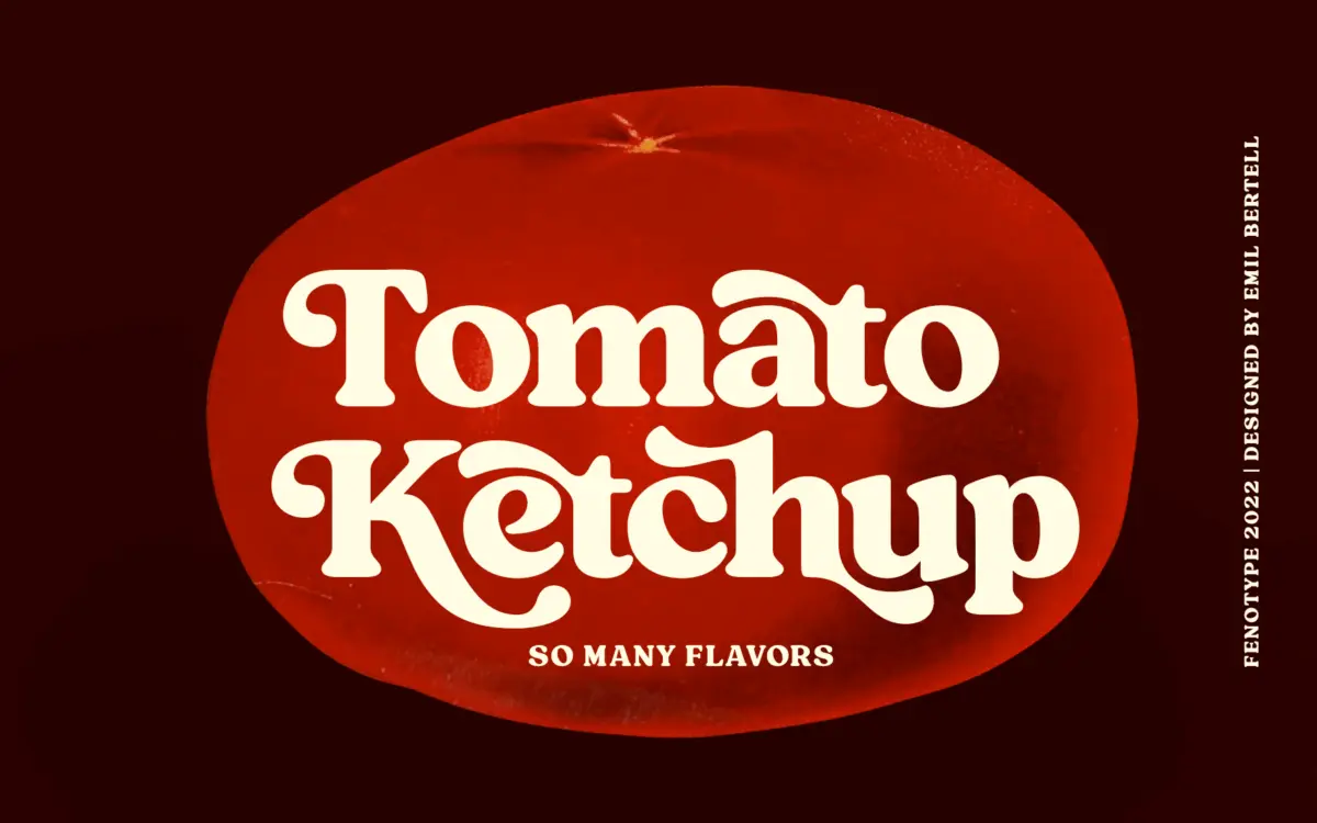
Tomato Ketchup is a heavyweight serif built for nostalgia rather than neutrality. The strokes are thick and slightly uneven, with bracketed serifs that look pressed rather than drawn, and there’s a wobble to the curves that reads as hand-cut rather than digitally perfected. It sits in that mid-century American vernacular territory — diner signage, hand-painted grocery labels, old soda branding — without leaning fully into script or novelty lettering. The weight is consistently heavy across the alphabet, so there’s no light companion built into this particular file; it’s a one-note instrument, but the note is a good one.
What separates it from generic “vintage bold serif” templates is the looseness in the joints. Terminals are blunt and a little irregular, counters are tight, and the overall texture has more warmth than precision. It won’t be mistaken for a corporate serif at any size — that’s the point.

Character set and features
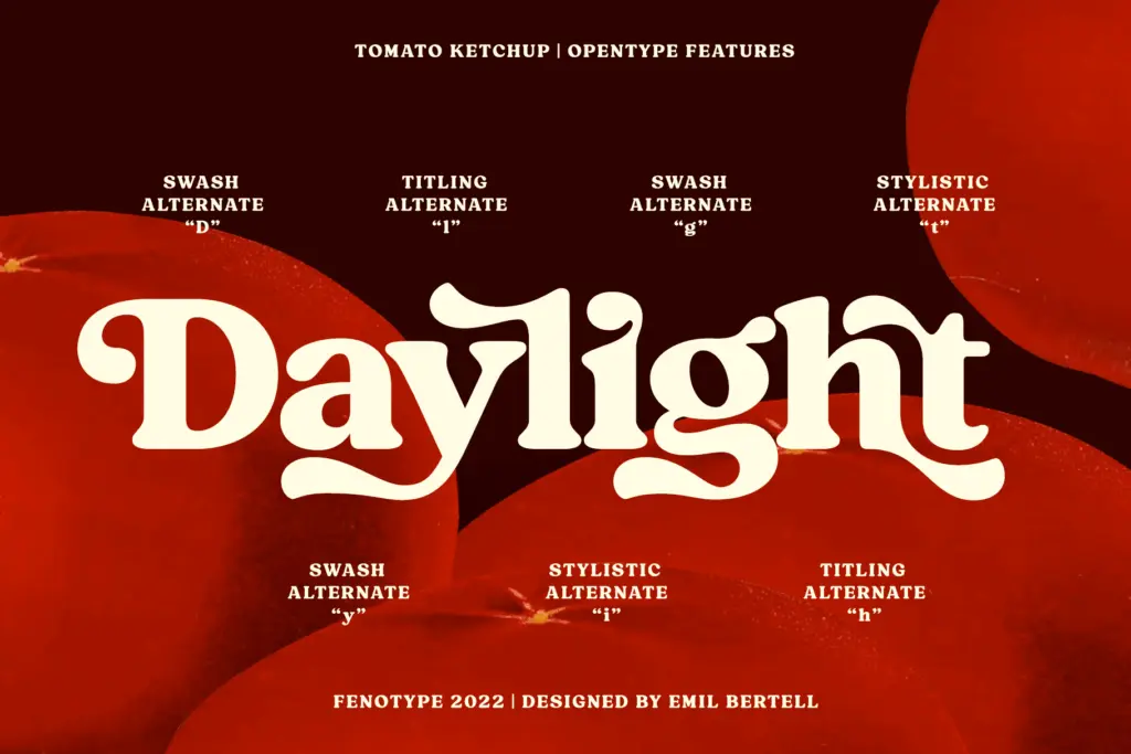
The OpenType feature set is where this font earns its keep. Contextual alternates are active by default and quietly resolve awkward letter collisions, so out-of-the-box typing already looks more considered than a straight default install. Beyond that there are stylistic alternates, swash characters, titling forms, and discretionary ligatures, all reachable either through OpenType panels in apps that support them or manually via the Glyphs or Character map, since the extra characters are PUA-encoded. That matters practically: designers working in software without full OpenType feature support can still get at the swashes and alternates, which isn’t always true of display fonts built this way.
The alternates give the face genuine range for a single-weight design. Swap in a swash capital or a titling variant and a logotype starts to feel bespoke rather than typed. This is a font that rewards someone willing to go glyph-hunting rather than accept the default string, and punishes someone who just types a headline and walks away — the base character set alone is fine but not remarkable.
Use cases
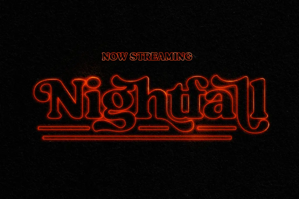
This is a display font, full stop — it’s not intended for body copy and shouldn’t be asked to do that job. At the sizes it’s built for, headlines, logotypes, packaging lockups, short menu copy, badge and label work, it holds its heaviness well and the retro character comes through clearly. The seller’s own advice to tighten tracking for a denser word-image is sound; the letterforms are chunky enough that loose spacing starts to look accidental rather than intentional.
It suits food and beverage branding obviously, given the name and the reference points, but also fits craft goods, small-batch packaging, restaurant signage, and any project chasing a mid-century Americana feel without going full script or full grunge. It’s less useful for anything needing restraint or a contemporary, neutral voice — this face has a strong opinion and doesn’t try to hide it. Pushed down into small text sizes, the irregularity that gives it character starts to work against legibility, so it’s best kept to short-form, larger-scale use.
What we liked, and what we didn’t
Strengths
- Contextual alternates fix letter collisions automatically without extra setup
- Deep swash, titling and ligature set gives real variation from a single weight
- PUA encoding means the extra glyphs are accessible even in apps without full OpenType support
Trade-offs
- Single heavyweight design with no lighter companion for hierarchy
- Irregular terminals lose clarity fast once pushed below headline sizes
Tomato Ketchup delivers convincing mid-century warmth in a single heavy weight, with a feature set generous enough to make each use feel custom-built. It's a specialist display face, not a workhorse, and it knows it. Best suited to short, large-scale applications where its retro texture can do the talking.
Verdict

Tantype reviews typefaces in depth — every font is tested in real branding, editorial and screen layouts before a word gets written. 555+ fonts reviewed and counting.