
Milkstore: a hand-painted brick-wall face set for vintage badges and packaging
Design style
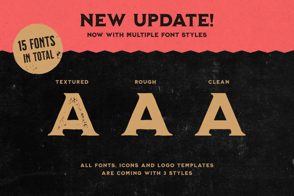
Milkstore reads as a sign-painter’s alphabet run through a wall of old brick. The five styles inside the collection share a lettering skeleton but differ in surface: a textured version with cracked, chalky edges, a rougher variant with heavier breakup, and a clean version with the texture stripped out entirely. That range is the whole pitch. You get the worn, distressed look for a mock-up, then a smoother cut of the same letters for anywhere the grime would be a liability, such as small print or embroidery mock-ups.
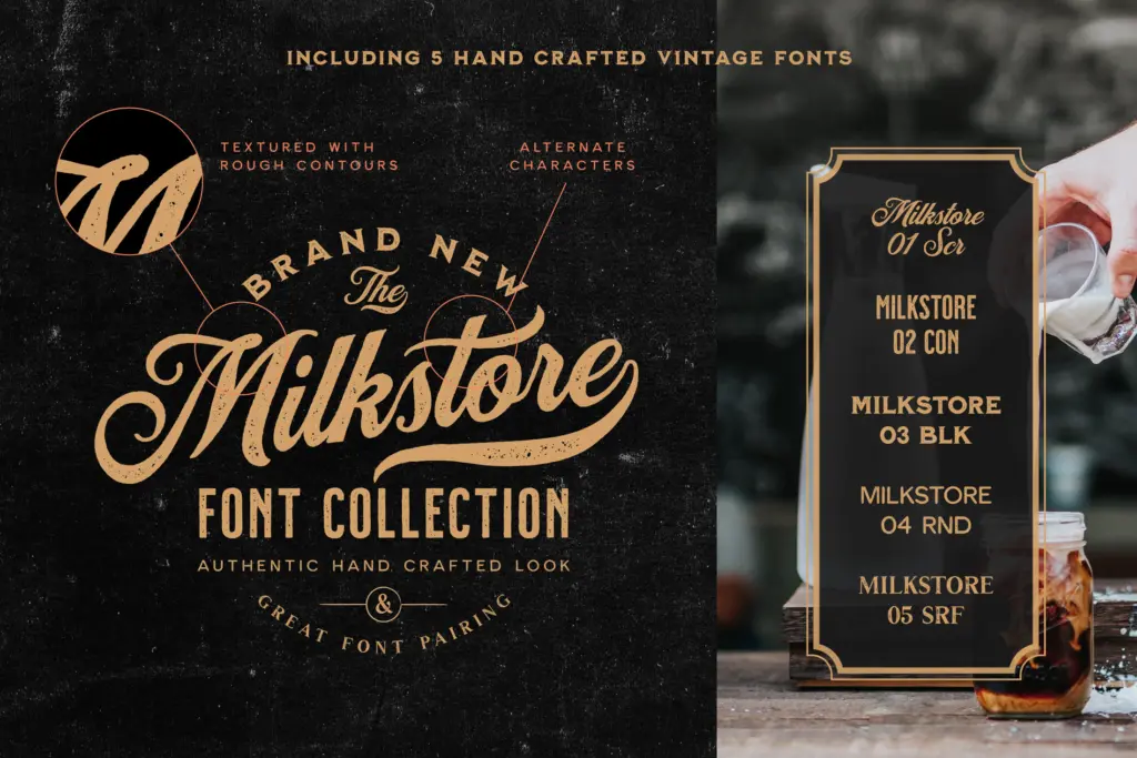
The uppercase-only companions (02 through 05) function more as supporting voices than standalone display faces — condensed, slightly narrower strokes that read as stencil or brush-adjacent cousins to the main hand. None of them are neutral. The brief is vintage Americana: hand-painted grocery signage, feed-sack lettering, brick-wall murals advertising a defunct soda company. If that reference point doesn’t suit the job, nothing in this set will bend far enough to help.
Character set and features
The primary face, Milkstore 01, is the one built for actual setting: it includes alternates and swashes, giving some relief from the repetition that plagues hand-lettered fonts when the same letterform appears twice in a headline. Numerals and punctuation are covered, and accented characters for Western European languages are included, so the set will hold up for French, German, or Scandinavian copy without falling back to bare Latin.
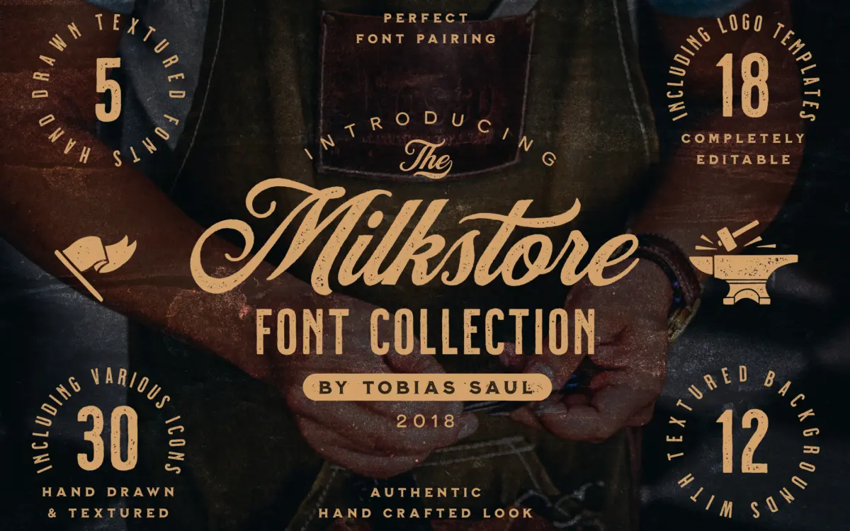
The other four faces are uppercase-only, which is worth noting before building a layout around them — they’re built for short bursts of type (a badge line, a stamp, a single word on a crate label) rather than paragraphs or even full sentence-case headlines. The bundled extras — eighteen editable logo templates, more than thirty hand-drawn icons, and twelve textured backgrounds — round the collection into something closer to a badge-design kit than a font release. The icons and templates come in matching clean and textured versions, which at least keeps the whole kit consistent in finish.
Use cases
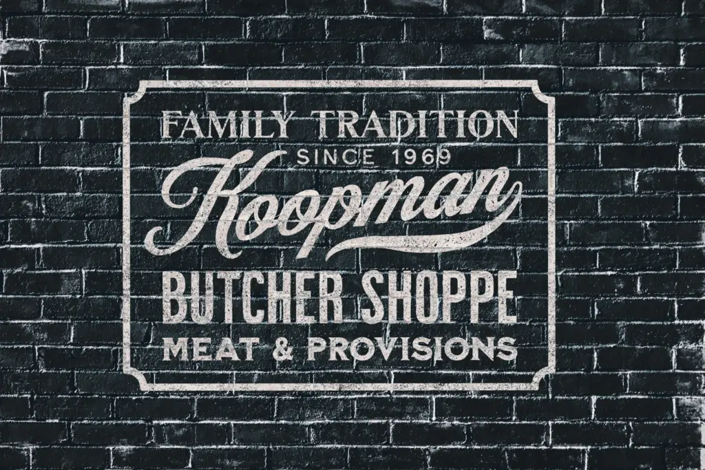
This is a collection for packaging, badge logos, and title cards that want to look like they’ve been on a wall since the 1950s: craft beverage labels, farmers’-market branding, artisanal food packaging, retro apparel graphics. The alternates in Milkstore 01 give a logo designer enough variation to avoid the obvious hand-lettered tell of repeated letterforms in a short wordmark.
It’s not a typeface for body copy, UI, or anything that needs to stay legible at small sizes across a paragraph — the texture and the uppercase-only companions rule that out immediately. Treat it as a lettering toolkit for a specific job: one word, big, textured, with a badge or icon wrapped around it. Outside that lane, reach for something else.
What we liked, and what we didn’t
Strengths
- Alternates and swashes in the primary face help avoid repeated-letterform tells in short logo lines.
- Textured, rough and clean versions of the same skeleton give flexibility in finish without changing the letterforms.
- Bundled icons, templates and backgrounds mean the badge or label can be built without sourcing extra assets.
Trade-offs
- Four of the five faces are uppercase-only, ruling out sentence-case headlines or any real body text.
- The vintage brick-wall texture is a strong, specific look that won't suit projects outside its retro-Americana lane.
Milkstore is a well-executed vintage lettering kit built for one job: short, textured wordmarks on badges and packaging. It's not trying to be a general-purpose typeface, and judged against that narrower goal it delivers, but the uppercase-only companion faces and heavy texture limit where it can go.
Verdict

Tantype reviews typefaces in depth — every font is tested in real branding, editorial and screen layouts before a word gets written. 555+ fonts reviewed and counting.