
Amaretti: a vintage-signage script with three weights and real swash range
Design style
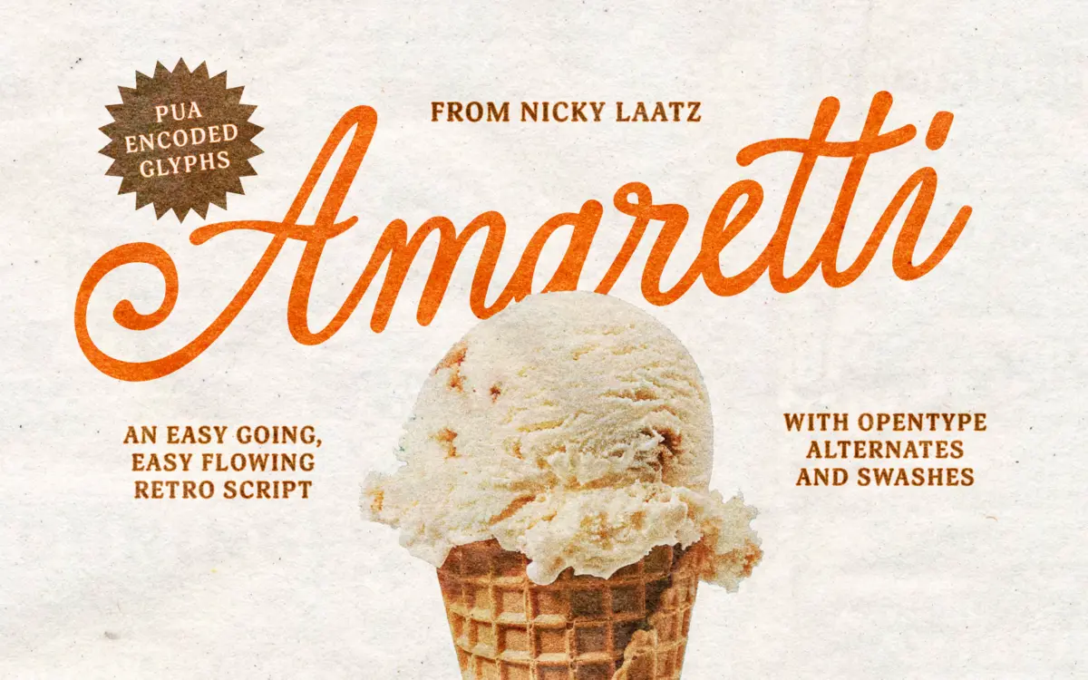
Amaretti belongs to the family of calligraphic scripts built to look hand-lettered rather than machine-drawn, and it pulls its reference points from mid-century advertising signage. You can see it in the way the strokes swell and taper — thick where a brush would press down, thin where it would lift — rather than following the flatter, more mechanical contrast of a lot of contemporary scripts. The joins between letters lean loose and gestural, with entry and exit strokes that curl rather than snap shut, which gives the whole thing a warmer, less rigid feel than script faces built strictly for logotype work.
The three weights give the design more range than most scripts bother with. A lighter weight reads as delicate and closer to fine-tip lettering, the middle sits as the general-purpose option, and the heaviest pushes the swells further, closer to a brush-marker feel. Each weight also comes with an oblique, which is a nice inclusion for a script — obliques on scripts often look forced, but here the slant reads as a natural extension of the calligraphic angle rather than a digital shear.
Character set and features
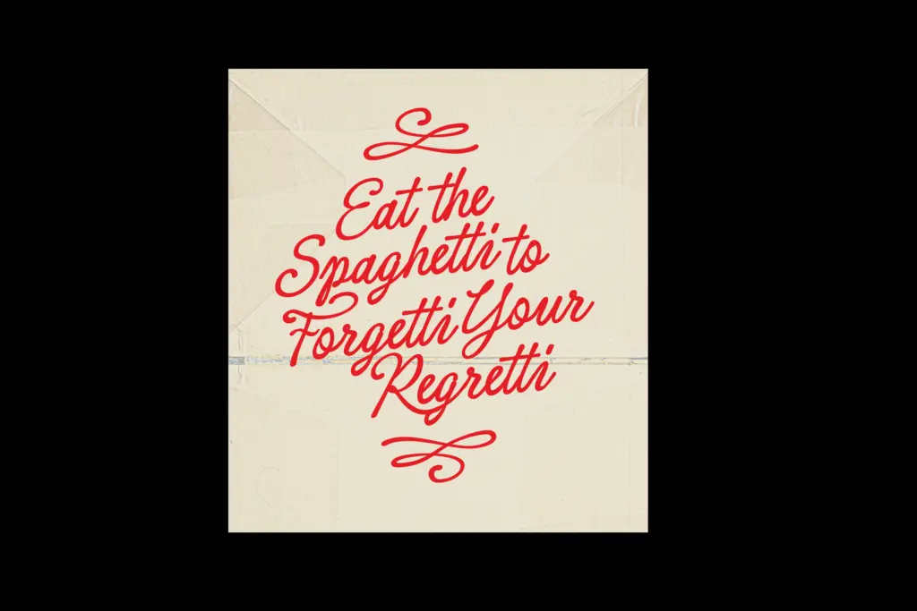
The OpenType layer is where Amaretti earns its keep. There are contextual alternates, ligatures and swash variants built in, which matters for a script because repeated letterforms in a word — double Ls, double Ss — are the quickest way to make hand-lettering look like a template. With alternates cycling in, a word like “Hello” or “Wedding” avoids the stamped-out look that undressed scripts tend to fall into. The swashes extend well beyond the baseline and x-height, so they need setting with generous line spacing to avoid collision with the line above or below.
Language support is limited to English, with a handful of common single diacritics included, so anyone setting French, Spanish or Central European text with fuller accent marks will need to check coverage first, or contact the designer directly as the brief suggests. It’s PUA-encoded, meaning the full alternate set is reachable inside apps like Canva that don’t support standard OpenType feature menus — a practical detail for anyone not working in InDesign or Illustrator.
Use cases
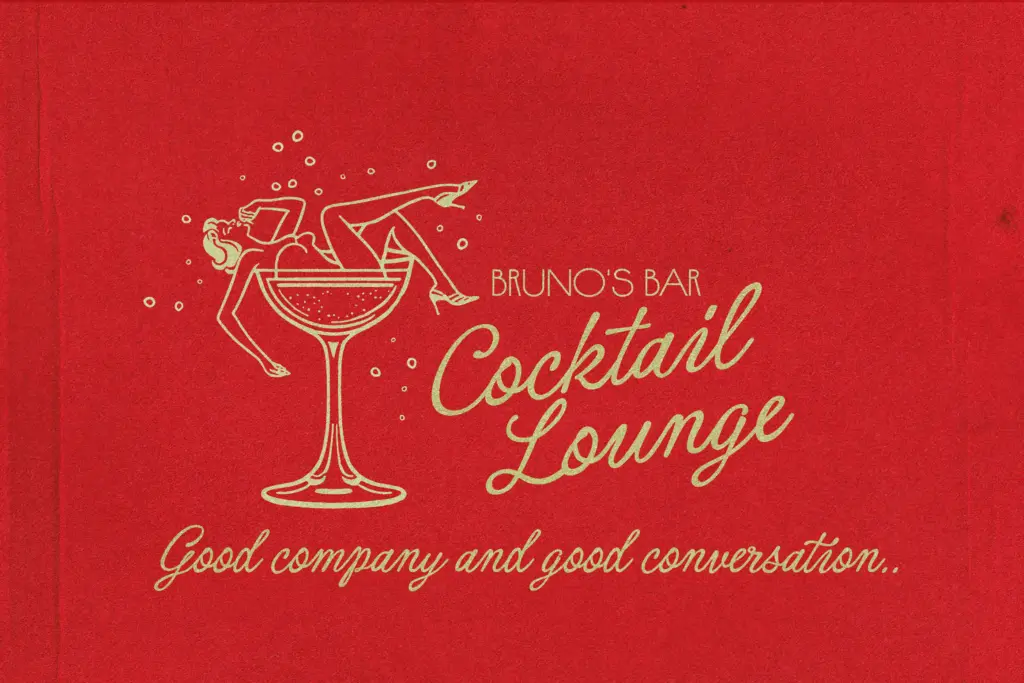
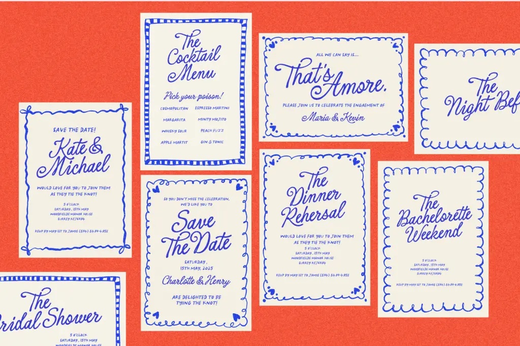
This is a display script, not a text face, and it wants to be set large — headlines, invitation lines, packaging lockups, short greetings. The lighter weight suits wedding stationery and greeting cards where a gentler touch is wanted; the bolder weight suits badge-style signage, matchbook-style branding and retail packaging where the lettering needs to hold up at a glance. The three-weight, oblique-inclusive structure means a single purchase covers a fair spread of a brand’s script needs without switching families, from a soft subhead to a punchier lockup. It is not built for paragraph-length copy, and pushing it there will expose how much the swashes rely on space around them to read cleanly.
What we liked, and what we didn’t
Strengths
- Three weights plus obliques give it more range than a typical single-weight script
- Contextual alternates and swashes prevent repeated letters from looking stamped out
- PUA encoding makes the full alternate set usable inside Canva
Trade-offs
- Language support is limited to English with only basic diacritics
- Swash extensions demand generous line spacing, limiting it to short, large-scale settings
Amaretti is a well-built vintage script with more range than most, thanks to its three weights and oblique companions. The swash and alternate system does the real work of keeping it from looking templated, though it demands generous spacing and stays firmly in display territory.
Verdict

Tantype reviews typefaces in depth — every font is tested in real branding, editorial and screen layouts before a word gets written. 555+ fonts reviewed and counting.