
PressBox Font Combo: a letterpress-style sans and slab duo for vintage posters
Design style
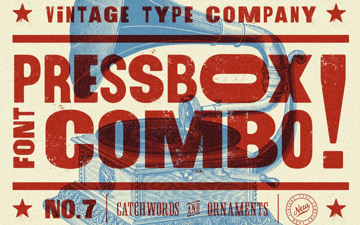
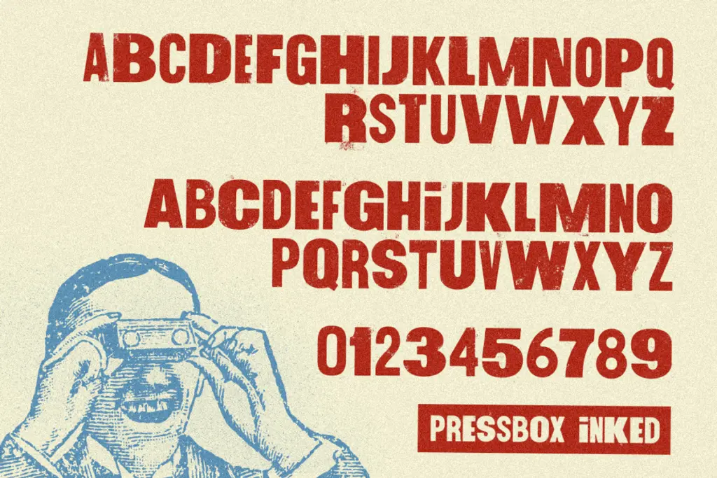
PressBox belongs to the well-worn tradition of American wood-type revival: thick, confident sans-serif letterforms that lean on the memory of hand-set letterpress posters, hardware store signage, and old circus bills. The main face, PressBox Display, carries that heavy, block-like presence, with a trick built into the case switching — capitals and lowercase pull from different widths, so you can knock out a condensed line or a wide one just by changing case rather than reaching for a separate style. It’s a simple mechanism but a genuinely useful one for anyone laying out a poster where line lengths need to be coaxed into a fixed measure.
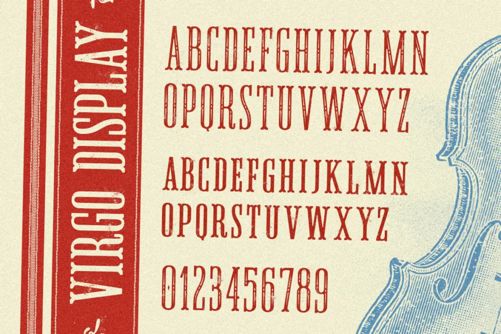
Virgo Display, the second face in the combo, plays a different role. It’s a condensed serif with spurs — small projecting details at the terminals that give it a stencilled, engraved quality rather than a purely typographic one. Set in all-caps with small-cap lowercase, it reads as a companion voice: narrower, more formal, better suited to a subhead or a line of supporting copy than to carrying a whole headline. Both fonts include an inked alternate style, which roughens the edges just enough to suggest worn type rather than a clean digital vector — useful if the rest of your layout is doing distressed textures or halftones and a crisp outline would look out of place.
Character set and features
The bundle’s real bulk comes from the pairing of two display faces plus a third, purely ornamental font — Virgo Ornaments — stocked with catchwords, flourishes, and decorative elements meant for building borders and frames around a poster or label. This is worth noting because a lot of vintage-styled combos skip the ornamental layer entirely and leave you hunting for a separate decorative font later; here it’s included as part of the same visual family, which keeps the kerning and stroke weight consistent across border and text.
PressBox and Virgo Display both carry multilingual character support across a broad set of Latin-based languages, from Czech and Polish to Welsh and Icelandic, which matters if your poster work needs to travel beyond English-language markets. The ornamental font, being decorative rather than textual, doesn’t need the same coverage and isn’t claimed to have it.
Use cases
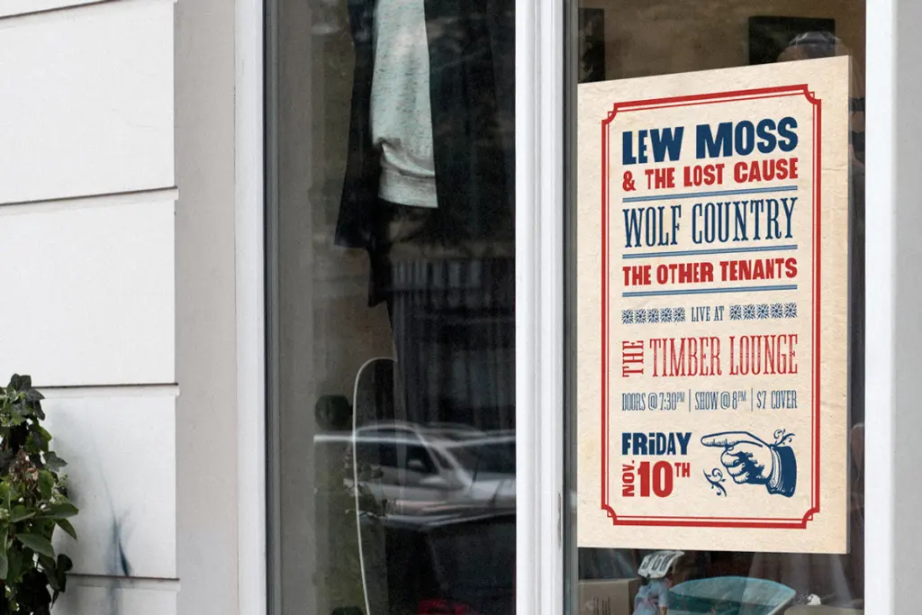
This is a combo built for a specific job: vintage-inspired posters, packaging labels, badge logos, and any layout that wants to look like it came off a hand-fed press rather than a laser printer. PressBox Display works as the headline voice, Virgo Display as a supporting line or a stylised word mark, and the ornaments fill in the borders and dividers that make the whole thing read as a unified period piece. It’s less suited to body text or long-form reading — the case-switching width trick and the spurred serif detailing are both headline devices, not paragraph ones. For craft beer labels, whisky packaging, western-themed branding, or event posters chasing an Americana mood, it does the job efficiently and without much fuss.
What we liked, and what we didn’t
Strengths
- The case-switching width mechanism in PressBox Display solves a real poster-layout problem without extra styles
- The bundled Virgo Ornaments keeps borders and decorative elements visually consistent with the type rather than mismatched
- Broad multilingual Latin character support on both display fonts extends its reach beyond English-only projects
Trade-offs
- Designed entirely for display use, so it offers nothing for body copy or long-form text
- The spurred, condensed serif of Virgo Display is distinctive but narrow in application, mostly useful as a supporting line rather than a lead
PressBox does one thing convincingly: it looks like worn American wood type, and the case-switching width trick is a genuinely clever bit of engineering. It's a headline and label tool through and through, not a text face, so its usefulness narrows fast outside vintage poster and packaging work.
Verdict

Tantype reviews typefaces in depth — every font is tested in real branding, editorial and screen layouts before a word gets written. 555+ fonts reviewed and counting.