
90s Fonts: 10 Best Nineties Fonts for Grunge, Y2K, Pixel and Hip-Hop Designs
The best 90s fonts don’t share one look, because the decade had several: grunge magazine type, photocopied zine lettering, pixel fonts from games and the early web, hip-hop graffiti and the chrome futurism of the Y2K years. A 90s font is any typeface drawn to recall one of those looks, from the decade itself or from today’s revival.
If you only try three, start with Inktoner for photocopied grunge, Perfectly Nineties for the tightly spaced serif of 90s magazines, and ChromeKid for Y2K and techno titles. All ten picks are commercial fonts sold on Creative Market, so they need a licence. Three genuinely free options from Google Fonts are further down.
See 90s fonts on Creative Market Commercial fonts; one-seat desktop licences for these picks are $15 to $49 at regular price (October 2026)
What is a 90s font?
The 1990s started where the 80s left off: Creative Market’s guide to 90s fonts from film and TV says the first few years were “just a continuation of the 1980s”. For neon, synthwave and arcade lettering, see our best 80s fonts. Six looks defined the decade.
Grunge and David Carson. Ray Gun, an alternative music magazine published from 1992 to 2000, used a chaotic style that became known as “grunge typography”. It wasn’t always readable: it once set an interview with Bryan Ferry entirely in the symbol font Zapf Dingbats. Its founding art director, David Carson, built a collage-like style of layered photos and messy type.
Early web and pixel fonts. In 1996 Microsoft started the core fonts for the Web project, a free pack that included Arial, Georgia, Impact, Verdana and Comic Sans MS. Pixel fonts filled buttons and banners: Silkscreen, released by Jason Kottke in 1999, was made for small web graphics, and game consoles drew their menus on the same kind of grid.
Comic Sans, 1994. Vincent Connare drew Comic Sans at Microsoft in 1994 after seeing Times New Roman in the cartoon speech bubbles of a test version of Microsoft Bob. It shipped with a Windows 95 add-on pack, became a default font in Publisher and Internet Explorer, and has been mocked for overuse ever since.
Rave flyers and techno. Sheffield’s The Designers Republic designed sleeves for Warp Records artists such as Aphex Twin and Autechre, a style that became “the visual language of ambient techno”. Swiss studio Büro Destruct, which made electronic music flyers from 1994 to 2005, says computers, techno and party culture created a new typographic language.
Hip-hop and graffiti. The mid-80s to mid-90s are known as hip-hop’s “golden age”, and its graphics grew out of graffiti. Cey Adams, a graffiti artist who became Def Jam’s founding creative director, co-founded its in-house design firm, the Drawing Board. Graffiti’s bubble letters and wildstyle go back to New York writers of the early 1970s.
Y2K and Trajan. The Y2K aesthetic of the late 90s and early 2000s meant chrome, translucent plastic, gradients and chunky or rounded fonts with glossy effects. At the other extreme, Trajan, the all-caps serif Carol Twombly drew for Adobe in 1989 from the inscription on Trajan’s Column, became known for appearing on many film posters. Our Trajan Pro guide covers it.
The best 90s fonts at a glance
- Inktoner — photocopied grunge sans with a layerable Ink Bleed style.
- Perfectly Nineties — tightly spaced magazine serif with print-texture actions.
- ChromeKid — Y2K techno display face in four layerable styles.
- Flyer TM — distressed serif in the spirit of 90s fan zines.
- Lost Inside — deliberately unstable type for Ray Gun-style layouts.
- Rose-Tinted — pixel family with italics, inspired by 90s Nintendo games.
- The Ultimate 90s Font Pack — five casual fonts for a 90s sitcom feel.
- Rage Machine — spray-paint graffiti script for mixtapes and streetwear.
- Angel TM — spiky tribal Y2K lettering.
- Dripdrop Liquid Font Set — glossy liquid-ink letters with drips and splats.
Best 90s fonts on Creative Market
Prices are the regular one-seat desktop licence on Creative Market, checked on October 16, 2026. Shops run sales often, so check the listing before you buy.
1. Inktoner
Inktoner, from ikiiko type, imitates a page that has been through a photocopier too many times: heavy, blocky letters with ink spread, broken edges and grit built into the outlines, which the listing says gives “90s vibes”. Its two styles, Regular and Ink Bleed, can be stacked slightly off-register for a misprinted double pass. Uppercase, lowercase, numerals and multilingual support come in TTF and OTF. The ink detail clumps at small sizes, so keep it big: gig flyers, zine mastheads, album covers and film titles. Desktop licence: $21.
See Inktoner on Creative Market · Read our Inktoner review
2. Perfectly Nineties
Jen Wagner made Perfectly Nineties after noticing the “classic, tightly spaced serifs of the 80s & 90s” coming back. It has moderate contrast, a slightly condensed build and close spacing, like a 90s magazine cover line, and its italic is meant to be mixed into the same headline. This listing has Regular and Italic with numerals and foreign-language support, plus two Photoshop actions for a vintage magazine print texture. For display, the designer suggests tracking of about -10 to -20. Use it for editorial work, beauty packaging and wordmarks. Desktop licence: $49.
See Perfectly Nineties on Creative Market · Read our Perfectly Nineties review
3. ChromeKid
ChromeKid, from Igor Ovsyannykov’s shop HipFonts, takes its cue from early-2000s digital and techno graphics, with sleek curves and a metallic feel. The four styles, Regular, Italic, Shaded and Outline, can be layered for a two-tone or outlined title without building it by hand. Formats aren’t listed beyond Creative Market’s general OTF/TTF note. Use it for club flyers, album covers, techwear and game titles. Desktop licence: $17 at regular price.
See ChromeKid on Creative Market
4. Flyer TM
Flyer TM, a distressed serif by Leo Karhunen of Type Mania, aims for the hand-printed, do-it-yourself look of 90s fan zines. Where Inktoner is a heavy sans, this is a serif with a worn, hand-printed finish, and the listing suggests it for editorial work as well as posters. It is a single style in OTF, TTF and WOFF2, covering Western and Central European and Pan-African Latin. Pair it with Inktoner headlines. Use it for zines, gig posters, book covers and flyers. Desktop licence: $24.
See Flyer TM on Creative Market
5. Lost Inside
Anastasiia Ivanskaia’s Lost Inside is a recent font, not a period one, but it follows the Ray Gun idea that type can be an image first and text second. The letters are unstable and distorted on purpose, meant to “feel slightly wrong”. Instead of a standard upper and lowercase it has two sets of letterforms you can mix, plus numerals, punctuation and multilingual support, in OTF and TTF. Keep it to short statements: posters, album art and editorial openers. Desktop licence: $19.
See Lost Inside on Creative Market · Read our Lost Inside review
6. Rose-Tinted
Wendy Murphy based Rose-Tinted on two Nintendo games of the decade, The Legend of Zelda: Link’s Awakening and Super Mario 64. Unusually for a pixel font, it has Regular, Italic, Bold and Bold Italic, with about 363 glyphs each. Files are OTF and TTF. The designer recommends multiples of 25 px with anti-aliasing off. Use it for game interfaces, stream overlays, pixel-art posters and early-web-style graphics. Desktop licence: $15.
See Rose-Tinted on Creative Market · Read our Rose-Tinted review
7. The Ultimate 90s Font Pack
Denise Chandler’s pack is the bright, cartoony side of the decade; Creative Market’s blog says some of its fonts recall sitcoms such as A Different World, Martin and In Living Color. You get four casual fonts, Truant, Totally Tubular, Childish Reverie and Highflier (Regular, Shadow, Scribble, Slice and Block), plus a bonus font, Oh Snap, with a Filler style. Three fonts also come in colour OpenType-SVG versions, which need an app that supports colour fonts. Use it for party invites, school merch and playful social graphics. Desktop licence: $22.
See The Ultimate 90s Font Pack on Creative Market
8. Rage Machine
Rage Machine, also from ikiiko, is a hand-drawn spray-paint font that the listing says “channels the unfiltered energy of graffiti art”. The strokes are rough at the edges, like paint from a can that is running low, and the letters lean forward and connect fast. It has uppercase, lowercase, numerals, punctuation, ligatures and multilingual support, in TTF and OTF; no alternates are listed. The joins need some hand kerning. Use it for mixtape covers, streetwear, skate graphics and posters. Desktop licence: $21.
See Rage Machine on Creative Market · Read our Rage Machine review
9. Angel TM
Angel TM, another Type Mania font, is what the shop calls a Y2K tribal font with “a bit of that early 2000s edge”. The letters take the spiky shapes of tribal art. It is classed as a script and ships as OTF, TTF and WOFF2, with Western and Central European and Pan-African Latin support. The listing shows upper and lowercase but doesn’t mention numerals or OpenType features, so check the preview if you need numbers. Use it for apparel, band merch, posters and digital art. Desktop licence: $24.
See Angel TM on Creative Market
10. Dripdrop Liquid Font Set
Sam Parrett made Dripdrop from real squirts of liquid ink on paper, so every letter bulges and drips. The main font has built-in light reflections that give it a wet, glossy finish, and the listing names Y2K-inspired graphics as a use. The set has six fonts: Dripdrop, Dripdrop Alt (a second set of letters to break up repeats), an Extras font of 43 drips, splats and underlines, and Solid versions of all three without the highlights. It covers 23 languages. Use it for streetwear, music posters and product labels. Desktop licence: $18.
See Dripdrop Liquid Font Set on Creative Market · Read our Dripdrop review
How to choose a 90s font
- Decide which 90s you mean. Grunge and zines: Inktoner, Flyer TM or Lost Inside. Games and the early web: Rose-Tinted. Hip-hop and street graphics: Rage Machine. Y2K: ChromeKid, Dripdrop or Angel TM. Magazines and fashion: Perfectly Nineties. Sitcom-style fun: The Ultimate 90s Font Pack.
- Use one loud font per layout. Pair a distorted or textured headline with a quiet serif or sans.
- Keep the chaos short. On a menu, sign or product page, limit an experimental font to one or two words.
- Set pixel fonts at their grid size. Pixel fonts blur at odd sizes, so follow the designer’s size advice and turn off anti-aliasing.
- Add chrome and gloss as effects. Y2K metal comes from gradients and highlights, so choose wide strokes that give the effect room.
- Cricut, vinyl and embroidery. Grunge texture, spray speckle and drips cut and stitch badly. Use solid letters such as Perfectly Nineties, Rose-Tinted or ChromeKid Regular.
Free 90s fonts
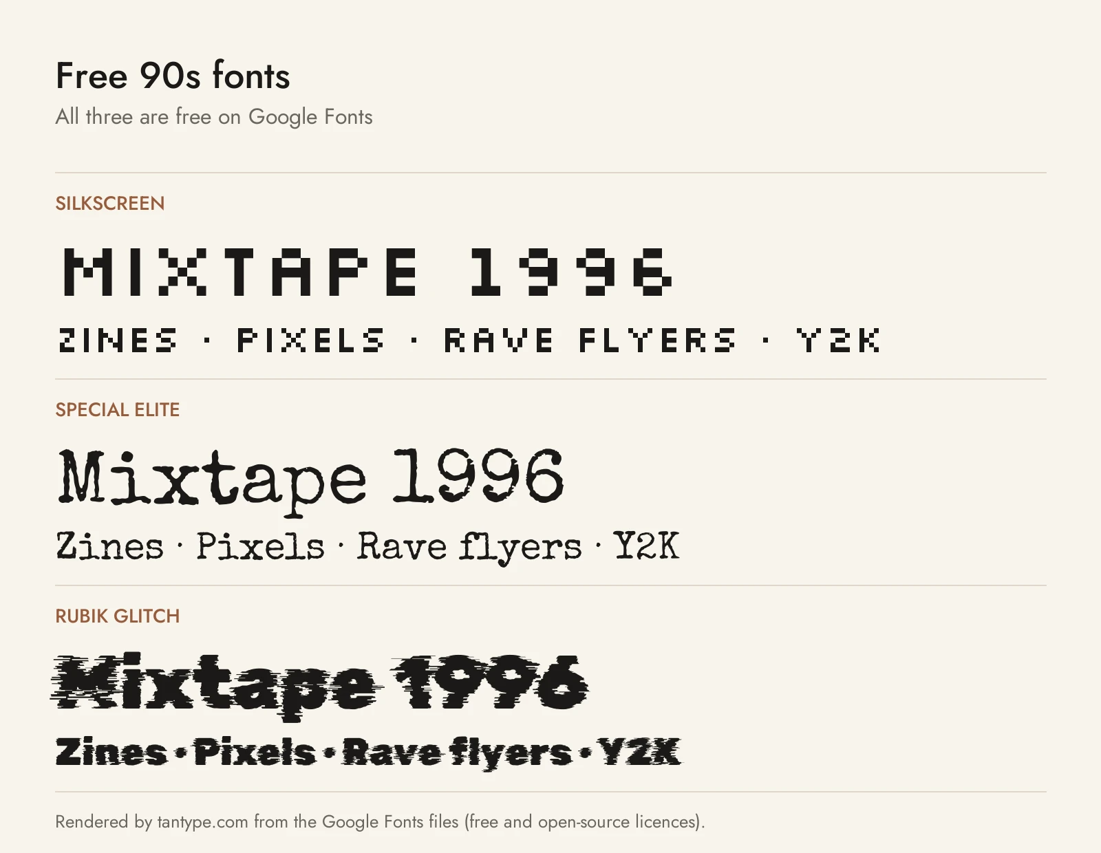
These three are free on Google Fonts under open-source licences (SIL Open Font License or Apache 2.0) that allow commercial use.
- Silkscreen by Jason Kottke is a genuine 90s font: a pixel typeface released in 1999 for small web graphics, in Regular and Bold. It is the free pick for early-web and game graphics, plainer than Rose-Tinted and without its italics.
- Special Elite by Astigmatic copies the Smith Corona Special Elite and Remington Noiseless typewriters, with what its description calls “a little bit of inked up grunge”. It is the free stand-in for Flyer TM in zine layouts, more mechanical and less hand-printed.
- Rubik Glitch by NaN and Luke Prowse is a script-generated, glitched version of the sans Rubik. It is a modern design, not a period one, but it suits rave flyers and techno titles. Under the damage sit Rubik’s conventional rounded shapes, unlike Lost Inside’s unstable letters, and there are no layered styles like ChromeKid’s.
Licensing: personal vs commercial use
Creative Market sells fonts under four licence types, set out on its font licence page:
- Desktop: unlimited personal and commercial projects, including physical products, packaging, social media and paid ads. On websites and in games the font may only appear as images, not live text. Buy one seat per user.
- Webfont: embed the font on websites you own or control, within the pageview limit you pick at checkout.
- App: embed the font in one app or game so users can’t extract it. A pixel font used as live game text needs this, not Desktop.
- E-pub: use the font in one ebook or electronic publication.
Two rules matter for 90s merch and logos. Print-on-demand use is forbidden whenever the end user is not the licensee, so a shirt tool where customers type their own text isn’t covered. And a font can be part of a logo only if it is modified and isn’t the dominant element; if you register the logo as a trademark, you must disclaim the font. Google Fonts’ open licences allow logos and merch; you just can’t sell the font files. Terms change, so read the current licence. This is general information, not legal advice.
90s font FAQ
What fonts were popular in the 90s?
Mostly the fonts that came with computers: Arial, Times New Roman, Verdana, Georgia, Impact and Comic Sans, several of them in Microsoft’s 1996 core fonts for the Web pack. Designers added distressed grunge type, pixel fonts and, on film posters, Trajan.
What is the most 90s font?
Comic Sans has the strongest claim: designed at Microsoft in 1994, then bundled with Windows add-ons, Publisher and Internet Explorer. For designers, Ray Gun’s grunge type is the most 90s style.
Which 90s font suits a grunge or zine look?
Inktoner for a heavy photocopied headline, Flyer TM for distressed serif text and Lost Inside for experimental layouts. The free option is Special Elite.
What is the difference between a 90s font and a Y2K font?
Y2K is the turn of the millennium: chrome, gloss, gradients and rounded or futuristic letters. “90s” more often means grunge, pixel and hip-hop styles. ChromeKid, Angel TM and Dripdrop are the Y2K picks here.
Is there a free 90s font for commercial use?
Yes. Silkscreen, Special Elite and Rubik Glitch are on Google Fonts under open licences that allow commercial use. Free “90s fonts” on download sites are often personal-use demos of paid fonts, so check the licence.
