
Lovelace: a Victorian-revival serif family for editorial and branding work
Design style
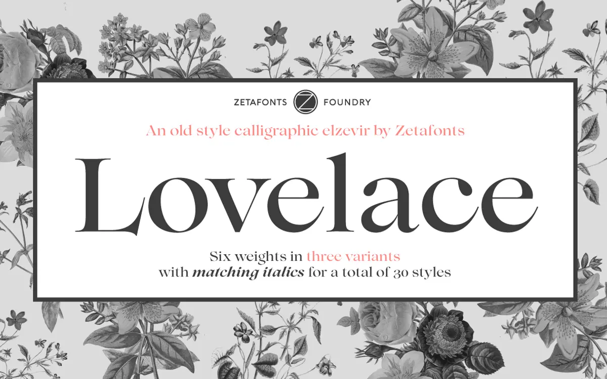
Lovelace is Zetafonts’ take on the nineteenth-century Old Style revival, pulling from the same lineage that produced Benguiat and Goudy’s calligraphic serifs but softening the formality of a strict Bodoni. The influence of Elzevir shows up in the added elegance and contrast, giving the letterforms a warmer, hand-lettered feel rather than the mechanical rigidity of high-contrast Didones. Serifs are heavy and angled, curves carry a calligraphic swing, and the overall texture reads as considered rather than austere. It sits somewhere between a period pastiche and a genuinely usable contemporary serif, which is a harder balance to strike than it sounds.
The family splits into two optical sizes — text and display — each running six weights from extralight to extrabold. That’s a proper range for building hierarchy within a single family rather than reaching for outside fonts to fill gaps. The display cut leans into sharper contrast and thinner hairlines, which suits large titling but would fall apart at small sizes; the text cut compensates with a bigger x-height and sturdier construction meant to hold up in body copy and on screen.
Character set and features
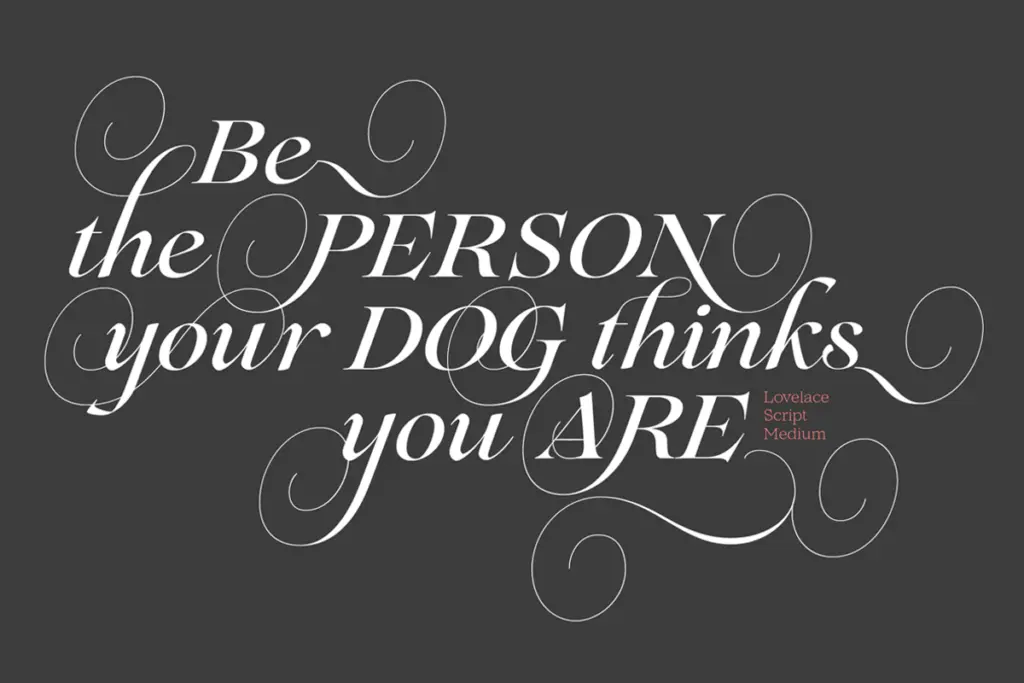
The italics are the most distinctive part of the set, built with real calligraphic influence rather than a mechanically sloped roman. Alongside them sits a separate display script, with connected lowercase and swash capitals designed by an in-house calligrapher. This isn’t a script bolted on for novelty — it’s positioned as a companion to the serif family, useful for headlines that need a more personal, lettered touch without switching to an unrelated typeface. Cyrillic support extends the family’s reach beyond Latin-only projects, which matters if your work touches Eastern European or Russian markets.
Across six weights per optical size, there’s enough range to run a full editorial system: extralight for pull quotes or captions, regular and medium for running text, bold and extrabold for headlines and covers. The OpenType features — ligatures and swashes chief among them — are aimed squarely at branding and logotype work, where a single flourished capital or connected pair can do a lot of the identity-building on its own.
Use cases
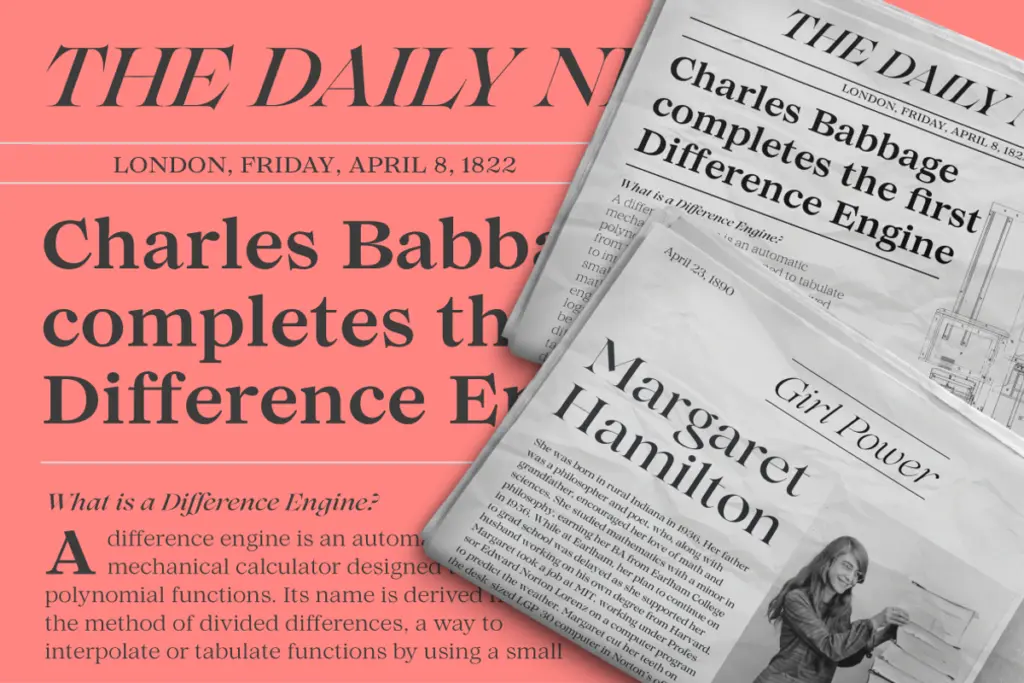
This is a family built for editorial design, packaging, and brand identity work where a serif needs to carry some personality without tipping into full decorative pastiche. The text optical size is the one to reach for in magazines, books, or long-form web copy where the generous x-height keeps things legible at smaller sizes. The display cut and its accompanying script are better suited to mastheads, logotypes, packaging typography, and title sequences — anywhere the thin strokes and swashes have room to breathe.
It’s less suited to dense UI work or anything requiring a neutral, invisible voice — Lovelace has too much character for that. And the display weights, with their sharp contrast, need generous point sizes to avoid the hairlines closing up or vanishing on lower-quality print stock. Used within its intended range, though, it’s a family that gives a project a distinct, period-inflected voice without feeling like a costume.
What we liked, and what we didn’t
Strengths
- Two optical sizes with six weights each cover both running text and large titling from one family
- Calligraphic italics and a connected display script give it a genuinely hand-lettered personality
- Cyrillic support broadens its use beyond Latin-only branding projects
Trade-offs
- The display cut's sharp contrast and thin hairlines lose integrity at small sizes or on rough print stock
- Its period character makes it a poor fit for neutral UI or interface typography
Lovelace is a well-researched revival that avoids feeling like a costume, with enough range across weights and optical sizes to run a full editorial or branding system. The display cut's thin contrast demands care at small sizes, but within its intended use it's a distinctive, dependable choice.
Verdict

Tantype reviews typefaces in depth — every font is tested in real branding, editorial and screen layouts before a word gets written. 555+ fonts reviewed and counting.