
Vienna Woodtype: a linocut-print sans for posters and packaging that want grain
Design style
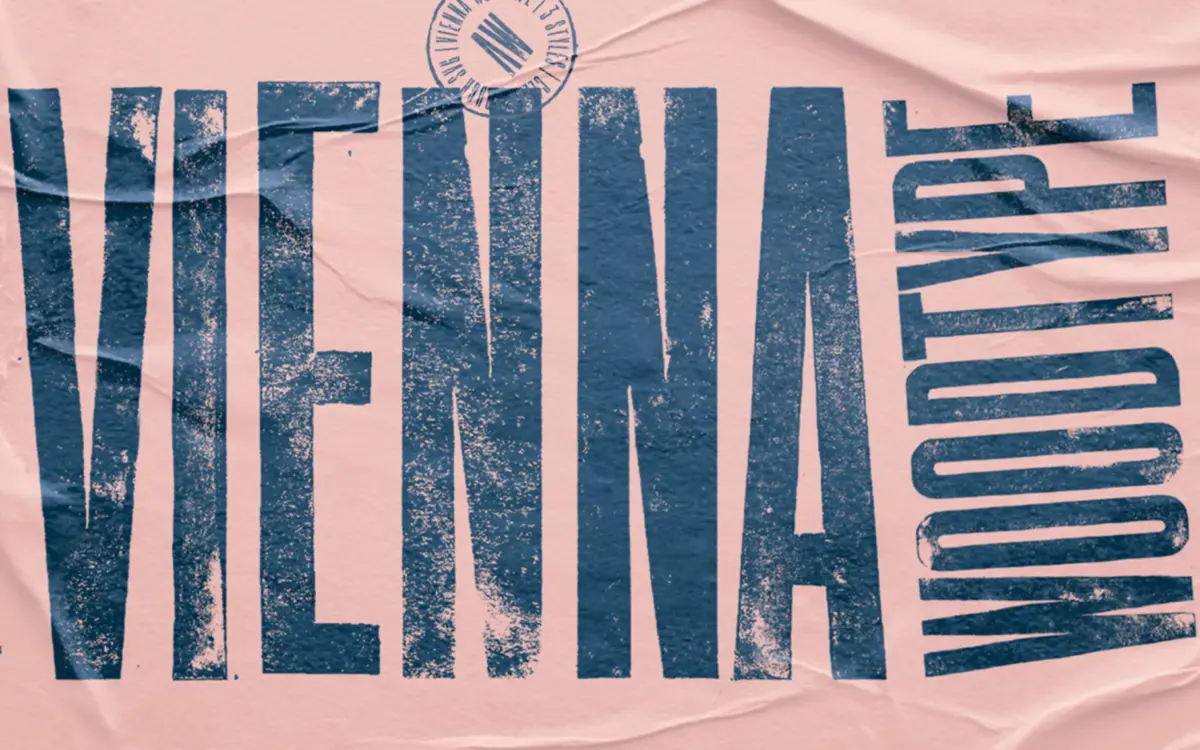
Vienna Woodtype starts from a physical process rather than a drawing tablet. The letters were cut into linoleum, printed by hand, scanned, and then rebuilt as a digital font — and that origin shows in every stroke. The forms are ultra-condensed sans shapes, narrow enough to stack tightly in a headline, but the outlines are not clean vector curves. Edges wobble slightly, corners round unevenly, and the ink coverage varies the way it does on a hand-pulled print. This isn’t a filter applied to a finished font afterwards; it’s the actual residue of the printing method.
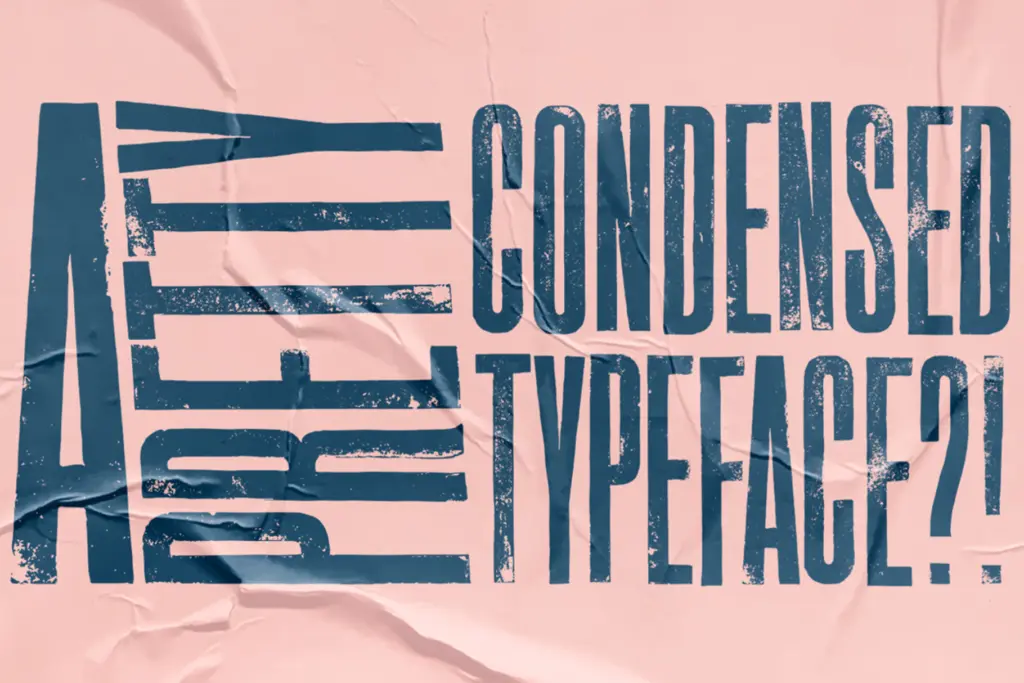
The condensed proportions do a lot of the structural work. Letters are tall and narrow, with tight apertures and short crossbars, which keeps the woodcut texture from turning into mush at larger sizes. It reads as a poster or signage face first — something meant to be printed big, on stock with some tooth to it, rather than pixel-perfect on a screen.
Character set and features
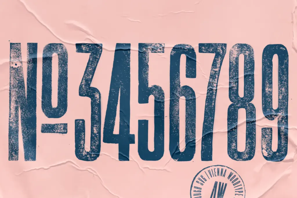
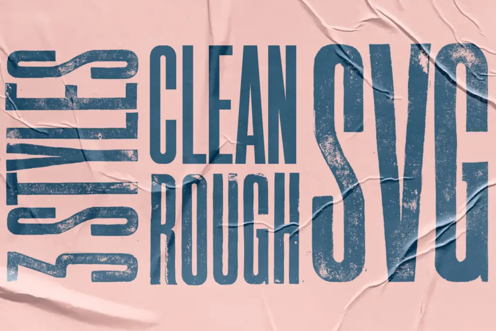
The font ships in three versions: a Clean cut with steadier edges, a Rough cut that leans harder into the linocut imperfections, and an SVG version that carries the printed texture as actual colour-layer artwork rather than a monochrome outline. That range is the main practical advantage here — you can dial the amount of grain up or down depending on whether the job needs restraint or full distress, without switching typefaces.
Because the letterforms come from hand-printed source material, don’t expect the geometric consistency of a drawn sans. Some letters sit slightly heavier than their neighbours, spacing has a hand-set irregularity to it, and kerning pairs will need occasional manual nudging in tight headline settings. That’s consistent with the source, not a flaw to fix — but it does mean this isn’t a font for long-form text or anywhere uniformity matters.
Use cases
Vienna Woodtype belongs on things that want to look printed, not typed: craft beer labels, artisanal food packaging, gig posters, record sleeves, anything trading on a handmade or workshop aesthetic. The ultra-condensed width makes it useful for narrow labels and vertical signage where a normal sans would need heavy manipulation to fit. The SVG version is worth using deliberately — it gives you genuine texture in mockups without relying on a separate distress layer in Photoshop.
It’s less useful the moment a brand needs to flex across a body-copy system, a UI, or anything that has to stay legible at ten point on a screen. Save it for headlines, wordmarks, and short packaging copy, and pair it with a plain, well-behaved text face for anything longer.
What we liked, and what we didn’t
Strengths
- Genuine handmade texture from an actual linocut print process, not a digital filter
- Three cuts (Clean, Rough, SVG) give real control over how much distress shows
- Ultra-condensed width suits narrow labels and vertical signage well
Trade-offs
- Uneven spacing and kerning mean headline setting will need manual adjustment
- Too irregular and narrow for body copy or long-form reading
Vienna Woodtype turns an actual linocut printing process into a usable display font, with enough range across its three cuts to control how rough it looks. It's a strong choice for craft packaging and poster headlines, but the condensed width and printed irregularity rule it out for body text or clean digital interfaces.
Verdict

Tantype reviews typefaces in depth — every font is tested in real branding, editorial and screen layouts before a word gets written. 555+ fonts reviewed and counting.