
Marlin: a condensed Western slab for saloon signs and label work
Design style
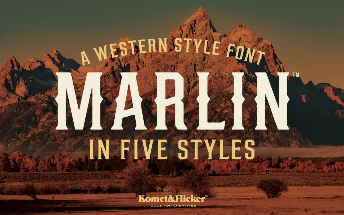
Marlin sits squarely in the old-west signage tradition: condensed slab serifs, heavy vertical stress, and slightly worn edges that suggest a woodblock print rather than a clean digital cut. The letterforms are tight and upright, built for stacking in short lines the way frontier storefronts and whisky labels used to. There’s a deliberate irregularity to the strokes — not full-on distressed texture, but enough roughness at the corners and joins to keep it from reading as a generic slab. It leans into a specific era rather than a vague vintage mood, which is its main design strength.
The condensed proportions do a lot of the work here. Letters are narrow and tall, with serifs that flare just enough to feel hand-cut. That combination gives it presence at large sizes without needing extra weight or ornamentation piled on top.
Character set and features
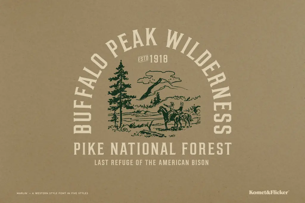
The lowercase set carries 22 alternate letters, which is the feature worth paying attention to. Swapping between the default and alternate forms changes the texture of a word noticeably — some alternates lean more rustic and irregular, others sit closer to a standard condensed slab. Mixing uppercase and lowercase, or switching alternates letter by letter, gives more variation than a typical single-style display font, though it does mean setting text takes some manual attention rather than just typing and walking away.
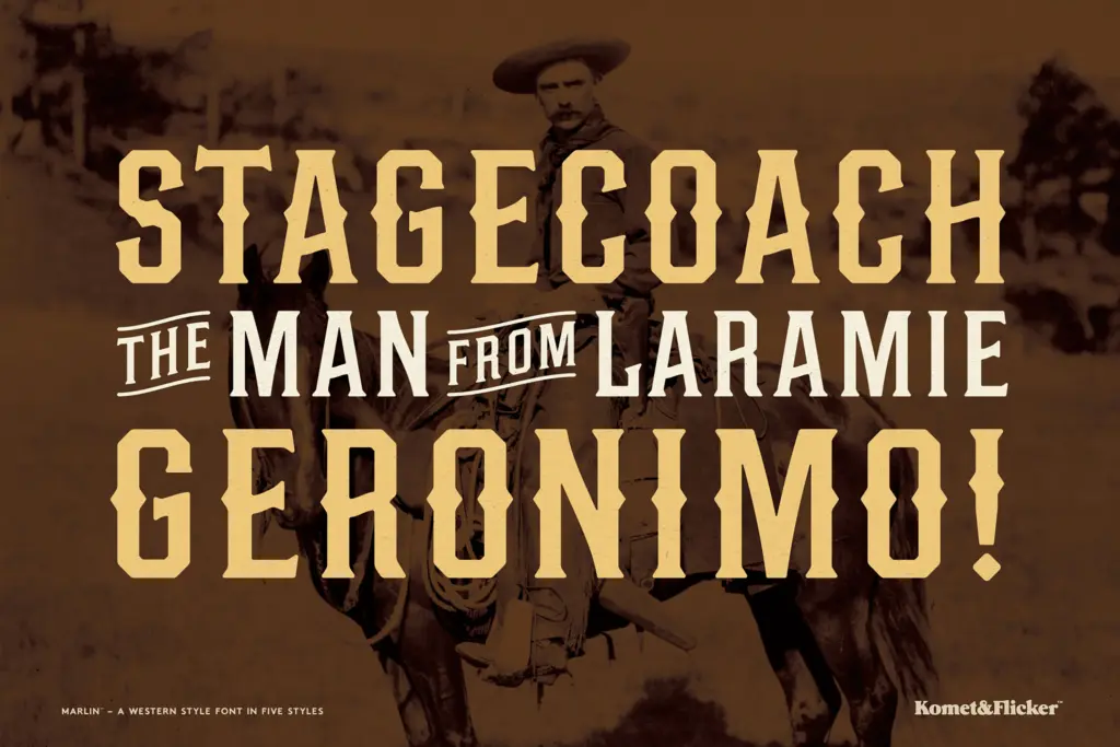
There’s also a set of 23 pre-built connector words — AND, OF, THE, and similar short, common terms — styled as single units rather than assembled from individual letters. These are clearly meant for signage-style compositions where a small filler word needs its own personality, a nod to the way old hand-painted signs often treated such words as decorative flourishes rather than plain type. It’s a practical inclusion, not a gimmick, though it only pays off if your layout actually needs one of those specific words.
What isn’t present, based on what’s provided, is any indication of broad language support or an extended weight range. This is a single-style display font with alternates, not a family with multiple weights to fall back on.
Use cases
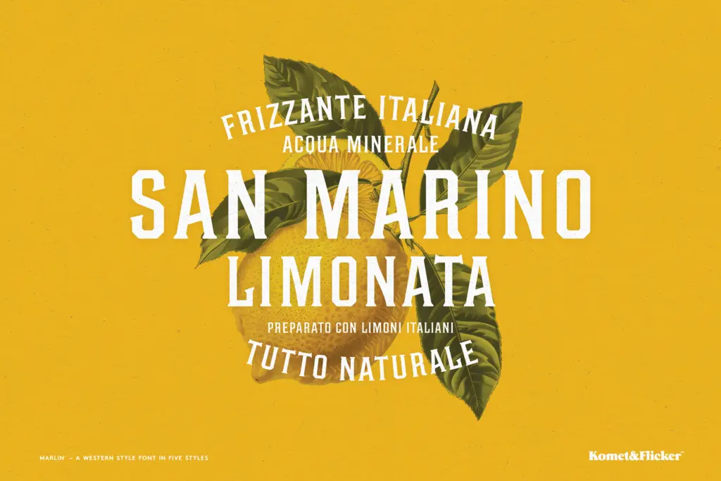
Marlin is built for short-burst display use: logotypes, badge marks, product labels, packaging for rustic or Americana-themed goods, poster headlines, and merchandise like t-shirts or tote bags aiming for a frontier look. The condensed width makes it efficient for tight logo lockups and label bands where horizontal space is limited.
It is not a font for body copy or anything requiring sustained reading — the tight spacing and rough edges that give it character at large sizes will fight you at small sizes or in dense paragraphs. Treat it as a headline and mark-making tool, paired with a plainer serif or sans for supporting text, and it does its job well. Push it into a full-page setting and the roughness stops reading as craft and starts reading as noise.
What we liked, and what we didn’t
Strengths
- 22 lowercase alternates give genuine variety without switching fonts
- Preset connector words like AND and THE solve a real signage layout problem
- Condensed proportions make it efficient in tight logo and label lockups
Trade-offs
- Rough, condensed forms lose clarity fast at small sizes or in long text
- Single-style display font with no apparent weight range to pair internally
Marlin is a competent, well-observed take on old-west signage lettering, with alternates that add real variation to a single-style display font. It's a specialist tool for short headlines and labels, not a workhorse for anything longer, and its rough condensed character will feel out of place outside its Americana lane.
Verdict

Tantype reviews typefaces in depth — every font is tested in real branding, editorial and screen layouts before a word gets written. 555+ fonts reviewed and counting.