
Hello Radio: a monoline vintage script for retro branding and labels
Design style
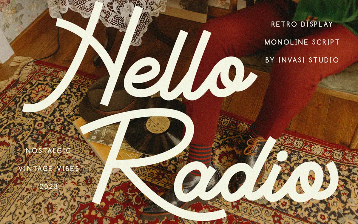
Hello Radio is a monoline script built around a single, unwavering stroke weight rather than the traditional thick-thin contrast most scripts lean on. That flatness is the whole personality: it reads like a sign painter’s quick brush note rather than a formal invitation hand. The joins between letters are loose and a little uneven, which gives it a hand-drawn quality without tipping into full casualness. The retro reference point is clear — think diner signage, transistor radio dials, mid-century packaging — but the drawing doesn’t lean on decoration to get there. It’s the rhythm of the strokes, slightly bouncy baseline and inconsistent letter widths, that does the work.
Because there’s no contrast to lean on, the strokes have to carry the imperfection themselves, and they do: terminals are slightly rounded rather than sharp, and the curves have a hand-cut looseness. It’s not a polished calligraphic script, and it isn’t trying to be. That’s a design choice worth noting before you commit to it for anything formal.
Character set and features
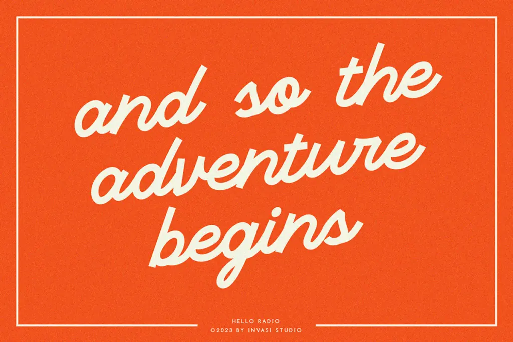
The set covers uppercase and lowercase, numerals, and standard punctuation, with ligatures included to smooth over some of the more awkward letter pairings that monoline scripts tend to produce. Multilanguage support across Latin-based languages is a genuine practical plus if you’re working across European markets — it means the font won’t fall over the moment an accent mark shows up.
The ligature set helps, but monoline scripts live or die on how well the connections read at small sizes, and this one asks for a bit of care. Tight tracking makes some joins muddy; loosen it slightly and the letters keep their individual shapes better. There are no wild swash alternates bundled in beyond what OpenType access provides, so anyone expecting a flourish-heavy display script should look elsewhere — this is a quieter, more workmanlike script than that.

Use cases
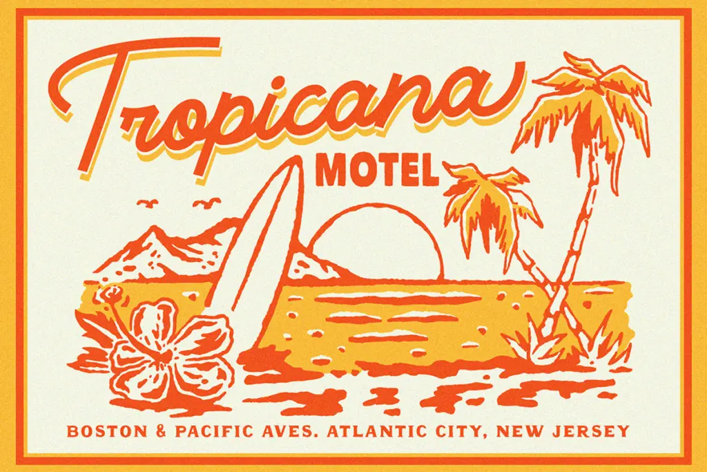
Hello Radio sits comfortably in packaging and label work — the monoline weight holds up fine printed small on a jar or a tag, where a high-contrast script might clog. It also does well as a secondary voice in branding: a script accent under a solid sans wordmark, or a stamped detail on a badge or sticker. T-shirt lettering and short retail signage are natural fits given the loose, hand-cut feel.
It’s less suited to long-form text or anything that needs to feel refined rather than nostalgic — wedding stationery, for instance, would need a defter, more contrast-driven script to hit that register. Where Hello Radio earns its keep is in short bursts: headlines, logotypes, product names, the kind of two-or-three-word moments where a bit of vintage grain reads as charm rather than clutter.
What we liked, and what we didn’t
Strengths
- The monoline stroke gives it a distinct, unfussy retro character rather than a generic script look
- Ligatures help smooth over awkward letter joins common in single-weight scripts
- Broad Latin-based language support makes it usable beyond English-only projects
Trade-offs
- Tight tracking or small sizes muddy the letter connections
- Lacks the flourish and contrast needed for formal or elegant applications like wedding stationery
Hello Radio is a competent, character-driven monoline script that leans into vintage sign-painting rather than calligraphic polish. It works best in short bursts — logos, labels, packaging — where its slightly uneven, hand-cut feel reads as charm. It's not built for long text or formal occasions, and needs generous tracking to stay legible at small sizes.
Verdict

Tantype reviews typefaces in depth — every font is tested in real branding, editorial and screen layouts before a word gets written. 555+ fonts reviewed and counting.