
Olivetti Lettera: a worn-ribbon typewriter face for analog-minded design
Design style
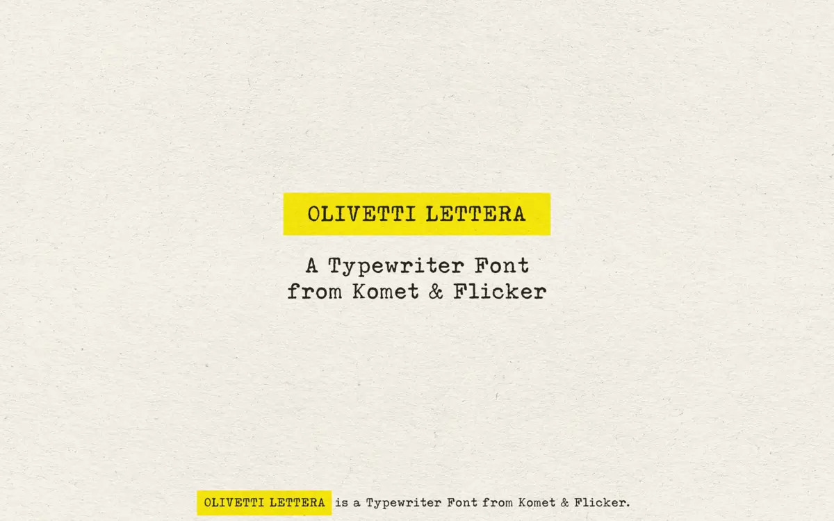
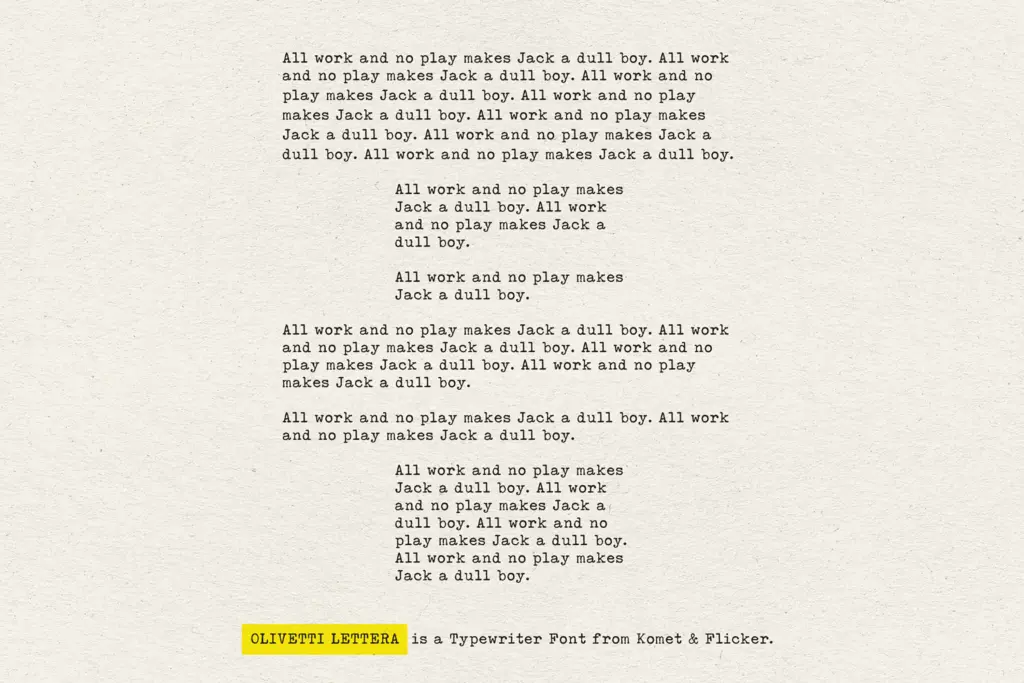
Olivetti Lettera takes its cue from the mechanical typeface of a mid-century portable typewriter, and it commits to the bit. The letterforms carry the slightly uneven ink distribution, soft edge breakup and inconsistent stroke weight that come from a metal hammer striking a ribbon rather than a pen or a stylus. Serifs are blunt and stubby rather than bracketed, and the x-height sits low, which pushes the whole face toward a document-typed-in-1962 feel rather than a polished editorial serif.
What separates it from a generic monospace typewriter font is the texture. Instead of one clean stencil pass, the letters look like they’ve been photographed off a real page — slightly bruised counters, faint doubling on some strokes, a texture that reads as print rather than vector. That rough handling is the entire point of the design, and it succeeds at looking like something struck rather than something drawn.
Character set and features
The set covers uppercase and lowercase basic Latin plus Western and Central European extended characters, so multilingual body copy is workable without falling back to a substitute font. Numbers, punctuation and a handful of symbols round out the practical set, and there are two styles of pre-built fraction glyphs for anyone laying out recipes, measurements or technical notes in a period-appropriate register.
The more interesting inclusion is a set of twenty custom connecting word glyphs — pre-built ligature-like combinations accessible through the Glyphs panel in Illustrator or Photoshop. These aren’t a formal OpenType feature set with automatic substitution; they’re manual picks, which means using them well takes a bit of patience and an eye for where a connected word actually improves the composition rather than just being a novelty.
Because the roughness is baked into the outlines rather than applied as a texture overlay, the font behaves predictably across applications — no dependency on bitmap textures or special rendering. That’s a practical plus for anyone who needs the effect to survive being placed in different software.
Use cases
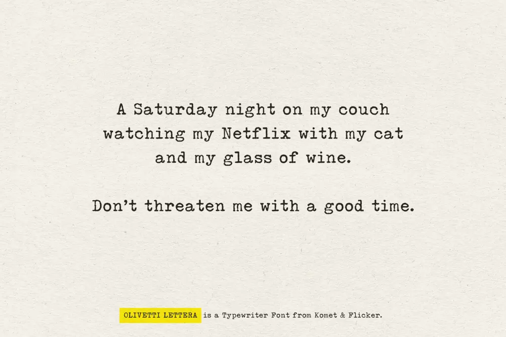
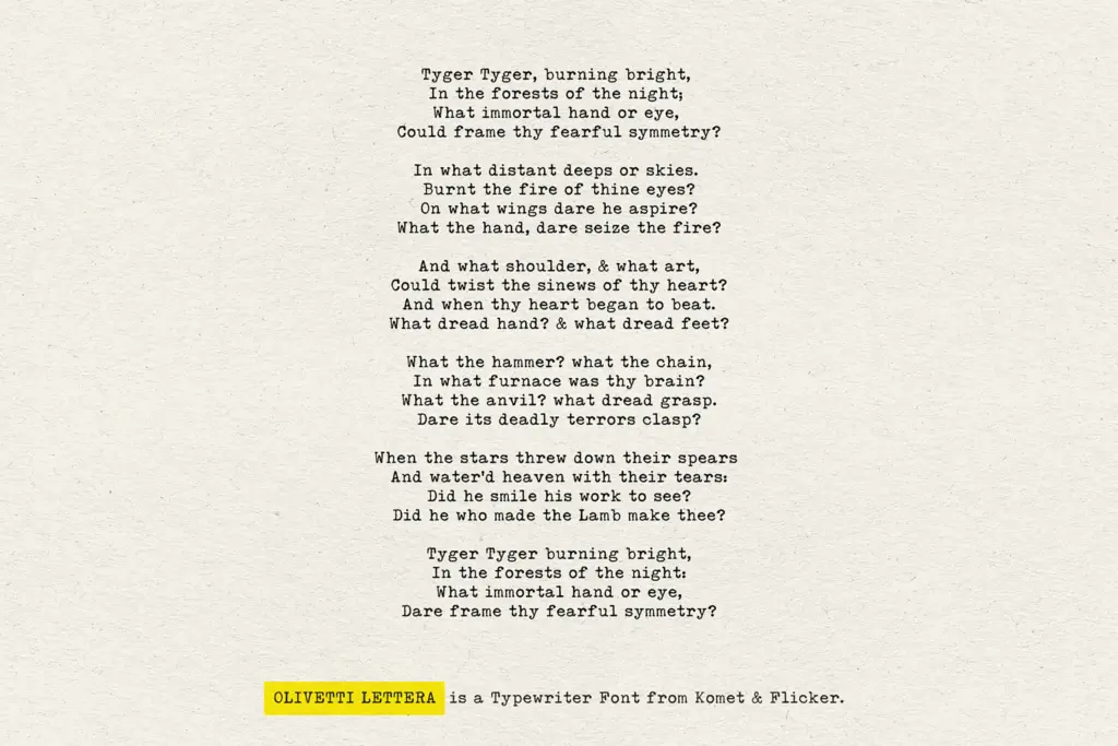
This is a display and accent typeface, not a body-copy workhorse. The low x-height, inconsistent stroke weight and the deliberate imperfections make long-form reading tiring past a paragraph or two, so it earns its keep in headlines, pull quotes, stamps, receipts, packaging inserts and anywhere a design wants to signal analog authenticity — old letters, archival documents, zines, indie music packaging, personal branding built around a handmade or nostalgic story.
It also suits mixed-media collage work: mood boards, scrapbook-style social posts, event flyers referencing a specific decade. The connecting glyphs give it an edge for quote cards or short editorial callouts where a handful of stitched-together words can carry a design moment without needing paragraph-length setting.
Where it won’t help: anything requiring a neutral, corporate, or highly legible small-print register. The rough edges that make it charming at 60pt turn into noise at 9pt, and its emphatic vintage voice will fight against clean, modern branding rather than support it.
What we liked, and what we didn’t
Strengths
- Ink breakup and stroke irregularity look genuinely mechanical rather than filtered on
- Multilingual Western and Central European support widens its practical use
- Twenty connecting word glyphs add flexibility for short editorial or quote-style layouts
Trade-offs
- Low x-height and rough edges make it unsuitable for body copy or small print
- Connecting glyphs require manual selection rather than automatic substitution, adding setup time
Olivetti Lettera nails the specific feel of a vintage typewriter strike, with genuine texture rather than a filter effect. It's a strong pick for display and accent work with a retro or analog story, but it isn't built for reading at length or for neutral, modern branding contexts.
Verdict

Tantype reviews typefaces in depth — every font is tested in real branding, editorial and screen layouts before a word gets written. 555+ fonts reviewed and counting.