
Poster Fonts: 10 Best Fonts for Posters, From Gig Flyers to Movie Titles
Poster fonts are typefaces that still read when they are big, far away and seen for a few seconds, on a wall, a lamp post or a cinema lobby. Most are display faces, often condensed or extra wide and set heavy, and they usually sit beside a quieter text font that carries the dates and small print.
Our top three picks are Neukultur, a compressed all-caps sans for gig and event headlines; Sequoia Display, a hand-drawn face modelled on 1930s national park posters, with a width axis; and Neue Swiss, an eight-weight grotesk for minimalist layouts. Every font on the main list is a commercial font sold on Creative Market. Three free Google Fonts options are further down.
See Creative Market’s poster font guide Commercial fonts: prices below were checked on October 16, 2026
What is a poster font?
A poster font is any typeface chosen to be read large and from a distance. There is no single poster style, but the job is old. Wood type “became popular during the nineteenth century for making large display typefaces for printing posters,” and was sold “in a wide range of widths from condensed to ultra-wide,” so a printer could fit a long word or a short one across the same sheet. Hatch Show Print in Nashville, founded in 1879, still prints concert posters “using letter press printing and hand-carved wood pieces.”
Later traditions added their own rules. The Swiss International Typographic Style used “asymmetric layouts, use of a grid, sans-serif typefaces,” usually Helvetica, Univers or Akzidenz-Grotesk. On film posters, the credits at the bottom (the billing block) are “usually set in a highly condensed typeface,” Wikipedia notes, so names reach the heights set by union contracts and still fit across the sheet.
What makes a font work on a poster:
- Legibility at distance. Sign makers size letters with a legibility index. In the United States Sign Council’s table, black Helvetica on a white, externally lit sign rates 29 feet of viewing distance per inch of letter height in upper and lowercase, but only 25 in all caps. So a headline read from 30 feet needs letters over an inch tall, and taller in capitals.
- Width that suits the copy. Condensed faces fit long titles and stacked lines; wide faces make one or two short words fill a sheet.
- Weight. Bold and black weights hold up across a room and over photos. Hairlines look fine up close but fade with distance.
- A partner. Matthew Butterick’s Practical Typography says most documents “can tolerate a second font. Few can tolerate a third.” On a poster that means one display face for the headline and one plain text face for the details.
The best poster fonts at a glance
- Neukultur — compressed all-caps sans for gig and event headlines.
- Hightone — tall condensed sans, Thin to Black, for stacked event type.
- Akira Expanded — very wide, heavy caps for festival and streetwear posters.
- Inktoner — photocopier grunge for punk and DIY gig flyers.
- Neue Swiss — eight-weight grotesk for minimalist, Swiss-style layouts.
- Vienna Woodtype — ultra-condensed letters printed from linocuts.
- PressBox Font Combo — Americana letterpress sans, condensed serif and ornaments.
- Sequoia Display — WPA-poster lettering with a narrow-to-wide variable axis.
- Rollin Eighties — 1980s movie-title sans with an inline style.
- Editor’s Note Display — high-contrast serif for theatre, gallery and drama posters.
Best poster fonts on Creative Market
Prices are for a one-seat desktop licence as listed on Creative Market on October 16, 2026; prices and sales change, so check the listing.
1. Neukultur (gig and event posters)
Dina Mae’s Neukultur is a single bold, compressed, all-caps sans, and the listing names posters, headlines, labels and “space-limited” layouts as its home. The letters are tall, flat-ended and evenly weighted, with no distressing or swashes, so the compression does all the work. Use it when a band name has to run large in a narrow column, or for a stacked date-and-venue block. There is no lowercase and only one weight, so pair it with a lighter text face. Desktop licence: $22.
See Neukultur on Creative Market · Read our Neukultur review
2. Hightone (event posters)
Typoraith Co calls Hightone a “modern, high-impact tall and narrow display font” and lists posters, editorial work, fashion and album covers among its uses. Where Neukultur has one weight, Hightone has “20 Variable Font Styles” from Thin to Black, so one family can build a whole event poster: a Black headline, a Medium line-up, a Light footer. It has upper and lowercase and unspecified multilingual support, in OTF and TTF. Open the tracking a little at Black, where the counters tighten. Desktop licence: $35.
See Hightone on Creative Market · Read our Hightone review
3. Akira Expanded (festival and streetwear posters)
Typologic’s Akira Expanded is the opposite of the condensed picks: each letter is far wider than it is tall, with flat-sided rounds and a heavy, even stroke. It is caps only; lowercase keys type capitals. You get Bold, Super Bold and Outline in OTF, TTF and WOFF, with stylistic alternates and Western European accents. Use it when the headline is one or two short words, such as a festival name or a sale, and let a narrow face carry the rest. The DaFont demo is for personal use only. Desktop licence: $20.
See Akira Expanded on Creative Market · Read our Akira Expanded review
4. Inktoner (punk and DIY gig flyers)
Inktoner, from the ikiiko shop, is a bold display font with “dirty style and ink bleed details,” made to look like a flyer run through a tired photocopier. There are two styles, Regular and Ink Bleed, and stacking one over the other gives a slightly off-register double print. It covers upper and lowercase, numbers, punctuation and multilingual support, in TTF and OTF. It suits punk shows, basement gigs, zines and record-shop posters. Keep it large; the bleed details clump when small. Desktop licence: $21.
See Inktoner on Creative Market · Read our Inktoner review
5. Neue Swiss (minimalist posters)
Jen Wagner Co’s Neue Swiss is a “commanding yet minimalistic” grotesk in the Swiss tradition described above. It has 16 fonts: eight weights from Hairline to Black, each with an italic, plus foreign-language support. Set a huge Black headline flush left, then run every other line in Regular or Light on the same grid, as the Swiss designers did. It also works as the text partner for the louder fonts on this list. Desktop licence: $149.
See Neue Swiss on Creative Market · Read our Neue Swiss review
6. Vienna Woodtype (vintage posters)
Christoph Zeugswetter (XTOPH) made Vienna Woodtype from real linocut prints: “The glyphs were handprinted, then scanned and then turned into a computer font.” The result is an ultra-condensed sans with uneven ink and slightly wobbly edges, close to a hand-pulled poster. It comes in Clean, Rough and SVG versions; the SVG colour font keeps the print texture but needs a recent Photoshop, Illustrator or InDesign. The listing doesn’t state language support, so check accents. Use it for craft fairs, beer festivals, folk gigs and screen-print style posters. Desktop licence: $50.
See Vienna Woodtype on Creative Market · Read our Vienna Woodtype review
7. PressBox Font Combo (vintage letterpress posters)
Sean Coady’s Vintage Type Company calls PressBox “an Americana, metal-type, inspired font family,” and it is a kit for old-time show bills. In PressBox Display, “you can switch the width of your glyphs simply by switching between upper & lower case,” handy when a line must fill a fixed width. Virgo Display is “a condensed, stylized serif with spurs,” and Virgo Ornaments adds catchwords and border pieces. Each main font has an inked style, and about 25 languages are supported. Use it for county fairs, rodeos and Hatch Show-style concert bills. Desktop licence: $18.
See PressBox on Creative Market · Read our PressBox review
8. Sequoia Display (vintage travel posters)
Rachel Kick based Sequoia Display on “the W.P.A. National Park posters created in the 1930s.” Its variable axis lets you pick any width between “extra narrow” and “extra wide,” so a short park name and a long one can fill the same banner, and five static widths come along for apps without variable-font support. Files are OTF, WOFF and WOFF2. It has one heavy weight with soft, slightly irregular edges. Use it for travel and outdoor posters, national park prints, trail races and summer camps. Desktop licence: $30.
See Sequoia Display on Creative Market · Read our Sequoia Display review
9. Rollin Eighties (movie-style posters)
Rollin Eighties, another ikiiko font, draws on 1980s neon and dance culture and “the cinematic style of 80s movies,” and its listing names movie posters and club flyers. It has “two bold styles”: a solid Regular and an Inline with a thin channel through each letter that suggests neon tubing. Alternates, ligatures, upper and lowercase and multilingual support are included, in TTF and OTF. Use it for a retro film title, a synthwave night or a VHS-themed event, and set the credits underneath in a condensed sans such as Hightone, as real billing blocks do. Desktop licence: $23.
See Rollin Eighties on Creative Market · Read our Rollin Eighties review
10. Editor’s Note Display (theatre, gallery and drama posters)
Jen Wagner Co’s Editor’s Note Display is “the sharp, high contrast partner” to her Editor’s Note family, with razor-sharp serifs and very thin hairlines meant to be seen large. It has 16 fonts, eight weights with italics, and Western and Central European language support. Use the heavier weights for theatre and ballet posters, gallery openings, book launches and drama film titles, where a serif sets a quieter tone than a gig poster. Skip the lightest weights for anything seen from far away. Desktop licence: $149.
See Editor’s Note Display on Creative Market · Read our Editor’s Note Display review
How to choose a poster font
- Start from the viewing distance. A flyer on a café noticeboard is read from a metre away; a stage banner from across a street. Decide the letter size first, then pick a font with open counters and enough weight for that distance.
- Match width to the words. Long band names, film titles and stacked headlines suit condensed faces such as Neukultur, Hightone or Vienna Woodtype; one short word suits a wide face such as Akira Expanded. Families with many widths, such as Hoefler&Co.’s Knockout or Sequoia Display’s width axis, let you change width line by line without changing typeface.
- Space out capitals. All caps need more size to read from the same distance, and Butterick advises adding 5–12% extra letterspacing to text in caps.
- Pair a display face with a text face. Set the headline in the poster font and the date, venue and ticket details in a plain sans or serif. A grotesk such as Neue Swiss sits quietly under almost any of the louder picks.
- Match the mood to the event. Rough textures (Inktoner, Vienna Woodtype) suit underground gigs and craft fairs. Wide geometric caps suit tech and fashion events; Lemon Milk is a popular donationware option there. For children’s and family events, a chunky rounded face such as Hello Headline (a modified version spells out the Bluey logo) feels friendly rather than loud.
- Check the character set. Several picks are caps only, and accent support varies.
Free poster fonts
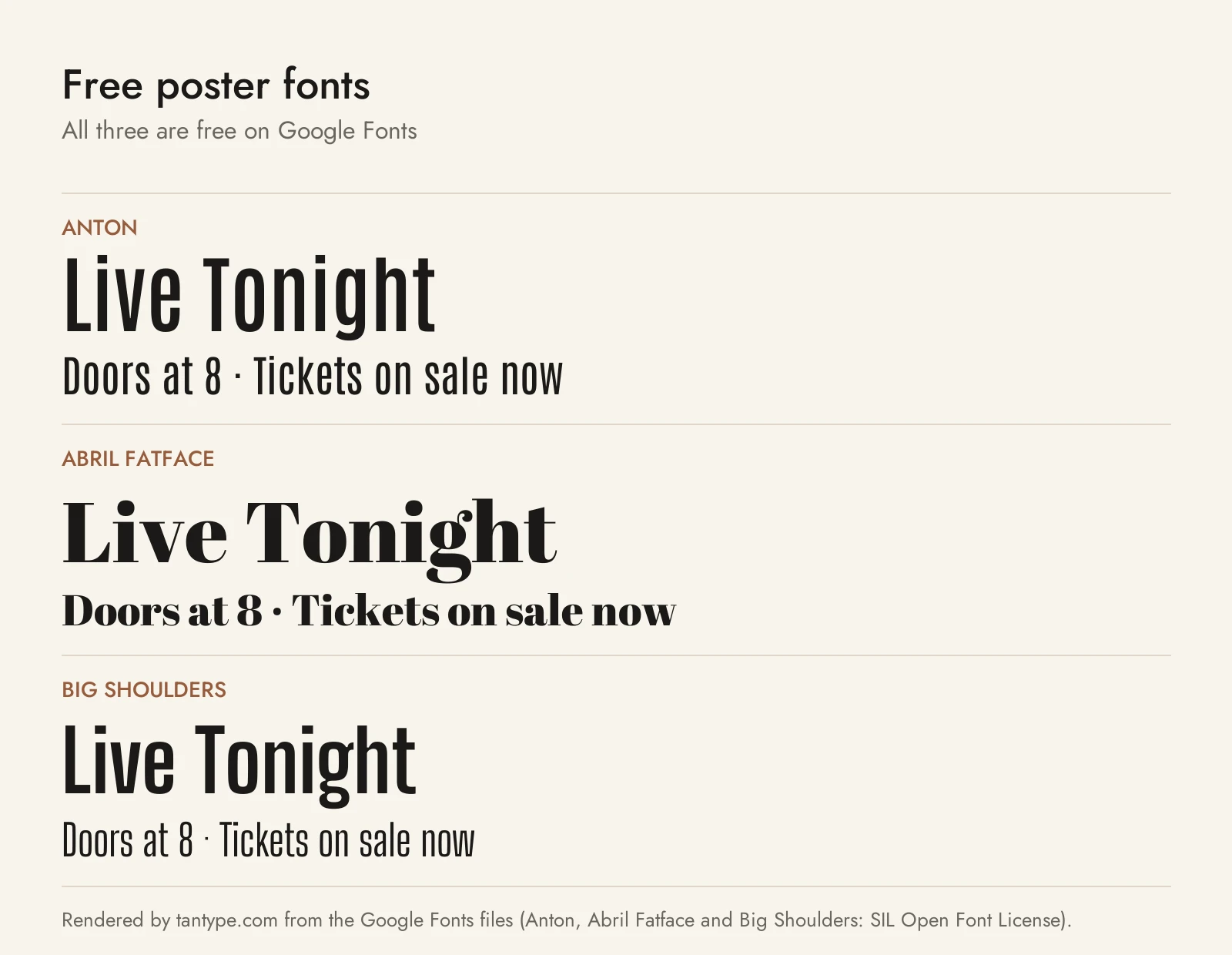
These three are free on Google Fonts under the SIL Open Font License, which allows commercial use.
- Anton by Vernon Adams is “a reworking of a traditional advertising sans serif typeface,” tuned for bold display. It is a heavy condensed gothic in one style, doing Neukultur’s job but with a lowercase. With no weight range, pair it with a lighter sans.
- Abril Fatface by TypeTogether “is inspired by the heavy titling fonts used in advertising posters in 19th century Britain and France.” It is a fat-face Didone serif, the free choice for vintage and theatre posters where Editor’s Note Display would also fit. Its hairlines need size.
- Big Shoulders by Patric King is “a superfamily of condensed American Gothic variable fonts, created for the Chicago Design System.” Its weight axis runs from Thin to Black, so one family can carry the headline and the details, which Anton can’t.
Licensing: personal vs commercial use
Creative Market sells fonts under four licences, explained on its font licence page:
- Desktop: install the font and use it in personal and commercial work; listings name logo design, print media, souvenirs, merchandise and images for websites or social media. One seat per user.
- Webfont: embedding on websites you own or control, within a pageview limit chosen at checkout.
- App: embedding in one app or game, as long as the font can’t be extracted.
- E-pub: embedding in one e-book or electronic publication.
The full font terms rule out editable templates and tools where customers type their own text, which matters if you plan to sell poster templates. Some designers add conditions of their own, so read each listing. Free demos such as Akira Expanded’s DaFont file are for personal use, and copies from free download sites carry no licence. This is a summary, not legal advice.
Poster font FAQ
What font is best for posters?
No single font. Choose by the poster’s job: a condensed sans such as Neukultur or Hightone for event and gig headlines, a wide face such as Akira Expanded for one-word titles, a grotesk such as Neue Swiss for minimalist layouts, and Vienna Woodtype or PressBox for vintage looks. Pair it with a plain text face for the details.
What size should poster fonts be?
It depends on viewing distance. The United States Sign Council’s figures work out to roughly 1 inch of letter height for every 25 to 29 feet in good conditions, with all caps at the lower end. A headline read from 50 feet needs letters about 2 inches tall.
What are free fonts for posters?
Anton, Abril Fatface and Big Shoulders are free on Google Fonts for personal and commercial use. Bebas Neue and Oswald are other free condensed options.
Can I sell posters made with a Creative Market font?
Generally yes: the desktop licence covers print media and merchandise. It doesn’t let you sell the font inside an editable template, and some designers ask for an extended licence for print-on-demand, so check the listing.
