
Neukultur: A Compressed Sans for Loud Headlines and Tight Spaces
Design style
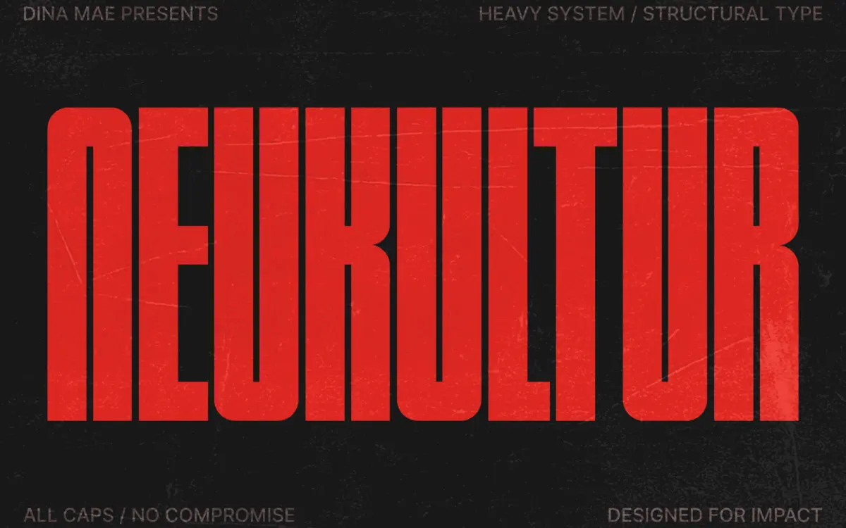
Neukultur is an all-caps compressed sans built for narrow columns and big claims. The letterforms are drawn tight and vertical, with strokes that hold a consistent weight and terminals cut flat rather than rounded. There’s a clear debt to brutalist print systems and archival stamp lettering — the kind of type that used to show up on shipping crates and municipal signage, where space was rationed and every character had to earn its width.
What separates it from the glut of compressed display faces on the market is restraint. There’s no faux-distress, no gimmick cuts, no decorative swash hiding in the alternates. The compression itself does the expressive work. Counters are narrow but not choked, and the vertical rhythm stays even across the alphabet, which is harder to pull off in a condensed face than it looks — letters like M and W tend to fight the format, and here they’re kept in line without feeling squeezed into submission.
Character set and features
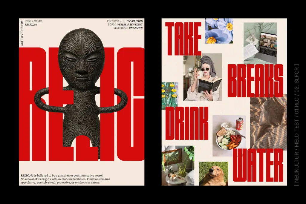
As an all-caps design, Neukultur trades lowercase nuance for density and punch. The set covers the standard Latin uppercase, numerals, and basic punctuation, which is what you’d expect from a display face built for short bursts of text rather than paragraphs. There isn’t a lowercase to fall back on, so anything that needs to read as running text will need a companion typeface — this one is a headline instrument, not a text face, and it doesn’t pretend otherwise.
Spacing is tight by design, which is the point, but it also means the font rewards a designer who’s willing to kern rather than one who wants to drop in a headline and walk away. At very tight tracking the counters in letters like B and R start to close in visually; pulling the tracking open even slightly restores clarity without losing the compressed feel. There’s no visible support for extended weights within the family here — it reads as a single bold cut, which keeps the personality consistent but limits how much tonal range you can get out of it alone.
Use cases
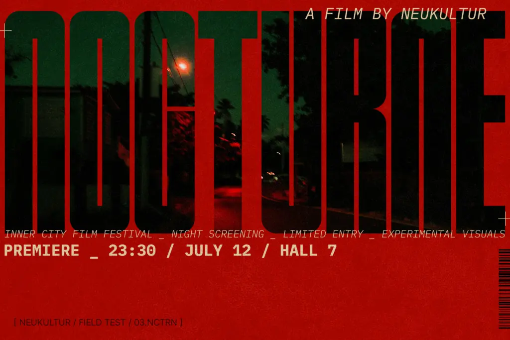
This is a poster and packaging font first. On a label or a record sleeve, the vertical compression reads as intentional and confident rather than cramped, and it holds up at large sizes where the sharp corners and even stroke weight stay crisp. Apparel graphics, gig posters, and product packaging where the brand wants to feel stripped-down and industrial rather than polished are the natural home for it.
It’s less suited to anything that needs a soft or approachable tone — the geometry doesn’t do warmth. It also won’t carry body copy or even long subheads gracefully; past four or five words the compression starts to feel like a constraint rather than a style choice. Used as a single-line headline treatment, paired with a quieter, more neutral typeface for supporting text, it does its job cleanly and without needing much dressing up.

What we liked, and what we didn’t
Strengths
- Even vertical rhythm keeps compressed letterforms from feeling cramped or uneven
- Restrained drawing avoids the gimmicky distress effects common in this category
- Reads confidently at large sizes on posters and packaging
Trade-offs
- All-caps only, so it needs a companion face for any actual body text
- Tight spacing requires manual kerning to avoid closed-up counters at small sizes
Neukultur does one thing well: a tight, confident compressed headline with an industrial edge. It's not a versatile family and it demands careful kerning, but for posters, labels, and apparel graphics it delivers exactly the loud-but-controlled tone it promises.
Verdict

Tantype reviews typefaces in depth — every font is tested in real branding, editorial and screen layouts before a word gets written. 555+ fonts reviewed and counting.