
80s Fonts: 10 Best Eighties Fonts for Synthwave, Neon and Arcade Designs
The best 80s fonts cover a lot of ground, because the look people call “eighties” mixes neon scripts, chrome logos, arcade pixels, VHS box art and the soft, swashy serifs of 1980s paperbacks. An 80s font is any typeface built to recall that lettering, from the decade itself or from the synthwave revival that followed it.
If you only try three, start with Overglow for a neon synthwave script, Rollin Eighties for retrowave titles with a built-in neon-tube style, and Hot Rush Font Duo for VHS-era logos and merch. All ten picks here are commercial fonts sold on Creative Market, so they need a licence. Three genuinely free options from Google Fonts are further down.
See 1980s typefaces on Creative Market Commercial fonts; desktop licences for these picks ran $12 to $89 in October 2026
What is an 80s font?
There is no single “eighties font”. Five looks overlap.
Typefaces the decade actually used. Many fonts that read as 80s were drawn in the 1970s. ITC Benguiat, a decorative serif by Ed Benguiat released in 1977, appears on the original 1980s covers of Stephen King’s novels and on the Choose Your Own Adventure books. ITC Avant Garde Gothic, ITC’s first release in 1970, is the geometric sans with tightly packed ligatures; a monospaced version followed in 1983.
Tech and sci-fi lettering. Wide, squarish sans serifs signalled “the future”. Microgramma (1952) and its successor Eurostile (1962), both from Aldo Novarese and Nebiolo, became sci-fi staples in the 60s and 70s, and Microgramma turns up in titles and props in Back to the Future and the Alien films. See our guides to Eurostile and Microgramma.
Chrome and airbrush. Cool and Collected calls the 1980s the heyday of airbrush art and points to the chrome effect used in countless logos. Chrome is an effect painted or rendered onto bold letters, not a typeface of its own.
Arcade pixels. Early video games drew letters on a small grid of square pixels. Google Fonts’ Press Start 2P, for example, is based on the screen font of 1980s Namco arcade games.
Synthwave, outrun and Memphis. Much of today’s “80s” look is a later revival. Synthwave, or retrowave, is music that emerged in the mid to late 2000s from 1980s film scores and games; “outrun”, named after the 1986 arcade game Out Run, came to mean VHS tracking artefacts, magenta neon and gridlines. Neon scripts and chrome type belong to that world. The Memphis Group, Ettore Sottsass’s Milan collective active from 1980 to 1987, added the squiggles and clashing colours that spread through mid-80s TV, skate and surf graphics.
The best 80s fonts at a glance
- Overglow — calligraphic neon script with underlines, made for synthwave titles.
- Rollin Eighties — retrowave display face with a Regular and a neon-style Inline.
- Hot Rush Font Duo — condensed sans, striped sans and marker script for VHS-era logos.
- Outrunner Retro Script — a budget disco-and-sci-fi-poster script.
- Vakulta — angular sans for 80s sci-fi and cyberpunk titles.
- Geom Graphic — squared sans family inspired by 1980s Japanese robot anime.
- Arcade Quest — an 8-bit pixel font for game and arcade graphics.
- No Signal — a VHS glitch display font with Illustrator and Photoshop styles.
- X-Rental — hand-drawn lettering from the video rental horror shelf.
- Heartbreak Eighties — soft, swashy retro serif for 80s glamour.
Best 80s fonts on Creative Market
Prices are for a one-seat desktop licence as listed on Creative Market on October 16, 2026. Shops run sales often, so check the listing before you buy.
1. Overglow
Indieground Design made Overglow with the artist Alessandro Strickner, who works as Overglow, and aims it at 80s and 90s artwork such as synthwave and vaporwave. It is a connected calligraphic script whose strokes swell and taper like a brush, with long underlines and swashes that sit under a word like a neon tube. There is one style, supplied as TTF and OTF plus web formats. Keep it to one or two words: logotypes, album covers, title cards and posters. Desktop licence: $19.
See Overglow on Creative Market · Read our Overglow review
2. Rollin Eighties
Ikiiko Type drew Rollin Eighties from 1980s nightlife, neon-lit dance floors, disco and sci-fi film posters. The letters use sharp diagonal cuts and big curves, the shapes of chrome logotypes and VHS boxes. The useful extra is the Inline style, which runs a thin channel through each letter so it looks like neon tubing before you add any glow. You get Regular and Inline with uppercase, lowercase, alternates, ligatures and multilingual support, in TTF and OTF. Use it for movie-style posters, club flyers and gaming thumbnails. Desktop licence: $23.
See Rollin Eighties on Creative Market · Read our Rollin Eighties review
3. Hot Rush Font Duo
Sam Parrett pitches Hot Rush as a “wild retro ride” through 80s nostalgia, and it suits motorsport decals, video packaging and skate graphics. You get a condensed, uppercase-only sans, a striped version with vertical lines through each letter, italics of both, and a fast marker-pen script. The script is uppercase-only too, but typing lowercase gives a second set of capitals, so repeated letters don’t look stamped. It adds end forms for ten letters, four swashes and support for 17 languages. Desktop licence: $22.
See Hot Rush Font Duo on Creative Market · Read our Hot Rush Font Duo review
4. Outrunner Retro Script
Outrunner, by Ardian Radityo of TSV Creative, is a retro script that the listing ties to the 80s: bright colours, disco, colourful sci-fi film posters and dance music. It is a slanted connecting script with fewer flourishes than Overglow, so it stays readable across a full name or a short slogan. The set includes lowercase, uppercase, numerals, punctuation, alternates and diacritics, in OTF and TTF. It is a cheap, sensible choice for party invitations, logo mock-ups and shirts. Desktop licence: $17.
See Outrunner Retro Script on Creative Market
5. Vakulta
Vakulta, from the shop twinstd, is an angular display sans that its designer says evokes the classic look of 80s sci-fi and cyberpunk. Strokes are cut at sharp angles, so a single word looks like the title of a sci-fi paperback or a game cartridge. It ships as OTF, TTF, WOFF and WOFF2, with OpenType features and multilingual support. The extra glyphs are also mapped to the Private Use Area, so you can reach them in apps without an OpenType panel. Use it for sci-fi posters, game titles and tech branding. Desktop licence: $20.
See Vakulta on Creative Market
6. Geom Graphic
Geom Graphic is the most complete family on this list. Ryoichi Tsunekawa of Dharma Type based it on 1980s Japanese robot anime such as Gundam and Ideon, and the listing compares its feel to Eurostile, only more squared and geometric. The O is close to a rounded square and stroke weight stays even. There are four weights, each with a matching italic, and extensive language support, enough to build a whole title sequence, game interface or product line rather than one poster word. It is also the most expensive pick. Desktop licence: $89.
See Geom Graphic on Creative Market · Read our Geom Graphic review
7. Arcade Quest
Arcade Quest, from Igor Ovsyannykov’s shop HipFonts, is an 8-bit pixel font drawn for the golden era of arcades and early consoles. Every letter sits on a square grid, like a high-score table or a “press start” screen. The listing describes letters, numbers and symbols with support for several languages but doesn’t list styles or files, so check the previews before you buy. Use it for game UI, stream overlays and arcade-themed invites. Desktop licence: $12.
See Arcade Quest on Creative Market
8. No Signal
Darumo’s No Signal is a display font with a built-in glitch effect, which the designer ties to 80s movie posters and TV shows. Letters look split and shifted, like a worn tape or a TV losing its signal. Besides the font, the package includes graphic styles for Illustrator and Photoshop, so you can add the colour-split look without building it yourself. The listing doesn’t mention extra weights. Use it for big headers, video thumbnails, music artwork and horror or sci-fi posters. Desktop licence: $12.
See No Signal on Creative Market
9. X-Rental
Christopher King of Wingsart Studio based X-Rental on the cover art of 1980s and 90s video rental stores and the Friday night horror movie. It is drawn by hand with brush, pen and ink, so it has the uneven, slightly unsettling feel of a cheap horror tape rather than a polished studio logo. There are four styles, Regular, Outline, Light and All Caps, each with alternates so repeated letters don’t match. Use it for horror film titles, podcast artwork, Halloween events and zines. Desktop licence: $24.
See X-Rental on Creative Market · Read our X-Rental review
10. Heartbreak Eighties
Not every 80s look is neon. Nicky Laatz’s Heartbreak Eighties is a retro serif with silky, soft edges and what she calls bold 80s vibes, closer to a glossy magazine or a paperback romance than an arcade. You get Regular and Oblique, plenty of swashy OpenType alternates and support for about 17 languages. The alternates are also PUA-mapped, so you can copy them from Font Book or Character Map. Use it for beauty and fashion branding, book covers and invitations. Desktop licence: $40.
See Heartbreak Eighties on Creative Market · Read our Heartbreak Eighties review
How to choose an 80s font
- Pick the slice of the 80s first. Synthwave and neon call for a script (Overglow, Outrunner) or an inline face (Rollin Eighties). Sci-fi and tech call for an angular or squared sans (Vakulta, Geom Graphic). Gaming calls for pixels (Arcade Quest). VHS and horror call for No Signal or X-Rental; glamour calls for Heartbreak Eighties.
- Pair a loud face with a plain one. Put a script or effect-heavy title over simple capitals, as Hot Rush does in one package. Two scripts together look muddled.
- Treat chrome and neon as effects. Build the chrome gradient or glow in Photoshop or Illustrator on top of a heavy display face with open counters, so the effect has room to show.
- Memphis is mostly shapes and colour. The Memphis Group designed furniture and objects, not typefaces. For a Memphis-style layout, let the squiggles and patterns do the work and keep the type a clean geometric sans.
- Check legibility at the real size. Swashy scripts, glitch fonts and textured faces lose detail when small, so test on phone screens and thumbnails.
- Cricut, vinyl and Canva. Glitch and textured styles cut badly; for vinyl, use solid letters such as Rollin Eighties Regular or Hot Rush Sans. In Canva and other apps without OpenType panels, fonts with PUA-mapped alternates (Vakulta, Heartbreak Eighties) are easier to work with.
Free 80s fonts
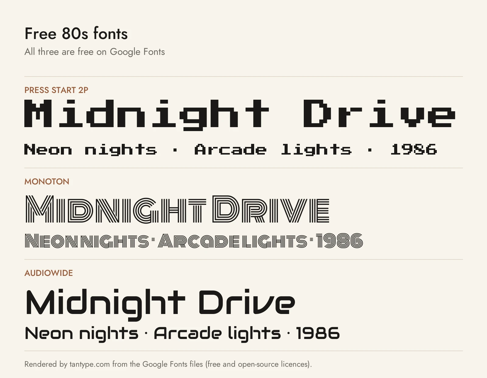
These three are free on Google Fonts under the SIL Open Font License, which allows commercial use. Each covers one 80s look, with fewer extras than the paid picks.
- Press Start 2P by Cody “CodeMan38” Boisclair is a bitmap font based on 1980s Namco arcade games, with letter shapes from the 1986 game Return of Ishtar. It has a firmer historical link than Arcade Quest and covers Greek and Cyrillic. Set it at 8, 16 or other multiples of 8 pixels.
- Monoton by Vernon Adams draws each letter as parallel lines, a modern take on 1930s multiline faces such as Rudolf Koch’s Prisma. Its roots are older than the 80s, but the lines read like neon tubing, which makes it the free stand-in for Rollin Eighties Inline. Use it above 30 points.
- Audiowide by Brian J. Bonislawsky of Astigmatic is a techno-futuristic sans of soft-cornered, tubular forms with nods to Handel Gothic. It is the free pick for sci-fi and tech titles, rounder and friendlier than Geom Graphic or Eurostile, and readable at subheading sizes.
Licensing: personal vs commercial use
Creative Market sells fonts under four licence types, set out on its font licence page:
- Desktop: install the font and use it in unlimited personal and commercial projects, including physical products, packaging, social posts and paid ads. On websites and in games it may only appear as images, not live text. Buy one seat per person who uses it.
- Webfont: embed the font on websites you own or control, within the pageview limit you pick at checkout.
- App: embed the font in one app or game in a form users can’t extract. A pixel font used as live text inside a game needs this, not Desktop.
- E-pub: use the font in one ebook or electronic publication title.
Two rules matter for 80s merch and logos. Creative Market doesn’t allow its fonts in print-on-demand tools where the customer, not you, types the text. And a font can be part of a logo only if it is modified and isn’t the dominant element; if you register the logo as a trademark, you must disclaim the font. OFL fonts from Google Fonts can go in logos and merch; you just can’t sell the font files themselves. Terms change, so read the current licence before you buy. This is general information, not legal advice.
80s font FAQ
What fonts were popular in the 1980s?
Many were 1970s ITC designs still in heavy use, such as ITC Benguiat on Stephen King and Choose Your Own Adventure covers. Wide sans serifs such as Microgramma and Eurostile signalled technology and sci-fi, and arcade games used pixel fonts.
What is the eighties font from Stranger Things?
According to Wikipedia, the show’s logo was inspired by the ITC Benguiat lettering on 1980s Stephen King covers. ITC Benguiat is a commercial typeface. A show’s logo is someone else’s trademark, so borrow the decade’s style, not the logo.
What is the best 80’s font for a neon or synthwave look?
Overglow for a script, Rollin Eighties Inline for capitals that already look like tubing, and Outrunner for a cheaper script. Among free fonts, Monoton comes closest. Add the glow in your design software.
Is there a free 1980s font for commercial use?
Yes. Press Start 2P, Monoton and Audiowide are on Google Fonts under the SIL Open Font License, which allows commercial use. Free “80s fonts” on download sites are often personal-use demos of paid fonts.
