
70s Fonts: 10 Best Groovy 1970s Fonts for Retro Logos, Posters and Merch
The best 70s fonts are soft, heavy and round: fat serifs that look poured rather than carved, bubbly scripts from concert posters and record sleeves, and tightly set geometric capitals. If you want a font that reads as the 1970s and not just “retro”, start with three picks: Groovy for bouncy hand-lettered script, Soulway for a fat, curvy serif with a matching Shadow style, and Castrell for funk and disco titles.
All ten fonts in this guide are commercial fonts sold on Creative Market, so you need a licence to use them. If your budget is zero, the free Google Fonts section further down has three options that get you close.
See Creative Market’s 70s fonts guide Commercial fonts; desktop licences for these picks ran $16 to $50 in October 2026
What is a 70s font?
A 70s font is a typeface that looks like the display type of the 1970s: album covers, magazine ads, packaging and film titles. Letters are heavy and rounded, contrast between thick and thin strokes is low, the lowercase is tall and headlines are often set tightly. Four sources shaped that look.
The Cooper Black revival. Cooper Black dates from 1922, when Barnhart Brothers & Spindler released Oswald Cooper’s soft, low-contrast design. Its use in ads faded in the 1960s until the Beach Boys’ Pet Sounds (1966) cover put it back in pop culture; Fonts In Use says that cover is often credited with sparking its comeback in the 60s and 70s. The Doors’ L.A. Woman and David Bowie’s Ziggy Stardust followed. Our Cooper Black guide covers the legal ways to get it, including the copy in Microsoft Office.
Phototype and ITC. Phototypesetting, which grew quickly in the 1960s, printed letters from film at any size. Wikipedia calls the phototype 1960s and 70s “a period of explosion in the production of display faces”. The International Typeface Corporation (ITC), founded in New York in 1970, set the formula: a much taller x-height, many weights and unusual ligatures. Gene Gable wrote that ITC designs “put a face on the ’70s and ’80s.”
ITC Souvenir and ITC Avant Garde. Souvenir began as a 1914 Morris Fuller Benton design with rounded serifs. Ed Benguiat redrew it in 1967, and ITC hired him to add weights and swashes. Its bold weights became so common that Souvenir is now tied to the decade. ITC Avant Garde grew from Herb Lubalin’s logo for Avant Garde magazine; Lubalin and Tom Carnase made it a geometric sans with 33 alternate characters and ligatures. Benguiat went on to release ITC Benguiat in 1977.
Psychedelic lettering. Psychedelic art belongs to the counterculture of the late 1960s and early 1970s. Wes Wilson‘s Fillmore posters from about 1966 used letters that seemed to move or melt, inspired by the block lettering of the Austrian artist Alfred Roller. Today’s “groovy” scripts, such as Lovestruck below, borrow that swelling, space-filling style.
Older faces such as Windsor, on the Whole Earth Catalog cover and Woody Allen’s titles, became 70s icons too (see our Windsor guide). Most “70s” fonts sold today borrow these moods rather than copy one typeface.
The best 70s fonts at a glance
- Groovy — heavy, bouncy script with a matching Extrude font.
- Soulway — fat, curvy 70s serif with a Shadow style.
- Castrell — rounded display type built on soul, funk and disco posters.
- Lovestruck — flowing psychedelic script with initial and terminal letters.
- Olive Village — soft, Souvenir-like serif with a groovier italic.
- Tangerine — curvy retro sans with an italic.
- Superfreak — all-caps bell-bottom lettering, Regular and Outline.
- TAN Tangkiwood — bold, playful serif with alternates in both cases.
- Velton Disco — reverse-contrast sans for disco and party graphics.
- BaseHead — rough, chunky headline face from 70s poster printing.
Best 70s fonts on Creative Market
Prices are for a one-seat desktop licence as listed on Creative Market on October 16, 2026. Shops run sales often, so check the listing before you buy.
1. Groovy
Hendra Pratama based Groovy on a 2017 lettering project and on retro type from the late 1960s and 1970s. It is a thick script with even strokes, a bouncing baseline and joins that swing rather than sit flat. The package has two fonts: Groovy Script and Groovy Extrude, which adds a stacked 3D block behind the letters so you can layer the two. There are 593 glyphs, with up to 21 alternates per letter, swashes and ligatures, plus a short tutorial on using them in Photoshop. Creative Market includes it in its own 70s guide. Use it for logotypes, merch and gig posters. Desktop licence: $19.
See Groovy on Creative Market · Read our Groovy review
2. Soulway
Indieground Design calls Soulway a “bold, curvy serif font inspired by 70s atmospheres”, modelled on one of the most iconic typefaces of the last century. The shop doesn’t say which, so check the previews if you need a close Cooper Black or Souvenir match. It names classic fast-food branding and soul album covers as the mood. You get Regular and Shadow styles as OTF and TTF, plus WOFF, WOFF2, EOT and SVG web files for use under a webfont licence. Choose it for menus, album art, posters and food packaging. Desktop licence: $19.
See Soulway on Creative Market
3. Castrell
Ikiiko’s Castrell is the funk pick. The listing calls it a “groovy typographic revival” built on 70s soul and funk, vintage disco posters, Afro-funk design and retro cinema. The weight is heavy and even, the curves generous and the baseline bouncy. The lowercase a and g have looping, hand-drawn shapes, while the capitals are calmer, so mixed case reads funkier than all caps. You get upper and lowercase, figures, alternates and ligatures as TTF and OTF, with multilingual support. Use it for movie-style titles, club posters, apparel and logos. Desktop licence: $23.
See Castrell on Creative Market · Read our Castrell review
4. Lovestruck
Lovestruck, from RetroSupply Co. with lettering artist Jason Carne, is the closest pick to Fillmore-era poster lettering. The shop says it is “inspired by the flowy freeform lettering of the 60s and 70s”, with Art Nouveau ornament and psychedelic flourishes. It has more than 600 glyphs, including initial and terminal letters, alternates and ligatures, and OpenType features that adjust the letters as you type, so there’s little manual kerning. Language support covers Western European languages. Use it for album covers, festival posters, candle and cosmetics labels, and zodiac designs. Desktop licence: $50.
See Lovestruck on Creative Market
5. Olive Village
Ivan Rosenberg describes Olive Village as a “vintage font inspired by 70’s groovy vibe with a touch of modernity.” It is the most Souvenir-like pick: rounded, slightly bulbous letters, moderate contrast and soft serifs. The Regular is calm enough for a short paragraph; the Italic is looser and groovier. Both come with stylistic alternates and ligatures. Ligatures work in most apps, but the alternates need a glyphs panel, as in Illustrator or Photoshop. The language list is long, from Polish and Turkish to Swahili. Use it for food packaging, book covers and editorial titles. Desktop licence: $16, the cheapest here.
See Olive Village on Creative Market · Read our Olive Village review
6. Tangerine
Tropical Type made Tangerine to capture a 1970s groovy mood with new letterforms rather than copies of period type, crediting “the big hair and bell-bottoms of the golden era” for its bold curves. It is a sans serif, so it sits nearer Avant Garde’s clean world than the scripts above, but with swelling, rounded strokes. An italic was added in February 2023. Files come as OTF, TTF, WOFF, WOFF2 and SVG, with accented characters. Use it for logos, packaging and café or juice-bar branding that needs a 70s note without a script. Desktop licence: $22.
See Tangerine on Creative Market
7. Superfreak
Nicky Laatz’s Superfreak is all capitals, “70’s inspired” and, in her words, comes with “groovy bellbottoms”: letters that flare out at the bottom like the trousers. It is a headline-only font. It comes in Regular and Outline, so you can stack the outline over a filled colour for a two-tone look. It covers English and six other Western European languages. Use it for party invitations, roller-disco and birthday graphics, T-shirts and short poster headlines, with a plain sans for the details. Desktop licence: $18.
See Superfreak on Creative Market
8. TAN Tangkiwood
TanType Co. describes TAN Tangkiwood as a single-weight display serif “inspired by 70’s vibes”, bold and playful. It gives you the warmth of a 70s headline serif without using Cooper Black itself. Alternates are included for both uppercase and lowercase, reachable in apps with OpenType support, and the font has multilingual support. Files come as TTF, OTF and WOFF. Set it big and tight for magazine-style headlines, café menus, book covers and packaging. Tantype is not affiliated with TanType Co. Desktop licence: $19.
See TAN Tangkiwood on Creative Market · Read our TAN Tangkiwood review
9. Velton Disco
Craft Supply Co.’s Velton Disco is a reverse-contrast display font: the horizontal strokes are thicker than the verticals, the opposite of normal type. On a modular retro sans frame, that gives a showy, striped effect, and the listing says it “channels the energy and glamour of disco.” It comes in Regular and Italic, with upper and lowercase, numerals, punctuation and accents. It is PUA-encoded, so you can paste extra glyphs from Font Book or Character Map if your app has no glyphs panel. Use it for party posters, club nights and magazine headlines. Desktop licence: $20.
See Velton Disco on Creative Market · Read our Velton Disco review
10. BaseHead
BaseHead, by Thufail Al Ghifary of Typeparties, draws on “70s poster typography and underground print culture.” The letters are thick and chunky with slightly irregular outlines, so it reads like ink pressed into cheap paper rather than a clean vector. That roughness sets it apart from the smooth picks above and suits zines, gig flyers, skate and streetwear graphics, and record-shop branding. It includes upper and lowercase, numerals, punctuation and multilingual support, as OTF and TTF. Keep it to headlines. Desktop licence: $19.
See BaseHead on Creative Market · Read our BaseHead review
How to choose a 70s font
- Pick the slice of the decade. Psychedelic posters want a flowing script (Lovestruck, Groovy). Soul, funk and disco want heavy rounded display type (Castrell, Velton Disco, Superfreak). Packaging, cookbooks and paperbacks want a soft serif (Soulway, Olive Village, TAN Tangkiwood). Underground flyers want something rough (BaseHead).
- Set it tight. The L.A. Woman cover uses tightly spaced Cooper Black capitals, a typical 70s move. Try negative tracking, then check that r and n don’t merge into an m.
- Pair it with a plain face. Use the 70s font for the headline and a quiet sans or serif for details. Two decorative faces side by side look busy.
- Check the real size. Scripts and outline styles fill in when small, so keep them to titles on menus and labels.
- Cricut and Canva. Solid shapes such as Soulway or Castrell cut cleanly in vinyl; rough fonts and outlines don’t. Canva and Cricut Design Space can’t reach most alternates, but PUA-encoded fonts such as Velton Disco let you paste them in.
Free 70s fonts
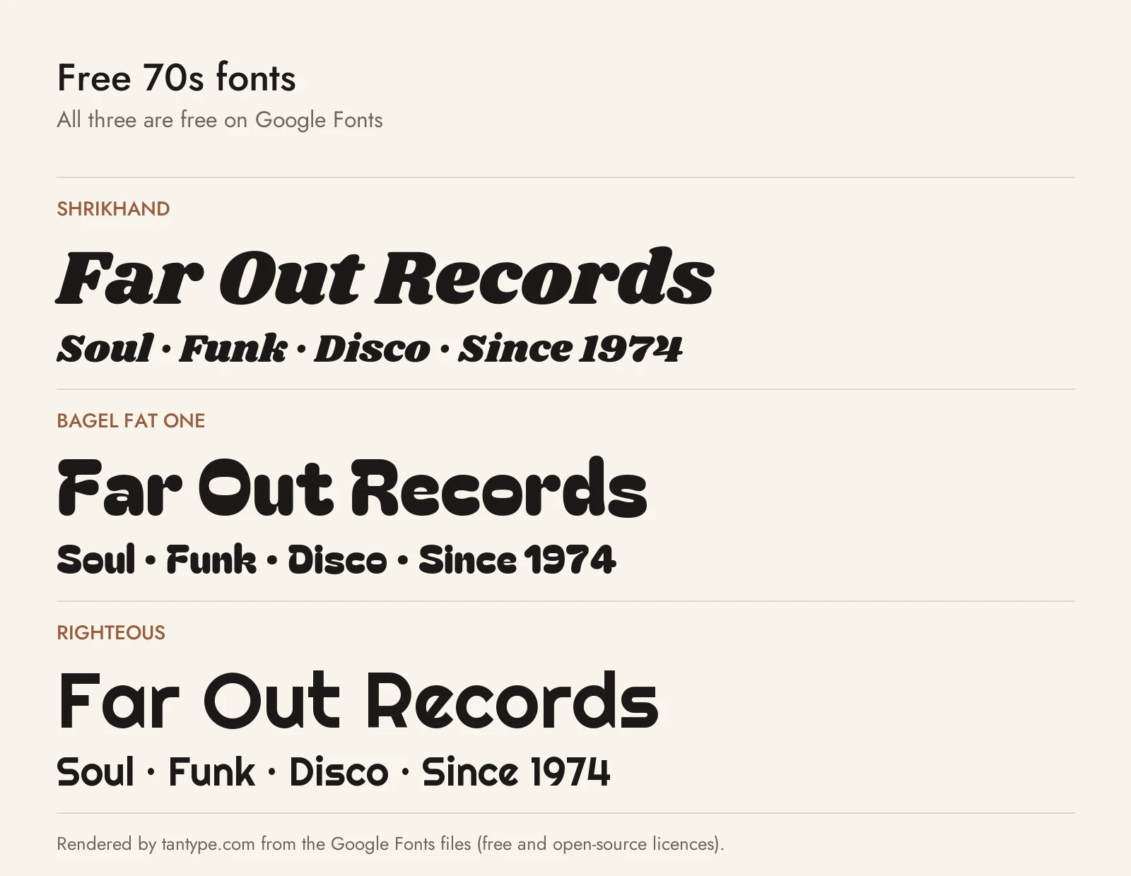
These three are free on Google Fonts under the SIL Open Font License, which allows personal and commercial use. None was drawn as a 70s revival, but each has the right shape.
- Shrikhand by Jonny Pinhorn grew out of the hand-painted street lettering of Gujarat, India. It is heavy, curvy and slanted, the closest of the three to the fat, soft serif look of Cooper Black and Soulway. There is one style and no shadow or extrude version.
- Bagel Fat One is a very heavy, round-cornered face that its designers say was inspired by bread, pastries and sweets. It has the puffy feel of Superfreak or Castrell, but it is cuter and less funky, with no alternates.
- Righteous is grid-based and geometric, with a full lowercase. Its starting point was Robert Berény’s Art Deco posters for Modiano, not the 70s, but its round geometric letters are the nearest free match to the Avant Garde-style sans of the decade, and it reads far better at small sizes than the paid picks.
Licensing: personal vs commercial use
Creative Market sells fonts under four licence types, set out on its font licence page:
- Desktop: unlimited personal and commercial projects, including physical products, packaging, social posts and paid ads. On websites and in games the font may appear only as images. One seat per user.
- Webfont: embedding on websites you own or control, within the pageview limit chosen at checkout.
- App: embedding in one app or game, in a form users can’t extract.
- E-pub: embedding in one ebook title.
Two points matter for 70s-style merch and branding. Print-on-demand tools where your customer, not you, sets the text are not allowed; selling finished shirts or posters you designed is covered by the desktop licence. For logos, the licence allows a font as long as the lettering is modified and isn’t the dominant element, and a registered trademark must disclaim the font. Terms change, so read the current page before you buy. This is a summary, not legal advice.
70s font FAQ
What fonts were popular in the 1970s?
ITC Souvenir, ITC Avant Garde, Cooper Black (a 1922 design revived from the late 60s) and, from 1977, ITC Benguiat. Cooper Black and Souvenir are the two most tied to the decade. The fonts in this guide are modern designs inspired by that look, not copies.
What is a good 70’s font for a T-shirt or Cricut?
Pick a solid, heavy face such as Soulway, Castrell, Superfreak Regular or Groovy Script. They cut cleanly and read from a distance. Check that your licence covers products you sell.
What 1970s font did Woody Allen use?
Since Love and Death (1975), almost all his title sequences use white Windsor Light Condensed on black, according to Wikipedia. Our Windsor guide explains where to get it.
What is the difference between 60s and 70s fonts?
They overlap. Late-60s psychedelic lettering is warped and hard to read on purpose. The 70s mainstream calmed it into fat, friendly type such as Souvenir and Cooper Black, plus tight geometric sans like Avant Garde. Lovestruck sits at the 60s end; Soulway and Olive Village sit at the 70s end.
