
Rollin Eighties: a retrowave display sans for movie posters and club flyers
Design style
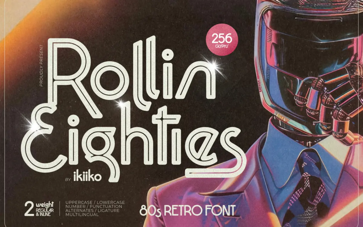
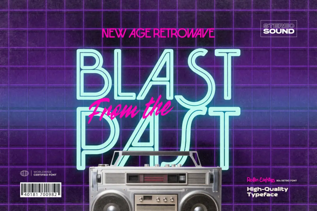
Rollin Eighties is a display sans built squarely on retrowave and disco-era signage rather than on any functional sans serif tradition. The letters lean into sharp diagonal cuts and dramatic curves — you can see the influence of chrome logotypes and VHS box art in the way strokes taper and flare. It comes in two styles, Regular and Inline, which is the one real design decision worth noting: the Inline version strips out the solid fill and leaves a thin channel running through each letterform, giving it that neon-tube look without needing an actual glow effect applied in software.
The letterforms favour attitude over neutrality. Verticals are often angled rather than straight, counters are opened up, and there’s a consistent sense of motion across the set — this isn’t a typeface that sits quietly on a page. That’s by design, and it works for what it’s going after, but it means the font announces itself loudly in any layout.
Character set and features
The set covers uppercase and lowercase, numerals, and punctuation, plus alternates and a ligature or two for designers who want to vary repeated letters or tighten specific pairs. Multilingual support is included, which widens its reach beyond English-only branding work. Both weights ship in TTF and OTF, so it’ll drop into whatever layout software you’re using without conversion headaches.
Worth flagging: this is a display face through and through, not a text face with a retro skin. There’s no attempt at a body-copy companion or a range of weights for hierarchy — you get two options, Regular for a solid, confident mark and Inline for the illuminated-sign treatment. If you need a third weight or a condensed variant for tight spaces, you won’t find it here, and you’ll need to build your own hierarchy using other typefaces for supporting text.
Use cases
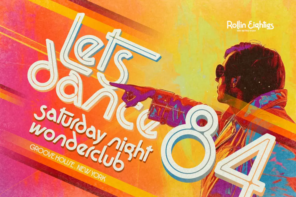
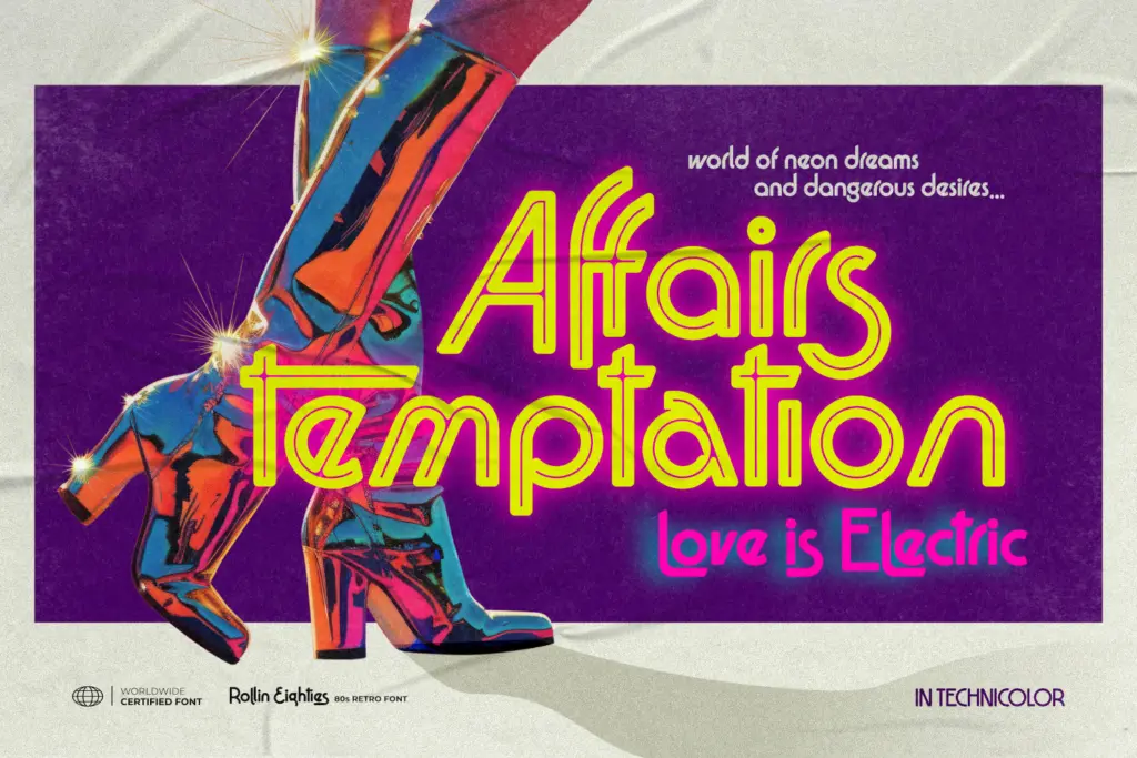
This is a headline font, and it knows it. Movie titles and poster treatments are the obvious fit — the sci-fi/disco crossover feeling practically asks for a tagline underneath and a sunset gradient behind it. Club flyers, event posters, and dance or music branding are equally natural territory, especially where the brief calls for synth-era nostalgia rather than contemporary minimalism.
It also works for packaging or merchandise that’s deliberately retro-themed — cassette-style releases, arcade branding, anything trading on 80s visual shorthand. Logo work is viable too, particularly for brands built entirely around that aesthetic rather than ones that need the mark to flex across sober, modern contexts.
Where it won’t help: anything requiring restraint. Corporate identity, editorial body text, UI, or any context where the typeface needs to recede rather than perform. At small sizes the Inline style in particular will lose definition — those thin internal channels need real space to read as channels rather than just vanishing into the fill. Reserve it for the sizes it was clearly drawn for: headlines, posters, and lockups where it’s the star rather than a supporting player.
What we liked, and what we didn’t
Strengths
- The Inline style gives an authentic neon-sign effect without extra effects work.
- Multilingual support and alternate characters add flexibility for international or varied layouts.
- Strong, consistent retrowave character that reads instantly as 80s without extra styling.
Trade-offs
- Only two weights limits how much hierarchy you can build without pulling in other typefaces.
- Inline style loses legibility at small sizes, so it's strictly a headline or display tool.
Rollin Eighties does one job well: loud, neon-adjacent 80s nostalgia for posters, flyers, and themed branding. It's not built for subtlety or small sizes, and the two-weight range limits how far you can push hierarchy on its own, but within its lane it delivers exactly the mood it promises.
Verdict

Tantype reviews typefaces in depth — every font is tested in real branding, editorial and screen layouts before a word gets written. 555+ fonts reviewed and counting.