
Inktoner: A Photocopy-Grunge Display Font for Underground Design
Design style
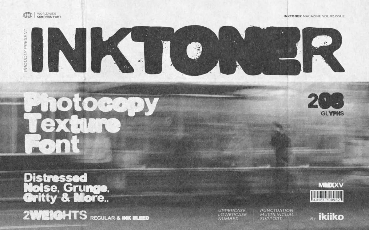
Inktoner is a bold sans display face built around the idea of degraded reproduction — the look of a flyer that’s been through a copier a few too many times. The letterforms are heavy, blocky, and roughed up at the edges with ink bleed and broken strokes standing in for toner scatter and paper grain. It’s not a subtle distress effect; the noise is baked into the outlines themselves, so every letter carries its own irregular chew marks rather than relying on a texture overlay.
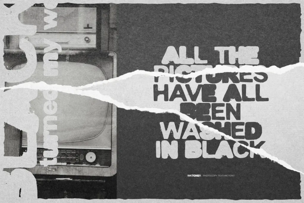
The construction underneath is simple and geometric, which is what keeps the grunge from turning into mush. Strip away the damage and you’d have a fairly plain, wide-set slab-like sans. That restraint matters — the roughness reads as a print artifact rather than a drawing style, which is a harder trick to pull off than it looks. The two weights, Regular and Ink Bleed, give you a way to layer the effect: stack both and letterforms overlap slightly off-register, mimicking a bad double-pass print job.
Character set and features
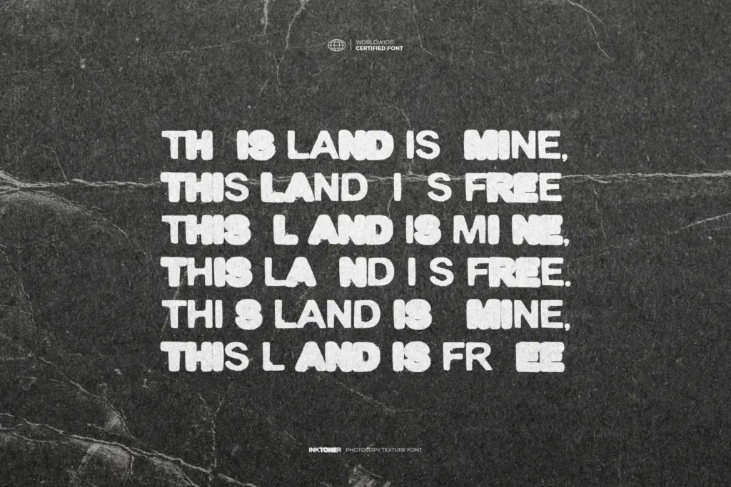
The set covers uppercase and lowercase, numerals, and punctuation, with multilingual support extending its reach beyond English-only projects. Both weights ship as TTF and OTF, and work across Mac and PC without any surprises.
Because the distress is built into the letter shapes rather than applied afterward, the texture is consistent — no random blotches jumping between characters at odd intervals, which is a common failure point in grunge fonts. That said, the lowercase set is less developed in character than the caps. The caps carry the concept; the lowercase feels more like a functional companion than a fully realized partner, and at small sizes some of the finer ink-bleed details start to clump, particularly in tight counters like ‘e’ and ‘a’.
The Ink Bleed weight in particular should be used sparingly — layered over Regular it creates a convincing double-strike effect, but used alone at body-text sizes it degrades into noise fast. This is a font that wants generous point sizes and short runs of text: headlines, single words, maybe a pull quote. It is not built for paragraphs.
Use cases
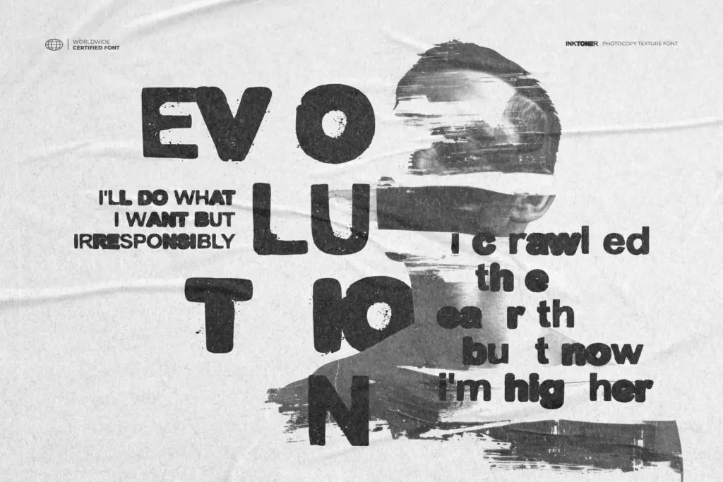
This is squarely a poster and packaging typeface. Movie titles, gig flyers, book covers with a pulp or underground bent, zine mastheads — anywhere the brief calls for a deliberately degraded, photocopied aesthetic. The 90s underground reference in the concept is legible in the finished letterforms: it reads as bootleg flyer or DIY zine rather than polished editorial.
It’s less useful anywhere that needs a clean fallback — logo marks that need to scale down to a favicon, or any UI or long-form text context. Designers reaching for Inktoner should plan to pair it with a plain, quiet body font, since Inktoner itself has no quiet register to fall back on. Used at large sizes, in short bursts, layering the two weights, it does exactly the job it was drawn for.
What we liked, and what we didn’t
Strengths
- Distress is built into the letterforms, so it stays consistent rather than looking randomly applied
- Layering the Regular and Ink Bleed weights gives a convincing double-strike, off-register print effect
- Simple geometric bones underneath keep the grunge from collapsing into illegibility at large sizes
Trade-offs
- Lowercase is noticeably less developed than the uppercase and clumps at smaller sizes
- Not usable for body text or small-scale branding work — it's a headline-only face
Inktoner does one job convincingly: it looks like a bad photocopy without relying on a texture filter. It's built for large, short-run display use, and it strains outside that lane. Anyone needing grunge headline type for posters or covers will get real mileage from it; anyone hoping for a flexible text face will be disappointed.
Verdict

Tantype reviews typefaces in depth — every font is tested in real branding, editorial and screen layouts before a word gets written. 555+ fonts reviewed and counting.