
Hightone: a tall condensed sans built for headlines and posters
Design style
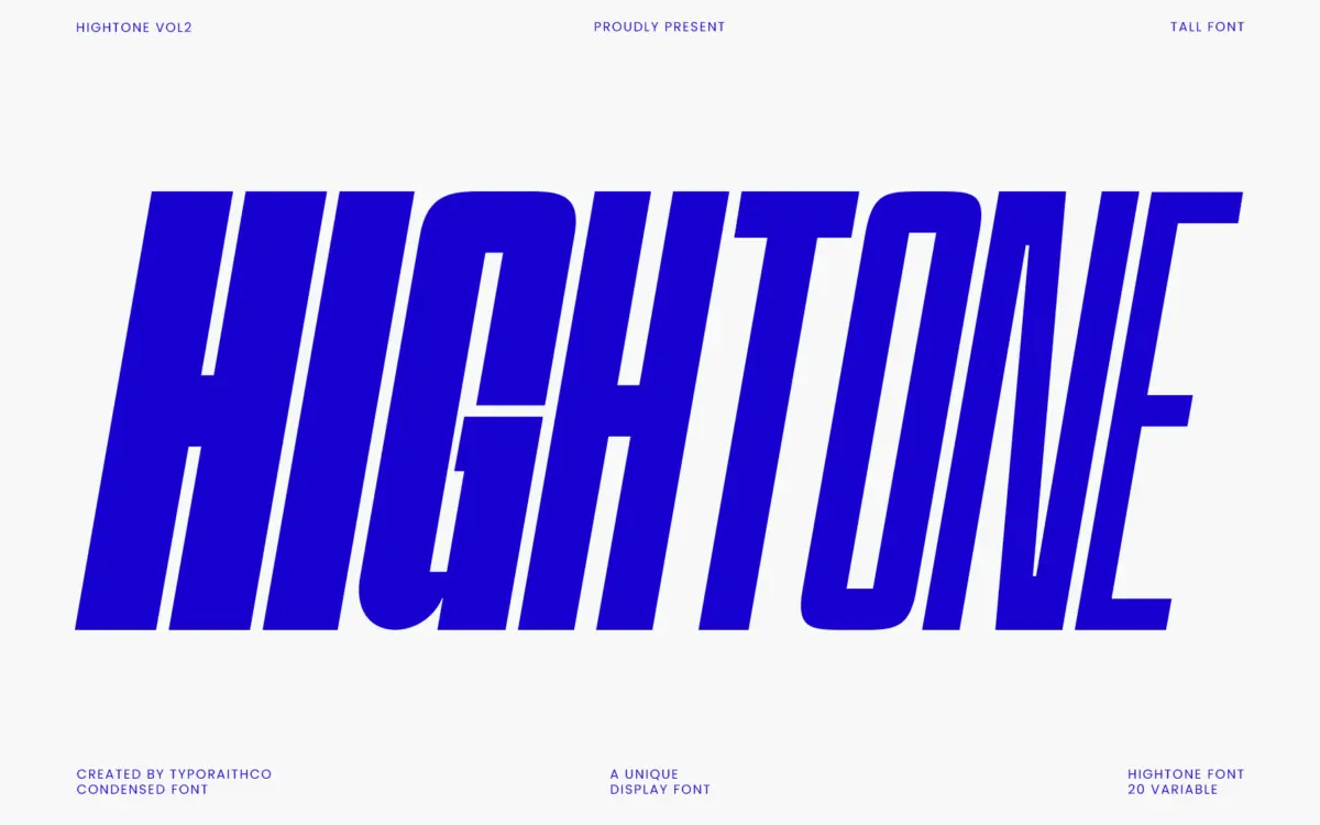
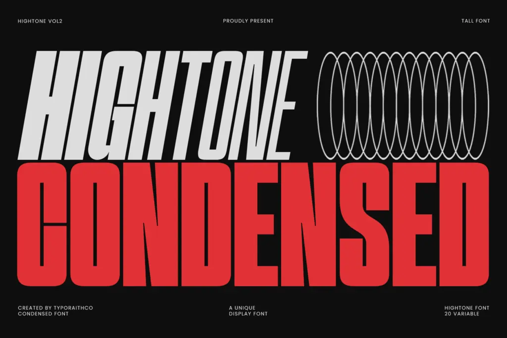
Hightone is a condensed sans pushed hard toward the vertical. Letters are narrow, strokes are even, and the whole family leans on height rather than width to get attention. It sits in a lineage of compressed display grotesques designed for stacking headlines into tight columns — the kind of face you reach for when a headline needs to feel loud without taking up much horizontal room.
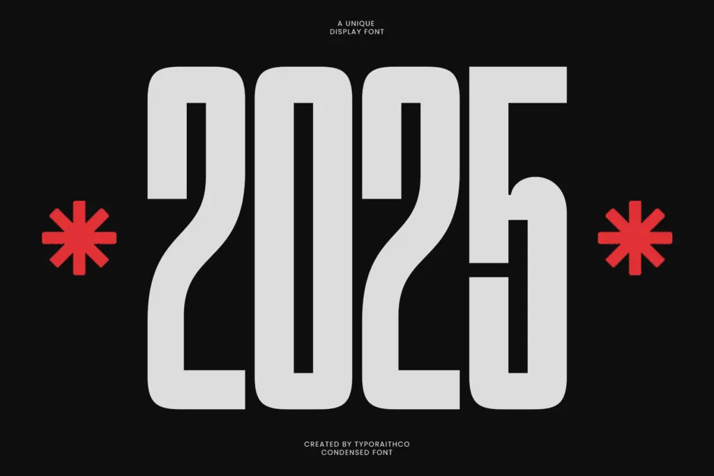
The drawing is competent and consistent across the range. Terminals are cut straight, curves are kept minimal, and there’s little ornamentation to speak of — this is a workhorse condensed face, not a stylistic statement piece. At the Black end the strokes thicken substantially while the skeleton holds its shape reasonably well, though some counters do start to close up, as happens with any condensed family pushed to its heaviest weight. At Thin, the letterforms feel a touch fragile, which is expected but worth noting if you’re planning to set body copy at that end.
Character set and features
The family spans 20 styles across a variable axis running from Thin to Black, so you get fine control over weight rather than being stuck choosing between three or four fixed cuts. That’s the real value here: a single variable file that lets you dial in exactly how much visual weight a headline needs, rather than rounding up or down to the nearest static style.
Multilingual support is included, which extends the font’s usefulness beyond English-only branding work, though the brief doesn’t specify exact language coverage so it’s worth checking your particular diacritic needs before committing. Delivered in OTF and TTF, it’s straightforward to drop into most design and web workflows without extra conversion.
What’s less clear is how much personality lives in the details — ligatures, alternates, or any distinguishing quirks in the character set aren’t mentioned, and nothing in the letterforms suggests hidden flourishes. This is a font built to do one job cleanly rather than to reward close inspection.
Use cases
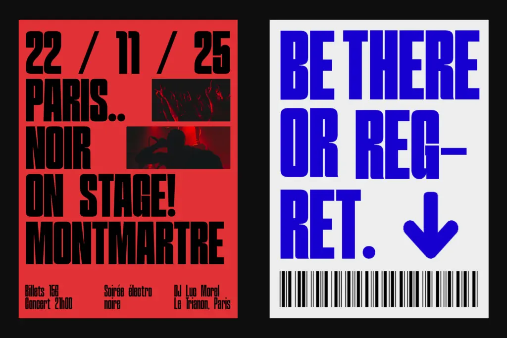
Hightone’s natural home is anywhere you need a strong, narrow headline: posters, editorial mastheads, fashion campaigns, album covers, and branding work where a tall, condensed wordmark needs to hold its own in a small footprint. The tight spacing and vertical emphasis make it effective in layouts where horizontal space is limited but visual punch is not optional — sidebar headlines, poster type stacked in columns, or fashion lockups that want to feel current without being flashy.
It is less suited to running text. The condensed proportions and even stroke weights that make it read as bold and modern at large sizes will fight legibility if pushed down into body copy or long-form paragraphs. Treat it strictly as a display tool: headlines, short editorial decks, and branding elements rather than anything meant to be read at length. Pair it with a more open, generously spaced text face for body copy, and let Hightone carry the loud parts of the layout.
What we liked, and what we didn’t
Strengths
- The 20-weight variable range gives real control over headline weight rather than forcing a jump between fixed styles
- Tight vertical proportions make it effective in narrow layouts where horizontal space is scarce
- Even, unfussy strokes keep the family looking coherent from Thin through Black
Trade-offs
- Counters close up noticeably at the heaviest weights, reducing clarity at small sizes
- No distinguishing character-set features or alternates to set it apart from other condensed display sans faces
Hightone does one thing — tall, tight, high-impact headlines — and does it reliably across a genuinely useful 20-weight variable range. It's not a font with much character beneath the surface, and it isn't built for anything beyond display use, but for posters, editorial headers and fashion branding it delivers exactly what it promises.
Verdict

Tantype reviews typefaces in depth — every font is tested in real branding, editorial and screen layouts before a word gets written. 555+ fonts reviewed and counting.