
Sequoia Display: a hand-drawn variable width font for retro posters
Design style
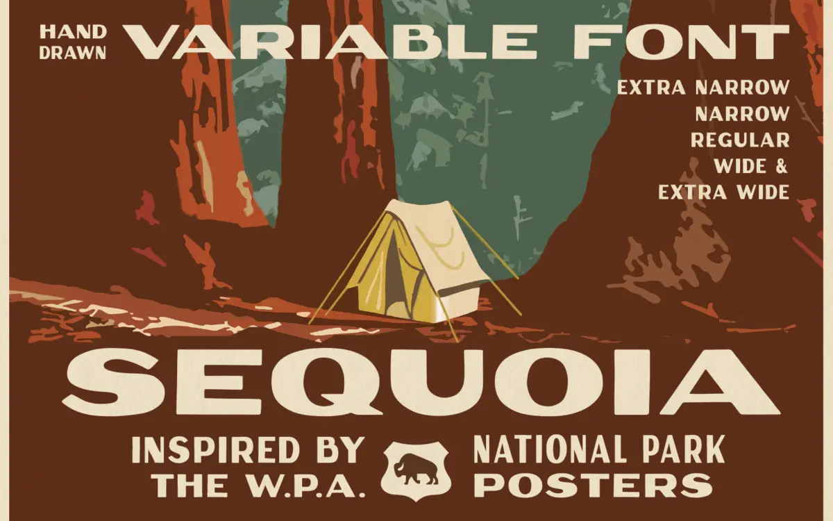
Sequoia Display borrows its temperament from the WPA national park posters of the 1930s — that blocky, screen-printed lettering that had to fill a fixed banner no matter what the word was. Rachel Kick has built that constraint into the font itself rather than just imitating the look. The letterforms are heavy, slightly irregular, with the kind of hand-cut edges that suggest a brush or a knife rather than a pen. Curves bulge a little unevenly, terminals are blunt, and the overall texture reads as warm and workmanlike rather than polished.
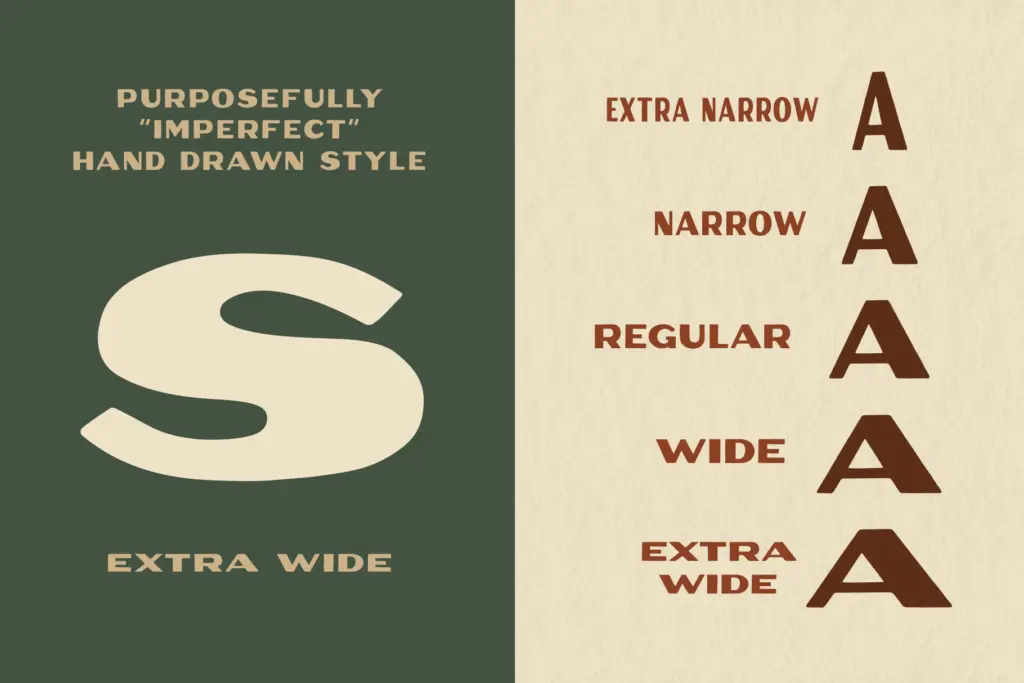
What makes it more than a nostalgia exercise is the variable axis running from extra narrow to extra wide. Stretching a hand-drawn face usually breaks it — strokes thin out, curves go slack — but Sequoia’s structure is simple enough that it holds its character across the range. At extra narrow it gets dense and stacked, almost architectural; at extra wide it relaxes into something closer to a friendly shop sign. It’s a good demonstration of variable font technology actually solving a real layout problem instead of being a gimmick.
Character set and features
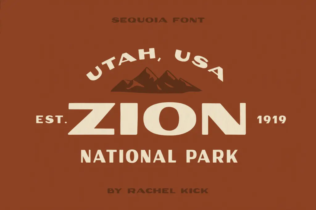
The font ships as a variable file plus five fixed static instances — extra narrow, narrow, regular, wide, and extra wide — each in OTF, WOFF, and WOFF2. That’s a sensible way to cover both web and print workflows without forcing anyone into variable-font tooling if they don’t want it. Practically, this means you can set a headline, then nudge the width until the line breaks where you want it, which is exactly the problem the original poster letterers were solving by hand.
Because it’s a single heavy weight rather than a family with light and bold options, don’t expect much tonal range within a layout — Sequoia does one job, loudly, and the width axis is your main lever for variation. The hand-drawn irregularities are consistent enough not to look accidental, but they do mean the font has a fixed personality: quirky and organic, not neutral. There’s no attempt here to be a workhorse text face, and it isn’t trying to be.
Use cases
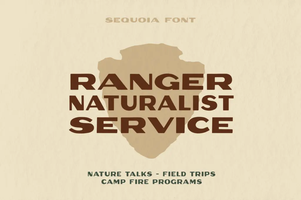
This is a headline and lockup font, not a paragraph font. It suits packaging, posters, badges, and branding work that wants an outdoorsy, retro-Americana feel — camping gear, craft beverages, park-themed merchandise, farmers’ market signage, that general territory. The width flexibility makes it genuinely useful for logo design and lockups where you need type to fill an exact space, like a badge or a bottle label, without hand-kerning every letter.
It’s less suited to anything needing subtlety or a wide range of voices — long headings that need to feel calm, or corporate identity work that wants restraint, will fight against Sequoia’s built-in roughness. Pair it with a plain sans or serif for body copy; asking it to do quiet work will just frustrate everyone involved.
What we liked, and what we didn’t
Strengths
- Variable width axis genuinely solves the problem of fitting headline text into a fixed space
- Hand-drawn irregularities stay consistent and controlled across the full width range
- Ships as both variable and five fixed static instances, covering web and print workflows
Trade-offs
- Single heavy weight limits tonal range within a layout
- Its rough, retro personality is fixed and won't suit brands wanting restraint or neutrality
Sequoia Display does one thing — bold, hand-drawn poster lettering — and does it with a genuinely useful variable width axis. It's not a text face and shouldn't be asked to be one, but for badges, packaging, and retro branding it earns its keep.
Verdict

Tantype reviews typefaces in depth — every font is tested in real branding, editorial and screen layouts before a word gets written. 555+ fonts reviewed and counting.