
Editor’s Note Display: a high-contrast serif built to be shown large
Design style
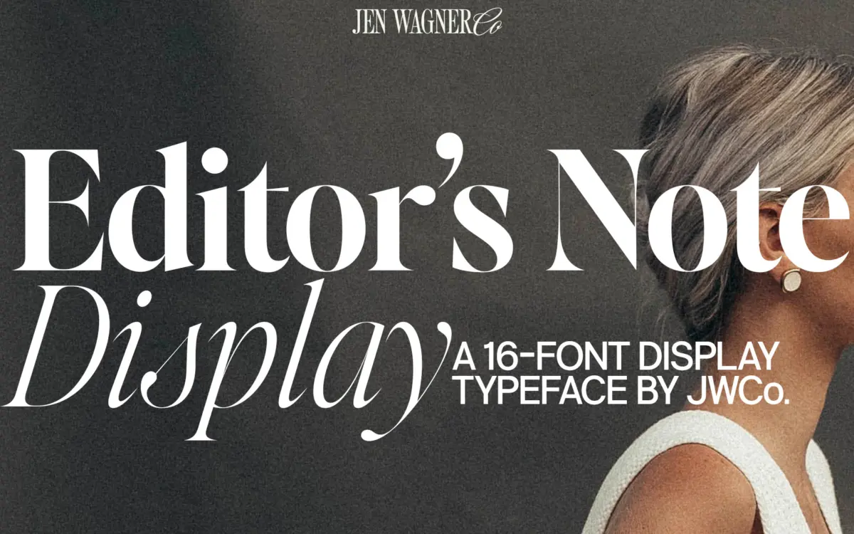
Editor’s Note Display is a companion to a text-oriented family, and it reads that way: the letter skeletons are familiar, but the contrast has been cranked hard for headline duty. Thick strokes swell and then narrow to genuinely thin hairlines, and the serifs come to sharp, almost brittle points rather than the softer bracketed serifs you’d expect in a workhorse text face. That combination of high contrast and pointed detailing gives it a slightly severe, fashion-editorial temperament — closer to the mastheads of glossy magazines than to a book interior.
The eight weights give it real range, from a delicate hairline-adjacent style up through something dense enough to anchor a cover line. What stays consistent across the range is the sense that this is a display face first: the drawing rewards size. Curves that would look fussy at small sizes resolve into confident, controlled arcs once you’re working at headline scale, and the sharp terminals read as intentional rather than accidental.
Character set and features
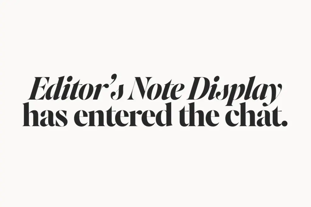
Sixteen fonts across eight weights, each with an italic, is a generous spread for a display family, and it means you’re not stuck picking between two or three options when a layout needs something between bold and black. Western and Central European language support covers most Latin-based editorial and branding work without extra hunting for accented characters. Numbers and punctuation are included, which matters for a face pitched at magazine-style headlines and pull quotes, where dates, prices and quotation marks show up constantly.
The italics are worth singling out. Given the high contrast in the roman, the italic could easily have gone spindly or unstable, but it holds its shape reasonably well — the thin strokes stay thin without disappearing, and the slant doesn’t undercut the pointed serif detailing that defines the family. That said, at the lightest weights the hairlines get thin enough that they’ll disappear on a lower-resolution screen or a coarse print substrate, so testing at your actual output size and medium is worth the ten minutes it takes.
Use cases
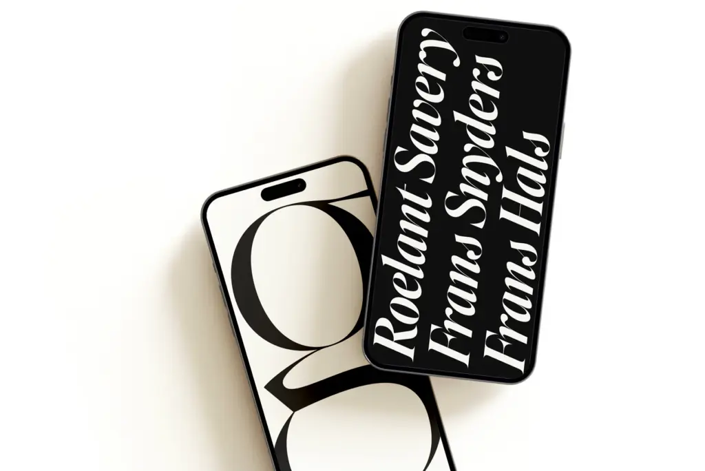
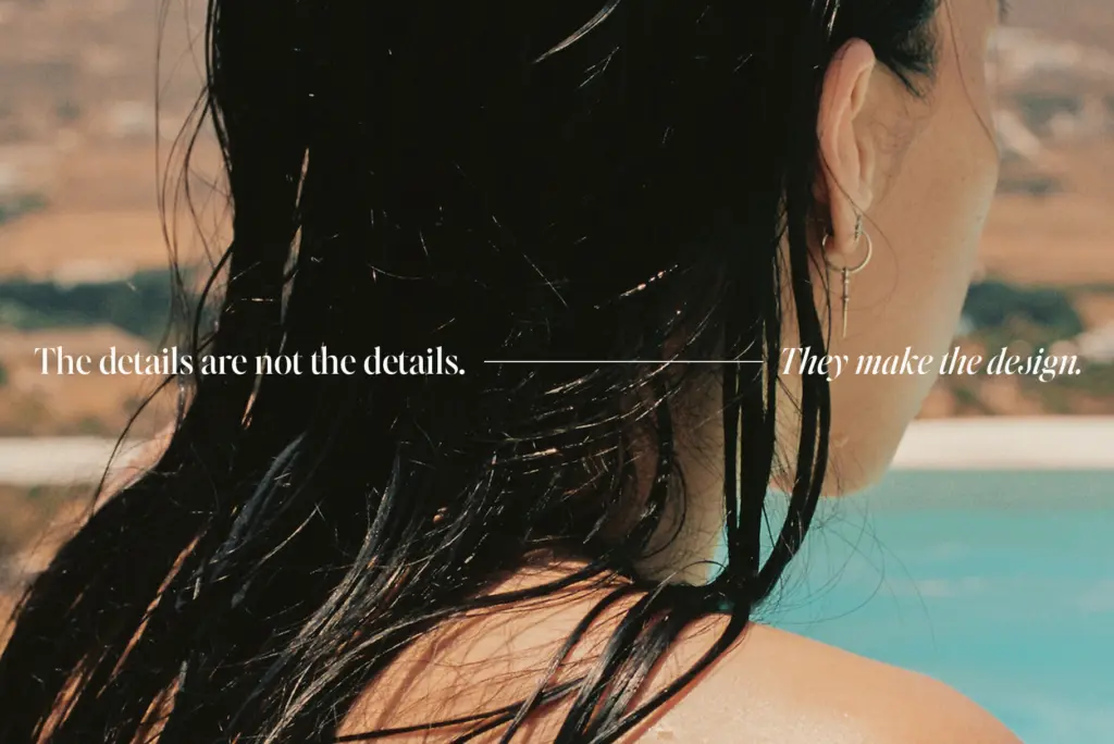
This is a headline font, not a paragraph font, and it knows it. It’s suited to web headers, social carousel titles, reel cover text, magazine-style pull quotes, and branding moments where a single word or short phrase needs to carry visual weight. The high contrast gives it a certain confidence at large sizes that a lower-contrast serif can’t match — it photographs well, and it holds up when blown up across a hero image or a poster.
Where it runs into trouble is anywhere the type has to shrink. Body copy, captions, dense UI labels — the hairlines start to fight the contrast, and at small sizes the sharp points that make it distinctive at 80pt just look thin and fragile. Pair it with the text-weight sibling in the family for those jobs rather than pushing this display cut smaller than it wants to go. Used as intended — big, short, confident — it does its job well.
What we liked, and what we didn’t
Strengths
- Eight weights with italics give real range for headline hierarchy
- Sharp, pointed serif details hold up convincingly at large scale
- Italic maintains structure despite the high stroke contrast
Trade-offs
- Hairlines at light weights can vanish on screen or coarse print stock
- Not suited to body copy or small-size UI text
Editor's Note Display is a confident headline serif with genuine drawing quality in its pointed serifs and high contrast strokes. It's built to be used big, and it should be — push it down to small sizes and the hairlines start to work against it. Best paired with a text-weight companion for anything smaller than a headline.
Verdict

Tantype reviews typefaces in depth — every font is tested in real branding, editorial and screen layouts before a word gets written. 555+ fonts reviewed and counting.