
Knockout Font Free Download
There is no legal Knockout font free download. Knockout is a commercial typeface designed by Jonathan Hoefler and sold by Hoefler&Co., which has been part of Monotype since 2021. Neither Hoefler&Co. nor MyFonts offers a free, trial or personal-use version. As of October 2026 a five-style Knockout series costs $169 from Hoefler&Co. or $177 on MyFonts, and the complete 32-style family costs $799 or $839.
Knockout font free download: is there a free version?
No. Hoefler&Co.’s Knockout page and the Knockout collection on MyFonts both sell it only as paid packages. Sites offering a free Knockout ZIP have no right to distribute it, and using those files leaves you unlicensed.
MyFonts lists Knockout under Hoefler & Co. and sells each series as a separate pack, as well as the full family:
License Knockout on MyFonts Commercial font: series packs from $177
If you can’t pay, the free Google Fonts alternatives below share Knockout’s American gothic roots and allow commercial use.
Knockout font at a glance
- Designer: Jonathan Hoefler, with contributions from Kevin Dresser
- Foundry: Hoefler&Co. (formerly Hoefler & Frere-Jones), acquired by Monotype in 2021
- Year: 1994, according to Hoefler&Co.; Fonts In Use gives 2000 as the release year
- Style: grotesque sans in the American wood-type gothic tradition
- Family: 32 styles across nine widths and four weights
- Languages: Hoefler&Co.’s Expanded Latin, listed as 503 languages
- Price: $169 per series or $799 for all 32 styles at Hoefler&Co.; $177 or $839 on MyFonts
- Free alternatives: League Gothic, Oswald, Anton
Design and character
Knockout looks back to the sans serifs that American job printers used from the late nineteenth century. The design notes say its styles reference “the tall, condensed wood types used for posters” and also the small “engraver’s faces” once used on stationery. It is a reworking of Hoefler’s earlier Champion Gothic headline series from 1991, and it first appeared in The New York Times Magazine in 1994.
Most modern sans families start from one design and stretch or embolden it. Hoefler&Co. argues that the old gothics were unrelated designs, each drawn for its own width and weight, and Knockout keeps that approach: the styles are organised as a family but drawn individually. Typewolf sums it up: Knockout “contains nine different widths and each width is individually designed.”
The MyFonts Knockout Field Guide lists the details to look for: an up-turned ear on the lowercase g, a curved base on the stem of the a, square dots on i, j and punctuation, a k whose lower diagonal meets the upper one halfway up the stem, and flat-sided counters in many styles. It calls Knockout “essentially a display design” that is “at its best in large sizes.”
What’s in the Knockout font family: the naming system
Every Knockout style has a number and a name borrowed from sports weight classes, such as No. 49 Lightweight or No. 93 Ultimate Heavyweight. Hoefler&Co.’s How to Use guide explains that, following nineteenth-century wood type, the styles are “organized by width instead of weight.”
- The boxing name is the width. Flyweight is the narrowest, then Bantamweight, Featherweight, Lightweight, Welterweight, Middleweight, Cruiserweight and Heavyweight, with Sumo as the widest.
- The prefix is the weight. “Junior” styles are light, unprefixed styles are the regular weight, “Full” styles are bold, and “Ultimate” styles are superheavy.
- The number encodes both. Junior runs from No. 26 to 34, regular from 46 to 54, Full from 66 to 74 and Ultimate from 90 to 94. Within each weight, a higher number is a wider style.
That gives nine Junior, nine regular, nine Full and five Ultimate styles (Welterweight to Sumo only), 32 in all. Hoefler&Co. sells them as seven five-style series: A (light condensed, Nos. 26–30), B (light wide, 30–34), C (condensed, 46–50), D (wide, 50–54), E (bold condensed, 66–70), F (bold wide, 70–74) and G (superheavy, 90–94). In the Junior, regular and Full weights, the Welterweight belongs to two series. There are no italics.
Installed fonts often show shortened menu names, so Knockout No. 93 Ultimate Heavyweight can appear as “Knockout 93 Ultmt Heviwt”.
Picking styles that work together
Because Knockout has no standard regular–bold pairs, Hoefler&Co. gives a rule for emphasis: to find the bold companion for a Series A or B style, add 41 to its number. No. 28 Junior Featherweight pairs with No. 69 Full Lightweight, for example. Neighbouring widths help with copyfitting too: the guide says swapping No. 51 for No. 50 or No. 52 usually passes unnoticed.
Language support and OpenType features
Knockout uses Hoefler&Co.’s Expanded Latin character set, which the foundry says supports 503 languages. The foundry lists only Latin-script languages, so don’t expect Cyrillic or Greek.
The How to Use guide lists four stylistic sets, which are switchable groups of alternate characters:
- Set 01: a straight-legged R
- Set 02: a figure 1 with a flag serif
- Set 03: a simplified euro sign
- Set 04: a larger ® symbol
Knockout also swaps in a lowercase t with a lowered crossbar when it sits next to an f, so the two bars line up, and it includes extra squares and arrows. InDesign, Illustrator, Photoshop, Affinity and Figma can reach these features. Canva, Cricut Design Space and most video editors can’t, so there you get the default letters.
Knockout font pairings and best uses
Knockout belongs in headlines, posters, packaging and branding. Size depends on style: Hoefler&Co. recommends the dense Series G for subheads and larger, while the light, wide Series A and B styles stay readable at very small sizes. For long text, the foundry points to Ringside, a separate 96-style adaptation of Knockout built for text and screens.
- Foundry pairings: Hoefler&Co. suggests Sentinel, Chronicle Display, Verlag and Indicia. The MyFonts Field Guide suggests Frutiger Serif, Requiem, Palatino Nova and Serifa.
- Free pairings: Zilla Slab gives a slab-serif contrast similar to Sentinel, Source Serif 4 works for body text, and Libre Franklin keeps the American gothic mood in small sizes.
- Decoration: Cyclone, sold separately, is a set of inline capitals modelled on Knockout No. 67 for two-colour headlines.
Fonts In Use lists 144 uses of Knockout. They include Pentagram’s Free Shakespeare in the Park 2018 campaign for The Public Theater, which builds on Paula Scher’s long-running identity for the theatre. Other entries are the subtitles on Vintage Books’ 2009 Raymond Carver series and Universal’s film The Hunt (2020).
Knockout licensing and prices
All prices are in US dollars as of October 2026 and can change.
- Hoefler&Co.: each series costs $169 and Knockout Complete (32 styles) costs $799 for one computer. For two computers the prices are $218 and $898; for five, $365 and $1,195.
- MyFonts: each Series Pack costs $177 and the Complete Family $839 for the smallest desktop licence. MyFonts also sells Webfont, App, Digital Ad/Email and Electronic Doc licences.
The two stores don’t count users the same way. Hoefler&Co. licenses fonts per computer, while MyFonts’ desktop licence is per user. Neither store sells a single style: Hoefler&Co.’s FAQ says licences for fewer than 50 computers must be bought as whole packages. Website use is a separate self-hosted webfont licence priced by traffic, and Cloud.typography is closed to new users.
For logos, the FAQ says to convert the lettering to outlines before handing it to a client. You may reshape the outlines, but you may not edit the font files. Every use, personal or commercial, needs a paid licence. This is a summary, not legal advice, so read the end-user licence agreement before buying.
Is the Knockout font on Adobe Fonts?
No. As of October 2026 there is no Knockout page on Adobe Fonts, and Adobe’s Jonathan Hoefler page lists Gotham, Archer, Sentinel and Hoefler Text, but not Knockout. A Creative Cloud subscription doesn’t cover it.
How to download and install Knockout
- Buy a series or the complete family from Hoefler&Co. or MyFonts.
- Download the ZIP from the link at the end of checkout or in your receipt email.
- Mac: open Font Book and drag the OpenType files in.
- Windows: select the .otf files, right-click and choose Install.
- Restart your design apps so the new styles show up in the font menu.
Free fonts similar to Knockout
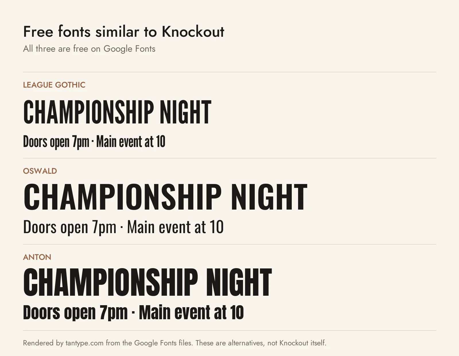
No free font copies Knockout’s individually drawn widths, but these three Google Fonts share its American gothic roots. All use the SIL Open Font License, which allows commercial use.
- League Gothic: a revival of Morris Fuller Benton’s Alternate Gothic (1903) with a variable width axis. It is the closest free match for Knockout’s narrow end, but it has one weight.
- Oswald: also based on Alternate Gothic, with weights from ExtraLight to Bold plus Cyrillic. It covers Knockout’s middle ground, but it has only one width, so it can’t follow Knockout from narrow to wide.
- Anton: a single heavy weight based on a traditional advertising sans. Use it where you would reach for Knockout’s Full or Ultimate styles in posters and sports graphics.
Among fonts we cover, Neukultur is a compressed sans for loud headlines and tight spaces, Gameday is a collegiate sans for sports branding and jersey numbers, and Whitney is another Hoefler&Co. sans.
Knockout pairs well with Gotham, the foundry’s geometric sans, for body text and subheads.
For a newer condensed sans with slanted styles, see our guide to Gazzetta, the TipoType font used on Taylor Swift’s The Life of a Showgirl.
Knockout font FAQ
Is Knockout font free?
No. Knockout is a commercial Hoefler&Co. font with no free or personal-use version. Licences start at $169 for a five-style series from Hoefler&Co. or $177 on MyFonts.
What is Knockout Featherweight?
Featherweight is the third-narrowest width. It comes in three weights: No. 28 Junior Featherweight (light), No. 48 Featherweight (regular) and No. 68 Full Featherweight (bold). The Ultimate series has no Featherweight.
Who designed Knockout?
Hoefler&Co. credits Jonathan Hoefler, with contributions from Kevin Dresser. Typewolf credits Hoefler and Tobias Frere-Jones and lists the foundry as H&FJ, the name it used while the two were partners.
Can I use Knockout in Canva or Cricut?
We couldn’t confirm Knockout in Canva’s built-in library. To use it there or in Cricut you would upload licensed files yourself, so check your licence covers that first. Stylistic sets won’t work in either.
What is the closest free font to Knockout?
League Gothic is closest for the narrow styles, Oswald for general headline use and Anton for the heavy styles.
