
Elegant Fonts: 11 Best Elegant and Luxury Fonts for Branding and Weddings
Elegant fonts look calm, expensive and deliberate: fine hairlines against heavy strokes, generous space between letters, and nothing that shouts. Most fall into three groups: high-contrast serifs from the Didone tradition, refined pointed-pen scripts, and a few light, quiet sans serifs.
Our top three are The Very Vogue Serif Family, a fashion-magazine serif with separate Display and Text cuts; Figura Sans, a 12-font sans for brand systems; and Take Me To Tuscany, a looping calligraphic script for labels and invitations. Every font on the main list is a commercial Creative Market font. Six genuinely free options, with their licences, are further down.
Browse elegant fonts on Creative Market Commercial fonts: regular one-seat Desktop prices, checked October 17, 2026
What is an elegant font?
An elegant font is a typeface that reads as refined and formal rather than casual. Most get there through high contrast between thick and thin strokes, fine or hairline serifs, open spacing and restrained shapes. The best-known examples are Didone serifs such as Bodoni and Didot, pointed-pen scripts and modulated sans serifs like Optima.
“Elegant” isn’t a formal classification; it describes a feeling that a handful of traits produce.
High stroke contrast and hairline serifs: the Didone look
The style most people picture is the Didone, or “modern”, serif. Wikipedia’s Didone article lists its traits as “narrow and unbracketed (hairline) serifs”, a vertical stress, “strong contrast between thick and thin lines” and, on some letters, ball terminals. Firmin Didot, Giambattista Bodoni and Justus Erich Walbaum defined the style around 1800; the name, a blend of Didot and Bodoni, dates from 1954. The article notes Didones are often printed on the glossy paper of Harper’s Bazaar and shows a Didot-style logo on British Vogue. That fashion link is why the style reads as luxury, and its fragile hairlines are part of the appeal and the risk. Our Bodoni font guide covers the legal free versions.
Generous spacing and small caps
Elegant layouts give letters room. Matthew Butterick’s Practical Typography recommends “5–12% extra letterspacing” for all caps or small caps, but not for lowercase. Small caps, “short capital letters designed to blend with lowercase text”, give names and headings an engraved feel. He warns that the small-caps button in a word processor “produces inferior counterfeits”; use a font with real small caps.
Refined scripts
Formal scripts copy the pointed steel pen. Microsoft’s description of Edwardian Script ITC notes the pen “can be pulled as well as pushed”, so pressure, not the angle of the nib, makes the thick and thin strokes. That swelling stroke separates a refined script from casual handwriting. For more pen-based styles, see our best calligraphy fonts.
Elegant sans serifs
Sans serifs get there through light weights, wide spacing or stroke modulation. Hermann Zapf’s Optima, released in 1958, is the classic example: Wikipedia calls it a “modulated-stroke sans-serif” with “a subtle swelling at the terminals suggesting a glyphic serif”, inspired by tombstone lettering at Santa Croce in Florence. Our Optima guide explains how to get it legally. Roman inscriptional capitals, the source of Trajan, are the other classic route to a formal, engraved look.
The best elegant fonts at a glance
| Font | Best for | Styles | Desktop price* |
|---|---|---|---|
| The Very Vogue Serif Family | Fashion headlines plus matching body text | Display and Text sub-families | $49 |
| Juana | Magazines and editorial branding | 8 weights with italics, plus an alternate version | $139 |
| Aida | Fashion wordmarks with ligatures | 10 (Light to Bold, roman and italic) | $79 |
| Muse | Chic logos and titles on a budget | 2 (Regular, Italic) | $18 |
| The Roman Edition | Classical book titles and premium packaging | 2 (Regular, Italic) | $69 |
| Figura Sans | Full brand systems and body text | 12 (6 weights with italics) | $129 |
| Sorento | A sans with serif-like contrast | 14 (7 weights with italics) | $20 |
| Brisca | Beauty and cosmetics wordmarks | All caps; style count not stated | $19 |
| Take Me To Tuscany | Perfume, fashion labels, invitations | 1 main style plus bonus variants | $30 |
| Stipa Willington | Wedding stationery and greeting cards | 1 | $23 |
| Quiet Luxury | A ready-made serif and script pairing | 2 (serif, script) | $15 |
*One-seat desktop licence on Creative Market, checked October 2026.
How we chose these fonts
We started from tantype’s own reviews of Creative Market fonts and kept only those with the traits above: high contrast, fine detail, controlled spacing or a pointed-pen stroke. Each listing was checked live on October 17, 2026 for availability, the regular Desktop price, styles, alternates and language support, plus buyer ratings where shown. We favoured families that can do more than one job and left out fonts already in our logo and calligraphy roundups. Descriptions come from the listings and our reviews, not from printing every font.
Best elegant fonts on Creative Market
Prices are regular one-seat Desktop licences, checked October 17, 2026. Sales are frequent; see each listing for current pricing.
Elegant serif fonts. These carry most luxury identities: fashion, beauty packaging, hotels and magazine covers.
1. The Very Vogue Serif Family
Nicky Laatz based this family on “glamourous fashion magazines from the 80’s and beyond.” Its strength is practical: two sub-families. Display has “higher contrast” and “naturally tighter letterspacing” for headlines; Text has “less contrast, a slightly heavier weight, and looser letterspacing” for body copy. That solves the main problem with Didone-style serifs, hairlines that break up when small, without a second font. The listing gives no weight count or language list. Desktop licence: $49.
See The Very Vogue Serif Family on Creative Market · Read our The Very Vogue Serif Family review
2. Juana
Latinotype describes Juana’s “extreme contrast between thick and thin strokes,” and it is the most complete serif family here: eight weights with matching italics, plus an alternate version with more calligraphic shapes, covering over 200 Latin-based languages. Our review notes genuinely cursive italics and contrast that holds from the lightest weight to the boldest. Latinotype names “editorial design, branding, magazines, logos, headings.” It’s the priciest pick, but it can run a whole publication. Desktop licence: $139.
See Juana on Creative Market · Read our Juana review
3. Aida
Silktype calls Aida “a high-contrast display typeface made for elegant, eye-catching design”, aimed at “headlines, fashion branding, and editorial layouts.” There are ten styles, Light to Bold in roman and italic, and “over 100 decorative ligatures and alternates” for building a distinctive wordmark. The lightest hairlines suit a perfume label but can vanish on cheap paper or small screens, so use the bolder weights small. The listing doesn’t state language support. Desktop licence: $79.
See Aida on Creative Market · Read our Aida review
4. Muse
Harmonais Visual’s Muse is “a chic & elegant display modern serif” made “for fashion-themed projects”: hairline serifs, a vertical stress and a slightly compressed, upright stance. You get HV Muse Regular and Italic in OTF, TTF and WOFF, ligatures you reach through Illustrator’s Glyphs panel, support for European languages and Vietnamese, and six free logo templates. For a boutique name or a lookbook title, it gives the Didone look for very little. Desktop licence: $18.
See Muse on Creative Market · Read our Muse review
5. The Roman Edition
Not every elegant serif is a Didone. SilverStag’s The Roman Edition is drawn “to embody the rich heritage of classical Roman letterforms”: wide, stable capitals with bracketed serifs, closer to inscriptions than to fashion magazines. The Regular is pitched at “magazine headlines, book titles, premium product branding”; the Italic adds “graceful swashes, ornate flourishes, and calligraphic endings.” It has over 50 ligatures and alternates and covers over 90 languages. Our review found the capitals and the softer lowercase set two different moods. Desktop licence: $69.
See The Roman Edition on Creative Market · Read our The Roman Edition review
Elegant sans serifs. Quieter than the serifs, they work for modern beauty, wellness and architecture brands, and as the partner to a high-contrast headline.
6. Figura Sans
Jen Wagner’s Figura Sans is a “classic, luxe sans” that, according to the listing, works “in both large and small settings as a display and body text.” Its 12 fonts run Light, Regular, Medium, Semibold, Bold and Extrabold, each with an italic. Our review notes open counters, cut terminals and a generous x-height, with italics that flow more than the uprights. No letter calls attention to itself, so it can sit behind a logo and carry packaging copy and, with a Webfont licence, the website. Desktop licence: $129.
See Figura Sans on Creative Market · Read our Figura Sans review
7. Sorento
Sorento is “an elegant, modern and contrast sans-serif font family” from Larin Type Co. Unlike most sans serifs it keeps a visible thick-thin rhythm, the same idea that makes Optima look refined, so it can feel high-end without serifs. There are 14 fonts (seven weights, upright and italic) in OTF, TTF, WOFF and EOT, and stylistic alternates “with a teardrop-shaped tail for uppercase and lowercase” for wordmarks. The best-value sans here. Desktop licence: $20.
See Sorento on Creative Market · Read our Sorento review
8. Brisca
Brisca is a thin, tall, all-caps sans from Creative King Design, aimed at “cosmetics, beauty, brands, logos, wordmarks, magazines.” Its strokes thin to hairlines in places, giving a drawn, almost calligraphic feel, and the listing mentions ligatures. Being caps only, it needs a second font for anything longer than a line, and hierarchy has to come from size and spacing. Widely letterspaced on a jar or a salon sign, it looks expensive. Files: OTF, TTF and WOFF. Desktop licence: $19.
See Brisca on Creative Market · Read our Brisca review
Elegant script fonts. Use them for one word or a short line: a name, a product title, an invitation heading.
9. Take Me To Tuscany
Nicky Laatz’s script was designed “to sweep you away with its extended strokes, exaggerated loops and decorative flourishes.” Strong contrast gives it a pointed-pen look; the steady slant keeps it readable. The listing suggests “Luxury branding, such as fashion labels, perfumes, or premium event invitations.” It includes 82 alternate letters and ligatures, PUA-encoded so you can reach them in Canva and other apps without OpenType support, plus bonus variants with slightly different weight and slant. It needs size: small, the hairlines turn to smudge. Desktop licence: $30.
See Take Me To Tuscany on Creative Market · Read our Take Me To Tuscany review
10. Stipa Willington
Alcode’s Stipa Willington is a calmer choice: a fairly upright script with controlled joins, moderate contrast and flourishes that don’t take over. Our review found its generous x-height keeps it from collapsing at smaller sizes, which matters for place cards and envelopes. It includes ligatures, a stylistic set of alternates and multilingual support; the listing suggests “wedding media, book covers, greeting cards, logos, branding.” It holds 4.8 out of 5 from 24 ratings, with 6,271 sales. Desktop licence: $23.
See Stipa Willington on Creative Market · Read our Stipa Willington review
A matched pair. If you’d rather not pair fonts yourself, a duo does it for you.
11. Quiet Luxury
Andrew Pixel’s Quiet Luxury combines “a tall, high-contrast serif and a graceful, flowing calligraphy script.” The serif has “elongated stems and delicate hairlines”; the script adds “sweeping swashes.” Our review puts it at the understated, fashion-magazine end of the style. It’s a small package, two OTF files with no stated glyph count or language list, so check your characters first. For a boutique or a candle line, it is a cheap matched pair. Desktop licence: $15.
See Quiet Luxury on Creative Market · Read our Quiet Luxury review
How to choose an elegant font
Luxury fonts by industry: fashion, beauty, jewellery and weddings
- Fashion: high-contrast Didone serifs, set large in spaced capitals. The Very Vogue, Aida and Muse sit in this tradition.
- Beauty and skincare: thin or modulated sans serifs such as Brisca and Sorento, with a serif or script for the product name. Mind the cliché: Jonathan Hoefler, quoted on Wikipedia, called Optima “the font of choice for the hygiene aisle.”
- Jewellery and watches: engraved-looking capitals suit small, precious objects: The Roman Edition, Juana in capitals, or the Roman-inscription style behind Trajan.
- Weddings: a pointed-pen script for names (Stipa Willington, Take Me To Tuscany) with a serif for details. See also our calligraphy fonts, or our Art Deco fonts for a 1920s look.
For a logo, Creative Market’s licence has specific trademark rules, covered in our guide to logo fonts.
Pairing an elegant serif with a sans
The most reliable pairing is a high-contrast serif for headlines with a calm sans for everything else. Keep one font in charge: the more ornate the serif, the plainer the sans. Good pairs from this list are Juana with Figura Sans, or Aida with Sorento. Free pairs: Bodoni Moda with a neutral sans, or Cormorant Garamond with Italiana in spaced capitals. Add a script only for one word, never as a third body font.
Readability: hairline serifs at small sizes
The traits that make a font elegant fail first. Wikipedia’s Didone article describes “dazzle”, where heavy verticals overpower thin strokes in long text, and says the right optical size “has been described as particularly essential” for these designs; text versions use “thicker ‘thin’ strokes and serifs.” In practice:
- Keep hairline serifs and thin scripts for headlines; set body text in a text cut (Very Vogue Text) or a sans.
- Use optical sizes when you can: free Bodoni Moda has an optical size axis from 6 to 96 in its Google Fonts files.
- Test on the real output: a phone screen, uncoated paper, foil. Light weights can disappear in print.
- Never set scripts in all caps; track only capitals and small caps.
Using elegant fonts in Word, Canva and Instagram
Word: Microsoft’s Add a font page says to unzip the files, right-click the fonts and choose Install; they appear in Word next time you start it. Microsoft 365 subscribers also get cloud fonts such as Bodoni MT, Garamond and Edwardian Script ITC. Embed fonts when sharing with people on older Office versions.
Canva: Canva’s Brand Kit help page says font uploads need a paid plan such as Pro or Teams, accept OTF, TTF and WOFF, and should be fonts you’re licensed to use. PUA-coded alternates, as in Take Me To Tuscany, let you paste swashes in Canva.
Instagram: you can’t install fonts in the app. Set the text in an image instead, or use Instagram’s built-in text styles (see the FAQ).
Free elegant fonts
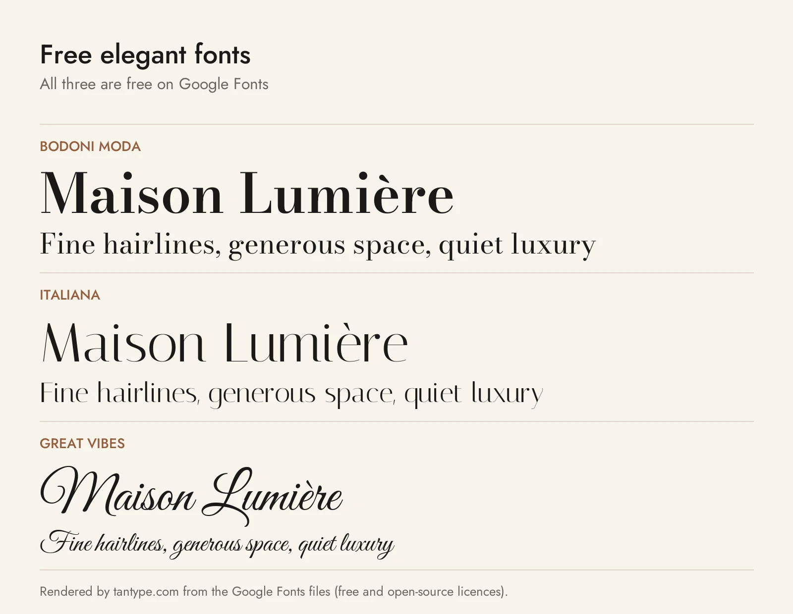
These six are free for commercial use, from official sources. None is one of the Creative Market fonts above.
- Bodoni Moda (Google Fonts): Owen Earl’s “no-compromises Bodoni family,” Regular to Black with italics and optical sizes. The closest free match to Juana or Aida, minus the ligatures.
- Italiana (Google Fonts): Santiago Orozco’s thin, high-contrast display face, “inspired by the calligraphy of the Italian masters.” It plays Brisca’s role, in one style only.
- Great Vibes (Google Fonts): Robert Leuschke’s flowing script with “over 2000 glyphs.” Less dramatic than Take Me To Tuscany.
- Cormorant Garamond (Google Fonts): Christian Thalmann’s Garamond-inspired display serif, five weights with italics. Softer and more bookish than a Didone.
- Marcellus (Google Fonts): Astigmatic’s flared serif “inspired by classic Roman inscription letterforms.” A free stand-in for The Roman Edition’s capitals.
- Boska (Fontshare): Barbara Bigosinska’s “Didone-style font family, with a calligraphic flourish,” six weights with italics, small caps and 13 f-ligatures. Probably the best free Didone for headlines.
| Font | Source | Licence | Commercial use |
|---|---|---|---|
| Bodoni Moda | Google Fonts | SIL Open Font License | Yes |
| Italiana | Google Fonts | SIL Open Font License | Yes |
| Great Vibes | Google Fonts | SIL Open Font License | Yes |
| Cormorant Garamond | Google Fonts | SIL Open Font License | Yes |
| Marcellus | Google Fonts | SIL Open Font License | Yes |
| Boska | Fontshare (ITF) | ITF Free Font License | Yes, including logos; no modifying or redistributing the files |
The Google Fonts licences are in each family’s google/fonts folder. Fontshare’s licence page says its fonts are “100% free for personal and commercial use,” and logos made with them “may be registered as trademarks.”
Licensing: personal vs commercial use
Creative Market’s font licence page sets out four licences:
- Desktop: “unlimited commercial and personal projects,” such as print, packaging and social graphics; on websites and apps “only in rasterized form” (as images). One seat per user.
- Webfont: websites you own or control, within a pageview limit.
- App: one application, not websites.
- E-pub: one e-book title.
Print-on-demand tools where customers type their own text are forbidden “whenever the end user is not the Licensee.” For logos, the font must be “(1) modified and (2) not the dominant element of the logo,” and you “must disclaim the asset if registering for Trademark protection.” None of the eleven listings offers a free personal-use version, and copies from download sites carry no licence. This is a summary, not legal advice.
Elegant font FAQ
What is the most elegant font?
There is no measured winner, but the Didone serifs, Didot and Bodoni, are the style most tied to elegance, thanks to two centuries of fashion and magazine use. Free versions include Bodoni Moda and Boska. For long text, a Garamond-style serif is the better choice, because hairlines tire the eye.
What is an elegant font in Word?
For Microsoft 365 subscribers, Bodoni MT, Garamond and Edwardian Script ITC are elegant choices that Microsoft lists as available in Office. Bodoni MT gives the Didone look, Garamond suits long text, and Edwardian Script ITC suits invitations. Any font you install, including those above, also appears in Word.
What is the elegant font on Instagram?
Instagram doesn’t publish a list. Its August 27, 2024 announcement of new fonts for Stories and Reels names none of them. Guides such as Kapwing’s list a text style called “Elegant” alongside Modern, Classic, Typewriter and Strong, but we couldn’t confirm it in Meta’s own pages, and the styles change with app updates. You can’t download or install it.
Elegant serif vs script: which should I use?
Use a serif when people must read more than a few words; use a script for a single name or title. Serifs carry menus, packaging and headlines; scripts add a personal, handwritten note but lose legibility in long lines and all caps. Many luxury brands use both: a serif for the name, a script as an accent.
What are luxury fonts?
Luxury fonts are elegant fonts used for high-end branding: high-contrast serifs, engraved-looking capitals, refined scripts and light sans serifs. The look comes from restraint as much as from the font: generous spacing, few sizes, and capitals with extra tracking.
Are “elegant font generator” sites real fonts?
No. Copy-and-paste generators swap your letters for Unicode symbols, mostly from the Mathematical Alphanumeric Symbols block, which was designed for maths. They work in bios and captions but may show as boxes or question marks on some devices, and search won’t treat them as normal words. For a logo, print or a website, use a real installed font.
Are elegant fonts free for commercial use?
Only some. The six free fonts above are licensed for commercial use. The Creative Market fonts need a paid licence, and fonts labelled “free for personal use” on download sites can’t be used for anything you sell or promote.
