
Brisca: A Thin, Elegant Sans for Beauty and Editorial Branding
Design style
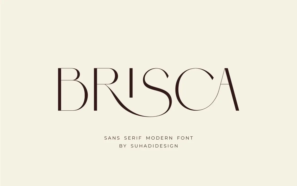
Brisca sits in the crowded but reliable category of thin, high-contrast sans serifs built for headlines rather than paragraphs. The strokes are pared down to hairlines in places, with just enough width variation to give the letters a drawn, almost calligraphic feel without tipping into script territory. It reads as a sans that has borrowed some manners from serif structure — narrow apertures, restrained curves, a general sense of composure rather than personality.
The proportions lean tall and narrow, which suits the current appetite for minimal, upscale branding. Nothing about the letterforms is loud. There’s no single distinguishing quirk you’d point to in a lineup — no unusual terminal, no eccentric counter shape — and that’s both the point and the limitation. Brisca is built to disappear into whatever context it’s placed in, which is a legitimate design goal, just not a dramatic one.
Character set and features
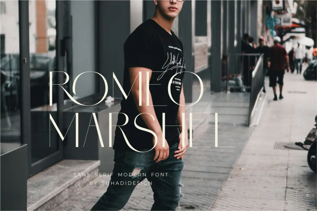
Brisca is uppercase-only, which immediately narrows how it can be deployed. There’s no lowercase to fall back on for body copy or even for secondary headline treatments — every word gets set in caps, meaning your typographic hierarchy has to come from size, spacing, and colour rather than case contrast. The set includes numerals and punctuation, along with what the foundry describes as multilingual support and a binding or ligature feature, presumably for joining certain letter pairs into a more continuous, hand-finished look.
At small sizes the thin strokes start to lose definition, especially on screens with weaker rendering or on packaging that will be printed in less-than-ideal conditions. This is a font for logotypes, headers, and short lines of set text — not for anything that needs to hold up as caption copy or run for more than a few words.
Use cases
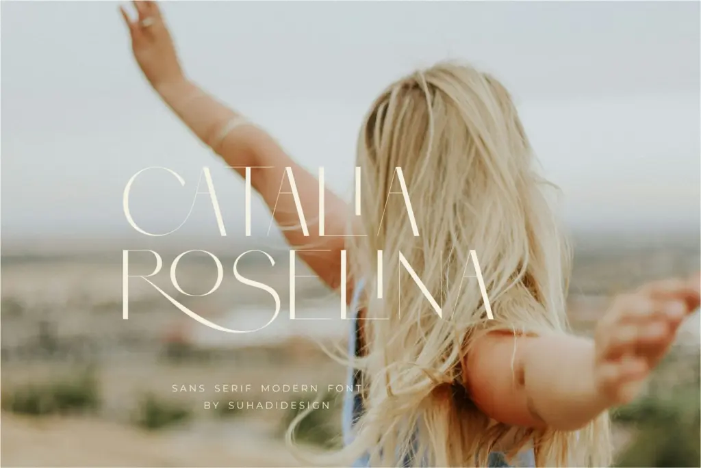
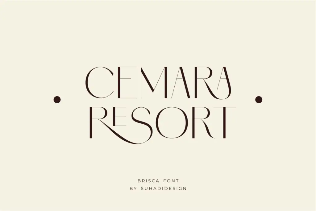
Given the all-caps structure and thin build, Brisca is best suited to wordmarks, short editorial headlines, and branding moments where a handful of words need to carry a lot of visual weight — think perfume packaging, beauty product labels, boutique business cards, or a masthead on a lifestyle magazine. It photographs well against clean, uncluttered backgrounds and pairs naturally with generous letter spacing.
It’s less useful anywhere you need flexibility of tone — long product names, multi-line taglines, or anything that requires a lowercase register to feel approachable rather than formal. Designers working across a full identity system will likely need to bring in a companion typeface for body text and secondary messaging, since Brisca isn’t built to do that job itself. Used within its lane — short, capitalised, spaced-out branding lines — it does the job cleanly and without fuss.
What we liked, and what we didn’t
Strengths
- Clean, high-contrast thin strokes suit upscale beauty and packaging work
- Binding/ligature feature adds a hand-finished touch to logotype lockups
- Numerals and punctuation are included for practical short-line use
Trade-offs
- No lowercase means every application is locked into all-caps setting
- Thin strokes lose definition at small sizes or in low-quality print
Brisca is a competent thin sans for short, capitalised branding lines — logotypes, packaging, business cards. It's not built to do more than that, and the all-caps-only structure limits how far it can stretch across a full identity system.
Verdict

Tantype reviews typefaces in depth — every font is tested in real branding, editorial and screen layouts before a word gets written. 555+ fonts reviewed and counting.