
Juana: a high-contrast serif family built for editorial headlines
Design style
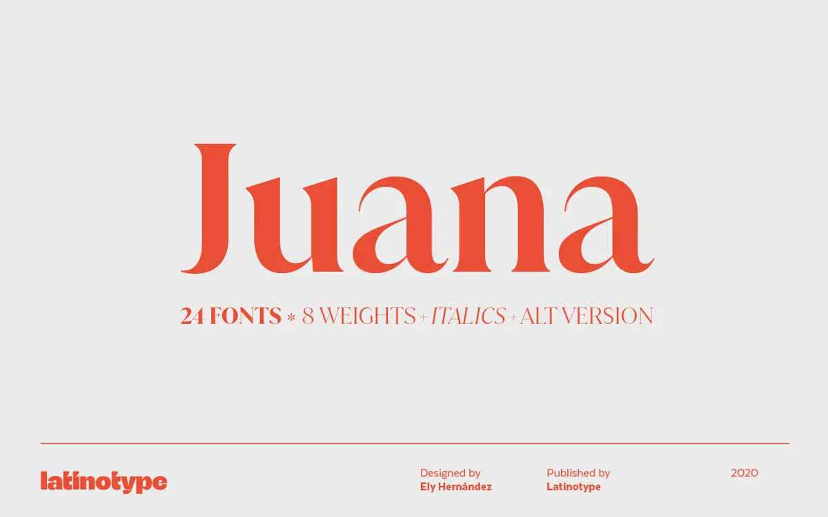
Juana belongs to the family of high-contrast serifs that trade the calm rhythms of text faces for something closer to fashion editorial. The stroke contrast is extreme by design: hairline serifs and thin transitions sit against strokes that swell dramatically at the bowls and verticals. This is the modern-serif tradition pushed toward its expressive limit, more Didone-adjacent than old-style, and it reads as confident rather than cautious.
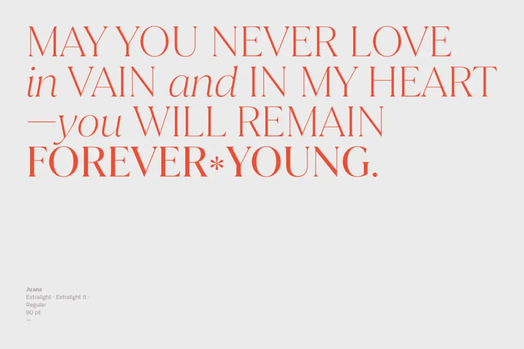
What keeps Juana from tipping into pure decoration is the consistency of its logic. The contrast axis stays predictable across the alphabet, so even at its most dramatic the letterforms don’t wobble between styles. The italics lean genuinely cursive rather than just sloped romans, which gives the family a second, softer register to work with. Across eight weights, the contrast idea holds from the lightest cut, where it’s almost polite, to the boldest, where the thins nearly disappear and the face turns into something closer to a display headline slab.
Character set and features
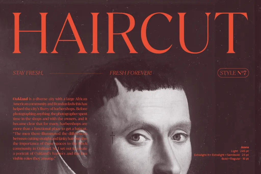
The family is built around a large weight range with matching italics, plus an alternate set that swaps in more calligraphic, less formal shapes for certain letters — useful for pulling Juana away from its more austere register when a brief calls for warmth instead of severity. Extensive Latin-based language support is the other headline feature: this is a face designed to work in translation, not just in English-language layouts, which matters for any brand or publication running across multiple markets.
Because the contrast is so pronounced, the character set rewards attention to size and weight choice. The lighter weights are where the thin strokes are most vulnerable — at small sizes or on low-quality substrates, hairlines can drop out or fill in unevenly. The heavier weights are sturdier and more forgiving, though they sacrifice some of the elegance that makes the light and regular cuts distinctive.
Use cases
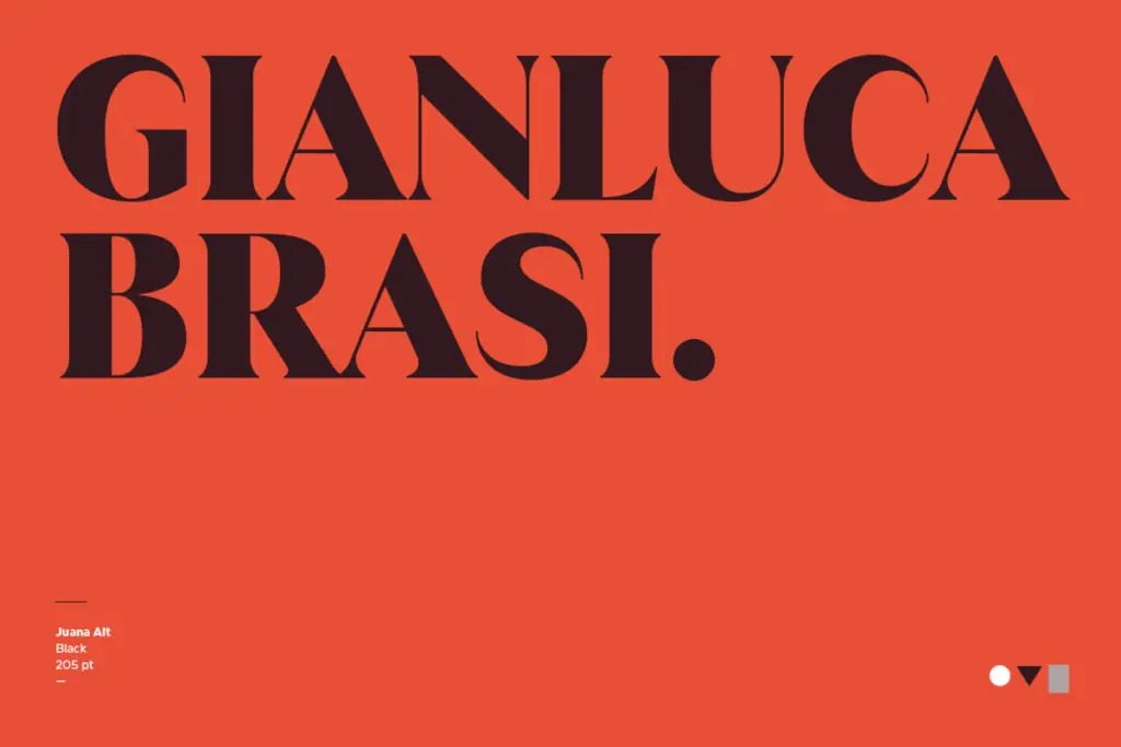
Juana is, unsurprisingly, most at home in editorial settings — magazine mastheads, feature headlines, section openers, anywhere a serif needs to carry visual weight and a bit of attitude without becoming a full display face. The contrast gives headlines a graphic quality that plain-text serifs can’t offer; it photographs well as a title treatment and holds up in large-format use like posters or packaging fronts.
Branding and logotype work is a natural fit too, particularly for fashion, beauty, or lifestyle identities that want a literary, slightly old-world feel without leaning fully vintage. The alternate set helps here, giving designers a way to soften the mark if the base cut reads too severe.
Where Juana struggles is body copy. The contrast that makes it striking at large sizes becomes a liability in long-form paragraph text, where hairlines thin out and the rhythm gets fussier to read. Pair it with a plainer serif or sans for running text and reserve Juana for the moments where a headline needs to do the talking.
What we liked, and what we didn’t
Strengths
- Extreme, consistent stroke contrast gives headlines real visual presence
- Genuinely cursive italics and an alternate set add flexibility beyond the base cut
- Wide language coverage makes it usable well beyond English-language layouts
Trade-offs
- Hairline strokes in lighter weights are fragile at small sizes or on rough substrates
- Not suited to body copy — contrast that reads as elegant in headlines becomes fatiguing in paragraphs
Juana is a confident, high-contrast display serif that does headline and branding work well, but its extreme thick-thin contrast limits it firmly to large sizes. It's a specialist face, not an all-purpose text family, and works best when treated as one.
Verdict

Tantype reviews typefaces in depth — every font is tested in real branding, editorial and screen layouts before a word gets written. 555+ fonts reviewed and counting.