
Sorento: a high-contrast sans family for editorial and label work
Design style
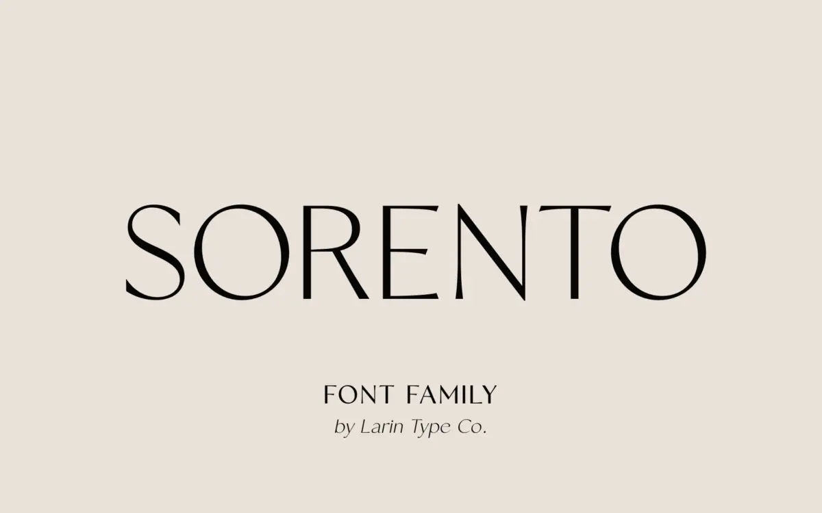
Sorento is a contrast sans, which is a slightly unusual proposition — most sans families flatten stroke weight to keep things quiet, but Sorento keeps a visible thick-thin relationship running through its letters, closer to what you’d expect from a modern serif’s structure than a typical grotesque. That contrast is the whole personality here. It gives the face a fashion-editorial feel without borrowing any serif details, and it reads as considered rather than default.
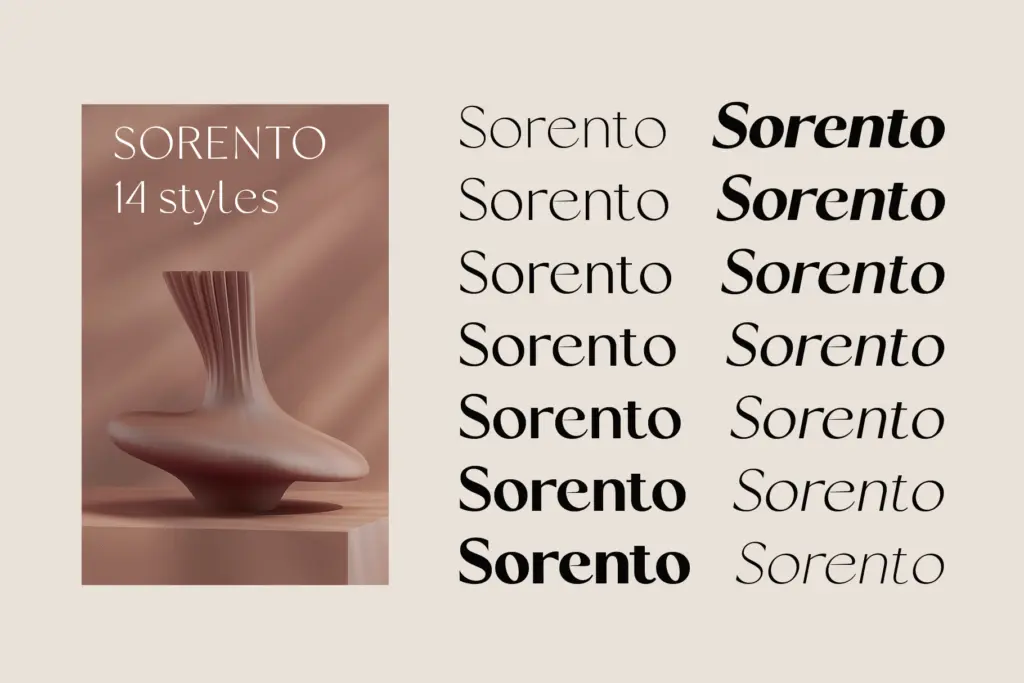
Seven weights per style, upright and italic, means the contrast holds up whether you’re in the thin end or the bold end, which isn’t guaranteed in families that stretch this far — thin weights especially tend to lose their character when contrast gets pushed too hard. Sorento seems built with that in mind, keeping proportions steady rather than letting the thin cut go brittle. The italic isn’t a slanted afterthought either; it carries its own rhythm, which matters if you’re going to use both styles together in the same layout.
Character set and features
The stylistic alternates are the feature worth knowing about before you commit to a layout. Uppercase and lowercase both get a teardrop-tail variant, which softens some of the more geometric letters and gives you a second register within the same family — useful for a wordmark that needs one flourish without becoming a script. These are OpenType-accessible, so they sit as swaps rather than separate files, which keeps the workflow simple in apps that support the feature panel; in ones that don’t, you’ll need the character map or glyph substitution some other way.
Language coverage extends across the standard Western and Central European diacritics — Polish, Czech, and Nordic characters are accounted for, along with a fair spread of accented Romance-language characters. That’s a reasonable range for European branding and packaging work without claiming anything beyond it.
Use cases
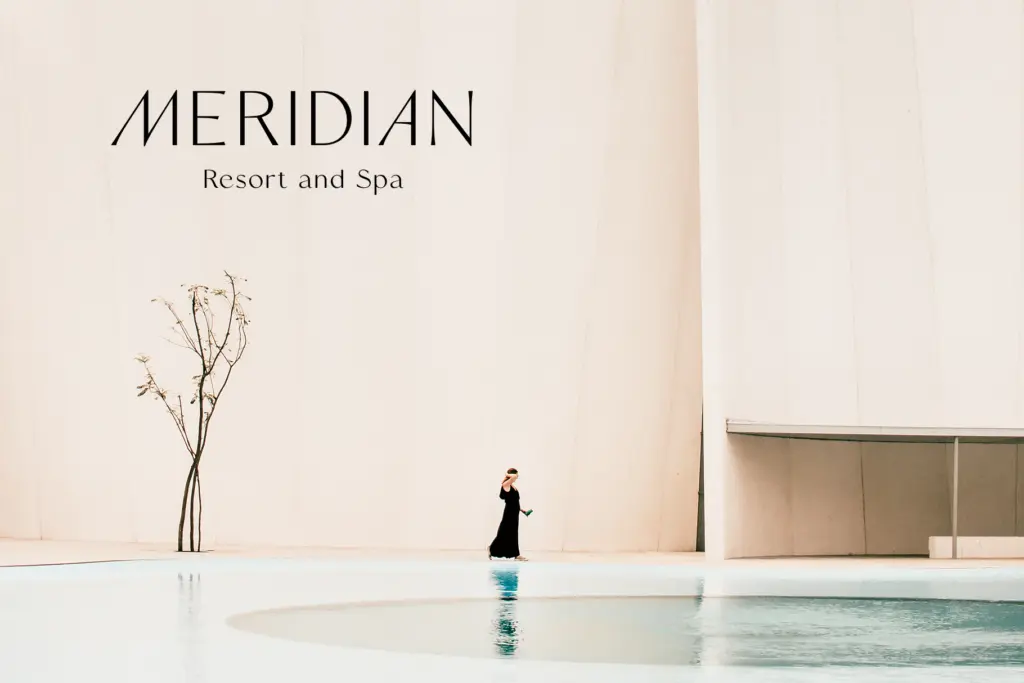
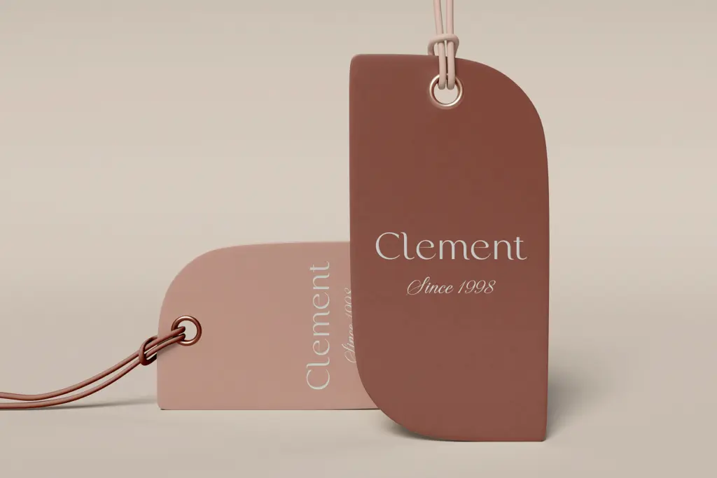
Given the contrast and the alternates, Sorento leans toward places where a sans needs to read as considered rather than neutral: fashion and beauty branding, cosmetic labels, magazine mastheads, packaging that wants a boutique feel without going full script. The bold and black weights carry headline work fine; the lighter weights are better kept at larger display sizes than dropped into dense body copy, since contrast sans faces generally soften at small sizes and this one is no exception.
For logotypes, the alternates give it more range than a single-cut wordmark font — you can set the same name two ways and see which reads better against a mark. It’s less suited to long-form text setting where a neutral, low-contrast sans would serve better; use it for what it’s built for, which is presence rather than invisibility.
What we liked, and what we didn’t
Strengths
- Contrast held consistently across seven weights without the thin cuts going brittle
- Teardrop stylistic alternates give logotypes a second register within one family
- Distinct italic with its own rhythm rather than a mechanical slant
Trade-offs
- Lighter weights lose definition at small sizes, limiting body-copy use
- Diacritic coverage is solid for Western/Central Europe but doesn't extend further
Sorento is a contrast sans built for branding and packaging work that wants personality without going ornate. The alternates add useful range for logotypes, though the lighter weights need generous size to hold together. Not a text face, but it wasn't trying to be one.
Verdict

Tantype reviews typefaces in depth — every font is tested in real branding, editorial and screen layouts before a word gets written. 555+ fonts reviewed and counting.