
Muse: a high-contrast display serif for fashion and editorial logos
Design style
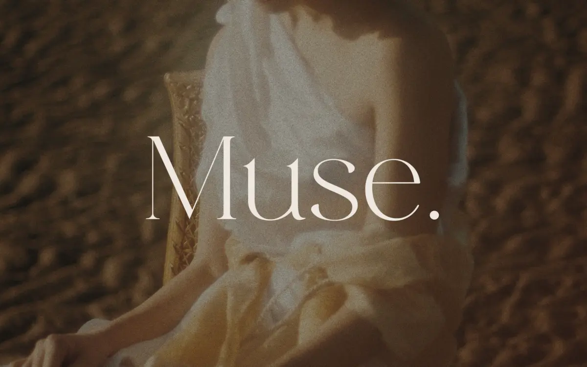
Muse belongs to the modern-serif family that fashion branding has leaned on for years: hairline serifs, dramatic thick-thin contrast, and a vertical stress that gives it a slightly compressed, upright posture. It reads as chic in the way that word gets used in the industry — polished, a little cold, built for negative space rather than warmth. The italic added later leans into that further, with a slightly narrower stance and more pronounced flourish on entry strokes, giving the family a second gear without changing its temperament.
Where Muse earns its keep is in the discipline of the contrast. The hairlines stay genuinely thin without disappearing at smaller display sizes, and the thick strokes never bulge enough to feel heavy-handed. It’s a controlled drawing rather than an experimental one — nothing here surprises you, but nothing looks careless either.
Character set and features
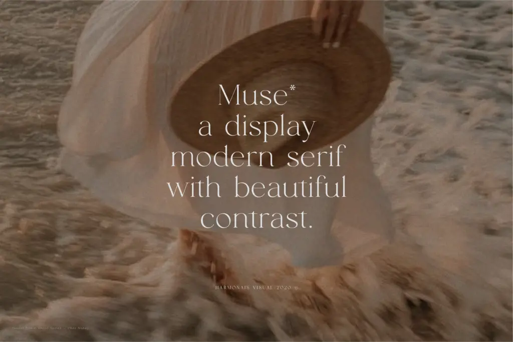
The set covers the standard European language range plus Vietnamese, which is a useful and slightly unusual inclusion for a display face at this level — worth checking if your project needs diacritic-heavy setting. Ligatures are present but require an OpenType-aware application to access them properly; in Illustrator you’ll need to pull them manually through the Glyphs panel rather than expect automatic substitution everywhere. That’s a minor workflow tax, not a flaw in the font itself, but it’s worth knowing before you commit to a layout that depends on them.
The regular and italic styles are the whole family — there’s no bold, no light, no extended weight range to build a hierarchy from within Muse alone. That’s consistent with its billing as a display-only serif rather than a working text family, but it does mean you’ll be pairing it with something else for body copy or secondary information almost immediately.
Use cases
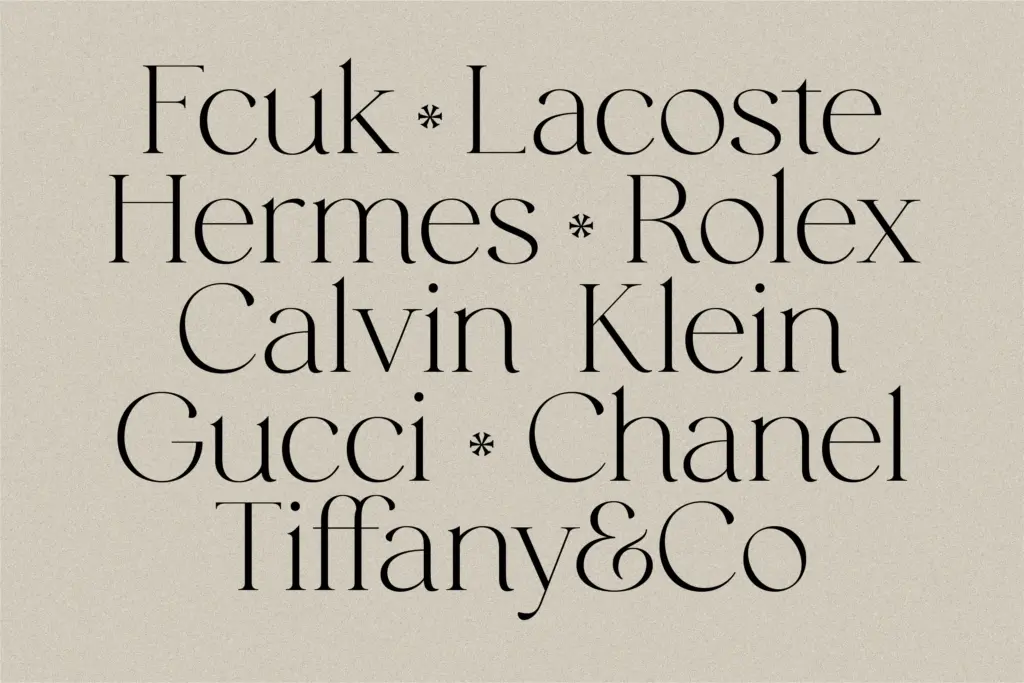
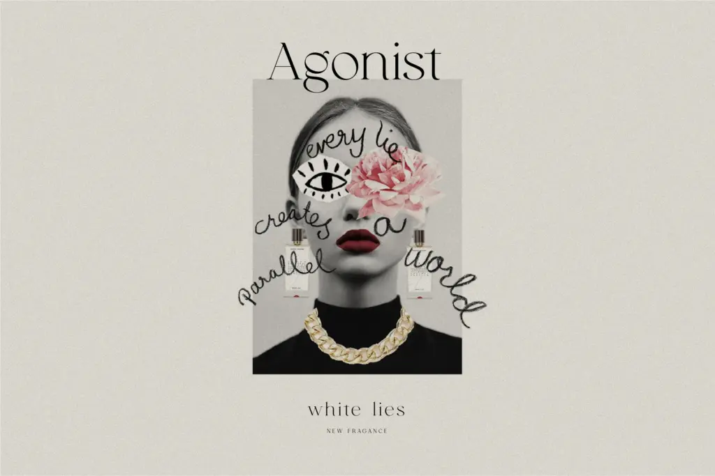
Muse is built for headline moments: logotypes, magazine mastheads, packaging front-of-pack type, invitation lettering, anywhere a single word or short phrase needs to carry a fashion-adjacent, upscale tone. At larger sizes — logo lockups, cover lines, title cards — the contrast reads clearly and the letterforms have enough personality to anchor a brand mark without extra ornamentation.
It struggles the moment you ask it to do more than that. Push it down to body-text sizes and the thin strokes start to break up, particularly on screens or lower-quality print stock. It’s also not a face for projects wanting warmth or informality — its polish is narrow and specific, and it will look out of place next to anything rustic, playful, or heavily illustrated. Pair it with a plain sans or a quiet serif for supporting text and let Muse do the one job it’s drawn for.
What we liked, and what we didn’t
Strengths
- Controlled thick-thin contrast that stays crisp at logo and headline sizes
- Italic companion adds a usable second register without breaking the family's tone
- Vietnamese support is a genuinely useful extra for a display face at this price point
Trade-offs
- Thin strokes degrade quickly at body-text sizes or on rough print stock
- Ligature access requires manual steps in some software rather than automatic substitution
Muse does one job — chic, high-contrast display lettering for fashion and lifestyle branding — and does it cleanly. It's not built to scale down to text sizes or to flex across many moods, so treat it as a headline specialist and pair it accordingly.
Verdict

Tantype reviews typefaces in depth — every font is tested in real branding, editorial and screen layouts before a word gets written. 555+ fonts reviewed and counting.