
The Very Vogue Serif Family: fashion-magazine serif with display and text twins
Design style
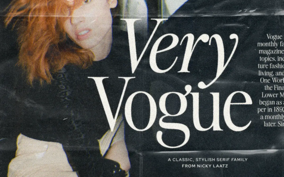
The Very Vogue Serif Family draws from the high-contrast serifs that ran across fashion magazine covers from the 1980s onward — the kind of lettering built to sit next to a portrait and hold its own. It has thin, fine hairlines set against thicker stems, generous curves, and a slightly theatrical air without tipping into novelty. The overall drawing is clean rather than eccentric: this is a serif that wants to look expensive, not weird.
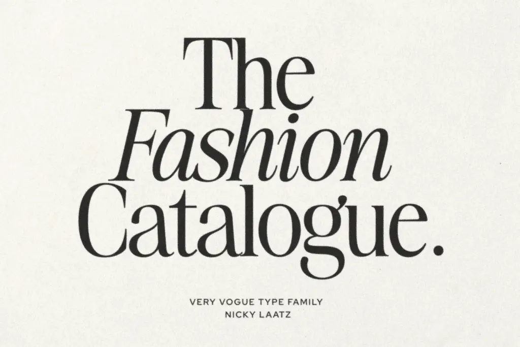
The family splits into two optically distinct groups, Display and Text. Display carries the higher contrast and tighter native spacing that reads as glamour at headline size — the thin strokes get genuinely thin, which gives it snap on a cover or a large title. Text dials the contrast back, adds a touch more weight to the strokes, and opens up the letterspacing, which is the right call: at high contrast and tight tracking, small type would choke. Having both drawn separately, rather than one design mechanically scaled, is the sensible way to solve that problem, and it shows in how each holds its shape at its intended size.
Character set and features
Each subfamily includes a lighter and heavier weight, so there are effectively four drawings to work with across the two optical sizes. That gives some room to build hierarchy — a heavy Display headline over a lighter Text standfirst, for instance — without introducing a second typeface. The seller’s own advice to adjust letterspacing manually by size is worth taking seriously: the defaults are tuned for a middle case, and pushing Display tighter or Text looser makes a visible difference to how polished the result looks.
Don’t expect this to behave like a workhorse text serif. The high-contrast strokes and refined details are the whole point, and they mean the design is doing a specific job — evoking a certain era and a certain glossy-magazine register — rather than trying to be neutral. Extended body copy in Text is workable but the personality stays present throughout, which is either exactly what you want or a sign you should look elsewhere.
Use cases
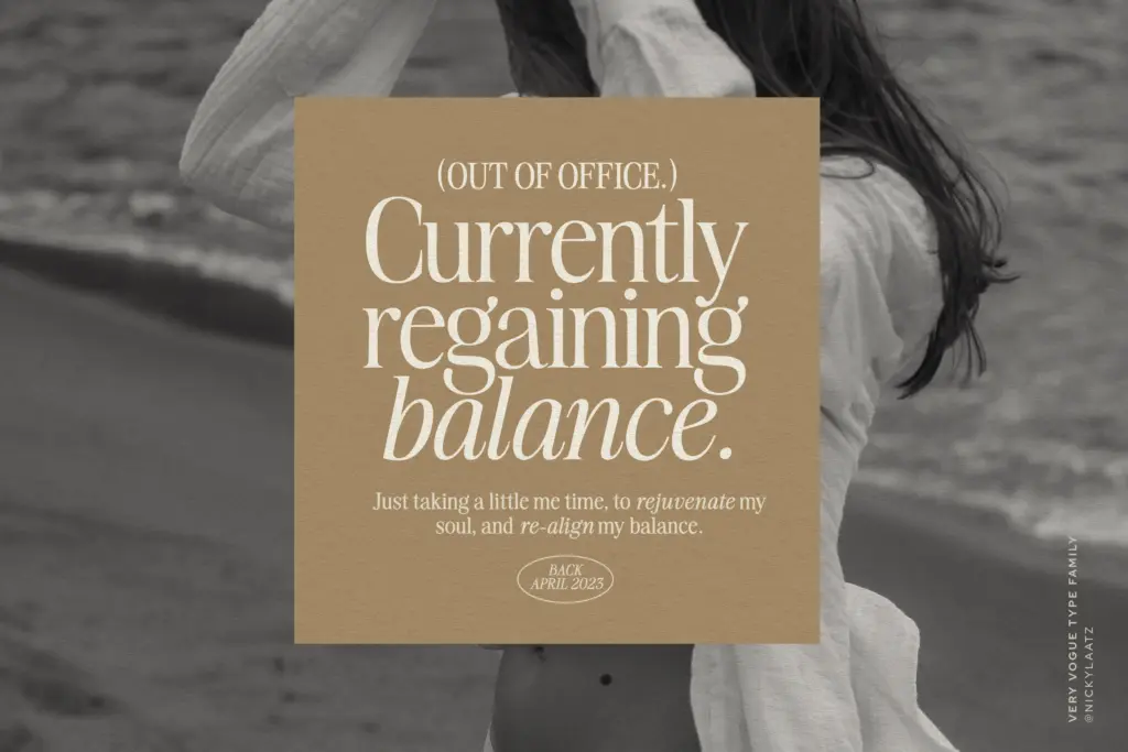
This is a font for identity work that wants a fashion or editorial reference point: magazine mastheads, cover lines, beauty and lifestyle branding, boutique packaging, invitations that want to look considered rather than casual. The Display cut is the one to reach for on headlines, logotypes, and anywhere a handful of large characters need to carry a page. The Text cut earns its keep in captions, pull quotes, and shorter passages of body copy where the display cut would be too brittle.
It’s less suited to dense, long-form reading — technical documentation, long articles, anything where the type needs to disappear. And because the look is so tied to a specific decade and mood, it won’t flex into a neutral corporate register if the brand ever needs to go quiet. Used within its lane, though, it’s a well-considered pairing of two related designs rather than one serif stretched thin across jobs it wasn’t built for.

What we liked, and what we didn’t
Strengths
- Display and Text are genuinely separate drawings tuned to their own size range, not one design scaled
- High contrast gives real presence at headline sizes without tipping into gimmick
- Two weights per subfamily give enough range to build hierarchy without a second typeface
Trade-offs
- High contrast and strong personality make it a poor fit for long-form or neutral text
- The look is tied closely to a retro fashion-magazine register, limiting its range outside that mood
The Very Vogue Serif Family does one thing well: high-glamour, fashion-magazine serif type, split sensibly into a tight-contrast Display cut and a looser, sturdier Text cut. It's not built for neutral or long-form work, but within editorial and luxury branding it earns its keep.
Verdict

Tantype reviews typefaces in depth — every font is tested in real branding, editorial and screen layouts before a word gets written. 555+ fonts reviewed and counting.