
Art Deco Fonts: 10 Best Art Deco Fonts for Logos, Posters and Invitations
Art Deco fonts borrow the lettering of the 1920s and 1930s: letters built from circles and straight lines, strong contrast between thick and thin strokes, and tall, narrow or very wide proportions. You still see the style on cinema signs, cocktail menus and luxury packaging.
Our top three picks are Lempicka, a light, ligature-rich duo with Deco frames and ornaments; Interbellum, a nine-font family for headlines and short text; and TAN Nightingale, a tall hairline serif. Every font on the main list is a commercial font sold on Creative Market. Three free Google Fonts options are further down.
See Creative Market’s Art Deco font guide Commercial fonts: prices below were checked on October 15, 2026
What is an Art Deco font?
Art Deco takes its name from the Exposition internationale des arts décoratifs et industriels modernes, held in Paris in 1925. According to Wikipedia, the style first appeared in Paris in the 1910s and flourished internationally from the 1920s to the early 1930s. The label itself only caught on in 1968, after the historian Bevis Hillier published a book on it.
In the 1930s a sleeker branch appeared. Streamline Moderne dropped the ornament in favour of curving forms and long horizontal lines inspired by aerodynamics, trains and ocean liners. Lettering followed both paths: some Deco type is sharp and geometric, some is rounded and streamlined.
Three classic typefaces show the range:
- Broadway was drawn by Morris Fuller Benton for American Type Founders in 1927 and published in 1928 as a capitals-only display face. Wikipedia notes its “bold geometric lettering and high contrast between thick and thin” lines. Sol Hess of Lanston Monotype later added a lowercase.
- Parisian, also by Benton for ATF, came out in 1928 (list of Benton’s typefaces).
- Peignot was designed by the poster artist A. M. Cassandre in 1937 for the French foundry Deberny & Peignot. It replaced the usual lowercase with a “multi-case” mixing lowercase and small capital shapes.
The traits that make a font read as Deco come from that period: geometric construction, symmetry, crossbars set unusually high or low, either extreme stroke contrast or perfectly even strokes, and proportions pushed to tall and narrow or wide and squat. Creative Market’s Art Deco guide sums it up as “clean vertical lines, elongated proportions, and architectural shapes”, unlike the flowing, plant-like curves of Art Nouveau.
The best Art Deco fonts at a glance
- Lempicka — light Deco duo with 150+ ligatures, Greek support and vector ornaments.
- Interbellum — nine fonts, from all-caps headlines to text styles with small caps.
- TAN Nightingale — tall hairline serif for beauty and fashion branding.
- Costa de Malaga — 95 ligatures and 260 alternates for custom wordmarks.
- Brilon — Deco serif with special capitals for logos and invitations.
- Delauney — all-caps geometric display with a Shadow layer.
- Monterio — four-weight, all-caps contemporary Deco sans.
- Emoritz — restrained all-caps geometric display in three weights.
- Detailed Artdeco — geometric sans with a lowercase and 100 ligatures.
- TAN Fairview — thin, sleek Deco display for minimal logos.
Best Art Deco fonts on Creative Market
Prices are for a one-seat desktop licence as listed on Creative Market in October 2026; sales and price changes are common, so check the listing.
1. Lempicka
Molly Suber Thorpe’s Lempicka is the most complete Deco kit here. You get two light, clean fonts, Lempicka Display and Lempicka Small Caps, plus 22 editable vector frames, borders and ornaments, including a Save the Date template. The designer lists more than 150 ligatures in the Display font, dozens of stylistic alternates, and full Latin and Modern Greek alphabets, which is rare for a decorative font. Files come as OTF, TTF, WOFF and WOFF2, with the vectors in AI, EPS and PDF. It suits wedding suites, gala invitations and boutique branding, where the frames do half the work. Desktop licence: $28.
See Lempicka on Creative Market
2. Interbellum
Buy Interbellum, from the Punch shop, if you need a system rather than one headline face. The nine fonts are All Caps Light, Regular, Bold and Light Contrast; Text Light and Text Regular; and Display, Display Line and Display Outline. The listing says each Text style has 832 glyphs, including small caps. Light Contrast has an unusual trick: it switches letters between a narrow and a wide form and turns C, O and G into underlined versions, giving you the mixed rhythm of 1920s signs. Use it for hotel and restaurant identities, menus and packaging ranges. Desktop licence for the family: $52.
See Interbellum on Creative Market
3. TAN Nightingale
TanType Co.’s TAN Nightingale is a single-style serif the listing calls “art deco inspired with dramatically elongated serif.” The Deco look comes from proportion: tall ascenders over a short x-height, and a hairline cutting diagonally through the C, G and Q. Our review of the font files counted 374 glyphs, with standard and discretionary ligatures, stylistic alternates and fractions, and Central European as well as Western Latin coverage. The hairlines are very fine, so set it large on perfume labels, skincare packaging and fashion headlines. Creative Market includes it in its own Deco guide. Desktop licence: $17. Tantype is not affiliated with TanType Co.
See TAN Nightingale on Creative Market · Read our TAN Nightingale review
4. Costa de Malaga
SilverStag’s Costa de Malaga is for designers who hand-tune every letter. The listing says each character comes in 12 variants (four regular height, four short and four tall), with 95 ligatures and 260 stylistic alternates in total. Staggering letter heights lets a hotel or bar name fit a shape instead of sitting on one flat line. The four styles are Regular, Regular Outline, Rounded and Rounded Outline, and the designer claims support for more than 90 languages. At $79 for the Desktop licence (single styles from $39) it is the most expensive pick, and it pays off on logo and packaging work that uses the alternates.
See Costa de Malaga on Creative Market
5. Brilon
Brilon, by Julius Behr of Heritage Type Co., is a serif “inspired by the Art Deco era” that keeps most of its Deco detail in the capitals. As our review notes, the uppercase has flared terminals and a few squared-off letters, while the lowercase is quieter. The package includes special uppercase letters, stylistic alternates, ligatures and Western European accents in OTF and TTF, plus eight botanical photos from the product presentation. There is only one weight, so build hierarchy with size and spacing. It works on wine labels, menu headers and invitation suites, and Creative Market’s guide features it too. Desktop licence: $19.
See Brilon on Creative Market · Read our Brilon review
6. Delauney
Delauney, from Ahmad Ramzi Fahruddin’s Arterfak Project, is an all-caps display font with geometric shapes and firm strokes, based on 1920s Deco. Its extra styles set it apart. Delauney Shadow is a layer you place over the Regular for a dimensional, poster-like effect, and Delauney Catchwords supplies decorative ready-made words in English, Spanish and Bahasa. You also get stylistic alternates, a stylistic set and multilingual accents. The Shadow layer makes it a good fit for event posters, theatre programmes and bar signage. Desktop licence for all three styles: $19, or $14 per style.
See Delauney on Creative Market
7. Monterio
Monterio from CCS Type is an all-caps sans serif in what the designer calls a “contemporary Art Deco” style. It is far less ornamental than Lempicka or Costa de Malaga, so it suits brands that want a hint of the 1920s without looking like a costume party. The family has four weights, Light, Regular, Semibold and Bold, with stylistic alternates, ligatures and more than 300 glyphs in TTF and OTF. You can set a logo in Bold and a tagline in Light with the same letter shapes. Try it for architecture studios, jewellery brands and property signage. Desktop licence: $35 for the family, $29 per weight.
See Monterio on Creative Market
8. Emoritz
Emoritz from Novitype is a clean, all-caps geometric display font inspired by 1920s Art Deco. Its strokes are even and its shapes simple, so it stays readable when you open up the letter spacing, which suits widely spaced Deco capitals. It comes in three weights, Light, Regular and Medium, with stylistic alternates, ligatures and accented characters, in TTF, OTF and WOFF. It is the most restrained of the all-caps picks, a safe choice for editorial headers, price tags and product labels. Desktop licence: $20 for the family, $19 per weight.
See Emoritz on Creative Market · Read our Emoritz review
9. Detailed Artdeco
Most Deco display fonts are capitals only. Detailed Artdeco, from Cuong Truong’s 177Studio, is a geometric sans with a full lowercase, so you can set a web heading or product name in mixed case. The designer says both cases include unusual letter variations, and the listing names 100 ligatures, from “ac” to “wo”, that switch on as you type in OpenType-aware apps. There are four weights, Thin, Light, Regular and Bold, in OTF and TTF. Use the Thin and Light for fashion and beauty work, the Bold for posters. Desktop licence: $20 for the family, single weights from $12.
See Detailed Artdeco on Creative Market · Read our Detailed Artdeco review
10. TAN Fairview
TAN Fairview is TanType Co.’s second Deco font here, described on the listing as “sleek, thin, and simple with a modern twist.” Where Nightingale is a serif, Fairview is a thin display face, closer to the stripped-down, streamlined end of the style. It comes in TTF, OTF, WOFF and WOFF2 with multilingual support and free updates. The shop notes that it works in Canva, but Canva doesn’t support its advanced OpenType features such as special characters. Think minimal logos, salon signage and social graphics with plenty of space around the lettering. Desktop licence: $17. Tantype is not affiliated with TanType Co.
See TAN Fairview on Creative Market · Read our TAN Fairview review
How to choose an Art Deco font
- Decide how much Deco you want. Ornate fonts with alternates (Lempicka, Costa de Malaga, Interbellum) announce the period at once. Restrained all-caps faces (Emoritz, Monterio) only hint at it and age better in a long-term brand.
- Check for a lowercase. Many Deco fonts are capitals only, like the original Broadway. For mixed-case headings, pick Detailed Artdeco, Brilon, TAN Nightingale or Interbellum Text.
- Watch the hairlines. Thin and high-contrast faces lose their fine strokes at small sizes, on textured paper and in vinyl cuts. For Cricut projects and signage read from a distance, choose a heavier weight.
- Know where the alternates live. Ligatures and alternates need OpenType support (Illustrator, InDesign, Affinity, Figma). Canva and Cricut Design Space usually show only the basic letters.
- Pair it with something quiet. Use one Deco font for the headline and a clean geometric sans for the rest, such as Futura or the free Josefin Sans below. Centred, symmetrical layouts and generous letter spacing help Deco capitals look right.
Free Art Deco fonts
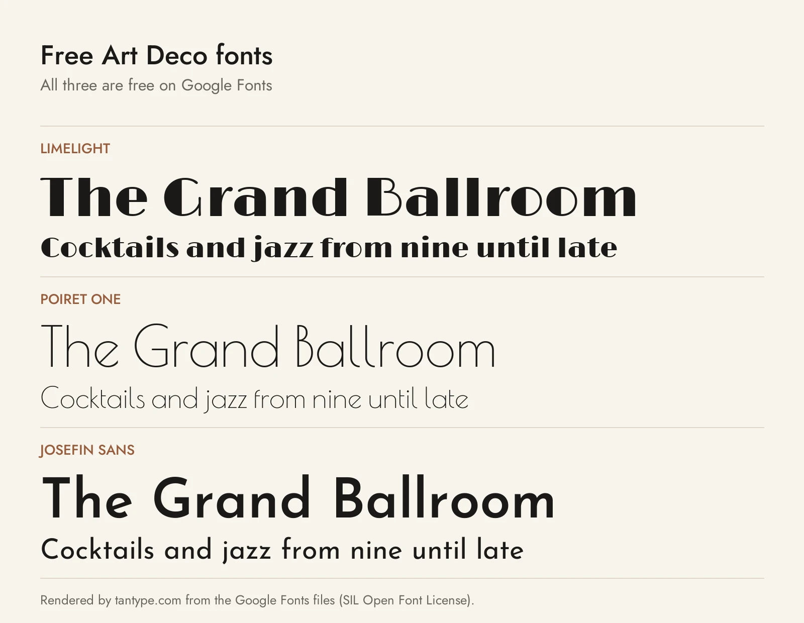
These three are on Google Fonts under the SIL Open Font License, so they are free for personal and commercial work. None has the alternates or ornaments of the paid picks.
- Limelight by Nicole Fally and Sorkin Type is, in Google Fonts’ words, “a sensitive rendition of the classic high contrast art deco style geometric sans serif.” It is the closest free match to Broadway-style lettering, but it has one weight and works best large.
- Poiret One by Denis Masharov is a light geometric display font “with a hint of Art Deco and constructivism.” It sits near TAN Fairview and Lempicka’s airy end of the style, with a lowercase but a single weight.
- Josefin Sans by Santiago Orozco is “inspired by geometric sans serif designs from the 1920s,” with an unusual x-height halfway to the cap height. Unlike the paid display fonts it has a full weight range and italics, so it is the best free choice for subheads and body text.
Licensing: personal vs commercial use
Creative Market sells fonts under four licences, explained on its font licence page:
- Desktop: unlimited personal and commercial projects, including products, packaging, social media and paid ads. On websites, apps and games the font may only appear as images, not embedded. One seat per user.
- Webfont: embedding on websites you own or control, within a pageview limit chosen at checkout. It does not cover desktop use.
- App: embedding in one app or game, as long as the font can’t be extracted.
- E-pub: embedding in one e-book or electronic publication.
Print-on-demand tools where your customer types their own text aren’t allowed. For a logo you plan to trademark, the licence page says the font must be modified and not the dominant element. You can’t share the files. None of the paid fonts above has a free personal-use version on Creative Market, and copies from download sites carry no licence. This is a summary, not legal advice; check the terms on each listing.
Art Deco font FAQ
What is a deco font?
“Deco font” is short for Art Deco font: a typeface based on 1920s and 1930s lettering, named after the 1925 Paris decorative arts exhibition. Look for geometric shapes, symmetry, strong contrast or perfectly even strokes, and stretched proportions.
What is the most famous Art Deco font?
Broadway, drawn by Morris Fuller Benton in 1927 and released by American Type Founders in 1928, is the one most people picture. Peignot, A. M. Cassandre’s 1937 design, is the best-known French example. The Creative Market fonts above are newer designs in the same spirit.
Are there free Art Deco fonts for commercial use?
Yes. Limelight, Poiret One and Josefin Sans are free on Google Fonts under the Open Font License, which allows commercial use. Fonts labelled “free for personal use” elsewhere usually need a paid licence for business use.
Can I use Art Deco fonts in Canva or Cricut?
Usually yes for the basic letters, but the ligatures and alternates that make fonts like Lempicka and Costa de Malaga special need software with OpenType support. For cut vinyl, avoid hairline styles.
What is the difference between Art Deco and Art Nouveau fonts?
Art Nouveau lettering is organic, with flowing, plant-like curves. Art Deco is geometric: straight lines, circles, symmetry and hard contrast. Some modern fonts mix the two, so check the specimen images before you buy.
