
Aida: a high-contrast serif family for fashion and editorial headlines
Design style
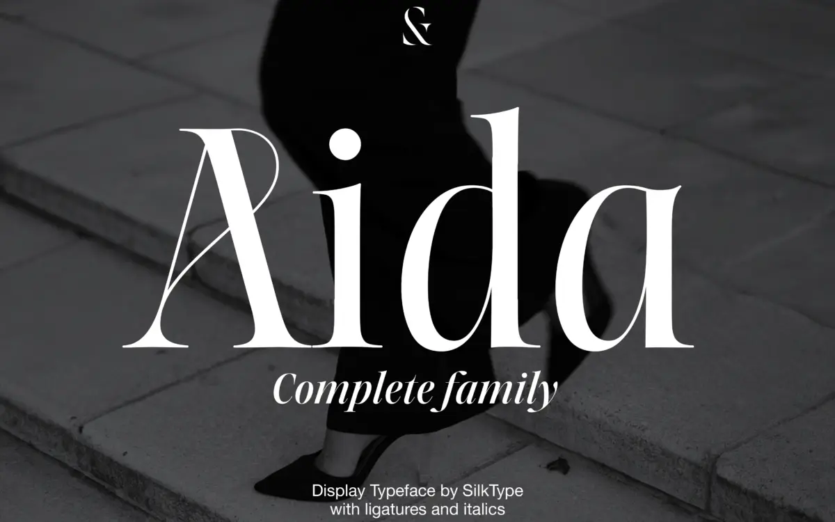
Aida belongs to the familiar family of high-contrast display serifs that trace their DNA back to Didone models, but Silktype pushes the contrast harder than most, thinning the hairlines down until they nearly disappear against the thick strokes. The result reads as fashionable rather than classical. It’s the kind of contrast that photographs well on a magazine cover or a perfume label, where the letters are meant to sit large and be looked at rather than read quickly.
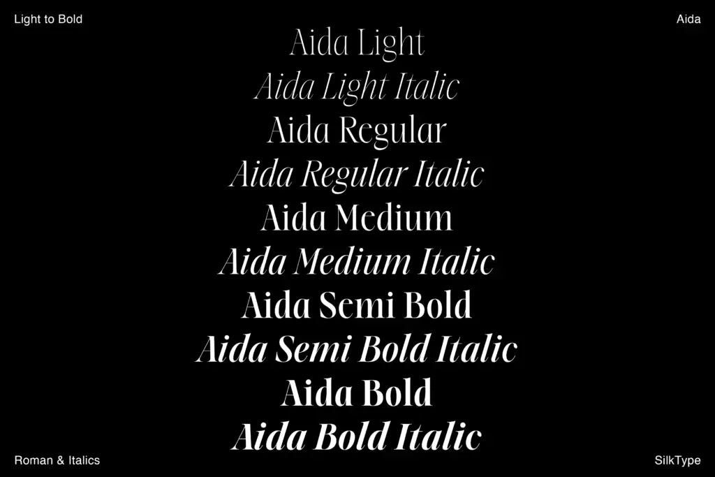
Across the ten styles, from Light to Bold in Roman and Italic, the contrast ratio shifts sensibly. The lighter weights are almost calligraphic, with hairlines so fine they’ll disappear on cheap paper or low-res screens. The bolder weights hold their shape better and carry more of the typeface’s actual personality — the thick strokes have a slight taper at the terminals that keeps them from feeling mechanical. The italics lean elegant rather than eccentric, with a moderate slant and narrower proportions that suit pull quotes and captions.
Character set and features
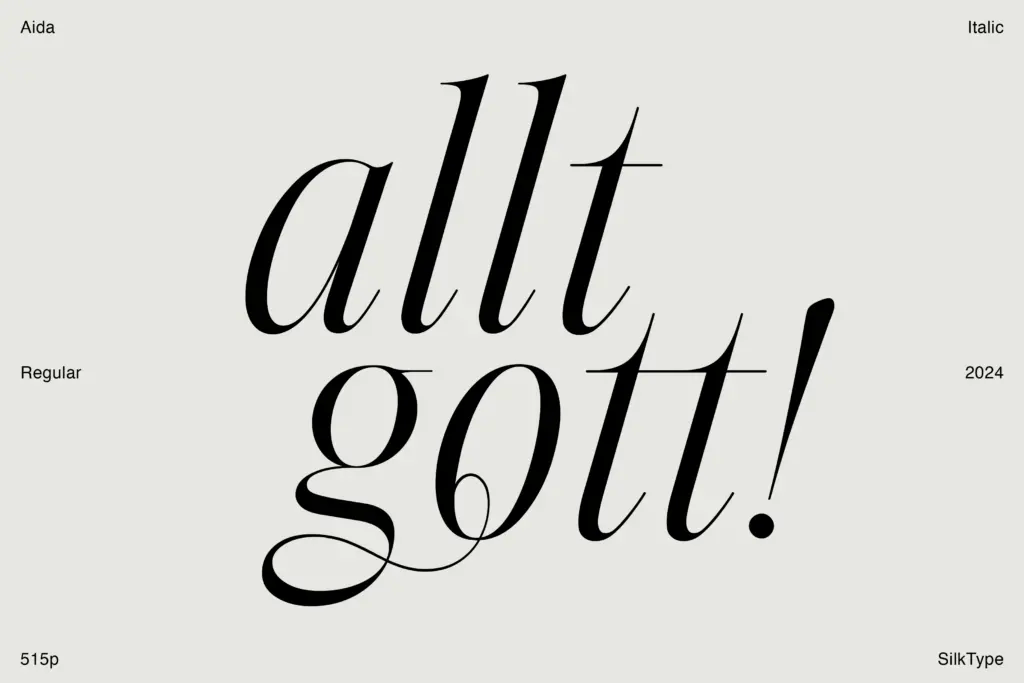
The family’s real selling point is its ligature and alternate set, which runs past a hundred glyphs. These aren’t just the standard fi/fl pairs — expect swash-heavy connections between letters that are clearly meant to be used deliberately, in a wordmark or a short line of display type, not scattered through body copy. Accessing them requires an OpenType-aware layout tool, and using them well requires some restraint; the ligatures are ornate enough that overusing them turns a clean design into a cluttered one.
The core letterforms are solid without being especially inventive on their own. The lowercase has fairly standard Didone proportions, and it’s the extreme thinness of the hairlines, plus the alternates, that give the family its identity rather than any unusual structural decisions in the letters themselves. That’s a reasonable trade-off for a display font — legibility at small sizes was clearly not the design brief here.
Use cases
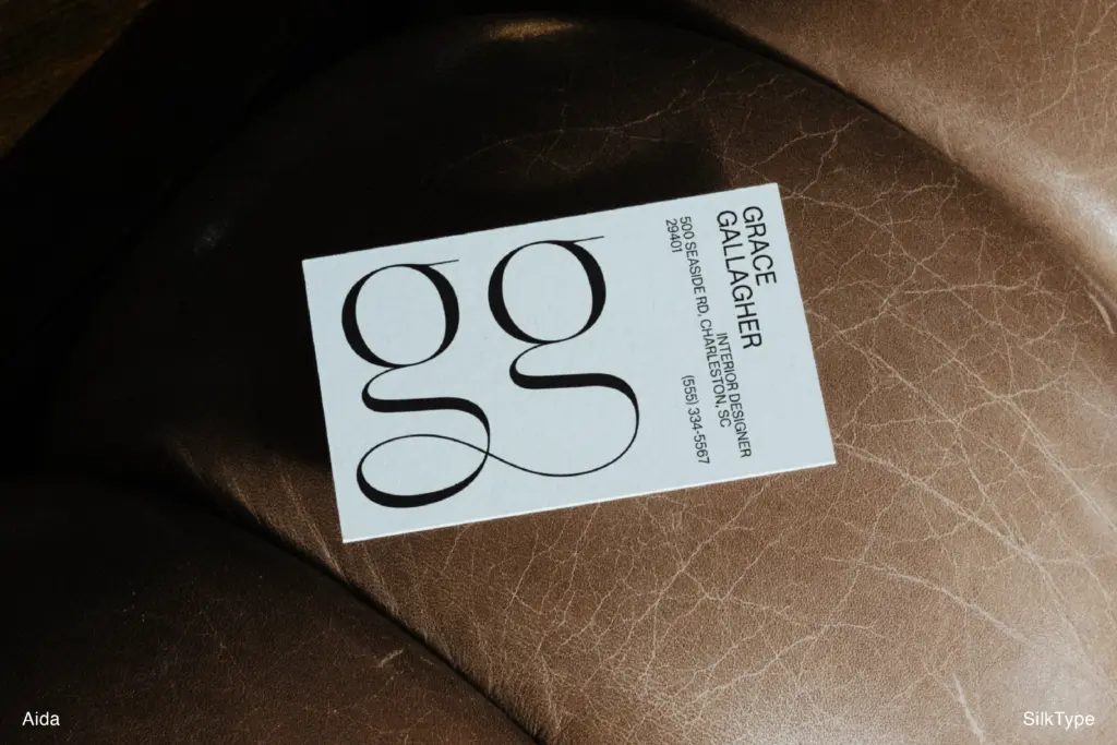
Aida is built for headlines, logotypes, and short-form editorial display — the sort of typography that appears at 60 points or larger, where the hairlines can register and the ligatures have room to breathe. Fashion branding, packaging text for premium goods, and magazine mastheads are all obvious fits. The lighter weights suit minimal, high-end branding where the type needs to feel quiet but precise; the bolder weights work for headline type that needs more presence on a page or a storefront.
It is not a typeface for body text, or even for extended subheads. The thin styles in particular will vanish at anything under 24 points, and the ligatures — while distinctive — are not something you want appearing accidentally in running text. Designers should also plan a fallback sans or plain serif for any long-form copy that has to sit alongside Aida’s display work, since the family doesn’t offer anything built for that job. Used as intended, on a single word or a short line, it does what it sets out to do with some genuine refinement in the drawing.
What we liked, and what we didn’t
Strengths
- Ten weights across Roman and Italic give real range for headline hierarchy
- The ligature and alternate set is large enough for genuine customisation, not just decoration
- Bold weights hold their shape well and carry the family's contrast without breaking down
Trade-offs
- Hairlines in the lightest weights are fragile and risk disappearing at small sizes or on rough print stock
- No accompanying text weight, so pairing with body copy requires an outside typeface
Aida is a confident high-contrast display serif with a genuinely useful ligature set, best kept to headlines and branding at large sizes. The thinnest weights are fragile and it offers nothing for body copy, but as a fashion-editorial display face it does its one job with real refinement.
Verdict

Tantype reviews typefaces in depth — every font is tested in real branding, editorial and screen layouts before a word gets written. 555+ fonts reviewed and counting.