
Figura Sans: a 12-font luxe sans built for branding and editorial layouts
Design style
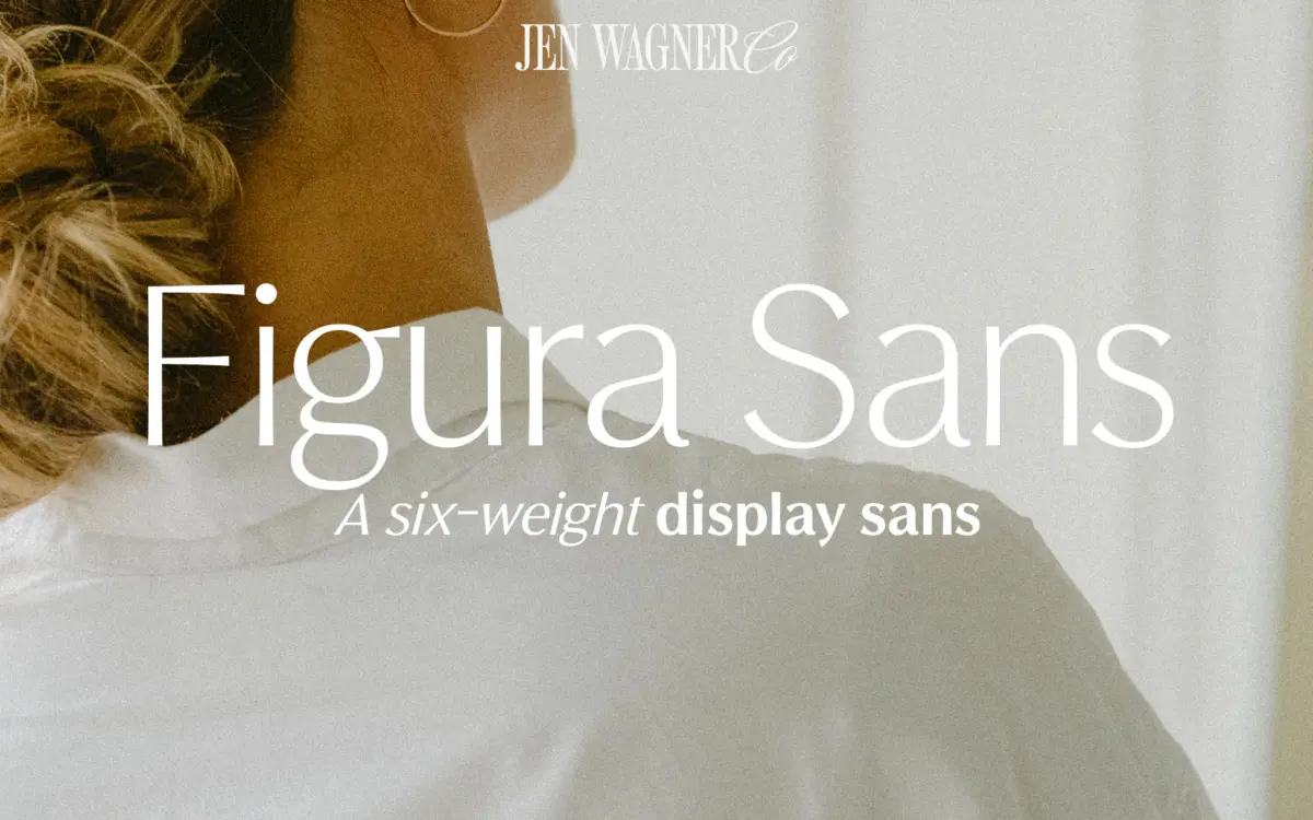
Figura Sans sits in the clean, slightly cool territory of contemporary branding sans faces — the kind of letterforms that read as expensive without doing much shouting. The skeleton is geometric at a glance but not rigid: counters are open, terminals are cut rather than rounded, and the x-height is generous enough to keep lowercase comfortable at small sizes. There’s a faint echo of grotesque proportion in the tighter apertures, which gives it a bit more personality than a pure neo-grotesque.
What makes it a ‘luxe’ sans in practice is restraint. Nothing in the letterforms draws attention to itself — no quirky terminal, no exaggerated contrast — which is exactly the point for a typeface meant to sit behind a logo or a product name rather than compete with it. The italics lean more calligraphic than the uprights, with a touch more flow in the joins, which is a nice counterweight to how buttoned-up the romans are.
Character set and features
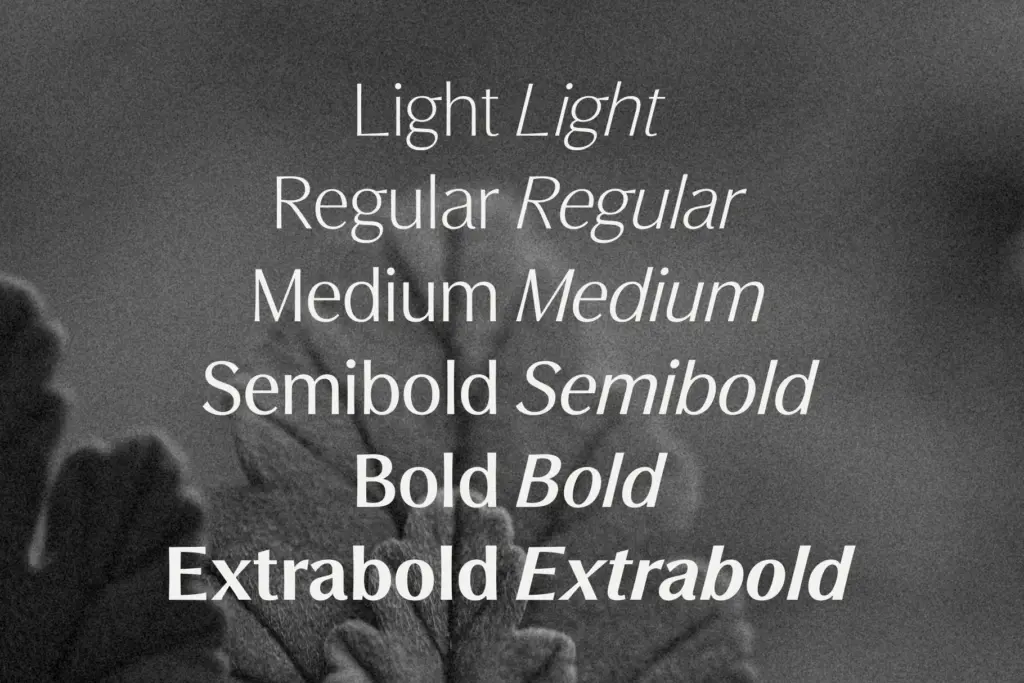
The family ships as six weights — Light through Extrabold, plus Medium and Semibold as in-between steps — each with a true italic, for twelve fonts total. That’s a genuinely usable range for anyone building a brand system rather than a single poster: you get enough tonal distance between Light and Bold to set a hierarchy of headline, subhead, and caption without reaching for a second typeface.
Numbers and punctuation are included, and foreign language support is noted, though the brief doesn’t specify which scripts or diacritics are covered, so anyone working in a non-English market should check the character map before committing. There’s no mention of small caps, alternates, or ligatures here, which is consistent with the family’s job: it’s built to be a dependable workhorse rather than a showcase of OpenType features.
At small sizes the open counters and even stroke weight keep words legible; the lighter weights do get delicate and are best reserved for larger body copy or subheads rather than dense paragraphs of fine print. The bolder weights hold their shape well in tight tracking, which is useful for logotypes and short headline treatments.
Use cases
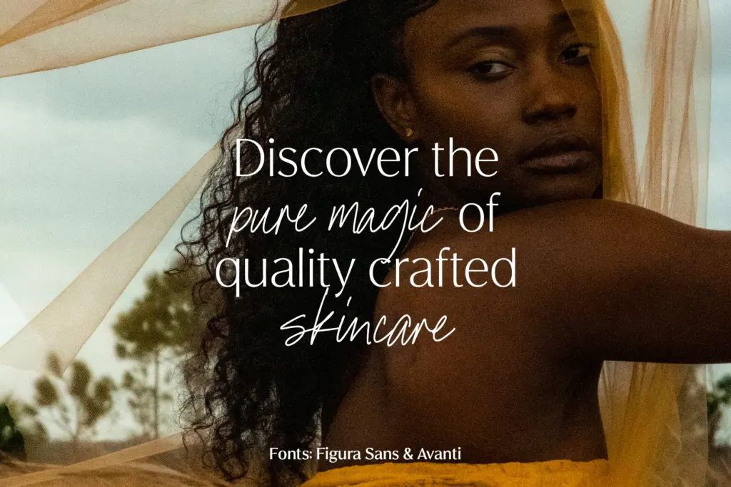
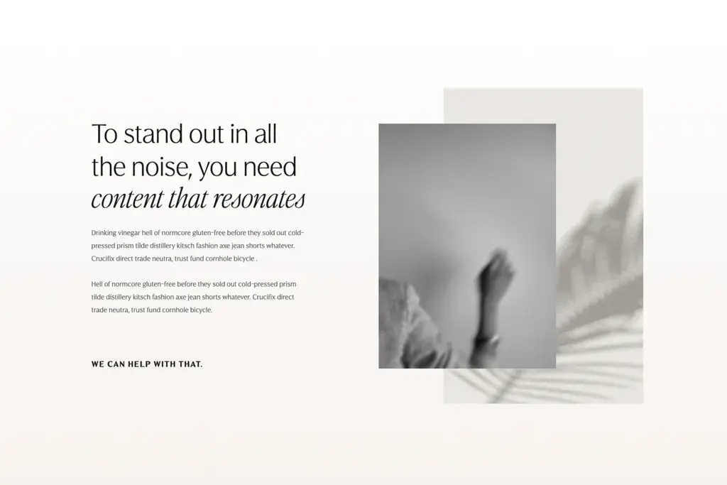
This is a brand-identity typeface first. It’s suited to beauty, fashion, and lifestyle branding where the client wants something that photographs well on packaging and reads cleanly on a phone screen — Figura Sans was clearly built with Instagram graphics and Pinterest pins in mind as much as print collateral. The combination of weights makes it workable for a full visual identity: logotype in a heavier weight, body copy in Regular or Medium, pull quotes in the italic.
It also has legs for editorial work — magazine mastheads, section headers, pull quotes — anywhere a clean sans needs to feel considered rather than default. Where it will strain is long-form reading at small sizes in the lighter weights, and in contexts calling for a typeface with more idiosyncratic character; this is a tool for polish, not for a brand that wants to look unconventional.
What we liked, and what we didn’t
Strengths
- Six weights plus matching italics give real room to build hierarchy without a second typeface
- Open counters and a generous x-height keep it legible at small sizes despite the restrained drawing
- Italics have more flow than the uprights, giving pull quotes and subheads some character
Trade-offs
- Lighter weights thin out at small sizes and aren't suited to dense body text
- No stated OpenType extras like alternates or ligatures, so it stays functional rather than expressive
Figura Sans is a dependable, well-rounded branding sans with enough weight range to carry a full identity system. It won't surprise anyone with its drawing, but that restraint is the whole appeal for beauty, fashion, and lifestyle work. Light weights need careful sizing, and the feature set is modest, but as a workhorse family it does its job cleanly.
Verdict

Tantype reviews typefaces in depth — every font is tested in real branding, editorial and screen layouts before a word gets written. 555+ fonts reviewed and counting.