
The Roman Edition: a classical serif for editorial and luxury branding work
Design style
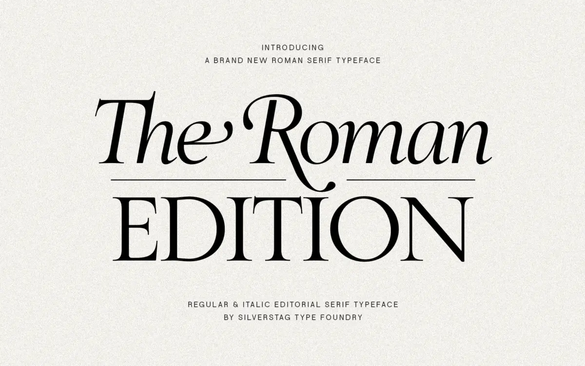
The Roman Edition draws from the classical Roman letterform tradition — the kind of proportioning you see in carved inscriptions and early humanist printing, filtered through a contemporary editorial sensibility. The capitals carry the chiselled, upright confidence of inscriptional lettering: wide, stable, built on a geometry that feels formal without tipping into stiffness. Serifs are bracketed and fairly delicate, with enough contrast between thick and thin strokes to give the face a sense of refinement at larger sizes.
Where it departs from a strictly revivalist approach is in the lowercase, which reads more fluid and slightly condensed in places, giving the typeface a lighter rhythm on the page than its capitals alone would suggest. The two registers — monumental caps, softer lowercase — work together reasonably well, though the contrast between them is noticeable enough that all-caps settings and sentence-case settings feel like two different moods from the same family.
Character set and features
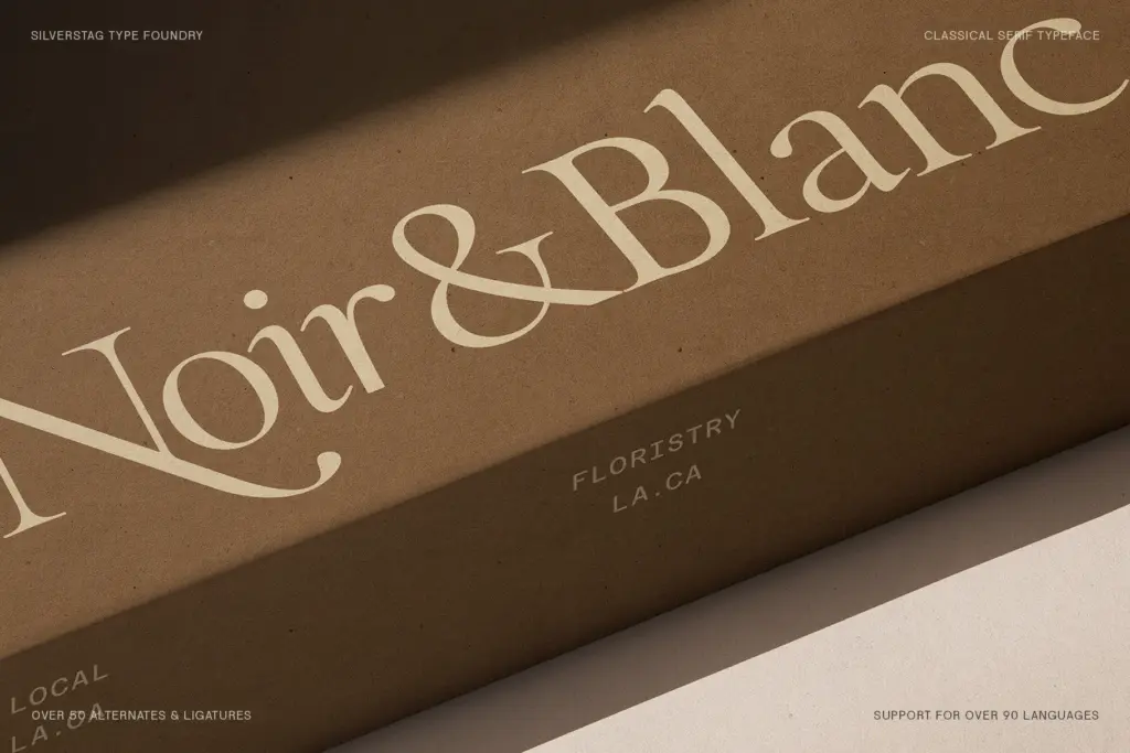
The brief lists a single weight, Regular, which keeps the proposition simple: this isn’t a typeface built for hierarchy through weight contrast, so any sense of emphasis in a layout has to come from size, spacing, or colour rather than switching to a bold or light cut. Ligatures are present, and swash-leaning alternates show up in a few lowercase characters, giving headline settings a bit of calligraphic flourish without requiring a separate script companion.
Diacritic and extended Latin support isn’t specified in detail, so anyone setting non-English copy should check the glyph set before committing to a multilingual project. At text sizes, the delicate serifs and moderate stroke contrast hold up acceptably in print but start to feel thin on screen, particularly at smaller point sizes or lower-resolution renders — this is a typeface that wants paper, or at least a generously sized digital canvas.
Use cases
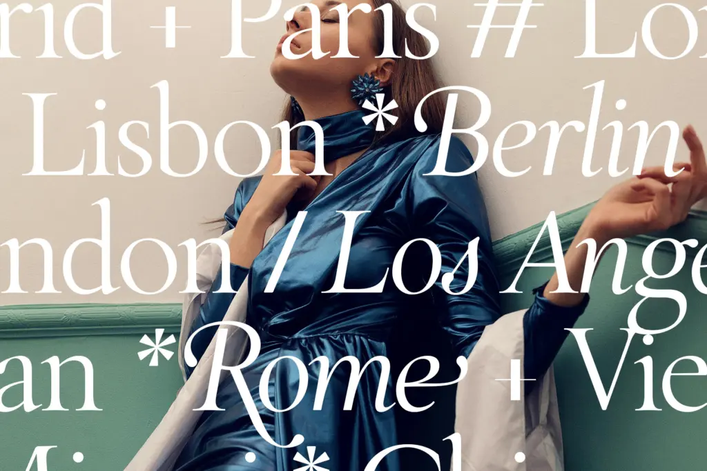
The obvious home for The Roman Edition is editorial: magazine headlines, pull quotes, section openers, anywhere a publication wants a serif with some inherited authority rather than a workhorse text face. It also suits luxury branding contexts — packaging, wordmarks, the kind of identity work where a single, well-set line of type needs to carry the whole impression of quality. Wedding stationery and formal invitations are a natural fit too, given the swash details and classical bearing.
It’s less suited to long-form body text or anything that demands a full weight range for internal hierarchy — brochures with multiple heading levels, UI copy, or dense editorial layouts that need a bold variant will have to borrow a companion typeface rather than relying on this one alone. Treat it as a display and short-copy face: headlines, titles, logotypes, and set pieces, not paragraphs.
What we liked, and what we didn’t
Strengths
- Capitals carry real inscriptional authority without feeling like a costume revival.
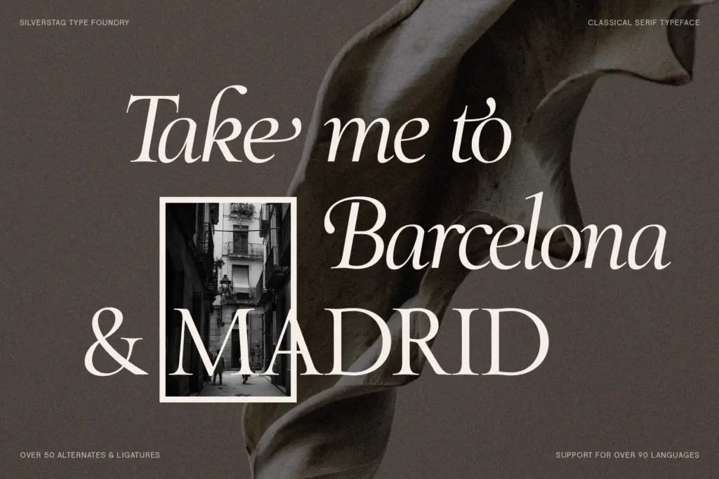
- Swash ligatures give headline settings a calligraphic lift without needing a separate script font.
- Well suited to short-copy luxury and editorial contexts where one confident line matters more than paragraphs.
Trade-offs
- Single weight means no built-in way to build hierarchy without pairing in another typeface.
- Delicate serifs lose definition at small sizes and on screen, limiting it mostly to print and display use.
The Roman Edition delivers genuine classical character in its capitals and a decent set of calligraphic flourishes, but the single-weight structure limits what it can do beyond headline and display work. It's a strong choice for editorial titling, luxury packaging, and formal invitations, less so for anything needing internal hierarchy or small-size legibility.
Verdict

Tantype reviews typefaces in depth — every font is tested in real branding, editorial and screen layouts before a word gets written. 555+ fonts reviewed and counting.